


Data Science Evaluation Metrics — Unravel Algorithms
Last Updated on January 6, 2023 by Editorial Team
Last Updated on December 14, 2020 by Editorial Team
Author(s): Maximilian Stäbler
Lessons learned about evaluation metrics for classification tasks.
If you do not know how to ask the right question, you discover nothing.
– W. Edwards Deming
In the machine learning world, there are countless evaluation possibilities, and every day, new ones are added. Right at the beginning of this article, I would also like to mention that there is no cure-all for every data science problem, which always provides the best way to analyze the results.
There are prevalent and very robust methods, but in many cases, they have to be adapted, or an application specific method is developed.
In order not to inflate this article unnecessarily, I would like to divide the metrics into the two classic data science application groups, classification, and regression. The latter will be discussed in the second part of this article series, and this article is dedicated to the metrics that can be used to evaluate Classification algorithms.
Less talk, more content.
– Me
Basics: To guarantee the understanding of this article and the reproducibility, all code used here is available on my Github [LINK]. The used notebook only needs the libraries pandas, scikit-learn, yellowbrick, matplotlib, and seaborn. All used data sets can also be imported via scikit-learn or are included.
Classification method: For the classifications, a logistic regression (binary class) is used. An explanation of the algorithms is not provided. However, excellent descriptions can be found under the following links.
Logistic Regression: LINK
[1] Pant, A., Introduction to Logistic Regression (2019), TowardsDataScience
Furthermore, I can only advise every abitioinated data-scientist to use the library Seaborn to create plots quickly, but I will not go into the creation of these plots. The exact procedure can also be seen in the available notebook.
Subjected metrics

Most common and metrics we will focus on are:
- Accuracy
- Precision
- Recall
- F1-Score
- ROC & AUC curve
The first metric we consider in this article is perhaps the easiest to understand metric in the entire field of data science: accuracy.
A simple example: Like every Saturday, I guess the outcome of the German soccer league, and like every Saturday, I guess the right winner of only one of the ten games. Like every Saturday, I lose my money, and like every Saturday, my accuracy is 10%.
A better example (and cheaper for me) can be described with the very well known breast_cancer record from scikit-learn. This data set describes with a total of 30 covariates whether a patient has cancer or not.

As for all other examples, we will now train a model that divides never before seen data sets into two classes and forms the basis for our evaluation metrics. Here we will use logistic regression.
Accuracy — absolute basic knowledge
All we have to do now to calculate our first metric (accuracy) is to compare how our model predicted the correct class for many patients.
So, we get an accuracy of 94% — not bad for a simple model, right?
The answer is yes, and no. Yes, an accuracy of 94% is quite good in most cases, unless you have made a technical mistake such as a wrong train-test-split.
But now imagine that you have a total of 100 patients, of whom 94 have no cancer and 6 have cancer cells in their bodies. In this case, the data set would be skewed, and you could reach 94% with a model that predicts a constant 0 (no cancer).
Generally speaking, skewed means that one of the binary classes exceeds the others by far ergo has many more entries.
In these cases, it is recommended not to use accuracy as a metric for the accuracy of the prediction.
To tackle these problems, we will use the same approach as in school when learning foreign languages: First, the vocabulary, then the application.
We use again the same data set as before, but for simplicity will assume the states as follows:
— 0 = no cancer
— 1 = cancer cells in the chest.
Our model will again make predictions for different patients, which will then be compared with the known states. Accordingly, our predictions can assume 4 states, as shown in the figure:
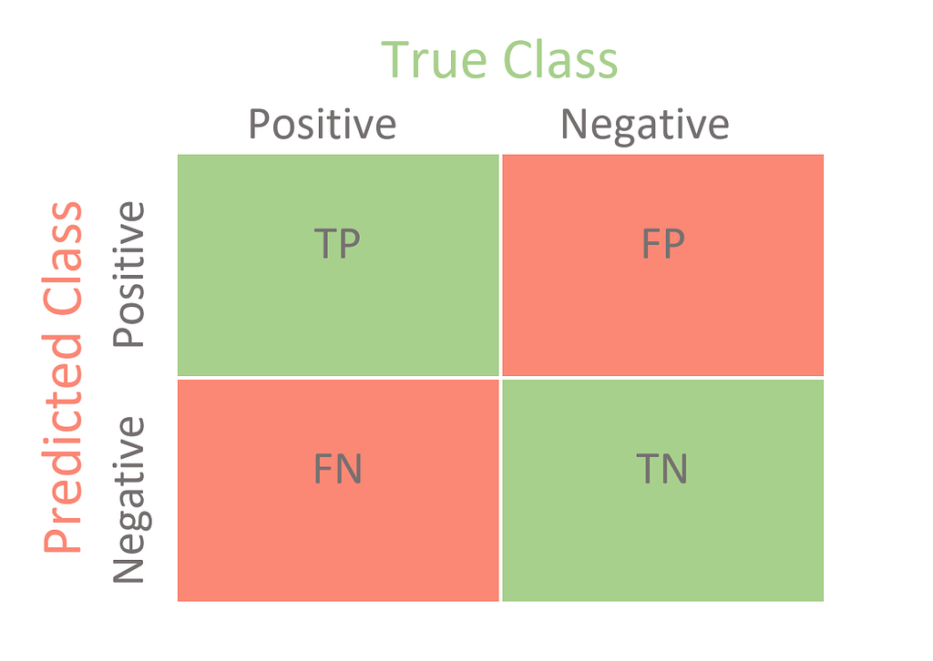
BTW: Check the post about confusion matrices by Mr. Mohajon [LINK] where I also stole the picture above 🙂
True Positive (TP): Our model predicts the patient has cancer, and the patient really has cancer. — Top Left
True Negative (TN): Our model predicts the patient doesn’t have cancer, and the patient is cancer-free. — Bottom-Right
False Positive (FP): Our model predicts a patient has cancer, but the patient is cancer-free. — Top-Right
False Negative (FN): Our model predicts a patient is cancer-free, but the patient has cancer. — Bottom-Left
Nice, now we know how to label our predictions. The size (amount of predictions) labeled with each state can now be used to give us a better understanding of what our model does well and what needs to be improved. For example, in medicine (or in our application case), it is extremely important to detect all cancerous diseases. No patient should be overlooked if possible. If some patients are wrongly classified as “ill,” this is not a good thing, but with further tests, these patients will be detected in almost all cases.
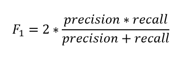
Precision and Recall — the panacea?
Precision and recall can be used for exactly such an application. Here are the formulas of the two metrics:
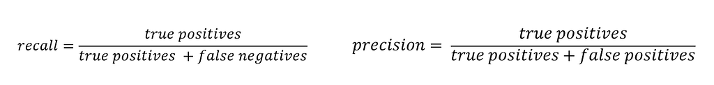
You can see directly from the previously made definitions and the formulas that a good model should have the highest possible values for Precision and Recall. For our first model, the scores are:
Precision: 93,27% — Recall: 98,88%
Both scores are quite high, so is that the final proof that we found the best model ever? Nope. Our dataset is just well-balanced. Let’s change that and create a more realistic real-world user-case.
As a reminder, we previously had an approximately balanced data set with class sizes ~200 and ~350, but now that the class sizes have been changed to 1919 and 357, respectively – we should see a big difference.
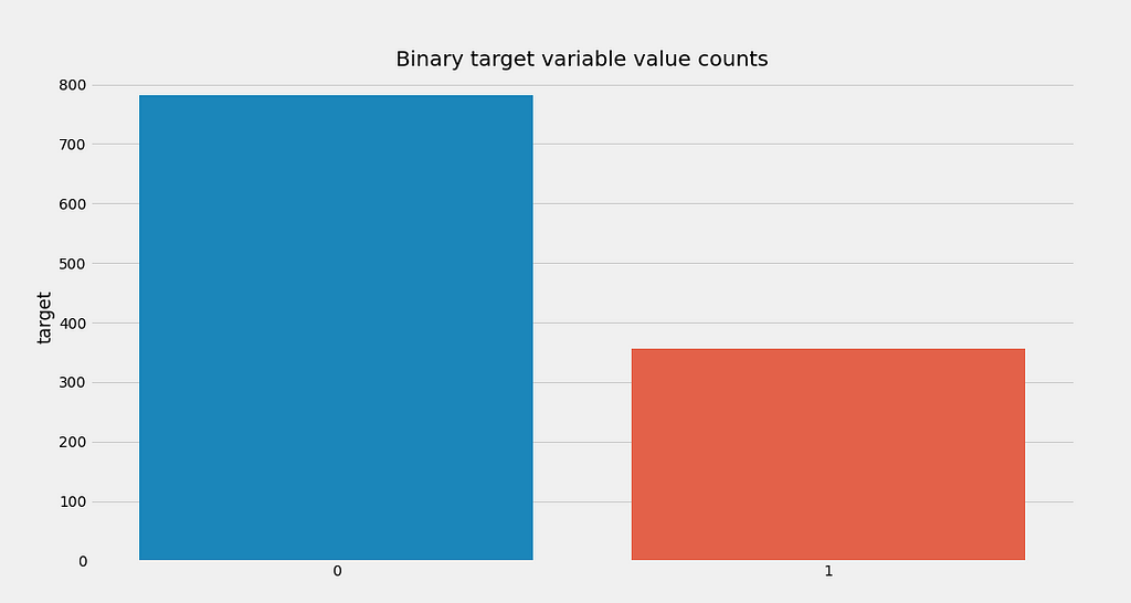
Metric results:
Accuracy: 0.71
Precision: 0.5244
Recall: 0.8543
Well, well, well… One can clearly see that all metrics have dropped dramatically. I do not want to diminish the influence of the model here, but the interpretation of the metrics is more important:
Due to the low precision, we can conclude that our model produces quite a lot of false-positives. This means that we predict a lot of patients have cancer when they are cancer-free in reality.
Furthermore, the okay value for the recall is a good thing, because as described above, we don’t want to say patients are cancer-free when they actually have breast-cancer. We have fewer false-negatives.
That’s all well and good so far, but what do we do if our values for Precision and Recall are not satisfactory?
To answer this question, you have to understand how a Machine Learning Model comes to a decision in a binary classification: The Threshold.
In most models where a probability is predicted, the threshold is set to 0.5, but what does that mean? Basically, only that every probability of a random variable less than the threshold (0.5) is classified as 0, and every probability greater than the threshold is classified as 1.
Although this threshold is a common baseline model, it is certainly not ideal for every application. Depending on the value of the threshold, the precision and recall values can change dramatically.
How about calculating the precision and recall values for numerous threshold values and plotting them? Damn good idea — congratulations: We just derived the Precision-Recall curve.
Note: Many of the following plots were created with the Yellowbrick library, which makes analysis of scikit-learn models extremely easy! Absolute recommendation! [LINK]
Precision-Recall-Curve
For the visualization of the curve, we will use a new data set. It contains NLP-features of an email and the information if the mail is spam or not. So we want to classify it binary again.
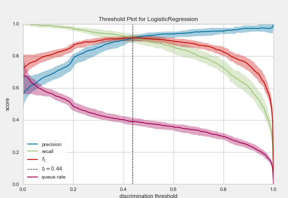
The displayed plot offers a lot of helpful information about the model, its capabilities, and potential limitations. The optimal threshold is 0.44.
What we can see directly is that while the accuracy increases as the threshold increases, the recall curve simultaneously decreases more and more.
An explanation for the shape of the two curves is absolutely logical after reading the upper part attentively (hopefully):
If we increase the threshold more and more until every mail is marked as spam, we will not miss any real spam mail (maximum precision). Still, we will also label all mails that do actually not spam as unwanted messages (very low recall).
A value that is also directly shown in the plot and represents a harmonic mean value of Precision and Recall is the F1 value.
So you can analyze the red F1 plot instead of looking at the two plots for precision (blue) and recall (green). This value is also always between 0 and 1, where 1 would mean a perfect prediction. Because the value is derived from the precision and recall curve, this value is very well suited for skewed data sets.
Similar to Precision and Recall or the F1 value, other metrics can be calculated from the results of the Confusion Matrix. The names of these metrics give a clear overview of their meaning:
TPR — True Positive Rate: Exact the same as precision
FPR — False Positive Rate: 1-FPR is also called specificity (True Negative Rate)

ROC & AUC Curve — Visualization of the Confusion Matrix
The AUC — ROC curve is an output measurement in different threshold settings for classification problems. In detail:
ROC is a curve of probability
AUC is the degree or measure of separability.
Both together show how much the model can differentiate between groups.
The better the model is at correctly predicting classes, the higher the AUC (best value 1, worst 0). In the context of our spam-dataset, a higher AUC means that the model will better predict whether a mail is a spam or not. Graphically speaking, the AUC is the area under the ROC curve! As always, it is much easier to understand by looking at an example. Here is the code and generated plot for the ROC-AUC curve of our spam-dataset and model:
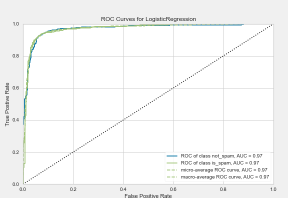
Nice plot maxi, but how can you use it now?
Similar to the threshold-plot before, this plot can be used to select the best threshold. In addition, this plot gives direct information about how the respective threshold influences the FPR (False-Positive-Rates) and the TPR (True-Positive-Rate), which is crucial for some applications!
Take our spam example: Here, the overall goal is to detect all spam. If single mails should end up in the spam folder without authorization, this is to a certain degree to be acceptable (under the realistic assumption that there is no perfect model). Translated into technical terms, this means that we want a very high true positive rate and a low false-negative rate.
This translated to the ROC curve, which would mean that we want the highest possible TPR value (Y-axis) with the lowest possible FPR value (X-axis). But since spam detection has priority, one is theoretically willing to make concessions on the X-axis. If you want fewer false-positives, you get more false-negatives in return. So for this example, you can see that if you want to have a 100% probability of detecting spam, you’ll get almost 40% of the mails as wrongly marked spam. On the other hand, a model with another threshold that “only” detects about 97% of spam would only mark about 7% of normal mails as spam. As said before, the decision is made by the user.
The AUC is also widely used when dealing with skewed datasets! What the AUC does, is that it notifies you that you have several wrongly classified positives (FP) despite the fact that you have high accuracy because of the dominant class, and therefore it would return a low score in this case. The reason for this is that the number of false positives will grow, and therefore the denominator is becoming larger (TP / (TP + FP)).
Summary
In these articles, the important metrics for the evaluation of classification problems were presented. Although the accuracy alone may be sufficient in some (simple) use cases, it is recommended to include other metrics to analyze the results. Since the ROC & AUC curve gives a very detailed insight into the capabilities and problems of the classification model, it is probably the most used of the presented methods.
However, it should be noted that there are many other more accurate, complex, and possibly much better-suited methods.
Part 2 of this article then deals with the most common methods for evaluating regression problems.
Stay in touch:
LinkedIn: https://www.linkedin.com/in/maximilianstaebler
Twitter: https://twitter.com/ms_staebler
Data Science Evaluation Metrics — Unravel Algorithms was originally published in Towards AI on Medium, where people are continuing the conversation by highlighting and responding to this story.
Published via Towards AI
Towards AI Academy
We Build Enterprise-Grade AI. We'll Teach You to Master It Too.
15 engineers. 100,000+ students. Towards AI Academy teaches what actually survives production.
Start free — no commitment:
→ 6-Day Agentic AI Engineering Email Guide — one practical lesson per day
→ Agents Architecture Cheatsheet — 3 years of architecture decisions in 6 pages
Our courses:
→ AI Engineering Certification — 90+ lessons from project selection to deployed product. The most comprehensive practical LLM course out there.
→ Agent Engineering Course — Hands on with production agent architectures, memory, routing, and eval frameworks — built from real enterprise engagements.
→ AI for Work — Understand, evaluate, and apply AI for complex work tasks.
Note: Article content contains the views of the contributing authors and not Towards AI.
Related posts
")

Recent Posts


")


