
Advanced Matplotlib: A Comprehensive Guide to Data Visualization
Last Updated on November 5, 2023 by Editorial Team
Author(s): RaviTeja G
Originally published on Towards AI.

Welcome back to the second installment of our two-part series of Matplotlib. In part 1, we saw how we can make the basic plot and understand the characteristics of various plots. In this article, we delve into advanced topics of Matplotlib to unlock its true potential for better visualization and representation of the data. Now, Without a dew let me give a glimpse of what lies ahead.
Table of Contents
- Multiple Subplots
∘ 1.1 Creating Multiple Plots in a Single Figure
∘ 1.2 Combining Different Types of Plots - Advanced Features
∘ 2.1 Adding annotations and text
∘ 2.2 Fill the Area Between Plots
∘ 2.3 Plotting Time Series Data
∘ 2.4 Creating 3D Plots
∘ 2.5 Live Plot — Incorporating Animations and Interactivity.
∘ Conclusion
∘ Announcement #100daysMLDL
— Let’s start painting with our data! —
1. Multiple Subplots
1.1 Creating Multiple Plots in a Single Figure
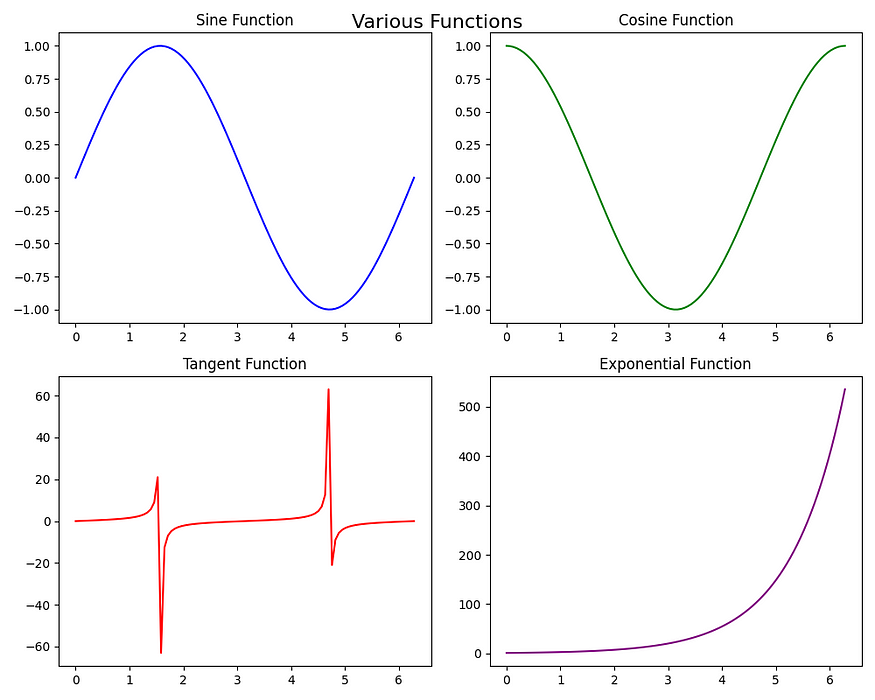
Say, You are working with a dataset that has the age of a person, the software they are working on, and their salary. You want to visualize the Python developers' ages and salaries and then compare them with Java developers. By Now, you know you can do that by making two plots one in each cell of the notebook. But then, you have to move back and forth to compare, we better not talk about what if there are 4 things to compare!!
To Ease this issue, we have a feature called subplots, in the same plot there will be different subplots of each. You can create the subplots using plt.subplots(nrows=x,ncols=y) . By default nrows=1, and ncols=1. plt.subplots() returns two things one(fig) is to style the entire plot, and the other(axes) is to make subplots. Plot each subplot using axes[row, column], where row and column specify the location of the subplot in the grid. You can use the sharex or sharey parameters when you have common axes for the subplots. Let’s see a few examples to make it clear.
import matplotlib.pyplot as plt
import numpy as np

# Sample data
x = np.linspace(0, 2 * np.pi, 100)
y1 = np.sin(x)
y2 = np.cos(x)
y3 = np.tan(x)
y4 = np.exp(x)

# Create a 2x2 grid of subplots
fig, axes = plt.subplots(nrows=2,ncols=2, figsize=(10, 8))

# Plot the first subplot (top-left) - axes[0,0]
axes[0, 0].plot(x, y1, color='blue')
axes[0, 0].set_title('Sine Function')

# Plot the second subplot (top-right) - axes[0,1]
axes[0, 1].plot(x, y2, color='green')
axes[0, 1].set_title('Cosine Function')

# Plot the third subplot (bottom-left) - axes[1,0]
axes[1, 0].plot(x, y3, color='red')
axes[1, 0].set_title('Tangent Function')

# Plot the fourth subplot (bottom-right) - axes[1,1]
axes[1, 1].plot(x, y4, color='purple')
axes[1, 1].set_title('Exponential Function')

# Adjust spacing between subplots
plt.tight_layout()

# Add a common title for all subplots
fig.suptitle('Various Functions', fontsize=16)

# Display the subplots
plt.show()
1.2 Combining Different Types of Plots
When talking about comparing plots, we will not always wish to have the same axes for both plots, right? There will be cases where we have one common axis and other different!
In such cases, You can combine these different plots within a single figure using the twinx() or twiny() functions to share one axis while having independent y or x-axes. For example, you can combine a line plot of Month vs. Revenue, with a bar plot of Month vs. Sales, to visualize two related datasets with different scales. Here we have a common x-axis but a different y-axis.
# Sample data
x = np.arange(1, 6)
y1 = np.array([10, 15, 7, 12, 9])
y2 = np.array([200, 300, 150, 250, 180])

# Create a bar plot
fig, ax1 = plt.subplots(figsize=(8, 4))
ax1.bar(x, y1, color='b', alpha=0.7, label='Sales')
ax1.set_xlabel('Month')
ax1.set_ylabel('Sales', color='b')
ax1.set_ylim(0, 20) # Set y-axis limits for the left y-axis

# Create a line plot sharing the x-axis
ax2 = ax1.twinx()
ax2.plot(x, y2, color='r', marker='o', label='Revenue')
ax2.set_ylabel('Revenue', color='r')
ax2.set_ylim(0, 400) # Set y-axis limits for the right y-axis

# Add a legend
fig.legend(loc='upper left', bbox_to_anchor=(0.15, 0.85))

# Add a title
plt.title('Sales and Revenue Comparison')

# Show the plot
plt.show()

2. Advanced Features
2.1 Adding annotations and text to enhance visualizations
In Matplotlib, you can incorporate annotations and text using various methods. This is very useful during presentations, it is a powerful technique to enhance the communication of insights and highlight key points in your plots.
- Adding text with
textfunctions: Theplt.text(x_pos,y_pos,desired_text,fontsize=desired_size)function allows you to add custom text at specified coordinates on the plot. - Annotating with
annotate()Function: Theplt.annotate(desired_text,xy=arrow_pos,xytext=text_post)function allows you to add text with an associated arrow or marker pointing to a specific location on the plot. - Labeling Data Points: You can label individual data points in a scatter plot using
text()orannotate()
# Sample data for retail shop revenue
months = ['Jan', 'Feb', 'Mar', 'Apr', 'May', 'Jun', 'Jul', 'Aug', 'Sep', 'Oct', 'Nov', 'Dec']
store_locations = ['Store A', 'Store B']
revenue_data = np.array([[90, 100, 110, 120, 125, 130, 140, 135, 130, 120, 110, 100],
 [70, 75, 80, 85, 95, 100, 105, 110, 115, 120, 125, 130]])

# Changing plot style to a comic style
plt.xkcd()

# Plot monthly revenue for each store location
plt.plot(months, revenue_data[0], marker='o', label=store_locations[0])
plt.plot(months, revenue_data[1], marker='o', label=store_locations[1])

# Highlight special promotions
plt.annotate('Due to Summer Sale we got a peak here.', xy=('Jul', 138), xytext=('Jun', 125),
 arrowprops=dict(arrowstyle='->', color='blue'))

# Add title and labels
plt.title('Monthly Revenue Comparison for Retail Stores (2023)')
plt.xlabel('Month')
plt.ylabel('Revenue (in thousands)')
plt.grid(True)
plt.legend()
plt.show()

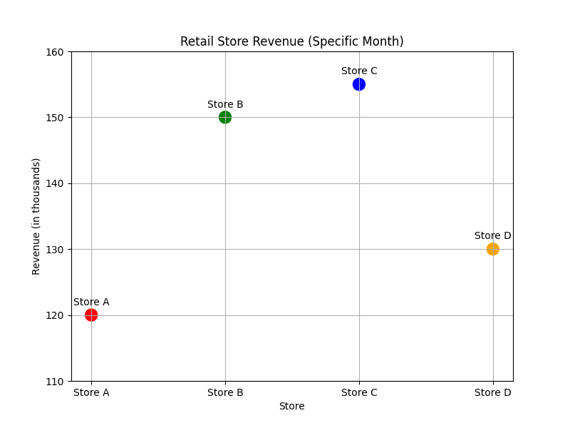
- Below is an example of the plot with labels, To add labels, we need to iterate through the names and use the annotate method for each point of the name. In this case, you don’t need to use
xyandarrowpropsparameters. But you do need to usetextcoords='offset points', this ensures that the positions specified for the label (in this case,xytext) are interpreted in a coordinate system where the origin (0, 0).
# Sample data for retail shop revenue in a specific month
store_names = ['Store A', 'Store B', 'Store C', 'Store D']
revenue_data = np.array([120, 150, 155, 130]) # Revenue in thousands
colors = ['red', 'green', 'blue', 'orange']

# Plot store revenue as points
plt.scatter(store_names, revenue_data, s=150, c=colors, marker='o', label='Revenue')

# Label each store
for i, store in enumerate(store_names):
 plt.annotate(store, (store, revenue_data[i]), textcoords="offset points", xytext=(0, 10), ha='center')
 # plt.text(store, revenue_data[i]+1,store)

# Add title and labels
plt.title('Retail Store Revenue (Specific Month)')
plt.xlabel('Store')
plt.ylabel('Revenue (in thousands)')
plt.ylim(110,160)
plt.grid(True)
plt.savefig(path+'plot_with_labels.png')
plt.show()
2.2 Fill the Area between the plots
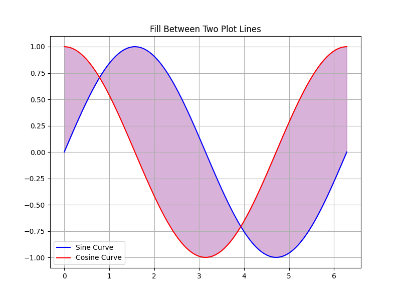
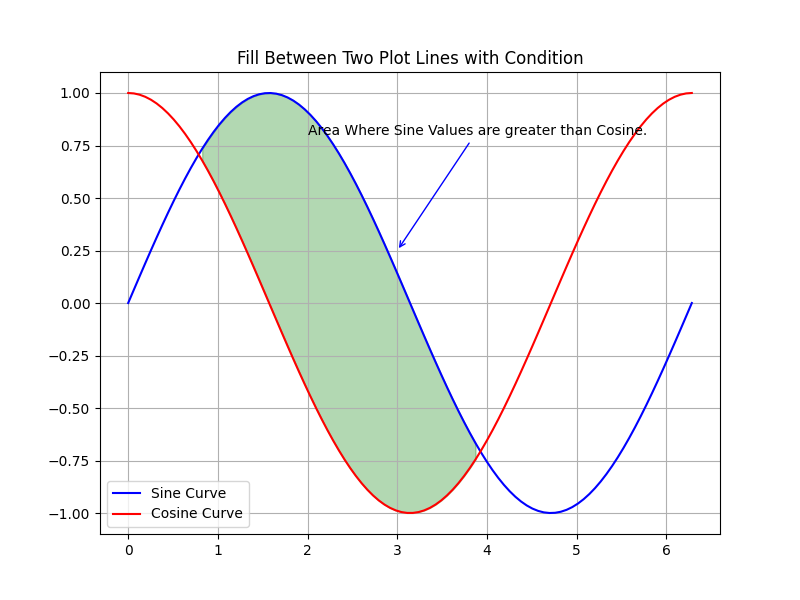
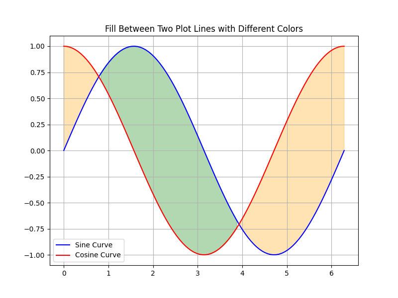
Sometimes we need to highlight the regions between two line plots, which can help viewers understand where one curve surpasses another. And this can be achieved through fill_between method in Matplotlib. The intensity of the fill color can be controlled through alpha parameter.
- To Fill all the Region between the x-axis and the plot line, you can use the command
plt.fill_between(x,y) - To Fill the intersection between two plot lines, you can use the command
plt.fill_between(x,y1,y2) - To Fill the intersection between two plot lines only if they satisfy a specified condition, you can use the command
plt.fill_between(x,y1,y2,where=condition) - To Fill more than one region of the plot with different conditions and different colors.
Here are a Few Examples of the above cases.
# Sample data
x = np.linspace(0, 2 * np.pi, 100)
y = np.sin(x)

# Plot the curve
plt.plot(x, y, label='Sine Curve', color='blue')

# Fill the region between the curve and the x-axis
plt.fill_between(x, 0, y, alpha=0.3, color='blue')

# Add title and labels
plt.title('Fill Between X-Axis and Plot Line')
plt.grid(True)
plt.legend()
plt.show()

# Sample data
x = np.linspace(0, 2 * np.pi, 100)
y1 = np.sin(x)
y2 = np.cos(x)

# Plot the two curves - Multiple line plots
plt.plot(x, y1, label='Sine Curve', color='blue')
plt.plot(x, y2, label='Cosine Curve', color='red')

# Fill the region between the two curves
plt.fill_between(x, y1, y2, alpha=0.3, color='purple')

# Add title and labels
plt.title('Fill Between Two Plot Lines')
plt.grid(True)
plt.legend()
plt.show()
# For the same above plot
# Fill the region between the two curves where y1 > y2
plt.fill_between(x, y1, y2, where=(y1 > y2), alpha=0.3, color='green')

# Highlight special promotions
plt.annotate('Area Where Sine Values are greater than Cosine.', xy=(3, 0.25), xytext=(2, 0.80),
 arrowprops=dict(arrowstyle='->', color='blue'))

# Add title and labels
plt.title('Fill Between Two Plot Lines with Condition')
plt.grid(True)
plt.legend()
plt.show()
# Plot the two curves
plt.plot(x, y1, label='Sine Curve', color='blue')
plt.plot(x, y2, label='Cosine Curve', color='red')

# Fill multiple regions with different colors
plt.fill_between(x, y1, y2, where=(y1 > y2), alpha=0.3, color='green')
plt.fill_between(x, y1, y2, where=(y1 <= y2), alpha=0.3, color='orange')

# Add title and labels
plt.title('Fill Between Two Plot Lines with Different Colors')
plt.grid(True)
plt.legend()
plt.show()
2.3 Plotting Time Series Data
We all know that Time series data is very common in many fields such as finance, climate science, business analytics, etc. And also the data will be very huge in these cases, we can’t make the most out of data by just doing some aggregations! Matplotlib offers us ways to easily interpret the time-series data.
Imagine, you want to plot website traffic over one month. If you make a line plot, the x-axis will be very clumsy with all the dates and you can’t see any dates properly! Something like below.

matplotlib.datesis a submodule within Matplotlib that provides tools and is useful when dealing with time series data, allowing you to format and customize the appearance of the date and time values on the x-axis.DateFormatter: This class allows you to customize the format of date and time labels on the x-axis. You can specify how dates are displayed, including the order of year, month, day, and the use of separators.DayLocator,MonthLocator,YearLocator, etc.: These classes help in locating and spacing date ticks on the x-axis. You can specify the frequency of ticks, e.g., daily, monthly, or yearly.AutoDateLocator,AutoDateFormatter: These classes automatically determine appropriate date tick locations and formats based on the data range. This is helpful for creating plots with dynamic date axes.- While plotting time series data, you can actually use
plot_date, specifically for DateTime data, and handle the x-axis as dates, providing better automatic date formatting and tick placement. - Here we also utilize,
plt.gcf()andplt.gca()which are Get Current Format and Get Current Axes. Create a date format using the above methods, and pass it toplt.gca().xaxis.set_major_formatter(d_format)
Let’s see the same example but with just three additional lines of customization that make the time series plot easily interpretable!
import pandas as pd
import matplotlib.pyplot as plt
import matplotlib.dates as mdates
import numpy as np
np.random.seed(10)

# Let's generate sample time series data for one month
date_rng = pd.date_range(start='2022-01-01', end='2022-02-01')

# Generate random website traffic values for one month
traffic_data = np.random.randint(500, 5000,len(date_rng))

# Create a DataFrame
traffic_df = pd.DataFrame({'Month': date_rng, 'Traffic (Visitors)': traffic_data})

# Now, let's create a time series plot
plt.plot_date(traffic_df['Month'], traffic_df['Traffic (Visitors)'], label='Website Traffic', color='purple')

# To show all the dates of one month
plt.xticks(traffic_df['Month'])

# create x-axis Date Format: Month Day, Year using the DateFormatter method
date_format = mdates.DateFormatter('%b %d, %Y')
# Customize date formatting by using sej_major_formatter method of matplotlib
plt.gca().xaxis.set_major_formatter(date_format)
# Autoformatting the x-axis
plt.gcf().autofmt_xdate()

# Adding Labels and Title:
plt.xlabel('Month')
plt.ylabel('Traffic (Visitors)')
plt.title('Monthly Website Traffic Over a Year')

# Adding Grid Lines and Legends:
plt.grid(True)
plt.legend(['Website Traffic'], loc='upper right')

# Display the plot
plt.show()
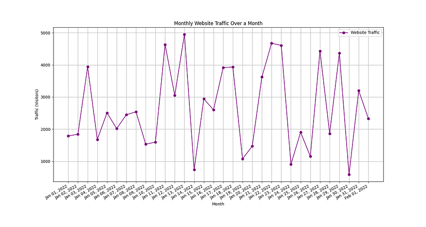
- Hence, By utilizing the methods from matplotlib.dates, we are able to customize the x-axis in a better way that makes the plot more readable.
2.4 Creating 3D Plots
When you are dealing with 3 or more variables or dimensions, then visualizing the complex data through a 3D plot might give more insights into the data. Some common use cases are visualizing terrain modeling, geographical features, 3D medical images, etc.
Creating 3D plots using Matplotlib involves using the mpl_toolkits.mplot3d toolkit, which provides functions for creating various types of 3D visualizations. you need to import the Axes3D to visualize the plots in 3D with the following command from mpl_toolkits.mplot3d import Axes3D .
First, we need to create a Matplotlib figure object using fig=plt.figure() . To add a 3D subplot to the figure we need to use the add_subplot method, axes=fig.add_subplt(111,projection='3d') . In this case, (1, 1, 1) means there is only one row, and one column, and the current subplot is in the first (and only) position.
Let’s create a 3D surface plot, you can also create a 3D line plot, 3D scatter plot, etc.
from mpl_toolkits.mplot3d import Axes3D

# Create a meshgrid of X and Y values
x = np.linspace(-5, 5, 100)
y = np.linspace(-5, 5, 100)
X, Y = np.meshgrid(x, y)

# Define the function to plot (example: a saddle shape)
Z = X**2 - Y**2

# Create a 3D surface plot
fig = plt.figure(figsize=(10, 8))
ax = fig.add_subplot(111, projection='3d')

ax.plot_surface(X, Y, Z, cmap='viridis')

# Add title and labels
ax.set_title('3D Surface Plot')
plt.show()

2.5 Incorporating Animations and Interactivity for Plots
It would be nice to rotate, zoom, and hover to see the location of the above 3D plot, right? Guess what, we can actually do that in one line! Use the command %matplotlib notebook in your Jupyter Notebook to make the plot interactive. If you want to change it back to static plots use %matplotlib inline .
When the interactive plots are enabled, you can also create nice animation plots, like a moving sine wave, etc. That can be achieved by using FuncAnimation methods from matplotlib.animation module. The FncAnimation method takes in the figure object, the function to call repeatedly, interval time to call the function. The below code will create an animated sine wave. So, Here animate function will be called every 1 second, and the resulting plot will be plotted in the figure object, so as it happens continuously we get an animation plot.
In the animate function, if you can add pd.read_csv(‘live_data.csv’) to call a csv file that gets updated often, then there you have a real-time plot that gets updated as the data changes.
from matplotlib.animation import FuncAnimation
%matplotlib notebook

# Create a figure and axis
fig, ax = plt.subplots()

# Function to update the animation
def animate(frame):
 x = np.linspace(0, 2 * np.pi, 1000)
 y = np.sin(x + 0.1 * frame) # Vary the phase to create animation
 plt.cla()
 ax.plot(x, y, 'bo', markersize=10)

# Create the animation
ani = FuncAnimation(fig, animate,interval=1000)

plt.title('Animated Point on Sine Wave')
plt.show()
Conclusion
In this two-part comprehensive guide, we have understood the fundamentals of the plots, customizations, Multiple subplots, Fill between the plots, and advanced features like 3D plots, Plotting Time Series Data, and Adding annotations and text.
As you continue your journey in the world of data science and analysis, remember that Matplotlib provides the foundation for creating compelling visuals that tell your data’s story, so just play with it. I hope you find this guide useful.
If you are interested in Pandas, Numpy, Matplolib, Seaborn, and Plotly, then look no further, I also have detailed articles on these essential libraries for Data Science, Here’s a curated List.

Detailed Guides for all the Essential Data Science Libraries
View list8 stories


I will be posting more interesting articles related to Machine learning as well. Follow me for more and Subscribe to not miss any exciting data science articles!
Announcement #100daysMLDL
Day 5/100 — Revisiting Matplotlib.
Here’s a Repo Link to the challenge. I invite you all to join me on this exhilarating journey! Whether you’re a fellow data enthusiast or just curious about the world of machine learning, there’s something here for everyone. Let’s learn, grow, and inspire each other. Thank you for reading, Happy learning, and Have a good day 🙂
Join thousands of data leaders on the AI newsletter. Join over 80,000 subscribers and keep up to date with the latest developments in AI. From research to projects and ideas. If you are building an AI startup, an AI-related product, or a service, we invite you to consider becoming a sponsor.
Published via Towards AI
Towards AI Academy
We Build Enterprise-Grade AI. We'll Teach You to Master It Too.
15 engineers. 100,000+ students. Towards AI Academy teaches what actually survives production.
Start free — no commitment:
→ 6-Day Agentic AI Engineering Email Guide — one practical lesson per day
→ Agents Architecture Cheatsheet — 3 years of architecture decisions in 6 pages
Our courses:
→ AI Engineering Certification — 90+ lessons from project selection to deployed product. The most comprehensive practical LLM course out there.
→ Agent Engineering Course — Hands on with production agent architectures, memory, routing, and eval frameworks — built from real enterprise engagements.
→ AI for Work — Understand, evaluate, and apply AI for complex work tasks.
Note: Article content contains the views of the contributing authors and not Towards AI.


