Building an End-to-End Machine Learning Project to Reduce Delays in Aggressive Cancer Care.
Author(s): Juliusnyambok
Originally published on Towards AI.
Building an End-to-End Machine Learning Project to Reduce Delays in Aggressive Cancer Care.
After years of battling over control of the TV (sparked by my sister’s questionable obsession with true crime), my sister, the brilliant pharmacist Miss Nyambok Cynthia, and I decided to put our eternal sibling rivalry to good use. With her as my medical consultant, we teamed up for the WIDS Hackathon to contribute to the fight against aggressive delays in cancer care.
“Delay is the enemy of progress” — Eliot Spitzer
Metastatic Triple Negative Breast Cancer is considered the most aggressive form of cancer accounting for 10%–15% of all breast cancer.Unlike other forms of breast cancer, this form of cancer lacks specific markers that make treatment easier. This contributes to its fast spread, difficult to treat, and tendency to re-occur.
The task is to predict whether the patients received metastatic cancer diagnosis within 90 days of screening. This article seeks to also explain fundamental topics in data science such as EDA automation, pipelines, ROC-AUC curve (how results will be evaluated), and Principal Component Analysis in a simple way.
Requirements
Our solution is hosted on Deepnote , a collaborative data notebook that provides powerful features for data science projects. You can find the application here and follow through with the discussion.
Gilead Sciences provided a rich, real-world dataset that contains information about demographics, diagnosis and treatment options, and insurance provided to patients who were diagnosed with breast cancer from 2015–2018. The dataset originated from Health Verity, one of the largest healthcare data ecosystems in the US.
You will require the following libraries for this project.
The problem presented to us is a predictive analysis problem which means that we will be heavily involved in finding patterns and predictions rather than seeking recommendations.
Act One: Exploratory Data Analysis — Automation
The nuisance of repetitive tasks is something we programmers know all too well. Automation helps team members focus on more strategic and demanding tasks. One important stage of any data analysis/science project is EDA.
Exploratory Data Analysis is a pre-study. It’s the analysis before the actual analysis.
SweetViz is an open-source Python library that generates visualizations that let you begin your EDA by writing two lines of code! It’s df. describe(include = “all”) on steroids. It provides a wide range of visualizations/summarizations such as a Pearson's correlation matrix ( shows how different columns contribute to each other’s output), distribution of different values and many more!

To invoke the library, these are the lines of code you will need after downloading the sweetviz == 2.3.1 (as of the date of completion for this project) package.
For this project, three things stuck out to us during the EDA phase:
- The structure of the dataset

In every predictive analysis problem, your key issue is the data type of the variables you are working with. For this case, our target variable [‘DiagPeriodL90D’] has only two values; 0 represents patients who didn’t receive metastatic cancer diagnosis within 90 days of screening while 1 represents the latter.
Our dataset contains 12 categorical and 71 numerical features with no duplicates.
2. Missing Values.
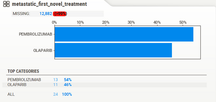
Although missing values are a common issue in most datasets, this one provided an intriguing prospect. Columns such as the one shown above were reported missing more than 99% of the data indicating that there might be a need to drop whole columns altogether. More on that later.
3. The unequal distribution of the target column

Yes! The data suggests that most of the patients (labeled “1”) did receive timely treatment. Good news right? Not necessarily. The ratio of distribution (62:38) suggests a class imbalance meaning that models created from this dataset might be highly prone to bias towards label ‘1’ which will be evident later on.
Act Two: Data Cleaning.
In this part, we clean the dataset by eliminating columns with significant parts of the data missing.
The cleaning part was mostly done at source which lessens the burden on us since according to Forbes, cleaning and managing data takes up to 60% of data scientists’ time further cementing the need for automation.
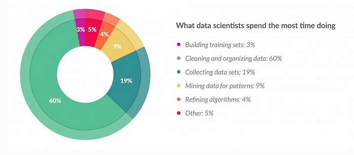
The code block below takes the sum of missing data values from a column and divides it by the total sum of rows present (12,906 expected rows) to find out the percentage of data that should be present. We set a threshold of 15% (0.15) of what is allowed to be missing while discarding the rest.
Act Three: Base Model Building
A base model is the first model you build in a data science project that acts as a benchmark for improvement. Linear Regression seeks to find a straight line between two variables, model the relationship between them and predict the value of one variable. Probabilities are used to place values in different categories, i.e., if the probability is more than 50%, then ‘1’ or else 0.
The reason for this choice was for it’s simplicity,interoperability and it’s widespread use as a baseline model.
Before we use the model, there is some minor preparation required. We achieved this using a pipeline. A model pipeline is an assembly line for creation of models. It’s similar to a packaging company. It receives your data, makes the necessary transformations i.e handling different data types, cleans it, splits it to train and test sets, and ships the prepared data to various customers (models) for them to use. Here’s the block of code doing just that:
We then run the model’s block:
Submissions for the competition would be reviewed under a classifier evaluation metric known as Area under the Receiver Operating Characteristic curve between the observed target and the predicted values. This metric produces a single number that summarizes how well a model distinguishes “positive” from “negative”. The higher the number, the better your classifier is at distinction.
Our result produced an initial score of 0.80, which was extremely promising, with a logistic accuracy score of 0.813. It’s pretty good for a base model.
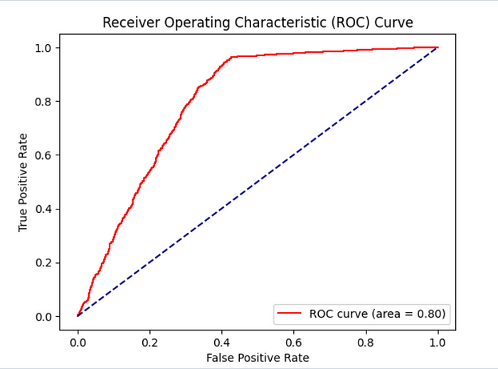
The YouTube Channel StatQuest provides simple and easy-to-understand explanations when it comes to heavy statistical jargon like the one mentioned.
Act Four: Model Evaluation and Improvement
Remember when I mentioned that there might be a chance the model produced might be biased? Let’s see if our assumption has a basis. We analyzed the distribution of the results and found out there might be some truth to this. The model’s prediction has a ratio of roughly 75:24 in favor of the class “1”. This could mean two things:
- The model is bias due to the imbalanced nature of the dataset
- The model is particularly good at picking out the class of patients ‘1’ who received timely treatment.
Further scrutiny is needed to determine which of the two carries more practical significance.
Let’s improve our solution by creating a second model instance and evaluating it through the same benchmarks. We’ll take a different route this time. We will use Principal Component Analysis before building another model to reduce the dimension of our dataset. PCA is a dimensionality reduction technique that can be summarized as follows:
Imagine you’re at a party with a ton of snacks (data). PCA is like picking a smaller plate with just a few key snacks that capture the overall flavor of the party (important features) without needing to carry the whole table (all the data). It keeps things simple while still representing the fun (information)!
This block’s output is a PCA Scree plot that provides a roadmap for choosing the right amount of “snacks” to discard. You look for an “elbow” which signals the point where adding more “snacks” has little to no benefit in “describing the overall flavor of the party”. From the diagram, that is near the 5th component.
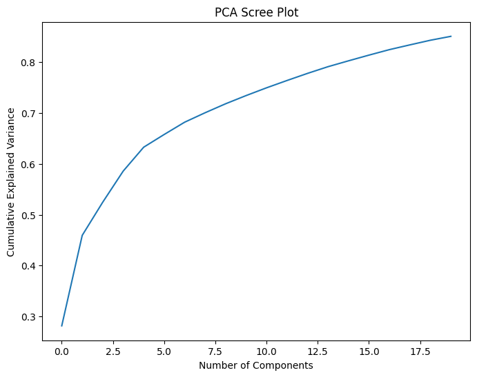
We remove the columns associated with those components which are ['age_20s', 'density', 'age_median', 'population'].
We fed the data into the pipeline and got this as our new result. There was an improvement when it came to accuracy but nothing to go scream to the hills for.
We decided that this would be our optimal solution and made our submission. Our solution scored 0.78, with the winner of the competition having a score of 0.80.
Act Five: Conclusion
In this short project, we have gone through the automation of EDA through the SweetViz library and the automation of machine learning tasks through pipelines and ROC — AUC. We hope that these are topics you’ll be able to build on and have fun with just as we did. Special thanks to WIDS for allowing us to participate in this amazing challenge.
Have a good one! Till next time.
Join thousands of data leaders on the AI newsletter. Join over 80,000 subscribers and keep up to date with the latest developments in AI. From research to projects and ideas. If you are building an AI startup, an AI-related product, or a service, we invite you to consider becoming a sponsor.
Published via Towards AI
Towards AI Academy
We Build Enterprise-Grade AI. We'll Teach You to Master It Too.
15 engineers. 100,000+ students. Towards AI Academy teaches what actually survives production.
Start free — no commitment:
→ 6-Day Agentic AI Engineering Email Guide — one practical lesson per day
→ Agents Architecture Cheatsheet — 3 years of architecture decisions in 6 pages
Our courses:
→ AI Engineering Certification — 90+ lessons from project selection to deployed product. The most comprehensive practical LLM course out there.
→ Agent Engineering Course — Hands on with production agent architectures, memory, routing, and eval frameworks — built from real enterprise engagements.
→ AI for Work — Understand, evaluate, and apply AI for complex work tasks.
Note: Article content contains the views of the contributing authors and not Towards AI.


