How to Tailor A Column Chart for Communication
Last Updated on January 25, 2024 by Editorial Team
Author(s): Angelica Lo Duca
Originally published on Towards AI.

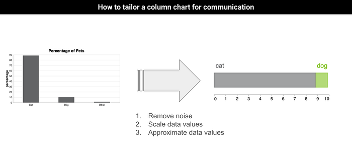
Drawing a column chart helps represent categories and values. However, a column chart is sometimes too overwhelming with useless content, and the audience may struggle to understand what it means. In this blog post, we propose a strategy to simplify a column chart when you have three main categories, such as:
- Yes/No/Maybe
- Male/Female/Other
- Good/Bad/Other
- …
The methodology involves the following steps:
- Analyze data
- Delete useless data
- Approximate the remaining data
- Draw the results
The proposed methodology produces a loss of information, so it is helpful only if you want to communicate something specific to an audience, for example, during a presentation in person or online. In the case of a technical and detailed report, it’s better to include all the available data to have a complete vision of the situation.
Once this essential aspect is clarified, let’s proceed with a practical example from my book Data Storytelling with Generative AI using Python and Altair. You can find more details about the book at the end of this article.
We’ll implement the examples in Altair, a Python library for data visualization.
Analyzing Data
Let’s start by analyzing the data. Remember that this approach works if we have data with two/three categories in the form Yes/No/Maybe, Male/Female/Other, Dog/Cats/Other and so on.
Consider, for example, the following dataset, also available here (the dataset is created from scratch by me):

Let’s plot a preliminary column chart in Altair showing all the categories:
import altair as alt
import pandas as pd

height=300
width=672
color='#636466'

df = pd.read_csv('source/pets.csv')

chart = alt.Chart(df).mark_bar(
 size=100,
 color=color
).encode(
 x=alt.X('pet',axis=alt.Axis(labelAngle=0, title='')),
 y=alt.Y('percentage')
).properties(
 width=width,
 height=height,
 title='Percentage of Pets'
).configure_axis(
 labelFontSize=15,
 titleFontSize=20,
 grid=False
).configure_title(
 fontSize=25
).configure_view(
 strokeWidth=0
)

chart.save('chart.html')
The code uses the mark_bar() mark property in Altair to draw a column chart and some configuration properties, such as the axis font size for labels and titles.
The following figure shows the resulting chart:

Let’s imagine we want to communicate only the difference between cats and dogs to an audience. As you can see from the figure, the Other category is irrelevant for communication purposes. The percentage value associated with the Other category is minimal (1.32%). Thus, we can remove it.
Warning: Please remember to do this removal only for communication purposes if you want your audience to focus on the difference between cats and dogs.
Deleting Useless Data
Let’s proceed with the Other category removal, as shown in the following snippet of code:
df.drop(index=[2],axis=0,inplace=True)
We have removed the third row from our dataset, corresponding to the Other category.
Approximating the Remaining Data
In Figure 1 or Table 1, we note that about nine pets out of 10 are cats, and the remaining one is a dog. Thus, to make the data more readable for our audience, we scale the percentage from 100 to 10, as shown in the following code:
df['percentage'] = df['percentage']/10
Now, we are ready to plot the simplified chart.
Draw the Results
Instead of plotting a column chart, we will plot a stacked bar chart with the two categories. The final chart comprises two main elements:
- A text describing the two categories
- The bar chart.
Let’s start to draw the text. The following code shows how to implement the text in Altair:
textFontSize=22

data = pd.DataFrame([{'text' : 'cat', 'x': 0.5},
 {'text' : 'dog', 'x': 9.4}
 ])

color2 = ['#636466','#80C11E']
scale = alt.Scale(range=color2)
text = alt.Chart(data).mark_text(
 fontSize=textFontSize,
).encode(
 text='text:N',
 x=alt.X('x:Q',
 scale=alt.Scale(domain=[0, 10]),
 axis=alt.Axis(tickMinStep = 1,grid=False, title=None, orient='bottom')
 ),
 y=alt.value(30),
 color=alt.Color('text:O', scale = alt.Scale(range=color2), legend=None)
)
We use mark_text() to draw a text in Altair. We defined a new data frame, called data, containing the texts to draw (cat and dog) and their position on the x-axis. This position is calculated empirically by doing some visual trials.
Now, we can draw the stacked bar chart, as shown in the following code:
chart = alt.Chart(df).mark_bar(size=50
 ).encode(
 x=alt.X('percentage:Q',
 scale=alt.Scale(domain=[0, 10]),
 axis=alt.Axis(tickMinStep = 1,grid=False, title=None, orient='bottom')
 ),
 y=alt.value(80),
 color=alt.Color('pet:O', legend=None,scale=scale),
 stroke=alt.Color('pet:O',scale=scale, legend=None),
 strokeWidth=alt.value(2),
 opacity=alt.value(0.6)
).properties(height=130)
Finally, we combine the two charts:
layer = alt.layer(
 text,
 chart
).resolve_scale(
 color='independent'
).configure_view(
 strokeOpacity=0
).properties()

layer.save('chart.html')
The following figure shows the resulting chart:

As you can see, the chart in Figure 2 is clearer than in Figure 1 for communication purposes. The audience can quickly understand the message.
Summary
Congratulations! You have just learned how to tailor a column chart in Altair to an audience to ease the communication process. The described methodology is the first step in helping to tailor a chart to an audience. There are other steps, including adding context and next steps. Stay tuned for more details about them 🙂
You can find the complete code of the example described in this post in the GitHub repository of my book, under CaseStudies/pets, available here.
Additional Resources
[BOOK] Data Storytelling with Generative AI: Using Python and Altair
[COURSE] Using Python Altair for Data Storytelling
You may also be interested in …
Using Slope Charts to Simplify Your Data Visualization
Simplify your overwhelmed charts by using slope charts: a tutorial in Python Altair
towardsdatascience.com
Three Charts to Represent a Percentage You May Not Know
A ready-to-run tutorial in Python Altair to build charts to represent a percentage
towardsdatascience.com
Using Vega-Lite for Data Visualization
A tutorial on how to start using Vega-Lite to draw charts.
pub.towardsai.net
Data Storytelling with Generative AI
An overview of my last book, published by Manning Publications
alod83.medium.com
One more word before leaving…
Thanks for your reading!
You can reach me on LinkedIn even to say hello 🙂
Join thousands of data leaders on the AI newsletter. Join over 80,000 subscribers and keep up to date with the latest developments in AI. From research to projects and ideas. If you are building an AI startup, an AI-related product, or a service, we invite you to consider becoming a sponsor.
Published via Towards AI
Towards AI Academy
We Build Enterprise-Grade AI. We'll Teach You to Master It Too.
15 engineers. 100,000+ students. Towards AI Academy teaches what actually survives production.
Start free — no commitment:
→ 6-Day Agentic AI Engineering Email Guide — one practical lesson per day
→ Agents Architecture Cheatsheet — 3 years of architecture decisions in 6 pages
Our courses:
→ AI Engineering Certification — 90+ lessons from project selection to deployed product. The most comprehensive practical LLM course out there.
→ Agent Engineering Course — Hands on with production agent architectures, memory, routing, and eval frameworks — built from real enterprise engagements.
→ AI for Work — Understand, evaluate, and apply AI for complex work tasks.
Note: Article content contains the views of the contributing authors and not Towards AI.


