Dynamic Maps and Plots With GPT-4 and Plotly Dash: A Story about UN Population Projections
Last Updated on December 30, 2023 by Editorial Team
Author(s): John Loewen, PhD
Originally published on Towards AI.
Time series choropleth map and violin plots with Python plotly
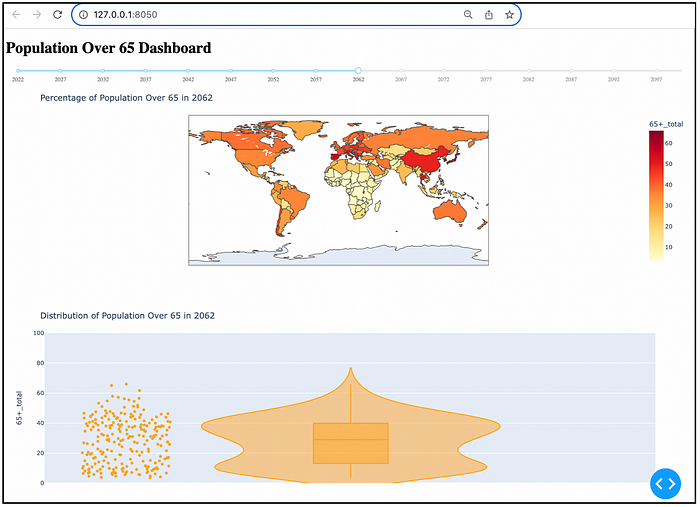
Plotly dashboard with a time-series choropleth map and violin plot
As a computer science professor, over the last 6 months, I have relentlessly put GPT-4 through the grinder to find its limits on Python data visualization code creation.
Recently, GPT-4’s ability to conjure up interactive Python Plotly dashboards has improved in leaps and bounds.
I have noticed steady improvement in its ability to conjure up accurate Python Plotly dashboard code of increasing complexity.
Your edge as a data scientist may be your ability to whip up quick and clean interactive maps and charts — an awesome duo.
So let’s do this — let’s use GPT-4 to conjure up a map and a chart — to tell us a story or two on global population projections — from a new report, the new UN population projections report (found HERE).
First, let’s look at how to add in a slider that allows for the animation of trends over time, starting with a global choropleth map.
And then let’s also add in an additional visualization — a violin chart — to give a 2nd (and 3rd) view to show how the global population is projected to age over the next 75 years.
To start off with, we can upload the UN… Read the full blog for free on Medium.
Join thousands of data leaders on the AI newsletter. Join over 80,000 subscribers and keep up to date with the latest developments in AI. From research to projects and ideas. If you are building an AI startup, an AI-related product, or a service, we invite you to consider becoming a sponsor.
Published via Towards AI
Towards AI Academy
We Build Enterprise-Grade AI. We'll Teach You to Master It Too.
15 engineers. 100,000+ students. Towards AI Academy teaches what actually survives production.
Start free — no commitment:
→ 6-Day Agentic AI Engineering Email Guide — one practical lesson per day
→ Agents Architecture Cheatsheet — 3 years of architecture decisions in 6 pages
Our courses:
→ AI Engineering Certification — 90+ lessons from project selection to deployed product. The most comprehensive practical LLM course out there.
→ Agent Engineering Course — Hands on with production agent architectures, memory, routing, and eval frameworks — built from real enterprise engagements.
→ AI for Work — Understand, evaluate, and apply AI for complex work tasks.
Note: Article content contains the views of the contributing authors and not Towards AI.


