
The Confusion Matrix for Classification
Last Updated on July 25, 2023 by Editorial Team
Author(s): Lawrence Alaso Krukrubo
Originally published on Towards AI.
Diving Into Confusion Matrix for Classification U+007C Towards AI
Understanding Accuracy, Recall, Precision, ROC, AUC and F1-score

The Confusion-matrix yields the most ideal suite of metrics for evaluating the performance of a classification algorithm such as Logistic-regression or Decision-trees. It’s typically used for binary classification problems but can be used for multi-label classification problems by simply binarizing the output.
Without rhetorics, The Confusion-matrix can certainly tell us the Accuracy, Recall, Precision, ROC, AUC, as well as the F1-score, of a classification model.
We shall look at these metrics closely in a few minutes…
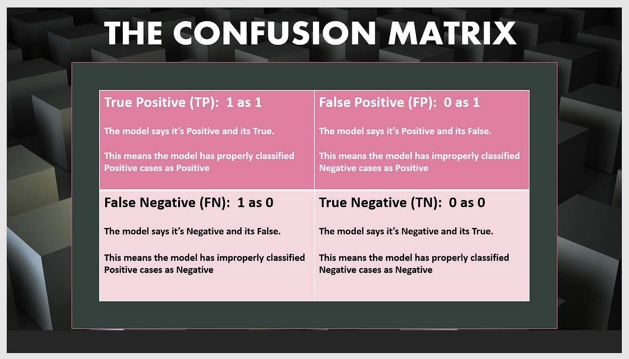
Let’s inspect the cells of The Confusion-Matrix:
Let’s assume we are building a Binary-Classification model to classify patients as either Diabetic (1) or Non-diabetic (0).
True Positive (1 classified as 1):
This is the cell that stores the number of positive cases properly classified as positive. In other words, the number of diabetic patients properly classified as diabetic.
False Positive (0 classified as 1):
This is the cell that stores the number of negative cases improperly classified as positive. Meaning, the number of non-diabetic patients improperly classified as diabetic.
True Negative (0 classified as 0):
This is the cell that stores the number of negative cases properly classified as negative. Thus, the number of non-diabetic patients properly classified as non-diabetic.
False Negative (1 classified as 0):
Finally, this is the cell that stores the number of positive cases improperly classified as negative… The number of diabetic patients improperly classified as non-diabetic.

Let’s play with some real-life data…
Let’s build a binary Decision-Tree classifier to actually classify patients into Diabetics (1) or Non-diabetics (0).
We shall use a dataset which was generated by a simulation of the data in The Pima Indians Diabetes dataset, published by the University of California, School of Information and Computer Science.
See link to the Patients raw CSV file and link to the Physicians dataset.
Let’s import needed modules
print(__doc__)import numpy as np
import matplotlib.pyplot as plt
import seaborn as sns
import pandas as pd
import itertools
# for plotting the ROC Curve
from sklearn.metrics import roc_curve, auc
Let’s import our data set from GitHub and read into a Pandas Data frame
data_link = 'https://raw.githubusercontent.com/Blackman9t/Machine_Learning/master/diabetes.csv'diabetes_df = pd.read_csv(data_link)diabetes_df.head()
Let’s check the shape and missing data count.

For a classification problem, we need to pay attention to the dataset. Let’s see the distribution of our feature matrix. This could help us choose the most ideal feature normalization method.
First, let’s define a method that plots the distribution of each feature.
see a link to the method here as it’s quite lengthy.
So let’s call the method on the diabetes_df data frame we defined above. This would create a Histplot of each independent variable.
plot_features(diabetes_df)>>

We can see that the distribution for variables:- Age, Pregnancies, SerumInsulin and DiabetesPedigree is similar. It’s asymmetrical and Unimodal. Having one dominant mode at the beginning made up of a lot of low values. Then a few mid to high values that tend to skew the shape to the right.
Other variables like PlasmaGlucose, DiastolicBP, TricepsThickness and BMI seem to have a roughly symmetrical and normal distribution. BMI is quite interesting with a bimodal distribution around 20 and 40 values, and a bell-shaped normal distribution from around the 25–55 range.
One thing is clear, the bulk of the distribution of values in this dataset is within the lower limits.
Let’s try to normalise the distribution of the variables that are asymmetrical. We shall use a simple feature-engineering technique by just converting these values to their log values.
The essence is to make our model generalise properly without bias to any particular set of skewed values.
for i in diabetes_df.columns:
 if i in ['Age', 'DiabetesPedigree', 'BMI', 'SerumInsulin']:
 print(i)
 diabetes_df[i] = diabetes_df[i].apply(np.log)
>>SerumInsulin
BMI
DiabetesPedigree
Age
Let’s see the shape of the distribution again.

Remember there are two datasets, one for the patients' data and the other for the doctors. Let’s look at the doctors' dataset, checking its shape and if missing values exist.
doctors_link = 'https://raw.githubusercontent.com/Blackman9t/Machine_Learning/master/doctors.csv'doctors_df = pd.read_csv(doctors_link, encoding='latin-1')
# Note the above code line throws a UnicodeDecodeError except we encode the string in latin-1 as shown above.doctors_df.head()

Next, we need to join the two datasets so that we can see which Doctor treated which patients. Since both datasets have the same PatientID column, we shall join them on this column, using the left-outer join (or left-join) on the Patients dataset with the doctors' dataset on the right.
This will ensure that all patients records are intact, even though some doctors record may be missing. Since we have 15000 patients record and 14895 doctors record.
# let's merge both datasets into a new dataframe and check the shape and if missing values exist.
diabetes_doctor_df = pd.merge(diabetes_df, doctors_df, how='left', on='PatientID' )diabetes_doctor_df.head()
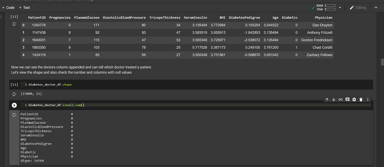
But wait… Hold on a second, we had 14895 entries in one dataset, merged with another dataset that had 15000 entries and yet pandas tells us there are no missing values??

Having a healthy curiosity is one extremely important skill that data science courses cannot teach you. We need to develop that skill conscientiously and deliberately every day.
Let’s look at the number of unique physicians in the dataset.
diabetes_doctor_df.Physician.nunique()
>>
109
This tells us there are only 109 unique doctors.
let’s look at the number of unique Patients in the dataset.
diabetes_doctor_df.PatientID.nunique()
>>
 14895
It now makes sense,
There are 14895 unique patients and the doctors' records have entries for exactly 14895 patients.
The fact that the patients' data set has 15000 entries is simply because some patients have multiple entries.
Since we merged the doctors and patients on the PatientID column, the merger rightly assigned each doctor to the patients they treated, even though we have only 109 unique doctors.

That explains it.
Preparing the Dataset for Machine Learning:
As is often the case with machine learning, some data preparation is required before we can use the data to train a model.
We shall normalize the features so that features that have large values do not dominate the training.
A few data-normalisation methods exist like Simple-feature-scaling, Min-max-method and Z-score or Standard-score.
Looking at the shapes of the distribution of each feature, those with a roughly normal distribution bell-shape will be normalized using the Zscore method.
While those with varying large and low values will be normalized using the Min-Max method. See link to Microsoft Azure ML on this.
1. Z-Score or Standard Score:
For each value here, we subtract the average or mean…
And then divide by the Standard deviation.
This gives a range between -3 and 3, but can be more or lessXnew= Xold−mean / STD(sigma)
2. Min-Max Method:
This method takes each value and subtracts the min and then divides by the range(max-min)…
The resultant values range between zero(0) and one(1)Xnew= Xold−Xmin / Xmax−Xmin
So let’s apply these methods to the selected columns.
# First select the features only and iterate through each one
for i in diabetes_doctor_df.columns[:-2]:
 mean = diabetes_doctor_df[i].mean()
 std = diabetes_doctor_df[i].std()
 mini = diabetes_doctor_df[i].min()
 maxi = diabetes_doctor_df[i].max()

 # if columns are not Age or Pregnancies, apply the Z_score norm method
 if i not in ['Age', 'Pregnancies']:
 diabetes_doctor_df[i] = diabetes_doctor_df[i].apply(lambda x: (x - mean) / std)

 # Else if columns are either Age or Pregnancies, then apply the Min-Max norm method
 else:
 diabetes_doctor_df[i] = diabetes_doctor_df[i].apply(lambda x: (x - mini) / (maxi - mini))
Let’s view the dataset
diabetes_doctor_df.head()

Now that we’ve prepared the data set, we’d use it to train and evaluate a classifier machine learning model. We’d split the data into a training set and a testing set with which to validate predictions generated by the trained model.

What’s the Class-distribution of the dataset?
Simply put… Of the 15,000 observations, how many fall into each category?
diabetes_doctor_df.Diabetic.value_counts()>>
0 10000
1 5000# Class 0 or Non-Diabetics has 10,000 observations
# Class 1 or Diabetics has 5,000 observations
This is a problem because our model will be trained with a data set that has twice the amount of one class of observations than the other. This means our model will learn the features of class 0 or Non-diabetics far better than it would learn how to classify Diabetics. That’s not good.
# Let's visualize the current class-distributionplt.figure(figsize=(8, 8))x = diabetes_doctor_df.Diabetic.replace(to_replace=[0, 1], value=['Non-Diabetics','Diabetics'])
sns.countplot(x)
plt.title('Count of Diabetics and Non-Diabetics')
plt.show()

Balancing The Dataset:
As said earlier, an imbalanced dataset makes the classifier to have a high recognition rate (sensitivity) for the dominant class. The F1 score of the model could be unreliable in an imbalanced Data set. link
Let’s go ahead and balance the dataset using SMOTE (Synthetic Minority Over-sampling Technique). Note other techniques are available, for dealing with imbalanced data. See this rich article for more.
SMOTE would balance the dataset by synthetically creating more observations of the minority class to equate the dominant class. In this case, additional 5,000 observations will be created and added to the Diabetics class, giving us 10,000 observations per class and 20,000 total.
from imblearn.over_sampling import SMOTE
sm = SMOTE(sampling_strategy='minority', random_state=19, k_neighbors=5)# Let's pass the features and label to the SMOTE object.over_sampled_features, over_sampled_label = sm.fit_resample(feature_matrix, label)# Let's print out the shape of the over_sampled objectprint('Shape of resampled feature set is:',over_sampled_features.shape)
print('Shape of resampled target data is:',over_sampled_label.shape)>>
Shape of resampled feature set is: (20000, 8)
Shape of resampled target data is: (20000,)# we now have 20,000 observations divided equally between classes Diabetics and Non-Diabetics
We can visualize the new class-distribution.

Okay, let’s import the needed libraries to split the dataset.
# we shall import train_test_split module to split the dataset
from sklearn.model_selection import train_test_split
We can now go on to split the dataset into training and testing sets with a ratio of 70% for training and 30% for testing. By setting the parameter test_size=0.3. See code below
X_train, X_test, y_train, y_test = train_test_split(over_sampled_df.iloc[:,:-1], over_sampled_df.Diabetic, test_size=0.3, random_state=1234)# let's print out the shapes of the training and testing datasets
print('X_train shape is',X_train.shape)
print('X_test shape is',X_test.shape)
print('y_train shape is',y_train.shape)
print('y_test shape is',y_test.shape)>> This prints out
X_train shape is (14000, 8)
X_test shape is (6000, 8)
y_train shape is (14000,)
y_test shape is (6000,)
So we have 14,000 training observations and 6,000 testing observations.
Defining the Confusion-matrix metrics:
As earlier mentioned, The Confusion-matrix yields the most ideal metrics for evaluating a classifier model. It shows the number of True-Positives (TP) and True-Negatives (TN), these are the Cases correctly classified and False-Positives (FP) and False-Negatives (FN), these are the cases incorrectly classified.

In binary classification, precision (also called positive predictive value) is the fraction of relevant instances among the retrieved instances…
while recall (also known as sensitivity) is the fraction of relevant instances that have been retrieved over the total amount of relevant instances.
Both precision and recall are therefore based on an understanding and measure of relevance. See link
1. Accuracy:
Accuracy is simply the fraction of cases correctly classified. For example, if our model correctly classifies 7,000 out of 10,000 Diabetics and 8,000 out of 10,000 Non-diabetics, this means That:-
TP=7,000, FN=3,000, TN=8,000, FP=2,000.
This means our model has an accuracy of 75%.
Accuracy = (TP + TN) / (TP + TN + FP + FN)
Accuracy = (7000 + 8000) / (7000 + 8000 + 2000 + 3000) = 0.75
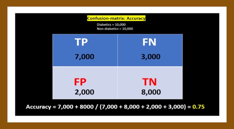
Accuracy alone is not a reliable measure for a classification model. And the reason is simple:- Using our imbalanced data set for example, imagine the model classifies all 10,000 Non-diabetic cases correctly (100%) and classifies only 2,000 of 5,000 Diabetic cases correctly (40%). The model would be:-
(10, 000 + 2,000) / 15,000 = 80% accurate.
Yet such a model would be near-useless in classifying Diabetic patients as 60% of cases will be misclassified.
2. Recall or Sensitivity or True Positive Rate:
The recall is simply the fraction of positive cases correctly classified from the total number of real positive cases in the dataset. For example, if there are 10,000 real or true positive Diabetic cases and our model correctly classifies 7,000 as Diabetics (TP), that means 3000 is wrongly classified as Non-diabetics (FN). If our model also correctly classifies 8,000 out of 10,000 Non-diabetics (TN), this means 2000 Non-diabetics are wrongly classified (FP).
Therefore TP=7,000, FN=3,000, TN=8,000, FP=2,000.
This means our model has a recall of 70%.
Recall = TP / (TP + FN)
Recall = 7000 / (7000 + 3000) = 0.7

3. Precision or Positive-Predicted-Value:
Precision is simply the fraction of positive cases correctly classified from the total number of cases that the model identified as positive. For example, if there are 10,000 real or true positive Diabetic cases and our model correctly classifies 7,000 as Diabetics (TP), that means 3,000 is wrongly classified (FN). If our model also correctly classifies 8,000 out of 10,000 Non-diabetics (TN), this means 2000 Non-diabetics are wrongly classified (FP).
Therefore TP=7,000, FN=3,000, TN=8,000, FP=2,000.
This means our model has a precision of 78%.
Precision = TP / (TP + FP)
Precision = 7000 / (7000 + 2000) = 0.78
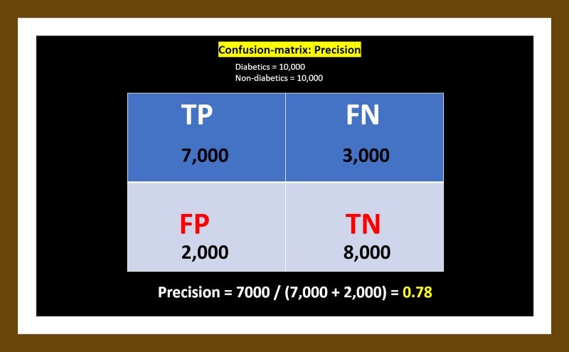
In a classification task, a perfect precision score of 1.0 for class Diabetics means that every item labelled as belonging to class Diabetics does indeed belong to class Diabetics. Whereas a recall of 1.0 means that every item from class Diabetics was labelled as belonging to class Diabetics.
The Trade-off between Precision and Recall:
Let’s replace Diabetes with Brain-cancer for a moment…
Often, there is an inverse relationship between precision and recall, where it is possible to increase one at the cost of reducing the other.
Consider a brain surgeon tasked with removing a cancerous tumour from a patient’s brain. The surgeon needs to remove all of the tumour cells since any remaining cancer cells will regenerate the tumour.
Conversely, the surgeon must not remove healthy brain cells since that would leave the patient with impaired brain function. The surgeon may be more liberal in the area of the brain he removes to ensure he has extracted all the cancer cells. This decision increases recall but reduce precision.
On the other hand, the surgeon may be more conservative in the brain he removes to ensure he extracts only cancer cells. This decision increases precision but reduces recall.

That is to say, greater recall increases the chances of removing healthy cells (negative outcome) and increases the chances of removing all cancer cells (positive outcome).
Greater precision decreases the chances of removing healthy cells (positive outcome) but also decreases the chances of removing all cancer cells (negative outcome).
4. F1-Score or Harmonic-Average:
Usually, precision and recall scores are combined into a single metric that tells us immediately, how well our model is performing. The F1-Score (The weighted harmonic mean of precision and recall), is one such metric.
A perfect F1-score is 1.0 or 100%. The closer it is to 1.0, the better the model.
From the above examples, we arrived at a Precision of 0.78 and a Recall of 0.7

Therefore: F1 = 2 * (0.78 * 0.7) / (0.78 + 0.7) = 0.74
Back to our Classification Task…
With the above metrics hopefully well explained, let’s continue on our Task to classify 15,000 observations of clinical patients as either Diabetic (1) or Non-diabetic (0). We had just done a SMOTE data-balancing activity that created 5,000 additional observations, giving us a total of 20,000 observations, split evenly into both classes.
Then we split the data into 14,000 training set and 6,000 testing set.

Let’s build the Decision Tree Classifier and import modules for calculating the F1-score, Confusion-matrix and Log_loss
from sklearn.tree import DecisionTreeClassifier
from sklearn import metrics
from sklearn.metrics import f1_score
from sklearn.metrics import confusion_matrix
from sklearn.metrics import log_loss
We would define three methods:-
- For plotting the confusion matrix, and pass it some parameters
- For plotting the ROC chart
- For creating the best Decision-Tree classifier or model with a max-depth ranging from 1 to 100.
1. plot_confusion_matrix(cm, classes,
 normalize=False,
 title='Confusion matrix',
 cmap=plt.cm.Blues):2. plot_roc_chart(model)3. best_decision_tree_classifier(X_train, X_test, y_train, y_test)
I will not copy and paste these methods here in full, to avoid verbosity. But you can follow along with the notebook on Github.
The Confusion Matrix Analysis:
- Evaluating the Imbalanced dataset:
If we had not balanced the dataset (10,000 class-0 and 5,000 class-1)and used it to train the model with the exact parameters of the above three methods, see the outcome below:
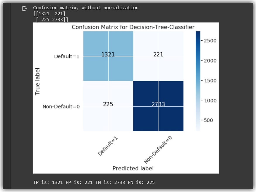

2. Evaluating the Balanced dataset:
Let’s also view the Confusion-matrix of the balanced dataset, using the exact same methods defined above that we used with the imbalanced dataset.


We can clearly see that by simply balancing our dataset, the model is able to perform significantly better in classifying patients. All metrics are improved from Recall, Precision, F1-score and AUC-score. See the table below:-

The model does a good job with The balanced dataset. Scoring a minimum of 92% in all key metrics. This can be really significant in a real-world scenario that involves the actual classification of patients.
Bear in mind that the model does not return only 0 or 1, but it actually returns a number between 0 and 1 that shows the probability score for each patient.
# getting the probability of the predicted observations.probs = model.predict_proba(X_test)
This means a patient classified as Non-diabetic (0), may have a probability score close to the Diabetic threshold. Therefore medical practitioners would be better informed to counsel and manage such patients, using a good classifier model.
Finally, Let’s look at The ROC Curve and AUC-Score:
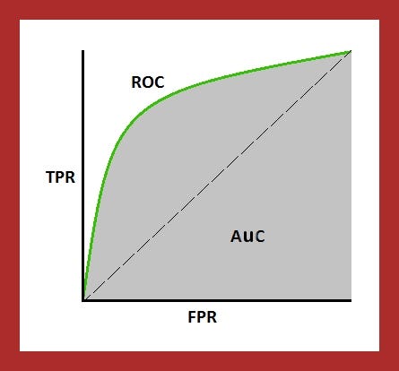
Simply put, the receiver operating characteristic curve or ROC Curve shows the trade-off between the True-positive-rate (positive cases correctly classified)and the False-positive-rate (positive cases incorrectly classified)
Let’s define some metrics to consider while plotting the ROC curve.
- True-positive-rate: AKA Recall, AKA Sensitivity. This is simply the Recall we defined earlier. It tells us the fraction of positive cases correctly identified as such (TP), from the total number of positive cases in the dataset.

2. True-negative-rate: Aka Specificity, AKA Selectivity. This simply measures the fraction of negative cases correctly identified as such (TN), from the total number of negative cases in the dataset

3. False-positive-rate: This is simply the fraction of the number of negative cases incorrectly classified as positive(FP), from the total amount of actual negative cases in the dataset.

So the fact is, if we plotted a chart with all the corresponding values of the True-positive-rate on the Y-axis and those of the False-positive-rate on the X-axis, the outcome would be the ROC curve.

The area under the ROC curve or AUC is the measure of the trade-off between the True and False positive rates.
A perfect classifier would have an AUC of 1.0, indicating no trade-off between True and False positive rates. Thus the higher the ROC curve is to the top-left position (1, 1) the better the AUC score. see link
Let’s see the ROC curves of both the imbalanced dataset and the balanced dataset.

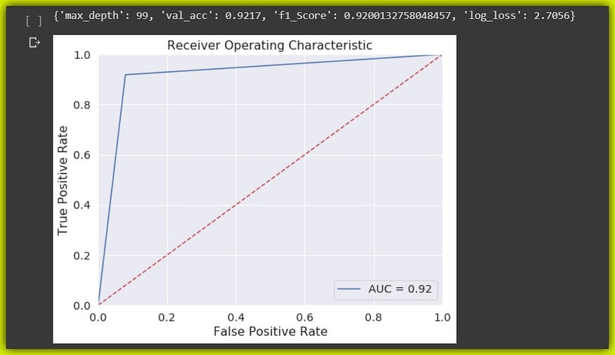
Summary:
This has been a pretty insightful session, thanks for patiently reading thus far. We learnt how to inspect the dataset for a classification task using a Histplot. We also interpreted the Histplot and the distribution of the data in order to select the ideal feature normalization technique based on each feature-distribution.
Then we inspected the class distribution and balanced the dataset using SMOTE technique. We went on to prepare the dataset for machine learning and we dug deep into the cells and various metrics of the Confusion-matrix.
Finally, we made classifications and compared the performance of the model on the imbalanced dataset with the balanced set. Then we learnt about The ROC Curve and the AUC score.
The raw datasets (patients and physicians) and the notebook are on Github.
If you need a refresher on statistics, do check out this free awesome course from Stanford University
Cheers!
About Me:
Lawrence is a Data Specialist at Tech Layer, passionate about fair and explainable AI and Data Science. I hold both the Data Science Professional and Advanced Data Science Professional certifications from IBM. I have conducted several projects using ML and DL libraries, I love to code up my functions as much as possible even when existing libraries abound. Finally, I never stop learning and experimenting and yes, I hold several Data Science and AI certifications and I have written several highly recommended articles.
Feel free to find me on:-
Join thousands of data leaders on the AI newsletter. Join over 80,000 subscribers and keep up to date with the latest developments in AI. From research to projects and ideas. If you are building an AI startup, an AI-related product, or a service, we invite you to consider becoming a sponsor.
Published via Towards AI
Towards AI Academy
We Build Enterprise-Grade AI. We'll Teach You to Master It Too.
15 engineers. 100,000+ students. Towards AI Academy teaches what actually survives production.
Start free — no commitment:
→ 6-Day Agentic AI Engineering Email Guide — one practical lesson per day
→ Agents Architecture Cheatsheet — 3 years of architecture decisions in 6 pages
Our courses:
→ AI Engineering Certification — 90+ lessons from project selection to deployed product. The most comprehensive practical LLM course out there.
→ Agent Engineering Course — Hands on with production agent architectures, memory, routing, and eval frameworks — built from real enterprise engagements.
→ AI for Work — Understand, evaluate, and apply AI for complex work tasks.
Note: Article content contains the views of the contributing authors and not Towards AI.


