


Good Old Iris
Last Updated on January 7, 2023 by Editorial Team
Author(s): Dr. Marc Jacobs
Originally published on Towards AI the World’s Leading AI and Technology News and Media Company. If you are building an AI-related product or service, we invite you to consider becoming an AI sponsor. At Towards AI, we help scale AI and technology startups. Let us help you unleash your technology to the masses.
Bayesian modeling of Fisher’s dataset
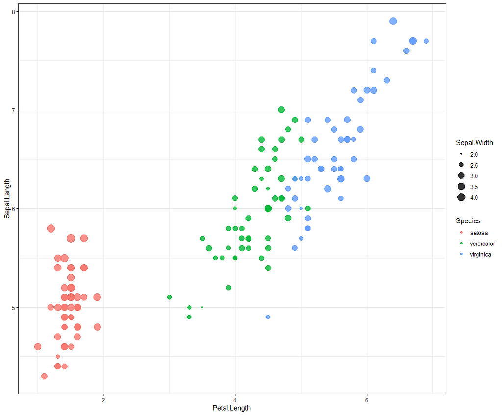
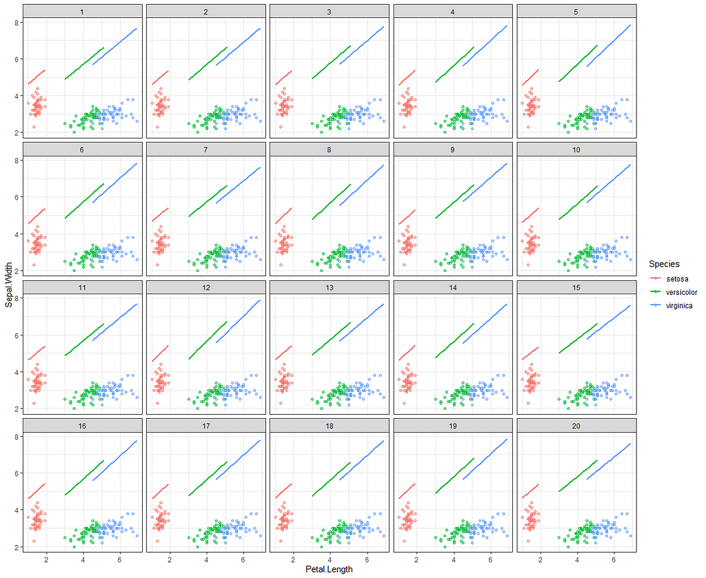
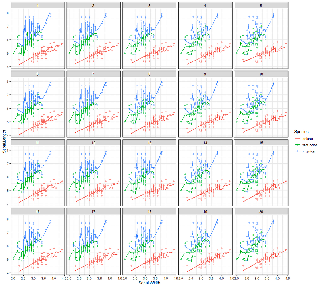
The iris dataset must be the most used dataset ever. At least, to me, it is the dataset I see coming about whenever there is a new sort of technique that can be used, or somebody wants to show what they did in terms of modeling. So, I thought, let's continue the tradition and also use Iris for Bayesian modeling. If just for the fun of applying Bayes to a dataset constructed by Sir Ronald Fisher — Mr. Frequentist himself.
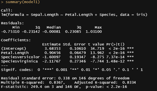
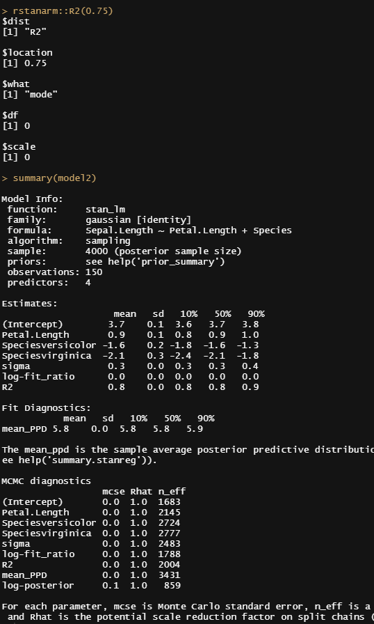
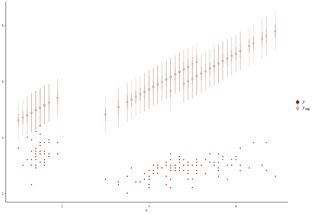
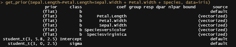
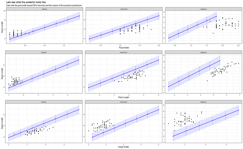
Now it's time to go Bayesian and I will start using the rstanarm package in which I indicate a prior R-squared of 0.75. It's an example I found somewhere else and I do not know why somebody would ever label such a prior, considering the R-squared value by itself is completely meaningless. You can have the same R-squared values for a range of relationships ranging from pretty decent to outright bad. Anyhow, let's see what happens and then move on to something better.
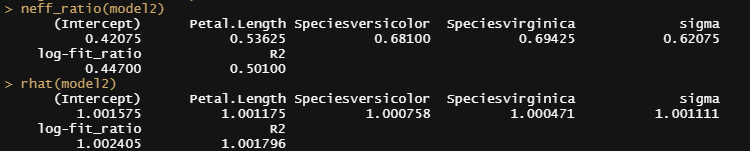
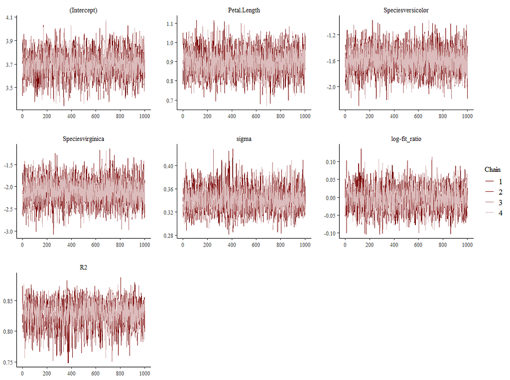
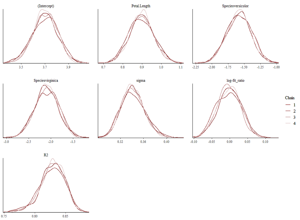
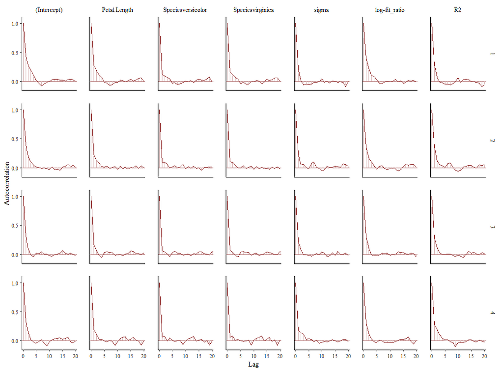
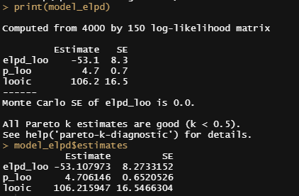
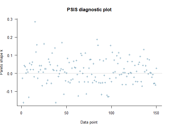
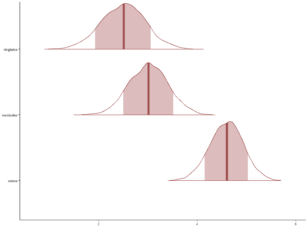
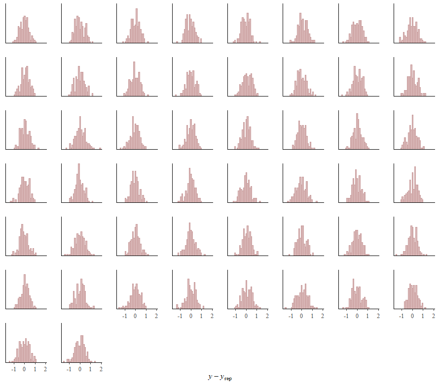
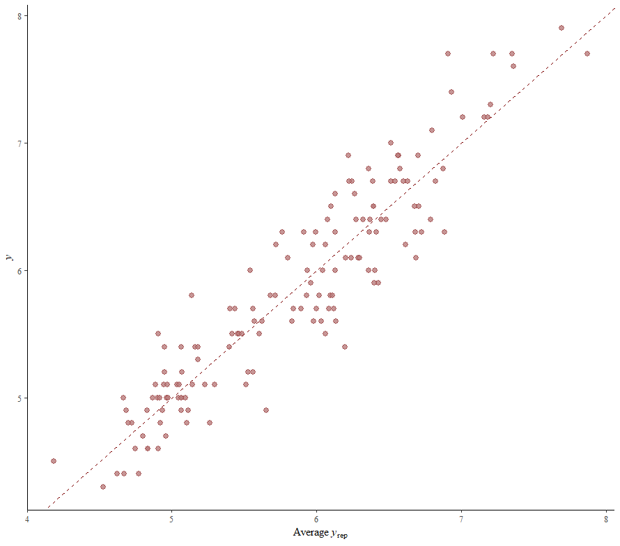
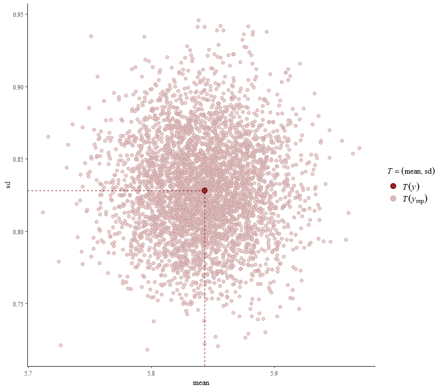
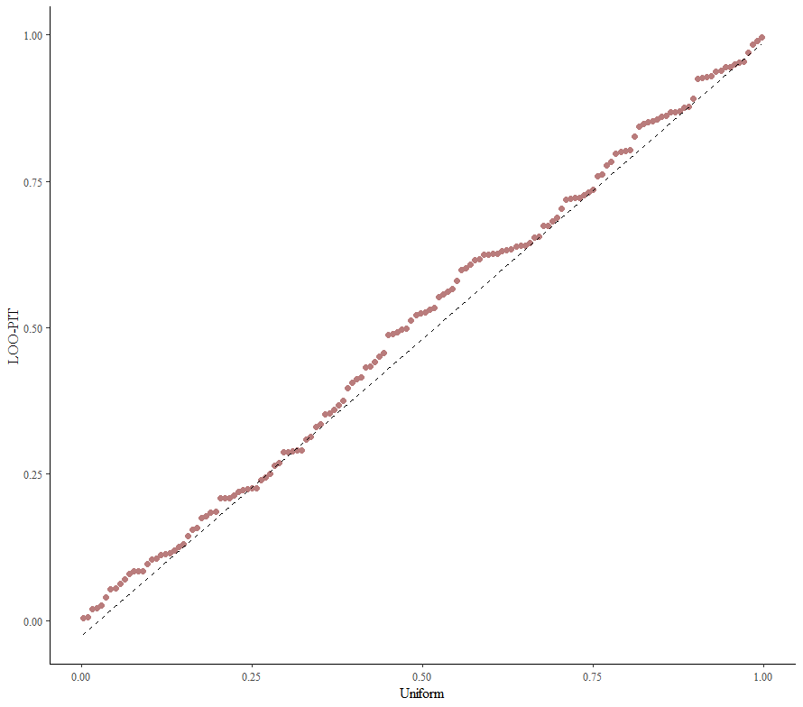
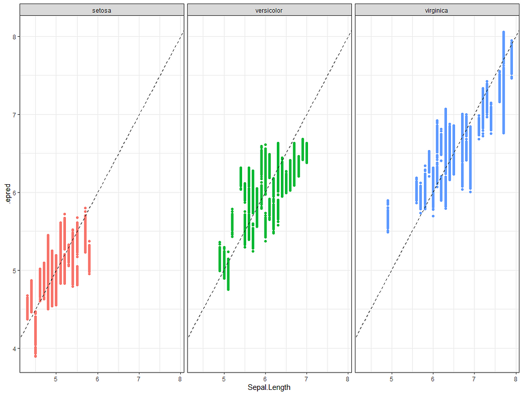
Alright, so, just like the Maximum Likelihood models we see so often, we can also assess Bayesian models. But, the metrics are no longer called AIC or BIC (although BIC does stand for Bayesian Information Criterion), but the Pareto-k-diagnostic and the entwined expected log predictive density (elpd) which is obtained via leave-one-out (loo) cross-validation. Just like the AIC or BIC, the values mean little, and only when comparing (nested) models does it make sense to look at them.
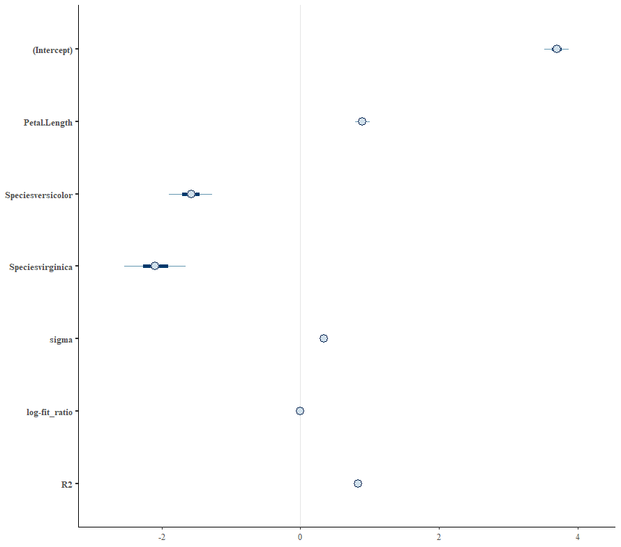
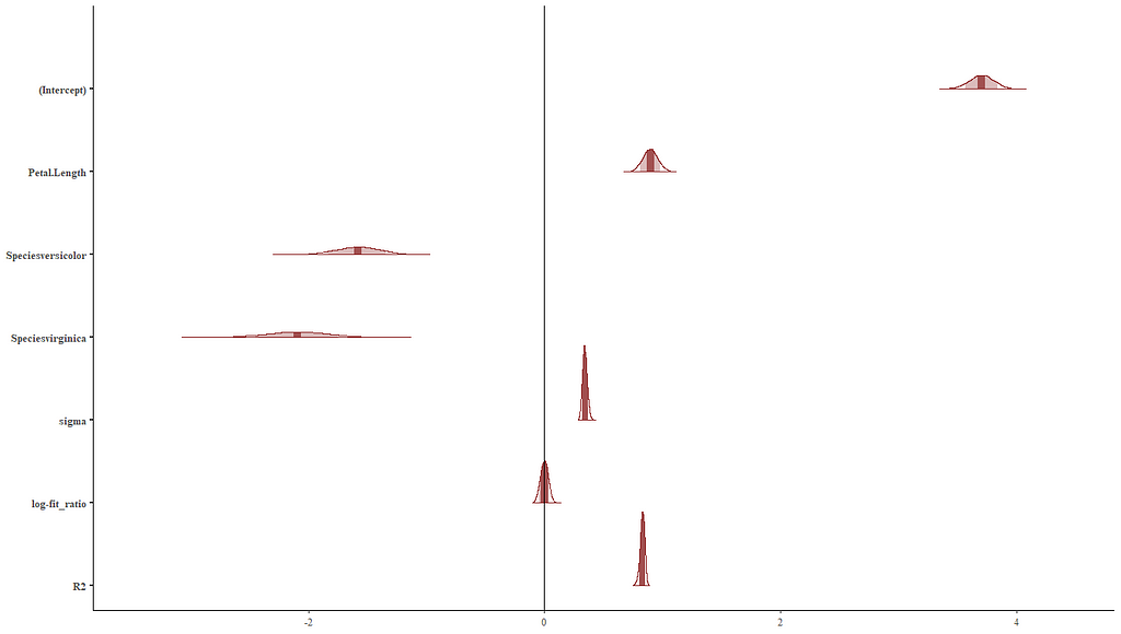
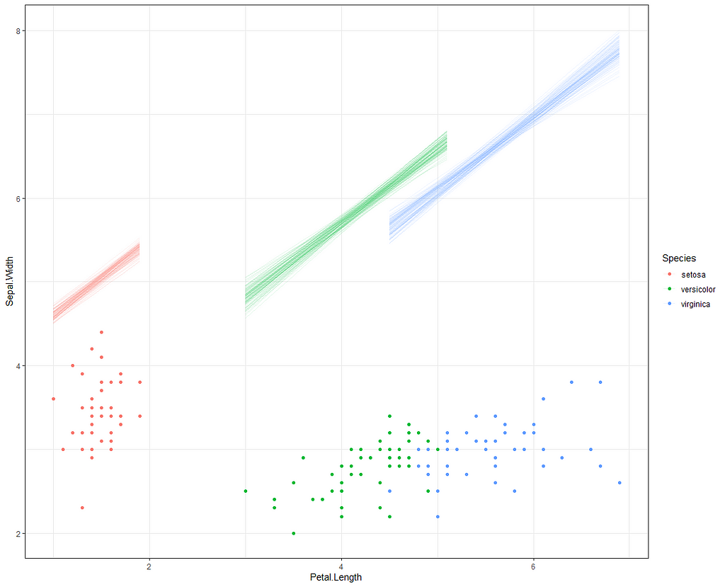
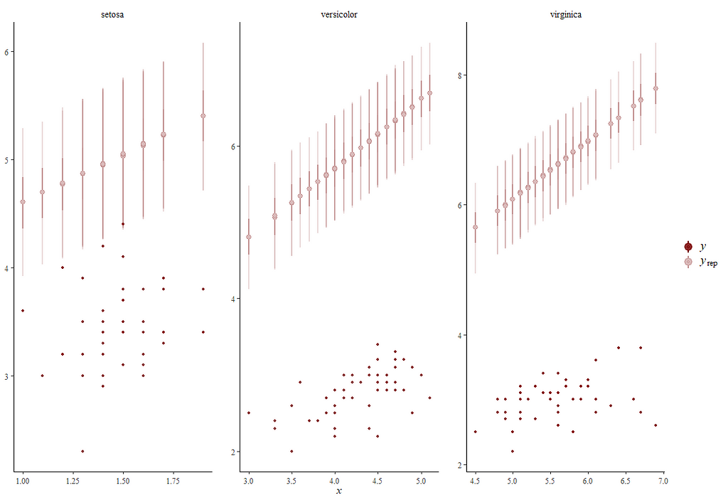
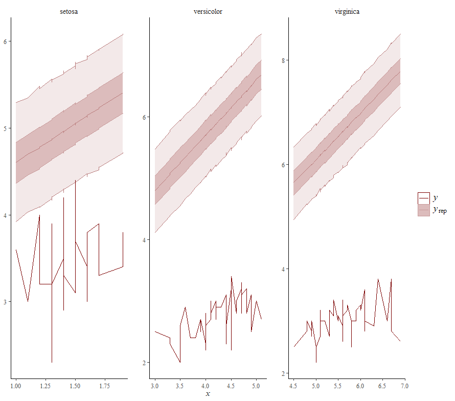
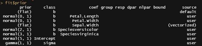
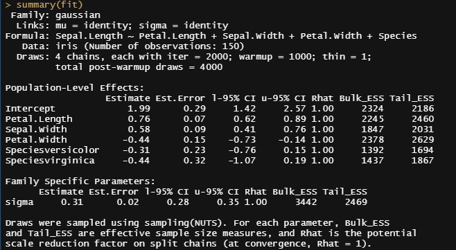
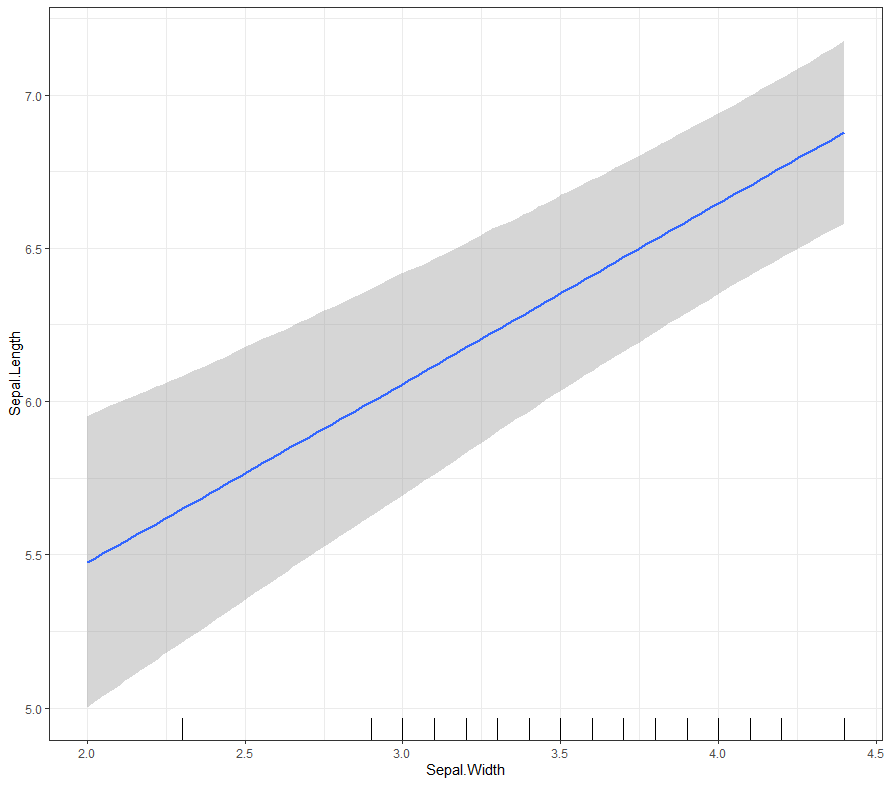
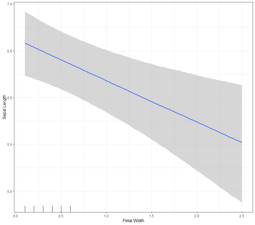
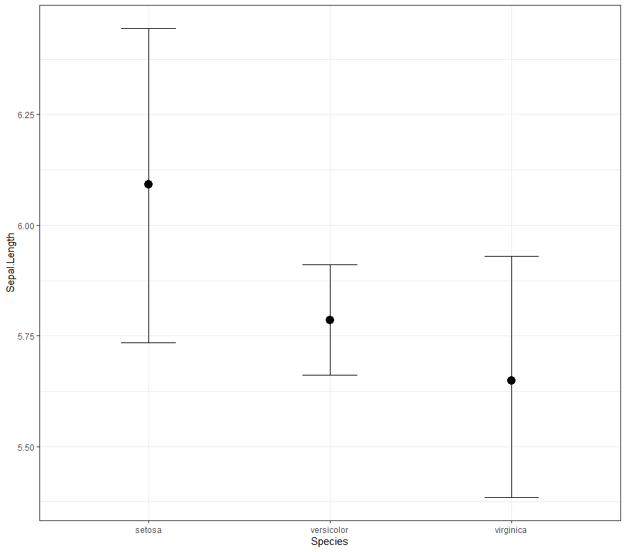
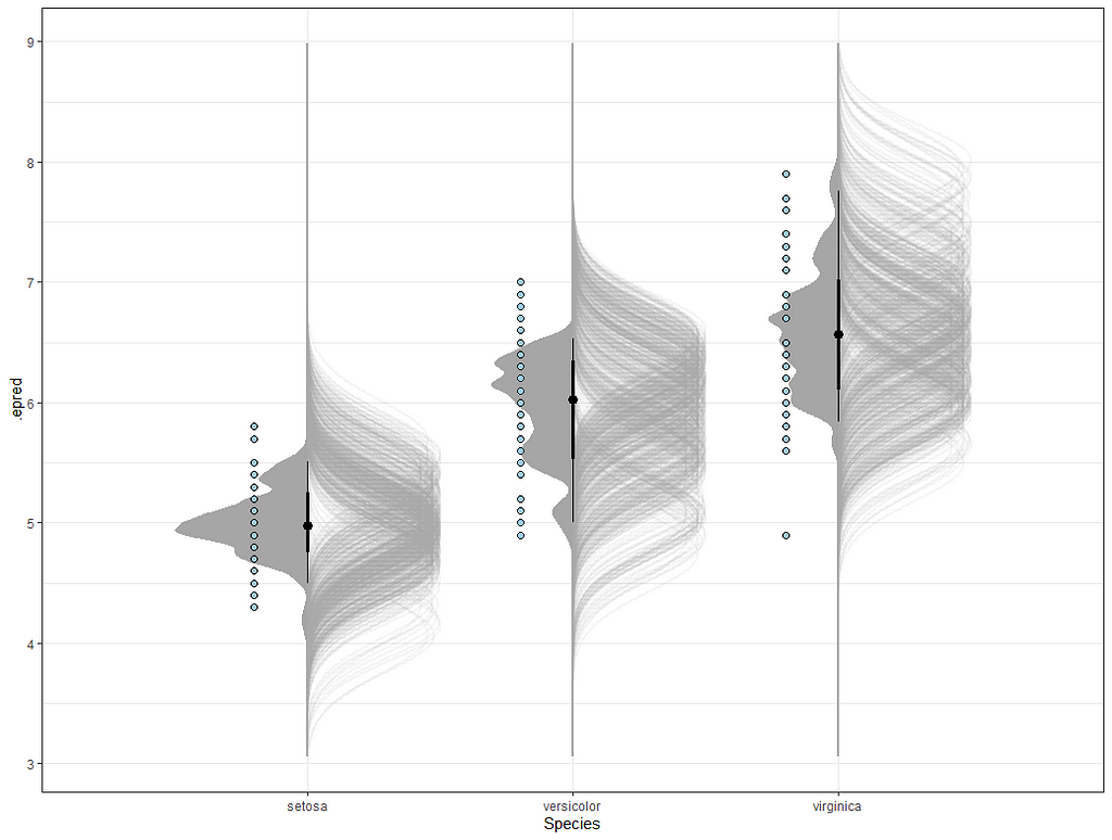
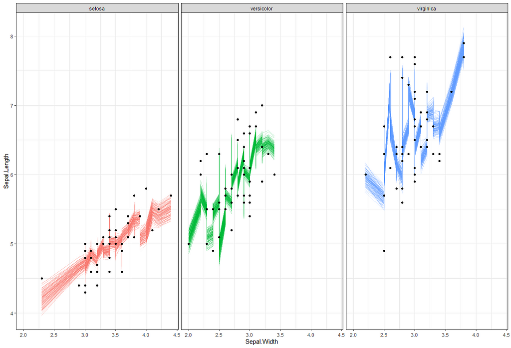
Now it's time we get serious and through in some priors. No, the informative stuff, but real priors that have an effect and that say: “I know my evidence”. Here, I mathematically say to the model that my prior belief is that there is no link between sepal.length and petal.length or petal.width. For sepal.width I have no idea (which is nonsense, but still), and I believe there are different effects for versicolor and virginica compared to setosa.
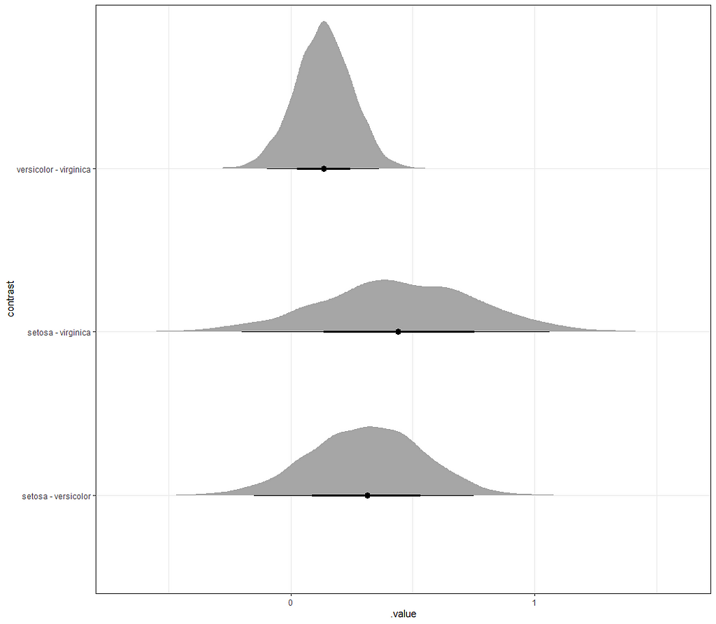
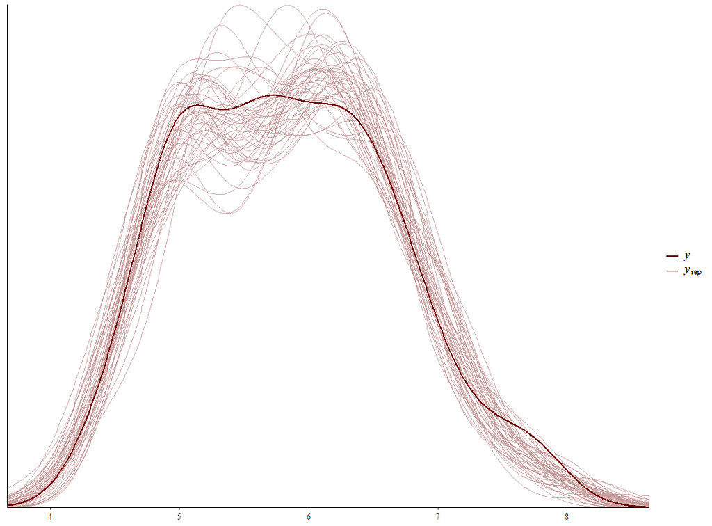
So, this is a way to use Bayesian analysis on the famous Iris dataset. The codes are at the bottom. If you are interested, just copy and paste and run them all. There is more code in the bottom than I highlighted above, and I invite you to make your own.
Let me know if something is amiss!
Good Old Iris was originally published in Towards AI on Medium, where people are continuing the conversation by highlighting and responding to this story.
Join thousands of data leaders on the AI newsletter. It’s free, we don’t spam, and we never share your email address. Keep up to date with the latest work in AI. From research to projects and ideas. If you are building an AI startup, an AI-related product, or a service, we invite you to consider becoming a sponsor.
Published via Towards AI
Towards AI Academy
We Build Enterprise-Grade AI. We'll Teach You to Master It Too.
15 engineers. 100,000+ students. Towards AI Academy teaches what actually survives production.
Start free — no commitment:
→ 6-Day Agentic AI Engineering Email Guide — one practical lesson per day
→ Agents Architecture Cheatsheet — 3 years of architecture decisions in 6 pages
Our courses:
→ AI Engineering Certification — 90+ lessons from project selection to deployed product. The most comprehensive practical LLM course out there.
→ Agent Engineering Course — Hands on with production agent architectures, memory, routing, and eval frameworks — built from real enterprise engagements.
→ AI for Work — Understand, evaluate, and apply AI for complex work tasks.
Note: Article content contains the views of the contributing authors and not Towards AI.
Related posts
Recent Posts


")

