


Analysis of BW in piglets
Last Updated on January 7, 2023 by Editorial Team
Author(s): Dr. Marc Jacobs
Originally published on Towards AI the World’s Leading AI and Technology News and Media Company. If you are building an AI-related product or service, we invite you to consider becoming an AI sponsor. At Towards AI, we help scale AI and technology startups. Let us help you unleash your technology to the masses.
Data Analysis
Using Mixed Models & Splines in R
In this Mixed Model example, I will use a somewhat more advanced dataset containing the bodyweight growth of piglets across different levels. The dataset was not that straightforward to analyze and I am sure that the model I show in the end can be greatly improved. Luckily, getting the best model is not the true aim of this post.
What I do want to achieve, besides just showing a Mixed Model with splines in R, is highlighting some additional functionality, such as:
- Plotting and tabulating of Mixed Model output
- Pairwise comparison of factors
- Profiled and Bootstrapped Confidence intervals of Fixed and Random effects
- A Shiny way of exploring your Mixed Model.
I believe the code, pictures, and added comments will show the way.
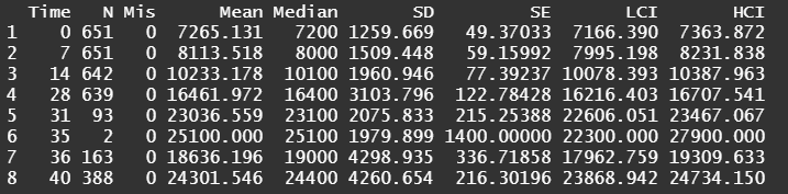
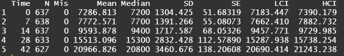
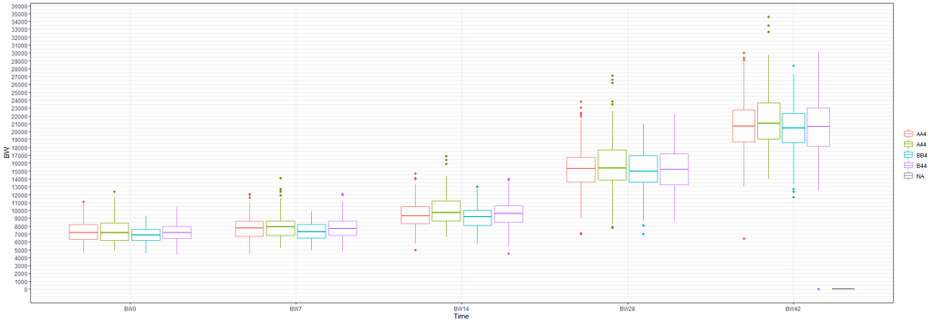
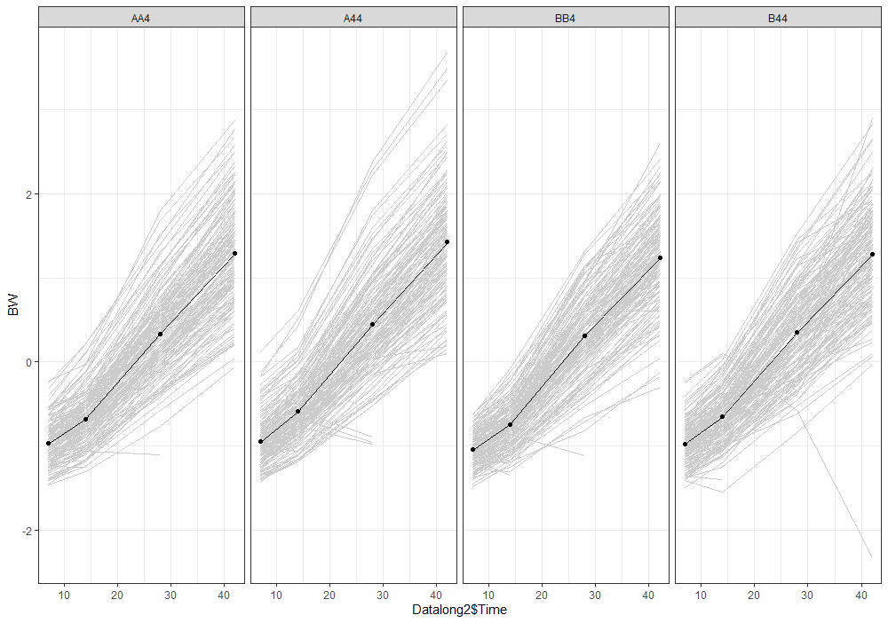
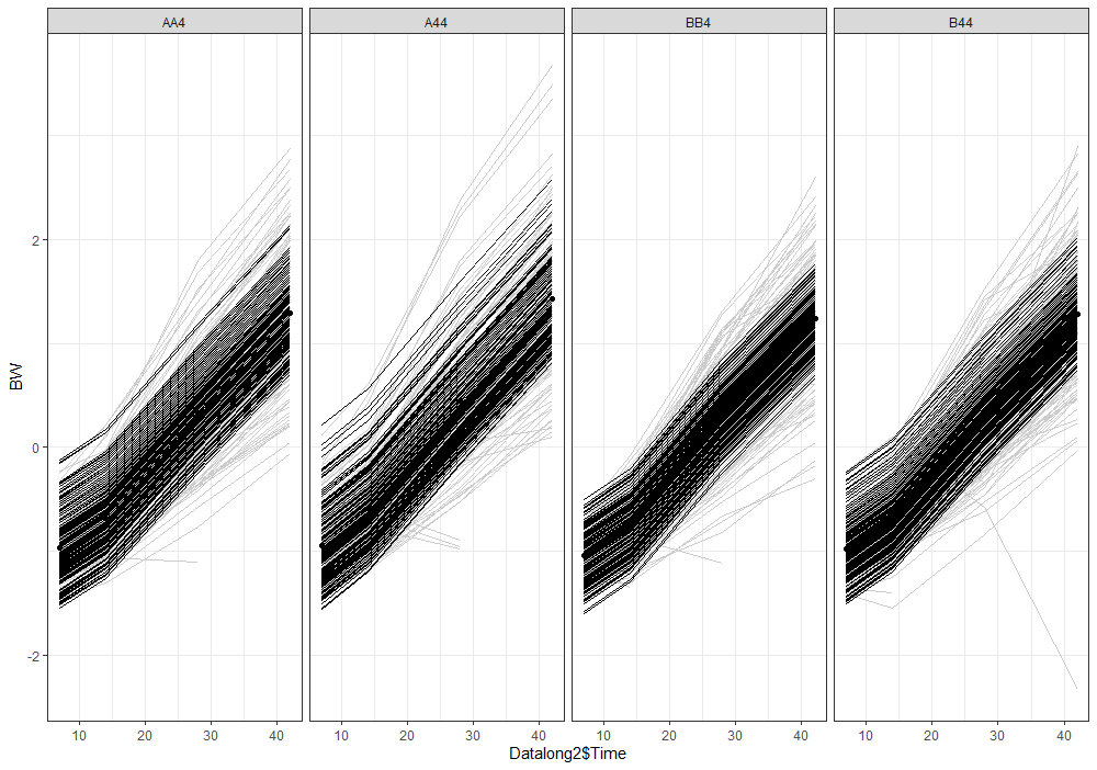
Analyzing growth data via a Mixed Model always requires the data to be in long format — multiple rows per ID in which each row contains a single observation of a time-varying factor. Here, that factor is BW.
Although Mixed Models are very good at dealing with unbalanced data, it is perhaps best if we stick with time points 0,7,14,28, and 42. The choice is personal of course, and one could choose differently. These choices need to be driven by science, not by statistics.
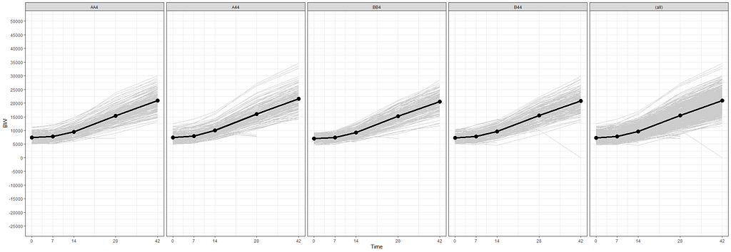
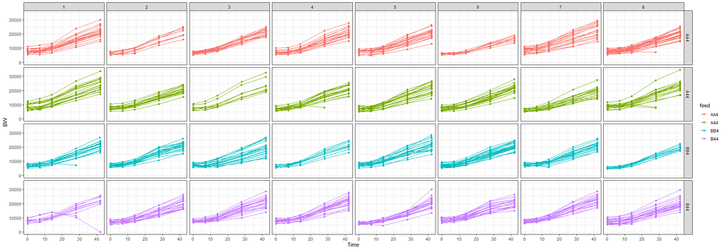
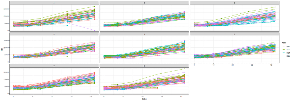

The biggest predictor of any longitudinal dataset will be time. Now, time in itself is actually the least interesting factor, since time by itself cannot do anything. It is just the progression of an underlying mechanism that we hope to unravel but cannot see. Hence, in the model, we label it time.
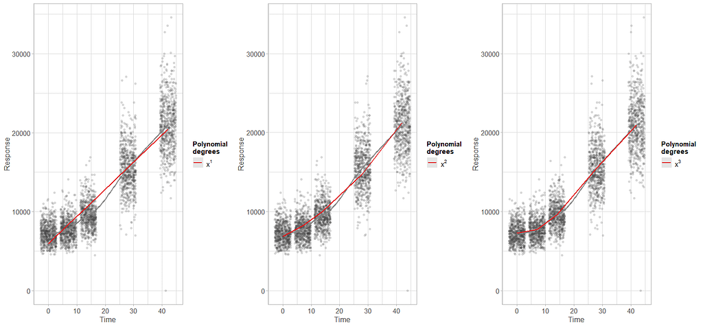
To model ‘time,’ we need to see if we can do that the best way in a linear fashion, or if perhaps polynomial transformations are necessary.
Now, it's time to model the data using Mixed Models. As shown in the introduction example, we can start modeling by just using the grand mean, and then work our way up using additional fixed and random effects.
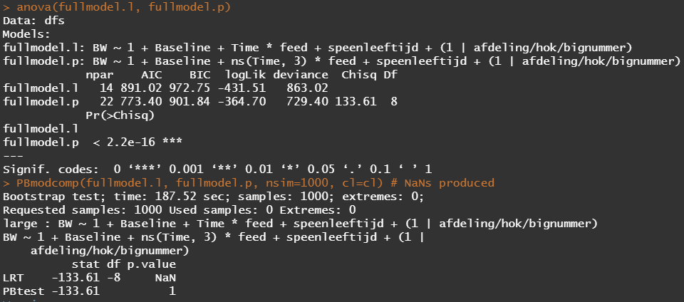
The following code executes increasingly more complex models and compares their model fit with each other.
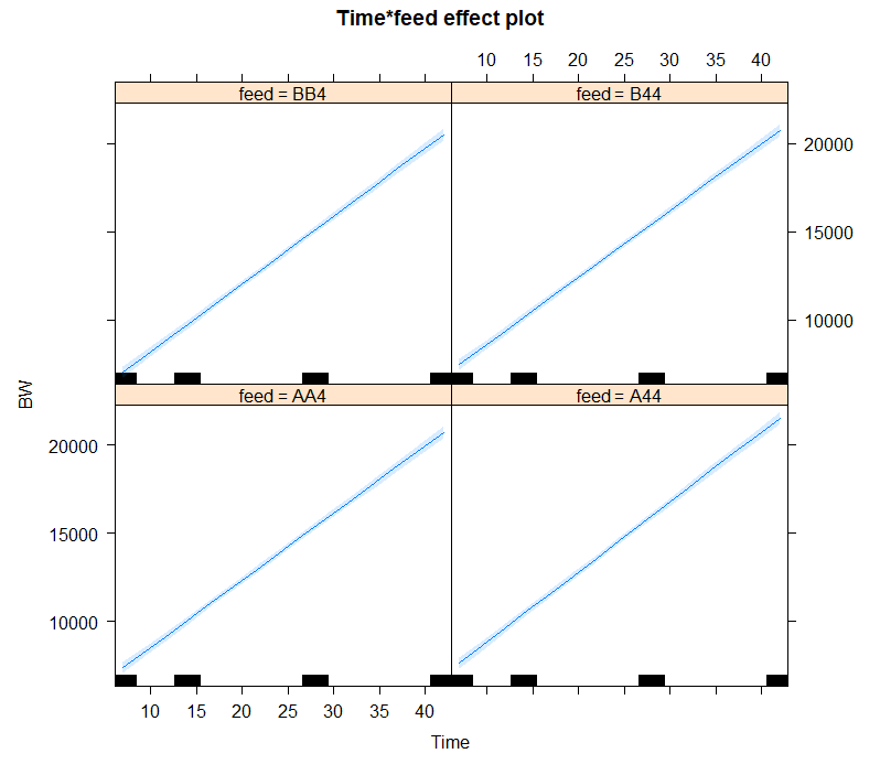
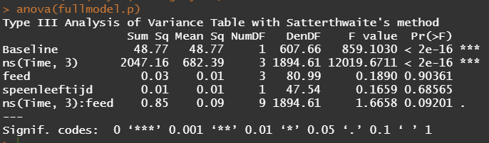
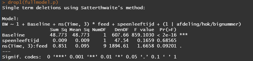
From the result, it seems that the spline model with three knots is the best model. The previous polynomial plots did hint at a curve, but I was not sure to go for two or three inflection points. It seems that statistics chose three, but one should always be careful. These models tend to overfit easily.
> data.frame(Model=myaicc[,1],round(myaicc[, 2:7],4))
  Model K     AICc Delta_AICc AICcWt Cum.Wt       eratio
4   TP3 7 44777.30     0.0000      1      1 1.000000e+00
3   TP2 6 44852.52    75.2234      0      1 2.160530e+16
2    TL 5 44902.44   125.1398      0      1 1.491971e+27
1     I 3 51091.40  6314.0990      0      1          Inf
Something that I did not show you, but continued to pop up, are warnings regarding the scaling of the predictors. Regression models are very susceptible to heterogenous scales limiting their ability to find the most optimal solution. Hence, it is best to center (subtract the mean from observations) and scale it (usually by standard deviation). This is what is often referred to as normalization.
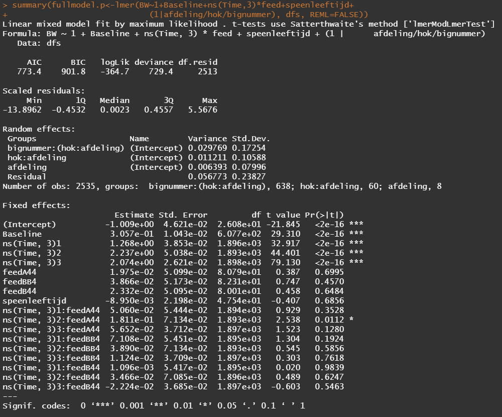
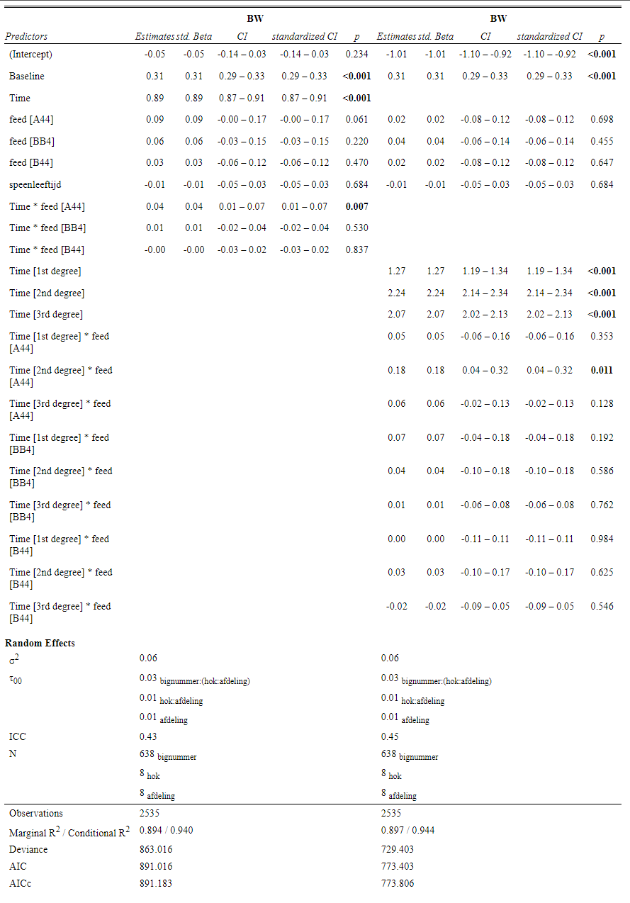
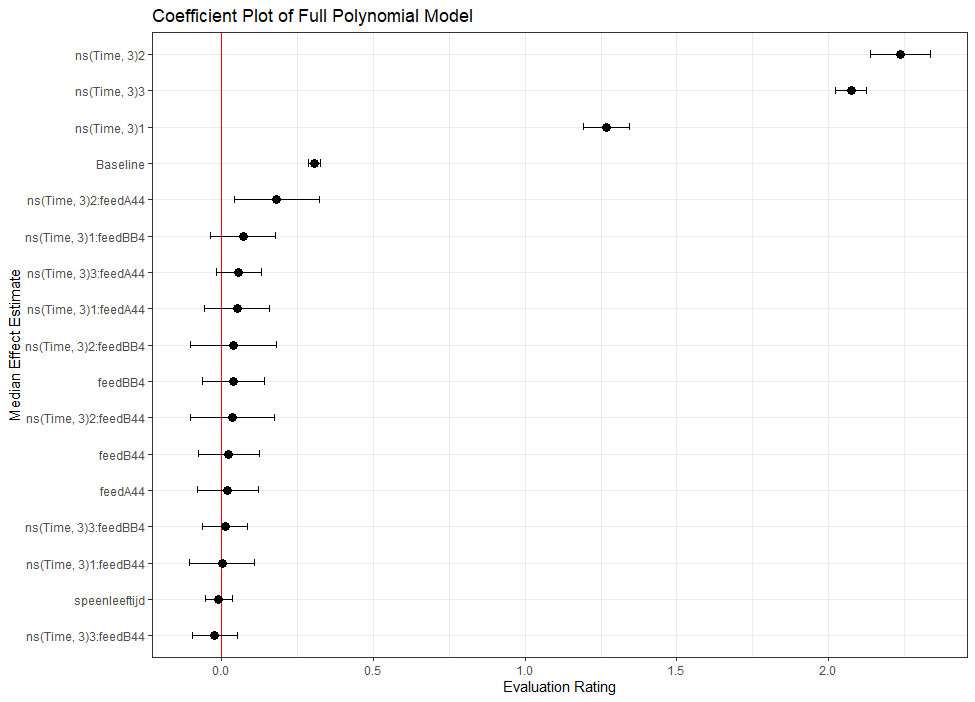
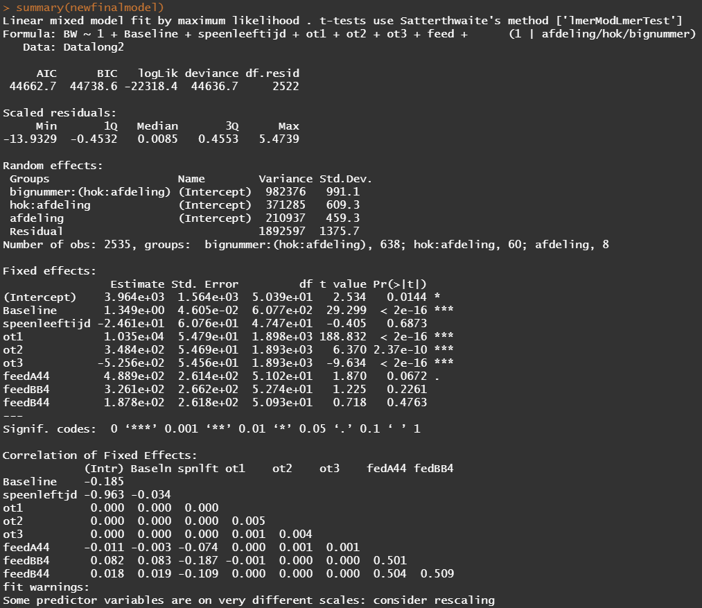
Okay, so lets model again using the normalized data. Below you see a linear and spline model, containing the same fixed effects and the same random effects. The (1|afdeling/hok/bignummer) refers to a random-intercept model in which random effects are modeled at the piglet-level (bignummer), the pen-level (hok), and department-level (afdeling). So, we are asking the model to create three distinct random intercepts. This is heavy-duty work!
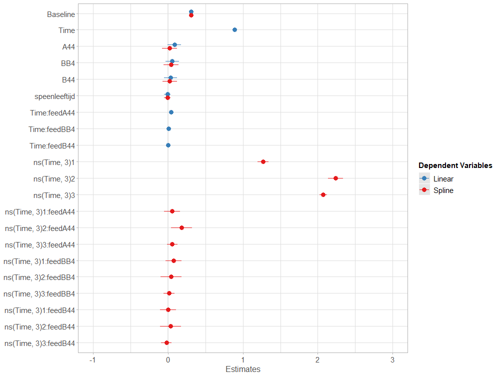
Even though our models are far from perfect, I still want to show you how to create these gorgeous and heavily customizable tables.
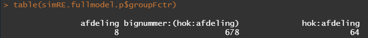
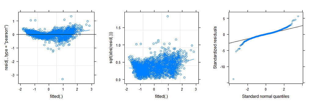
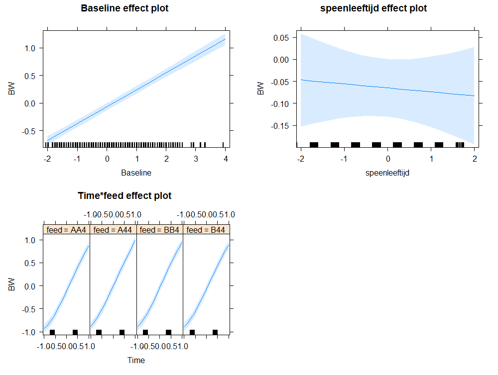
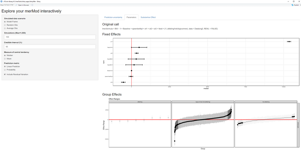
The plots below show the decreasing complexity as we move up to higher levels of the nested dataset. In the upper left, you can see the random effects of each of the 678 piglets. There is quite some variation there! That variation is still present when you look at the pen level, but disappears mostly — but not completely — at the department level.
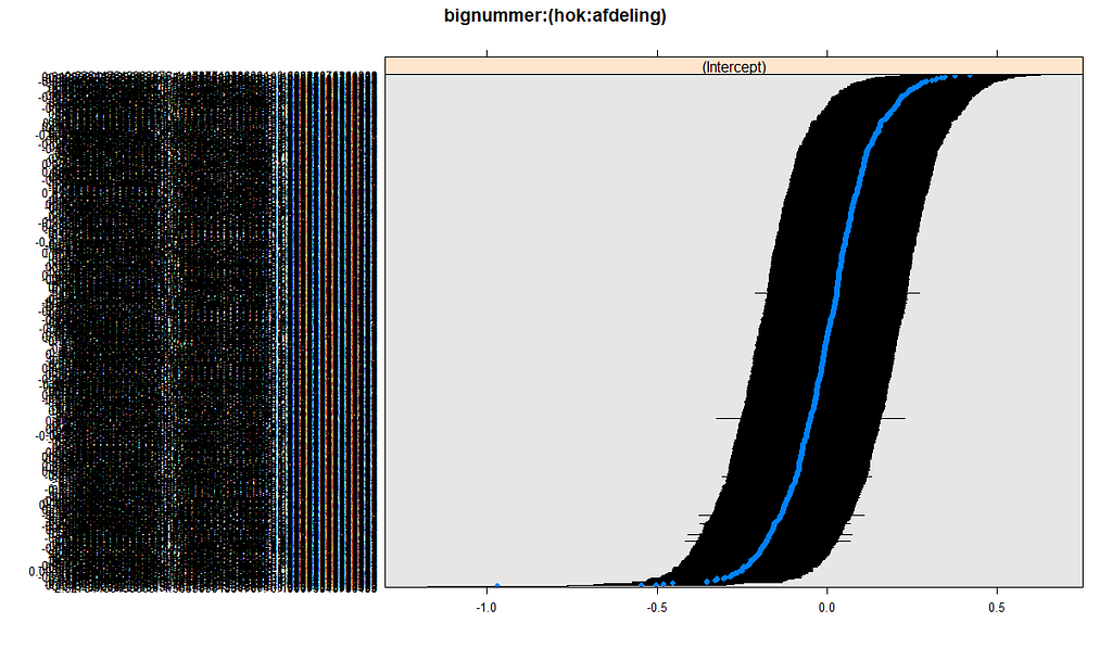
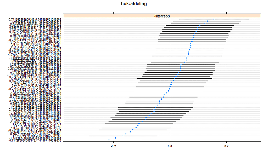
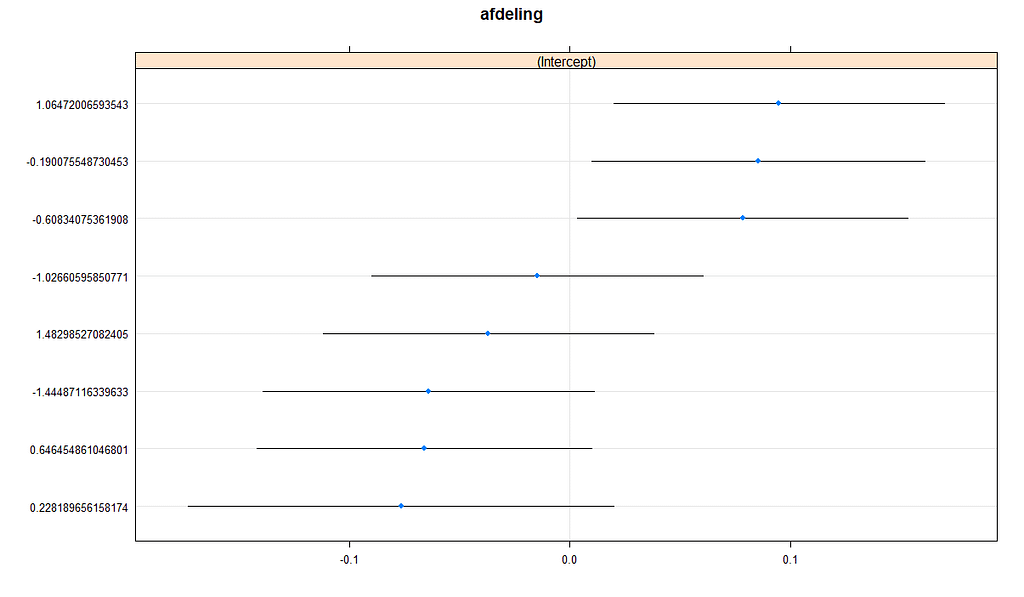
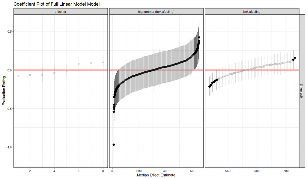
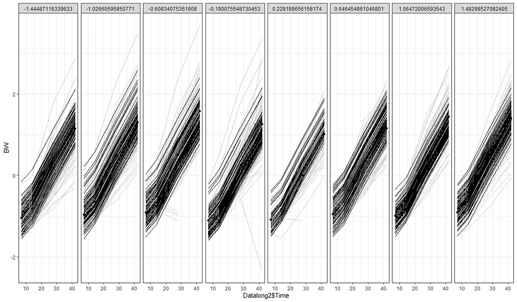
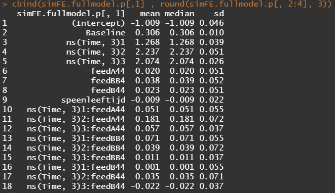
What you are looking for below are strange values and great ranges. A great range shows that the model is too unstable, providing different results when resampling the data (or most likely the residuals in this case). Keep in mind, the data are normalized, so don’t be alarmed by negative values.
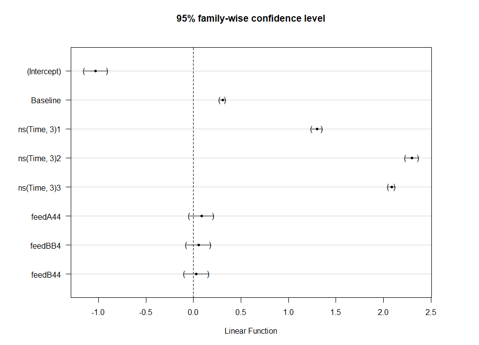
> fullmodel.p.profile
                           2.5 %      97.5 %
.sig01                0.15789798  0.18806449
.sig02                0.08045540  0.13829972
.sig03                0.03433251  0.16420614
.sigma                0.23087468  0.24606877
(Intercept)          -1.10607167 -0.91646721
Baseline              0.28509093  0.32624303
ns(Time, 3)1          1.19281521  1.34393775
ns(Time, 3)2          2.13788842  2.33545366
ns(Time, 3)3          2.02265831  2.12545518
feedA44              -0.08153903  0.12081676
feedBB4              -0.06433766  0.14123498
feedB44              -0.07802993  0.12428090
speenleeftijd        -0.05629743  0.03623871
ns(Time, 3)1:feedA44 -0.05616030  0.15734512
ns(Time, 3)2:feedA44  0.04118821  0.32098636
ns(Time, 3)3:feedA44 -0.01626940  0.12931287
ns(Time, 3)1:feedBB4 -0.03581485  0.17795854
ns(Time, 3)2:feedBB4 -0.10099513  0.17879623
ns(Time, 3)3:feedBB4 -0.06148481  0.08396338
ns(Time, 3)1:feedB44 -0.10512360  0.10730989
ns(Time, 3)2:feedB44 -0.10426754  0.17359444
ns(Time, 3)3:feedB44 -0.09451097  0.05002694
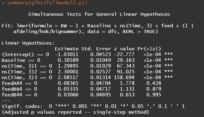
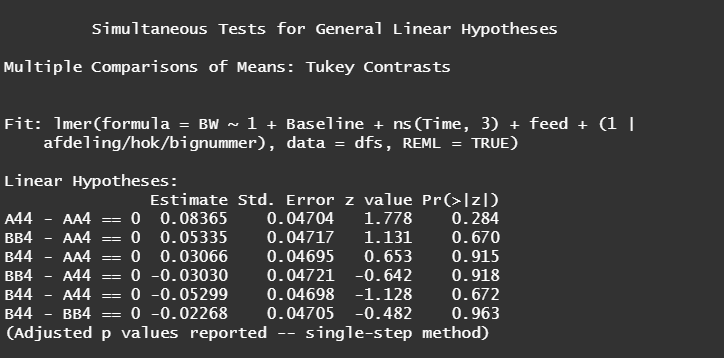
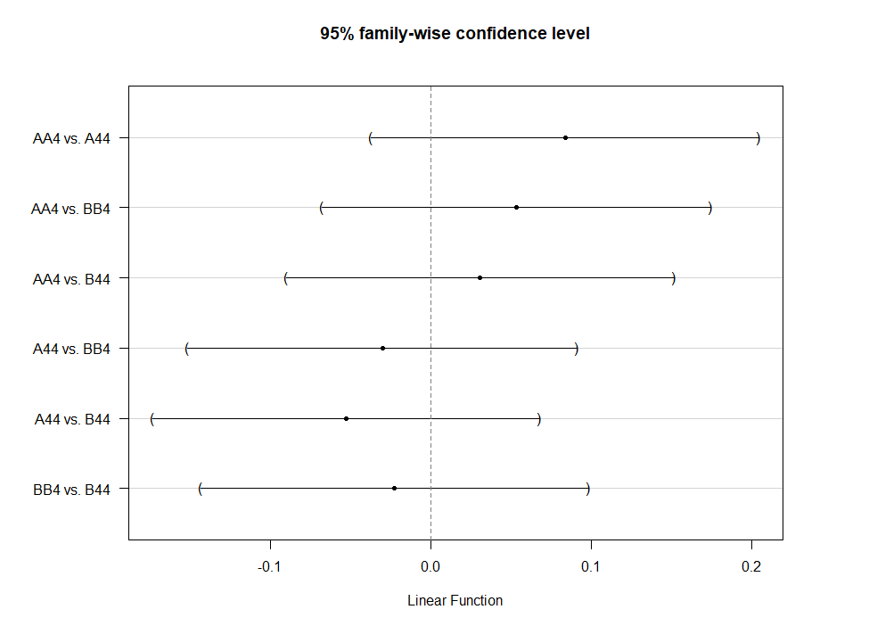
Even though the model is still not great, and we already know that certain factors should not be included, let's dive deeper into the world of linear predictors and estimated means or LSMEANS as they are often referred to.

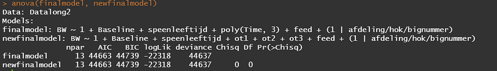
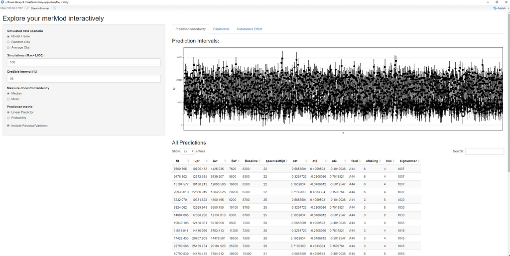
This last bit is a bit of an extra. If you want to explore your Mixed Model and test your knowledge, you can transform your model into a Shiny tool. Luckily, all the coding work has already been done, so you just need to make the model. The problem is, however, that the Shiny application does not recognize splines. In general, splines can give you some issues when combined with rigid packages which I do not understand. They far exceed any polynomial models.
So, to actually transform your model in a Shiny tool, you need to hard-code the polynomial model but include breakpoints. Technically, we now have a piecewise-regression model, which is actually the foundation for a spline.

This is the end of this post. I hope you enjoyed it and keep watching us for more posts!
Analysis of BW in piglets was originally published in Towards AI on Medium, where people are continuing the conversation by highlighting and responding to this story.
Join thousands of data leaders on the AI newsletter. It’s free, we don’t spam, and we never share your email address. Keep up to date with the latest work in AI. From research to projects and ideas. If you are building an AI startup, an AI-related product, or a service, we invite you to consider becoming a sponsor.
Published via Towards AI
Towards AI Academy
We Build Enterprise-Grade AI. We'll Teach You to Master It Too.
15 engineers. 100,000+ students. Towards AI Academy teaches what actually survives production.
Start free — no commitment:
→ 6-Day Agentic AI Engineering Email Guide — one practical lesson per day
→ Agents Architecture Cheatsheet — 3 years of architecture decisions in 6 pages
Our courses:
→ AI Engineering Certification — 90+ lessons from project selection to deployed product. The most comprehensive practical LLM course out there.
→ Agent Engineering Course — Hands on with production agent architectures, memory, routing, and eval frameworks — built from real enterprise engagements.
→ AI for Work — Understand, evaluate, and apply AI for complex work tasks.
Note: Article content contains the views of the contributing authors and not Towards AI.
Related posts
Recent Posts


")