


Analysis of a Synthetic Breast Cancer Dataset in R
Last Updated on January 7, 2023 by Editorial Team
Last Updated on January 21, 2022 by Editorial Team
Author(s): Dr. Marc Jacobs
Originally published on Towards AI the World’s Leading AI and Technology News and Media Company. If you are building an AI-related product or service, we invite you to consider becoming an AI sponsor. At Towards AI, we help scale AI and technology startups. Let us help you unleash your technology to the masses.
Data Analysis
Time-to-event data fully explored
This post is about me analyzing a synthetic dataset containing 60k records of patients with breast cancer. This is REAL data (in terms of structure), but without any patient privacy revealed. The site where you can request the data can be found here and is in Dutch. The great thing about this is that these datasets not only allow us to analyze patient data, without knowing who the patient is but also allow us to test new algorithms or methods on data with a clinical structure. Hence, if you develop something on synthetic data, it will for sure have to merit on (new) patient data.
So, let's get started. The dataset is big and there are many models that can be made. My goal was to explore the data and to build a clinical decision tool based on survival models.
I will show standard graphical exploration, missing data analysis, survival models, and refineries such as penalization.
I hope that this post will inspire more people to dive deeper into this dataset. What I made here is by no means an end-product, nor do I wish it to be. There is just too much there.
Let’s get started!
First of all, I will import the data, explore it from a basic perspective, and then create new variables by refactoring them, combining them, or renaming them.
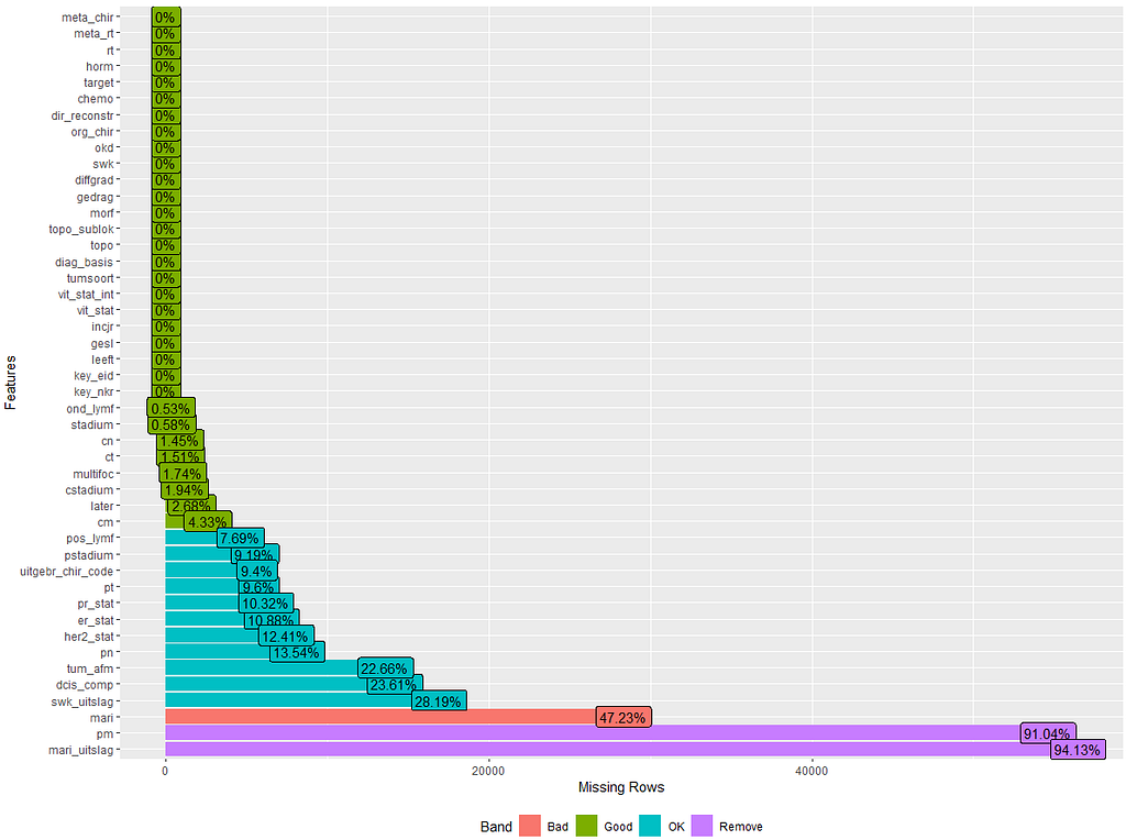
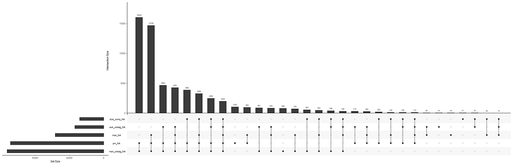
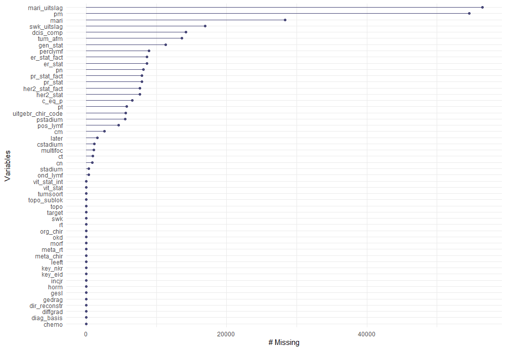
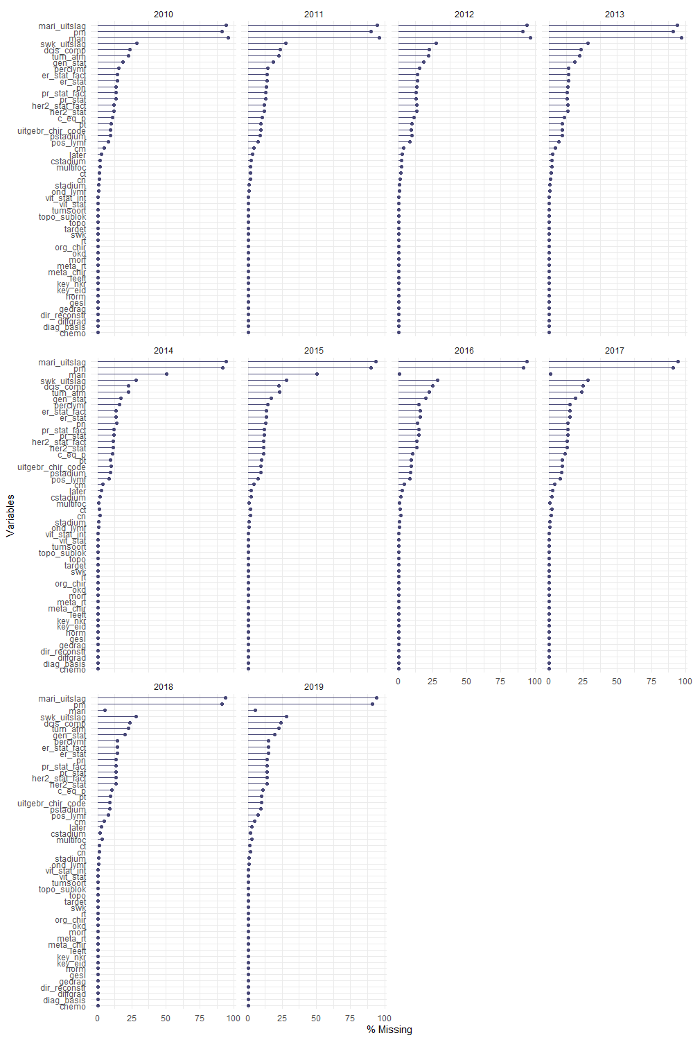
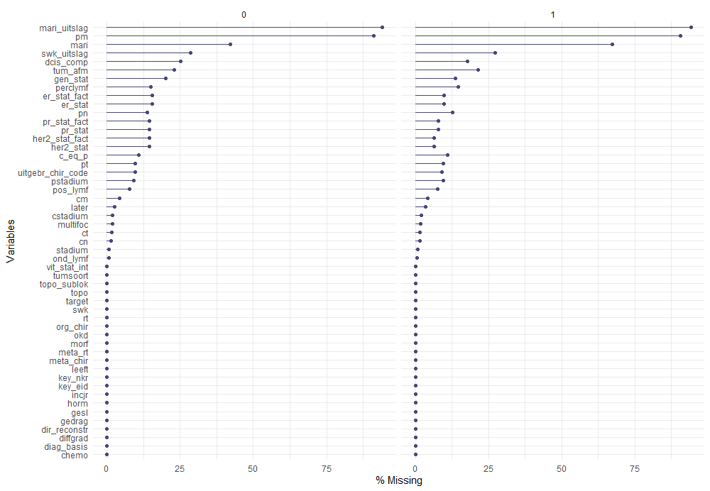
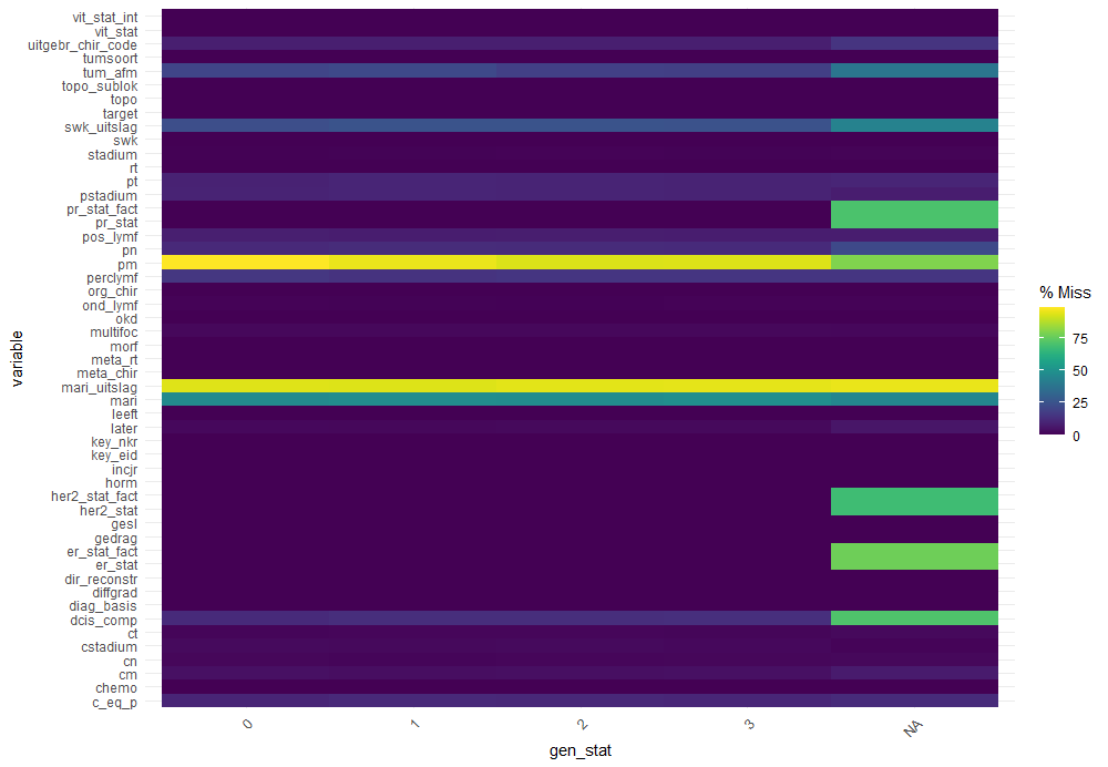
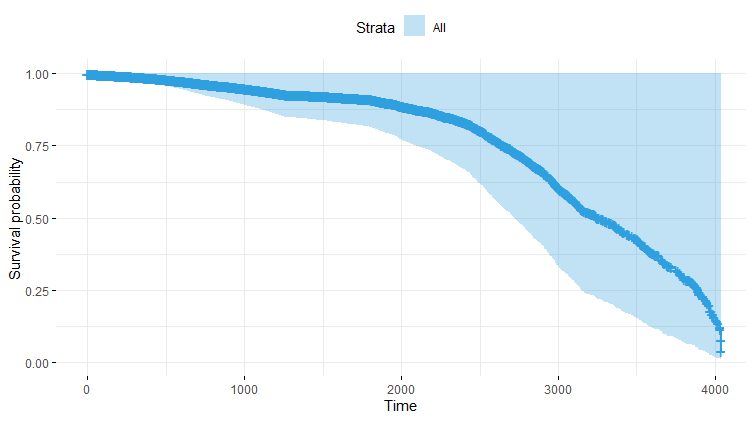
The missing data patterns do not really worry me, so it's time to look deeper into the data. There is a lot, and R does not like me using traditional plots such as points and lines with so many observations. Hence, this is why heatmaps are best, but I cannot resist the urge to dive deeper into the data and still use good old scatter plots.

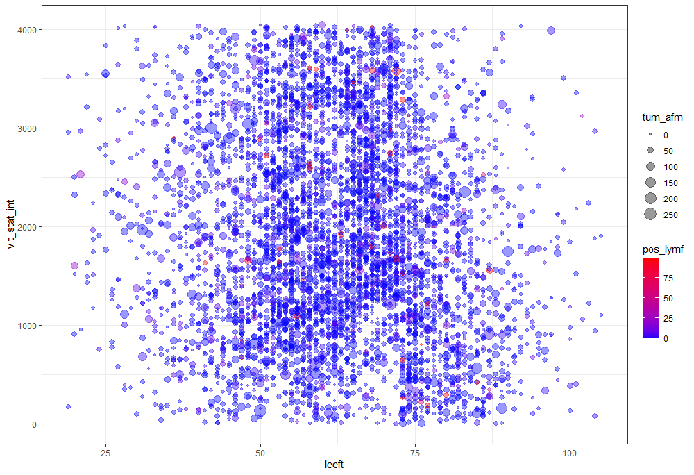
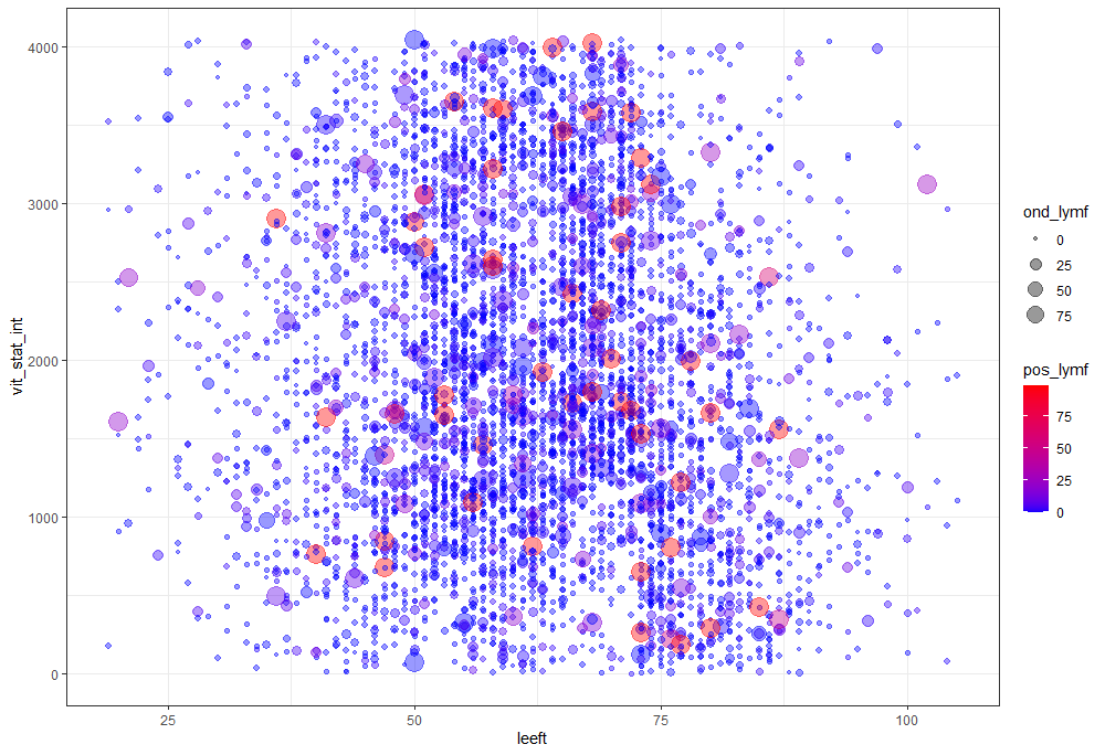
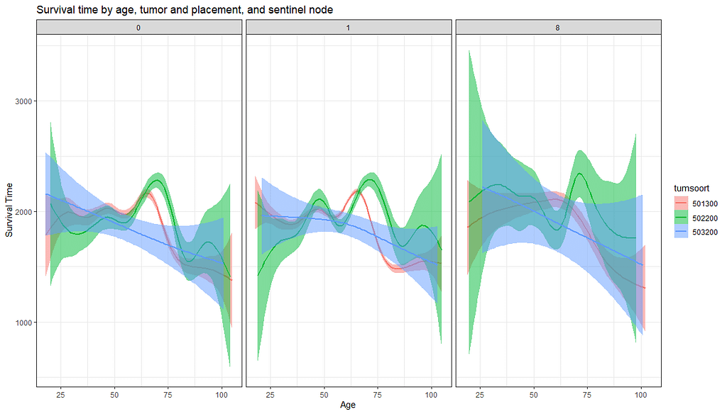
Let's try something more, and a lot else. As you can see, I did not go for the traditional scatterplot matrices, since they have no merit here — 75% of the variables included are categorical variables.

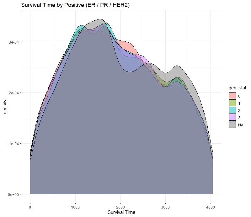
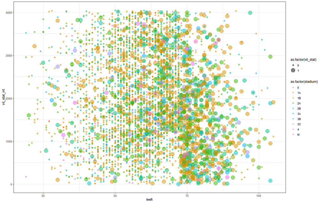
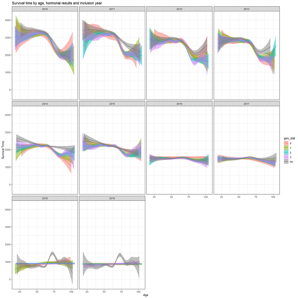
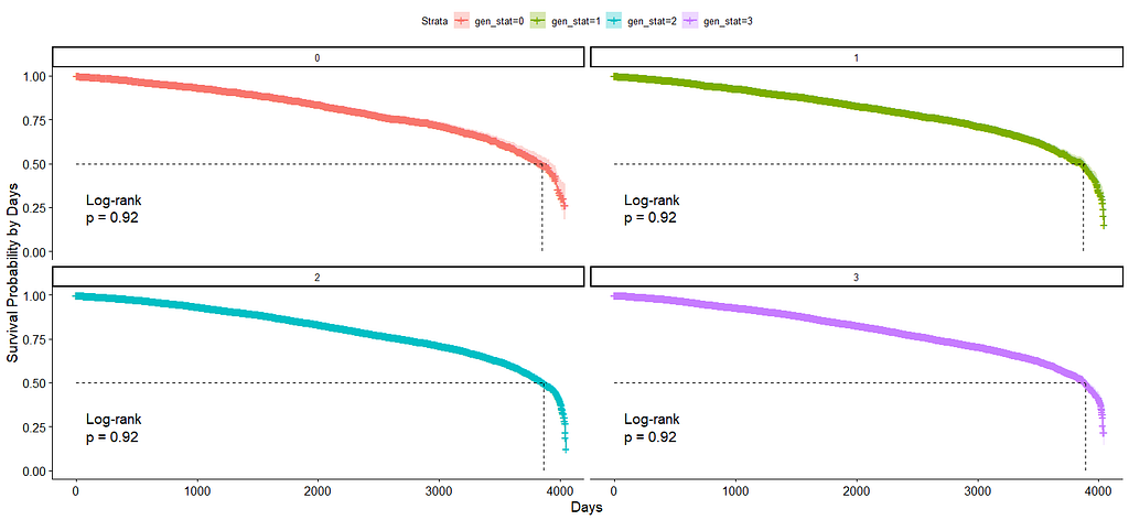
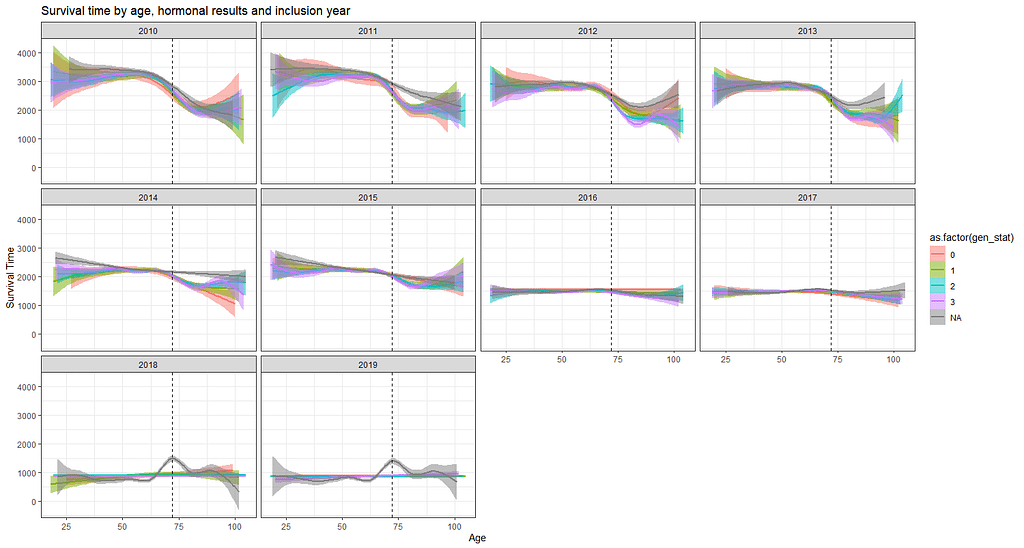
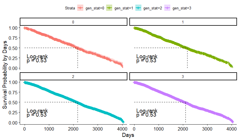
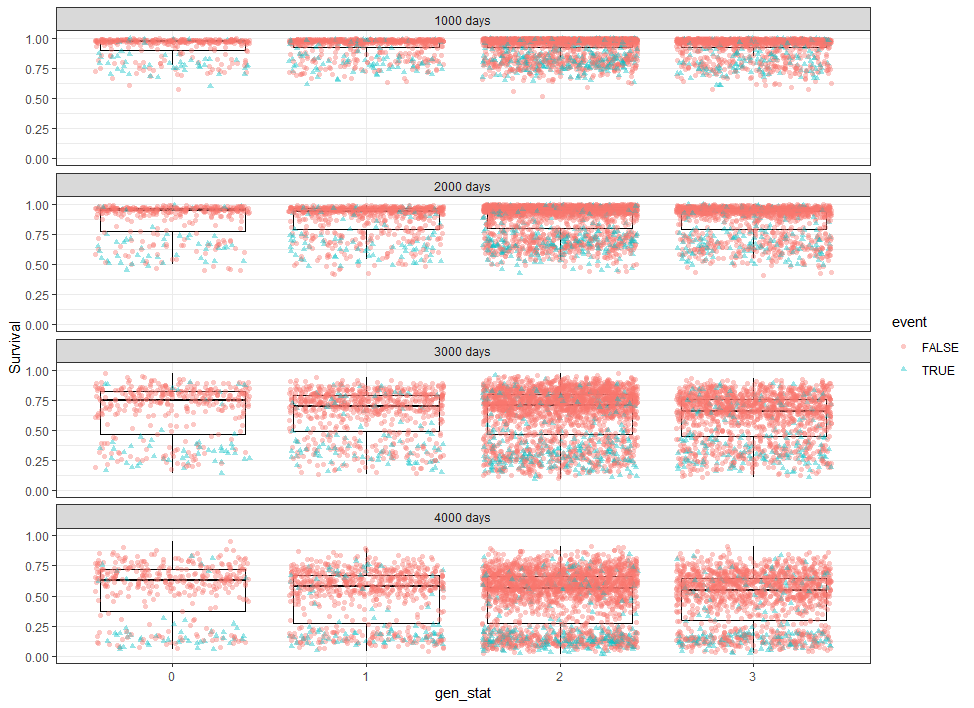
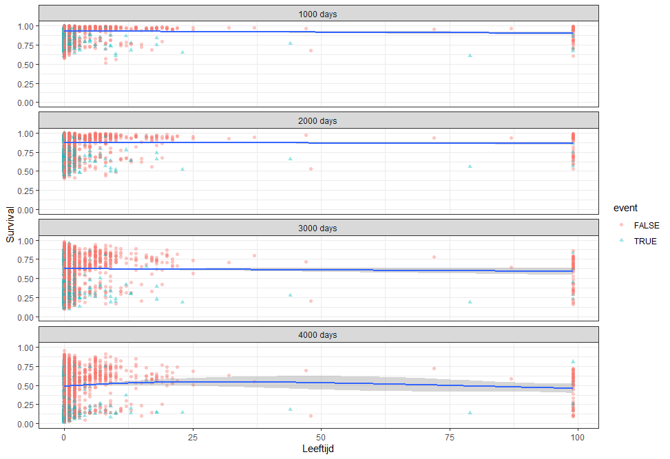
The following graph is trying to show a relationship between survival time, patient age, inclusion year, and a variable called gen_stat which is a combined new variable including the three hormonal markers: her2, er, and pr. If any of these markers were found, regardless of the score, they were labeled a one. Hence, a score of three on gen_stat means that a patient scored positive on all three markers.
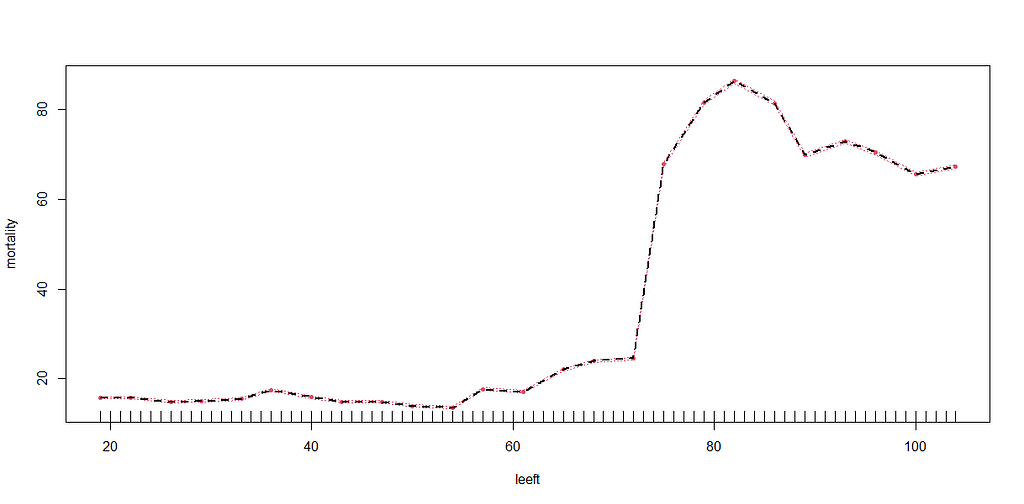
More interesting than those markers is the age of the patient. We will show later that age has for sure a cut-off point.

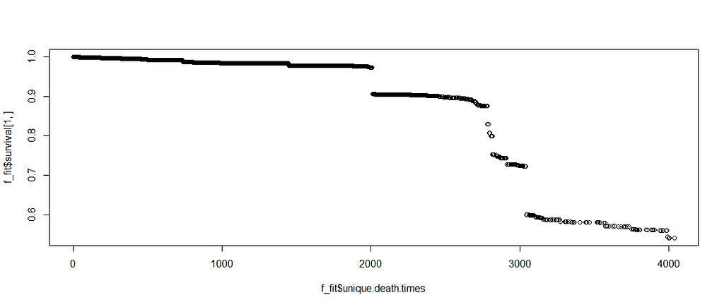
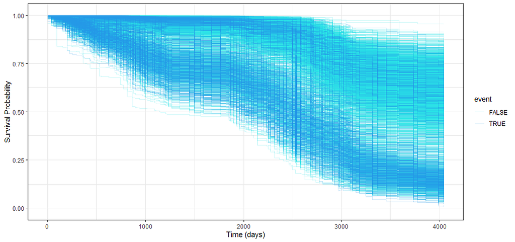
Let's move to the survival analysis itself. This is not the first time I post about conducting survival analysis, and for a deeper introduction please read here and here.
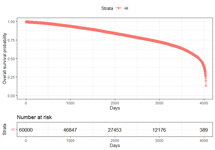
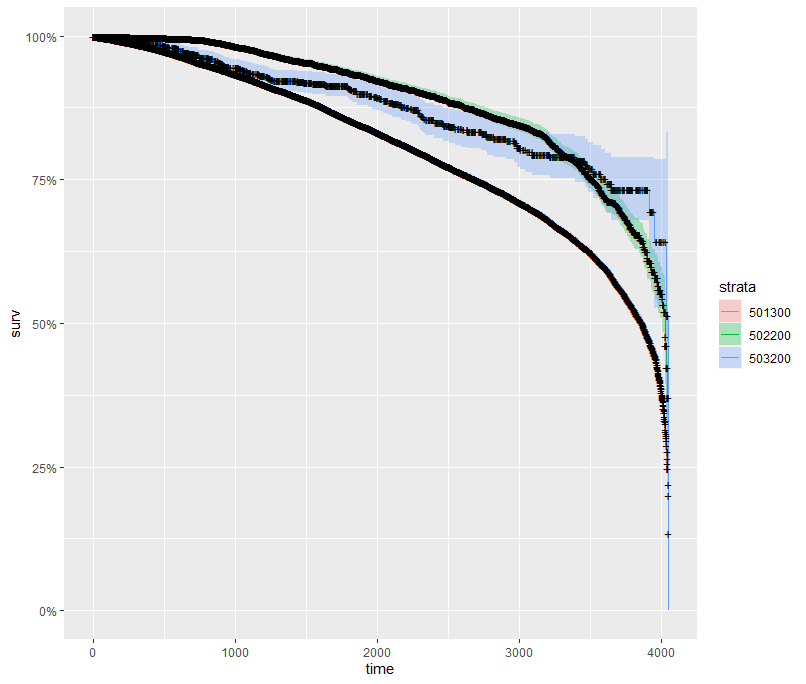
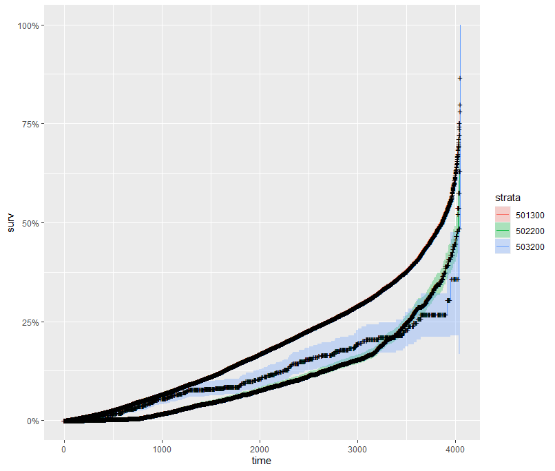
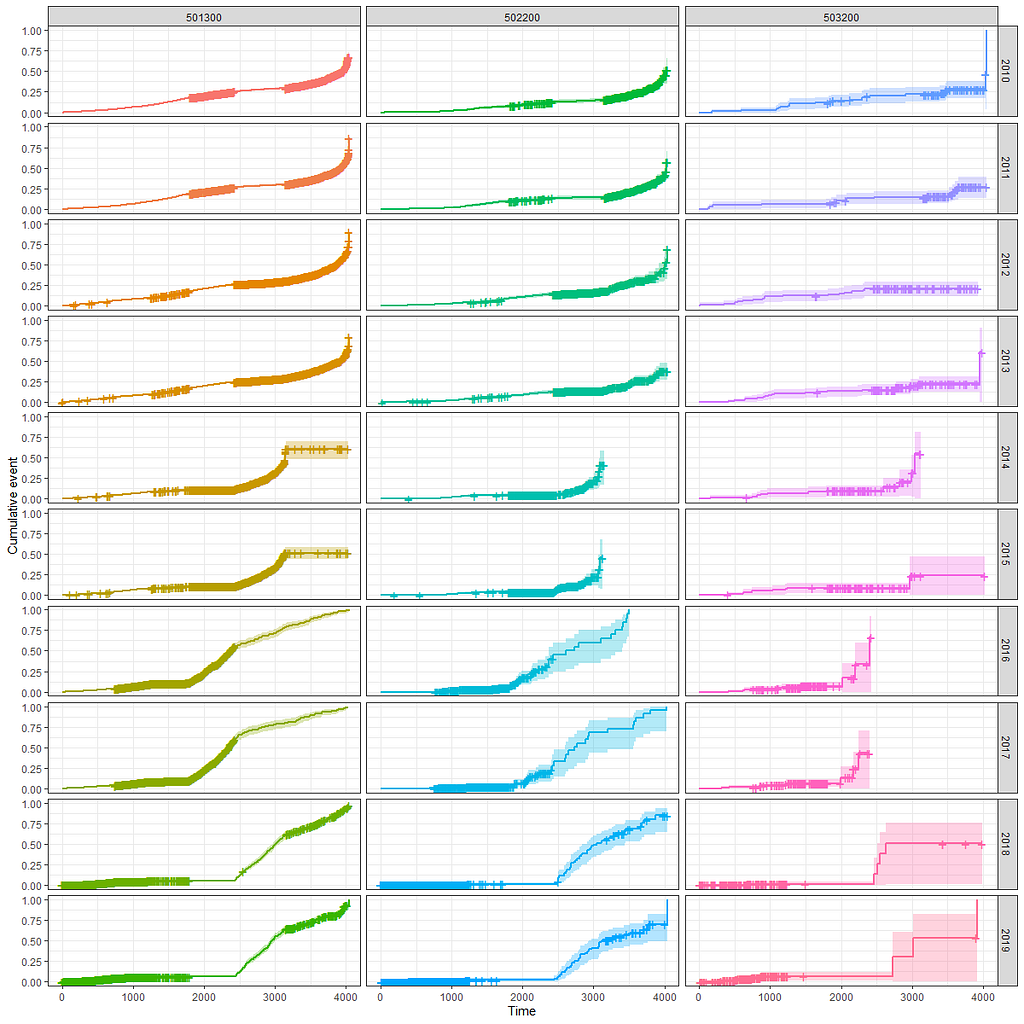
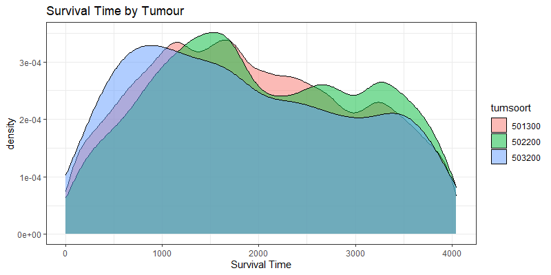
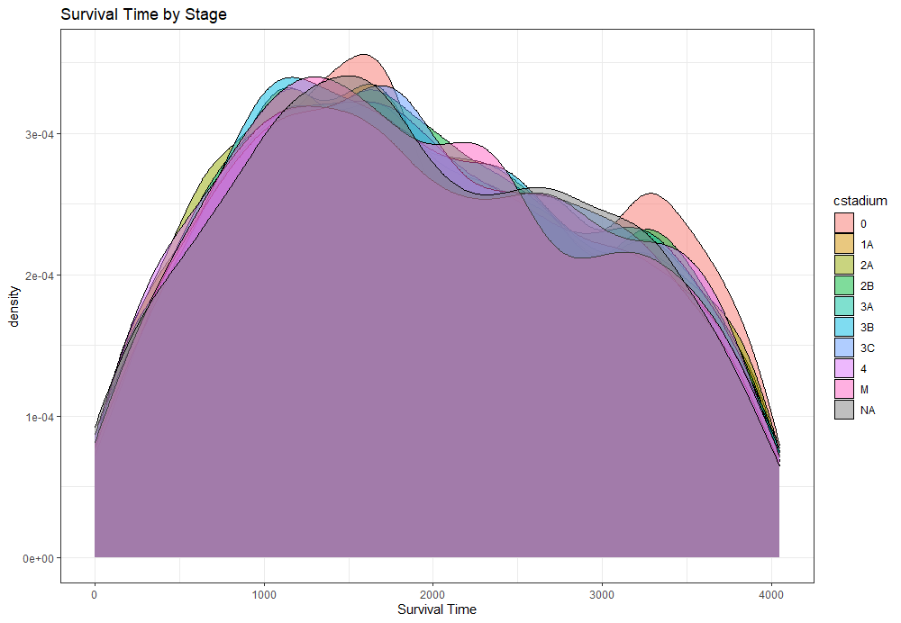
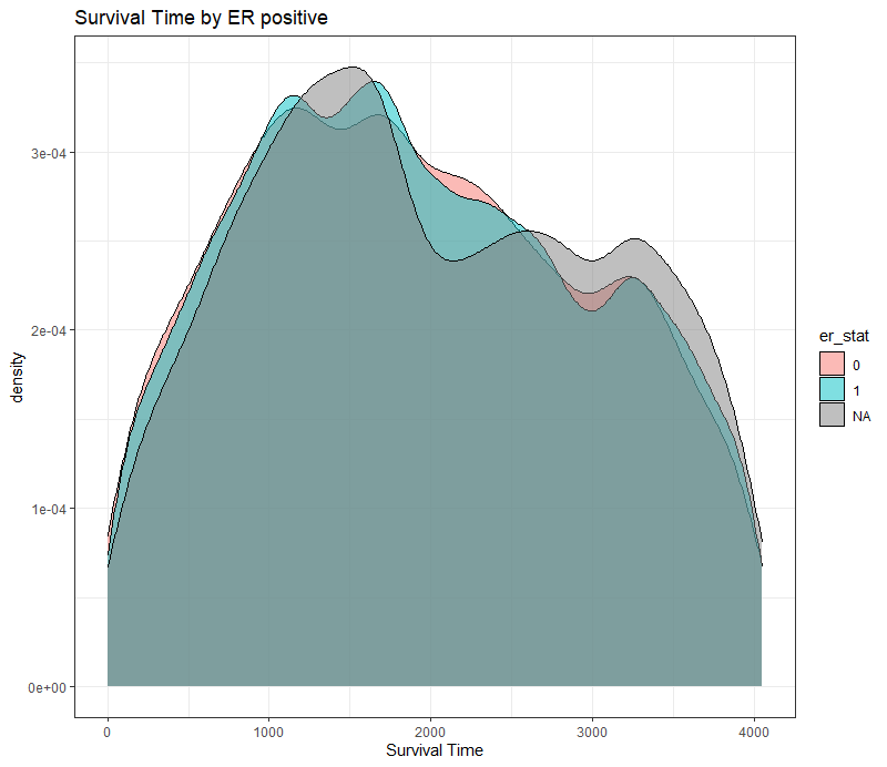
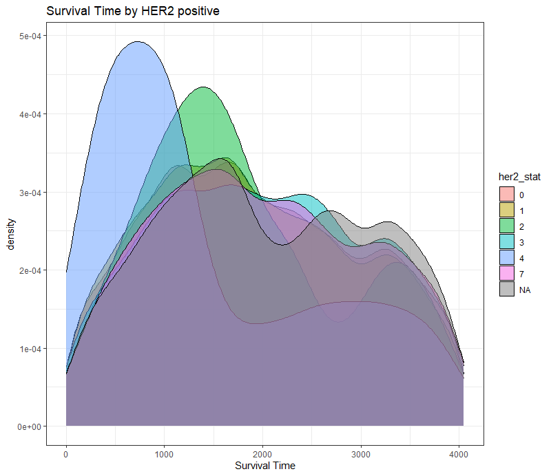
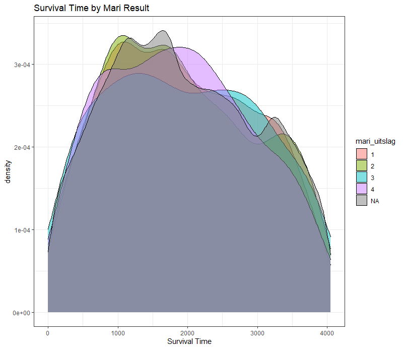
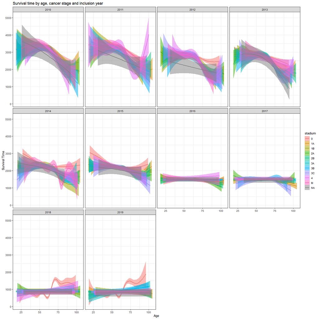
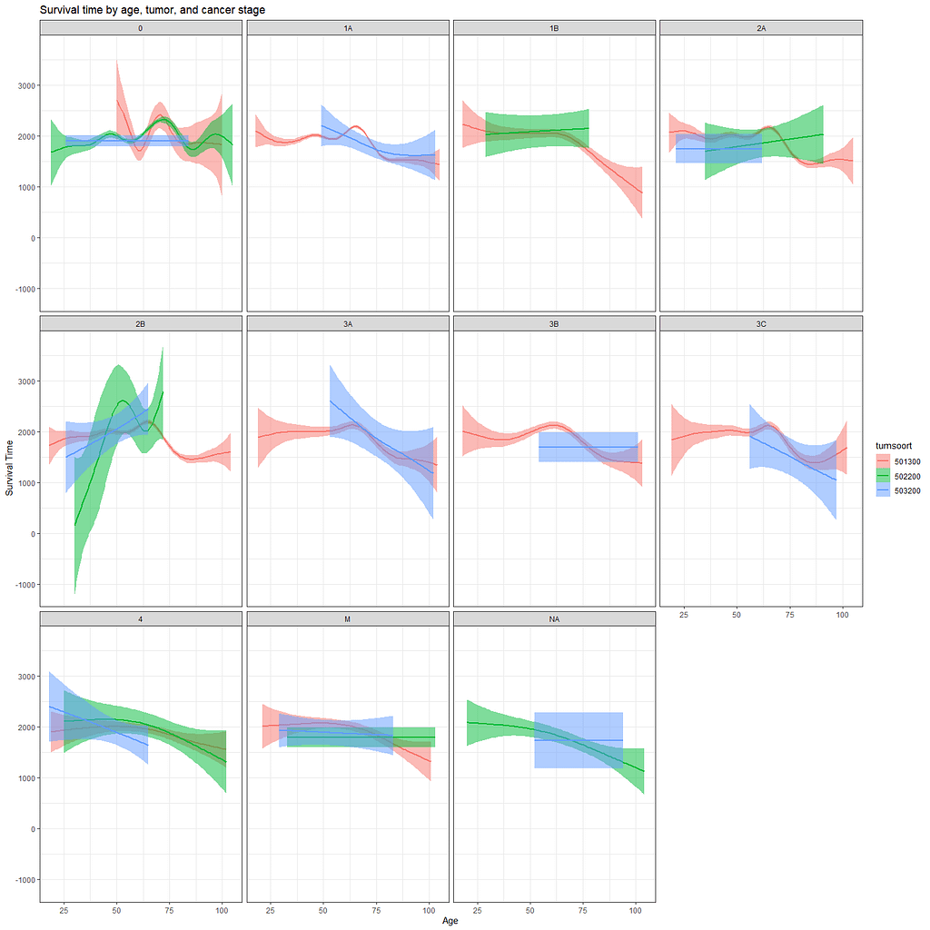
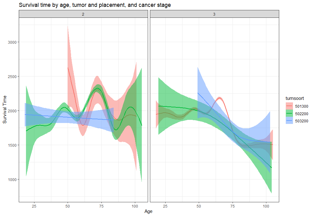
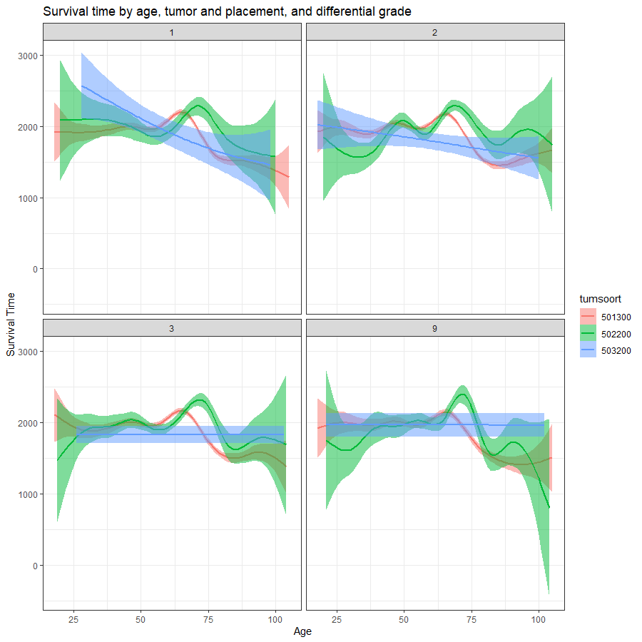
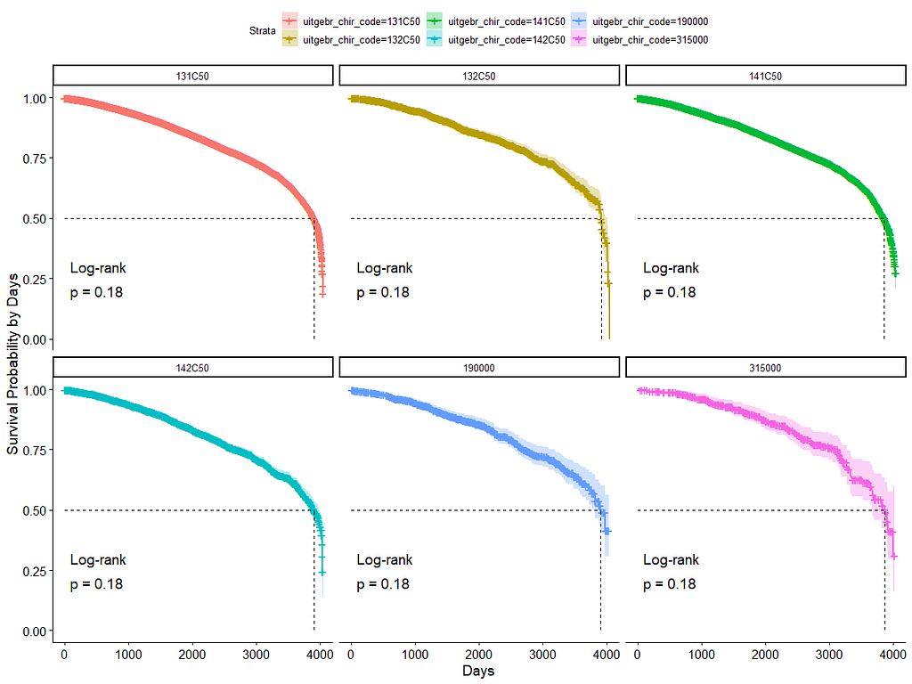
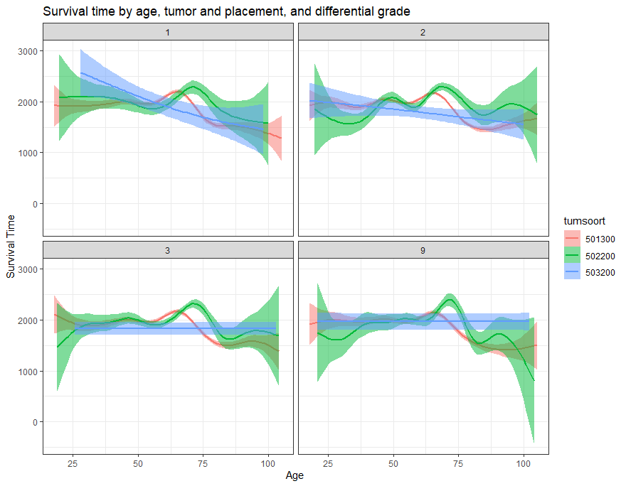
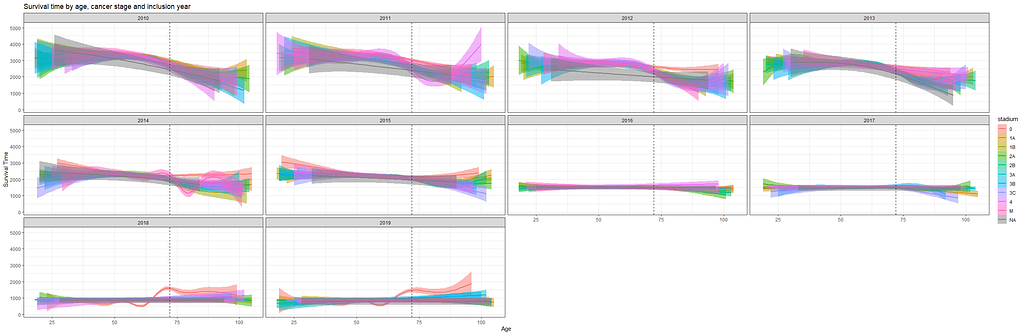
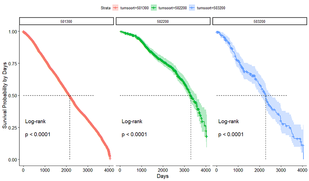
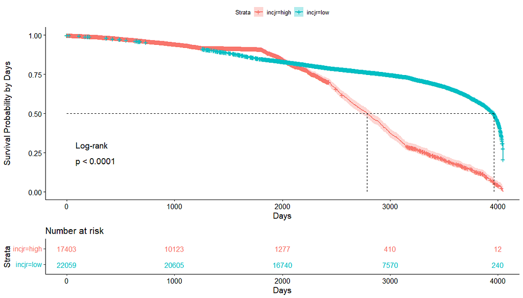
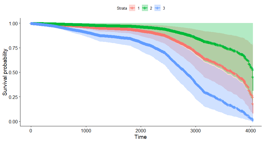
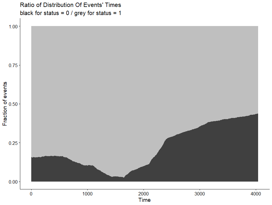
And then I started splitting by almost every imaginable variable included.
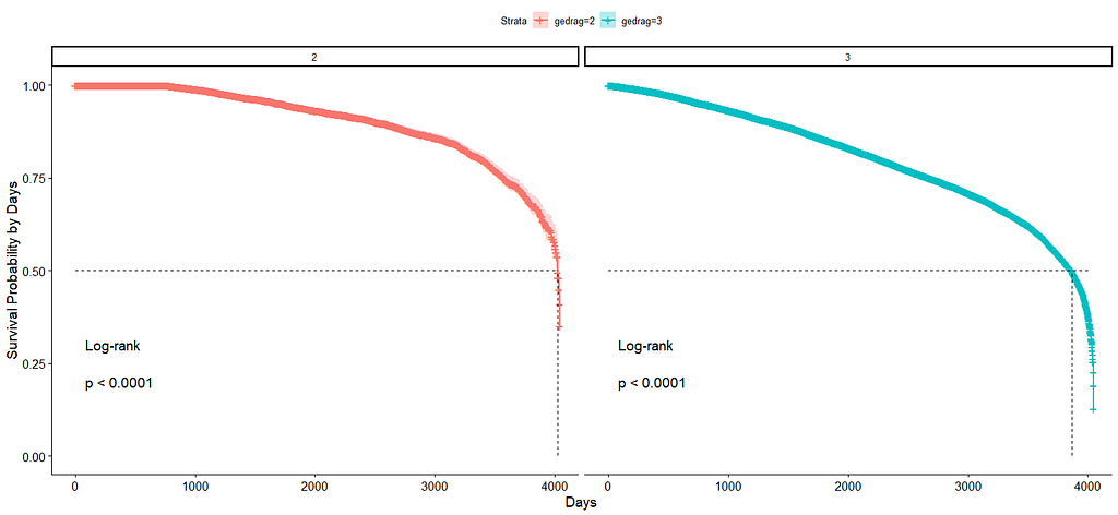
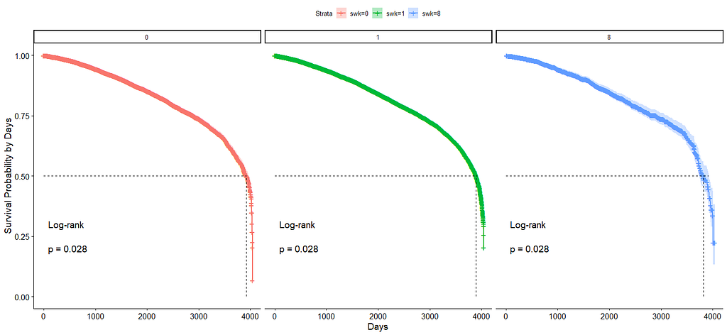
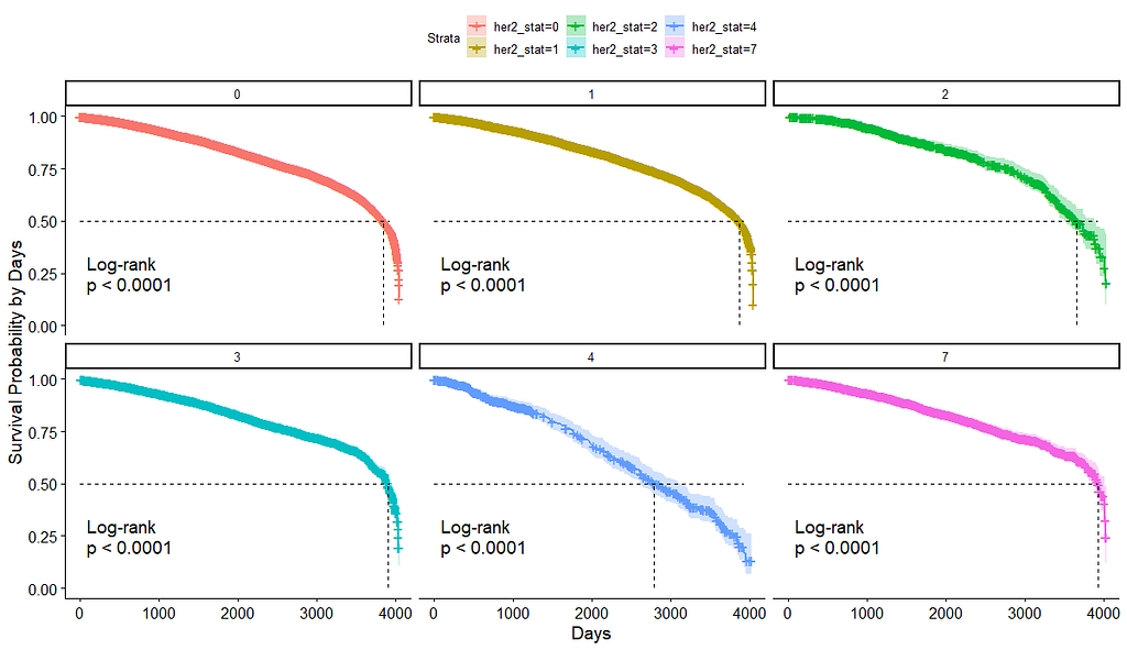
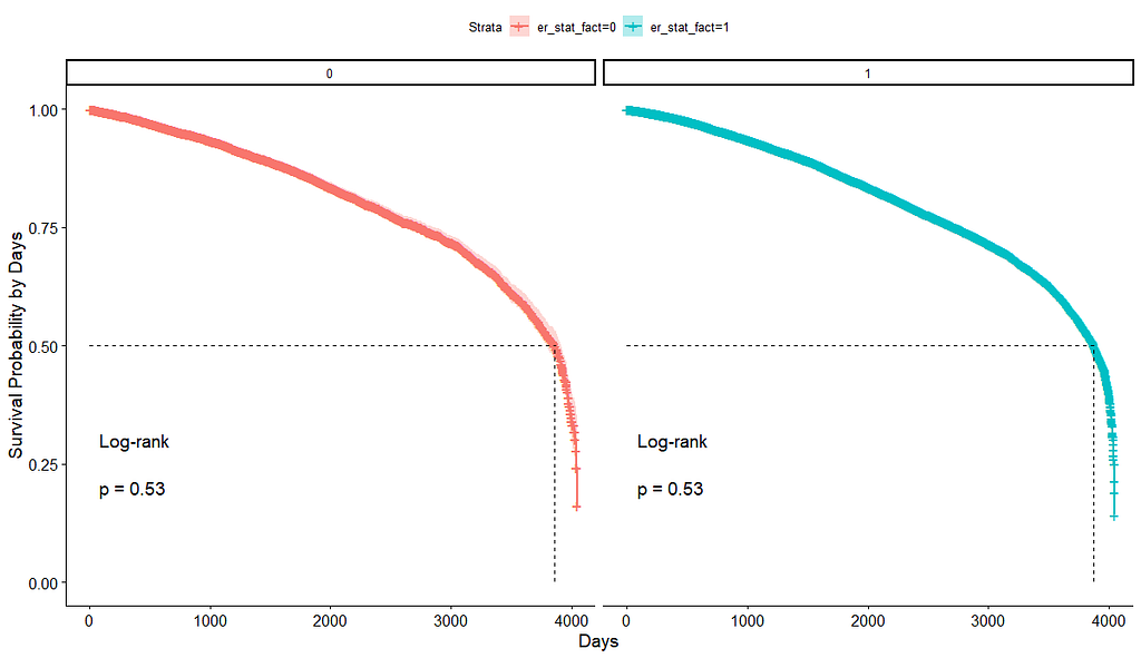
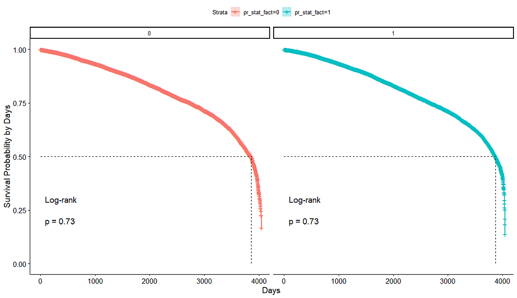
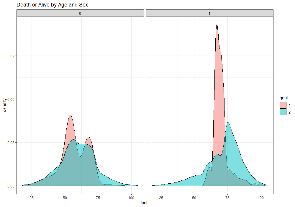
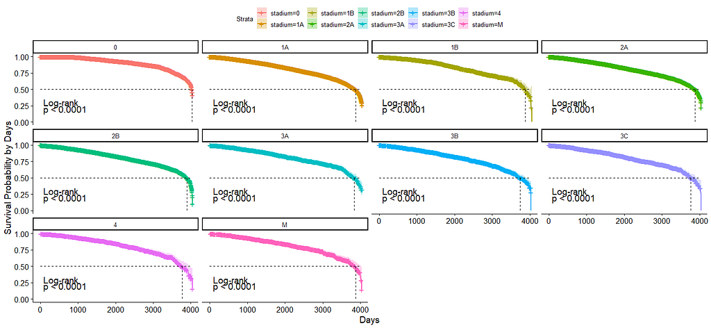
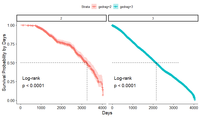
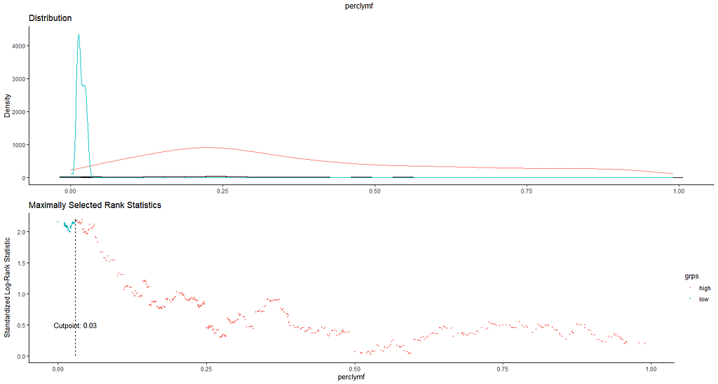
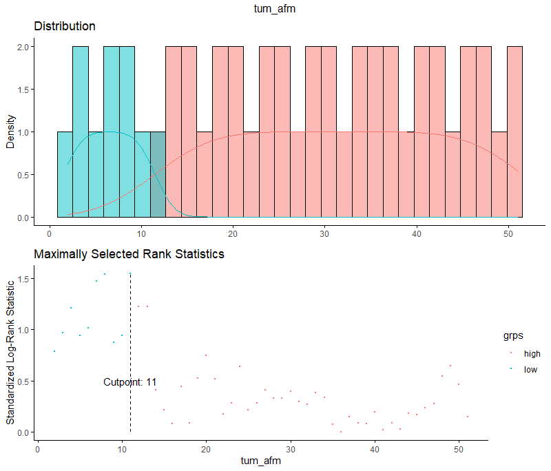
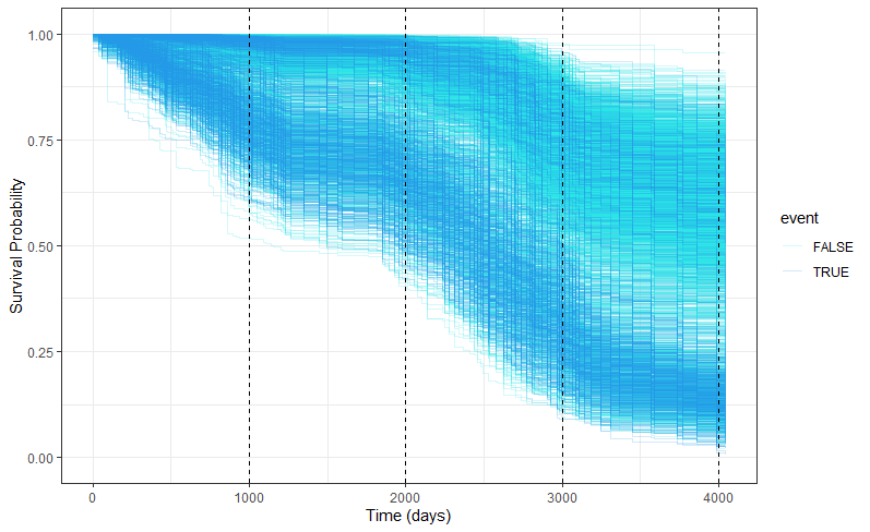
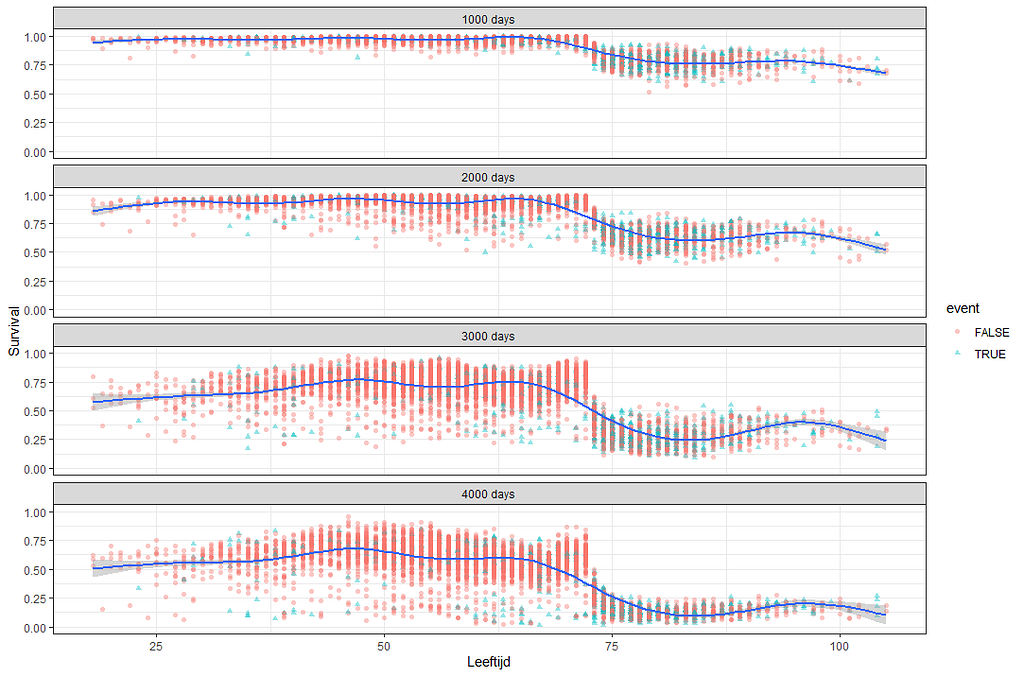
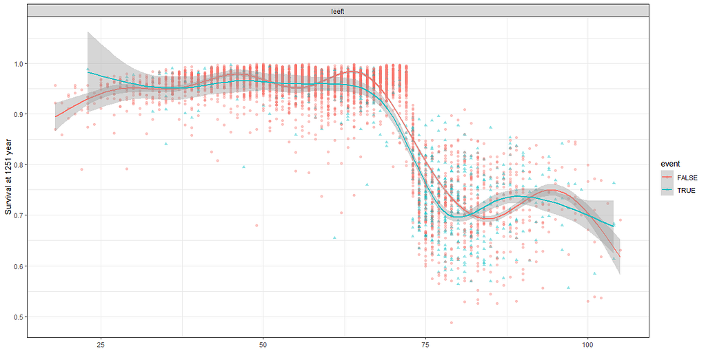
We have a lot of data to spend, but not a lot of variables and only a few of them are continuous. Those that are continuous, let's have a look and see if we can find cut-points that would yield completely different survival curves. Or at least, bring curves that have something interesting to say. Do not that this entire process is statistical driven — normally, biology should drive hypotheses and a first effort should be made to verify them via the data. Alas, let's go for the statistical approach and start with age.
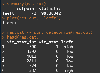
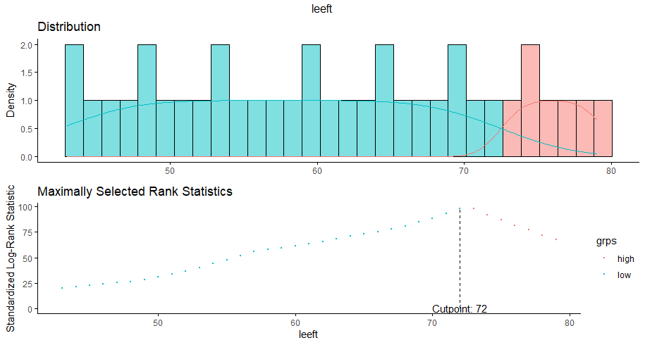
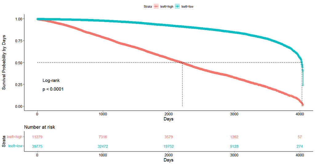
Now, let's create some survival curves, where we only look above age 72.
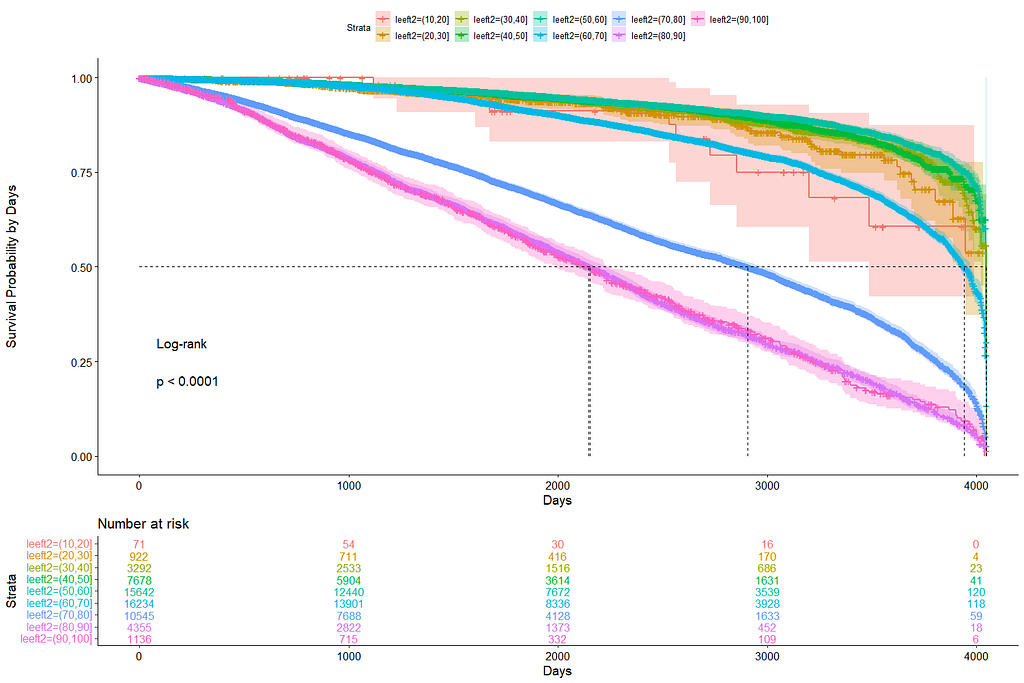
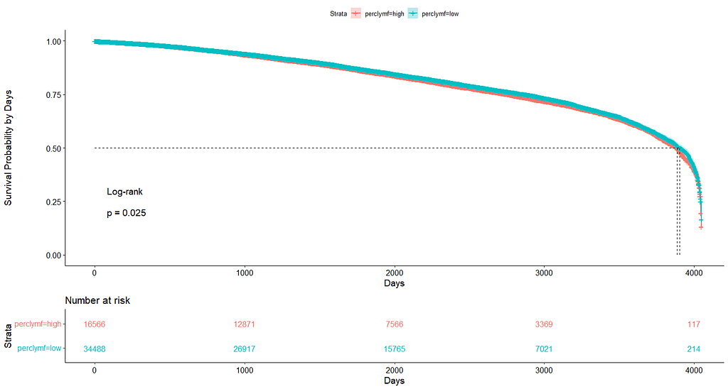
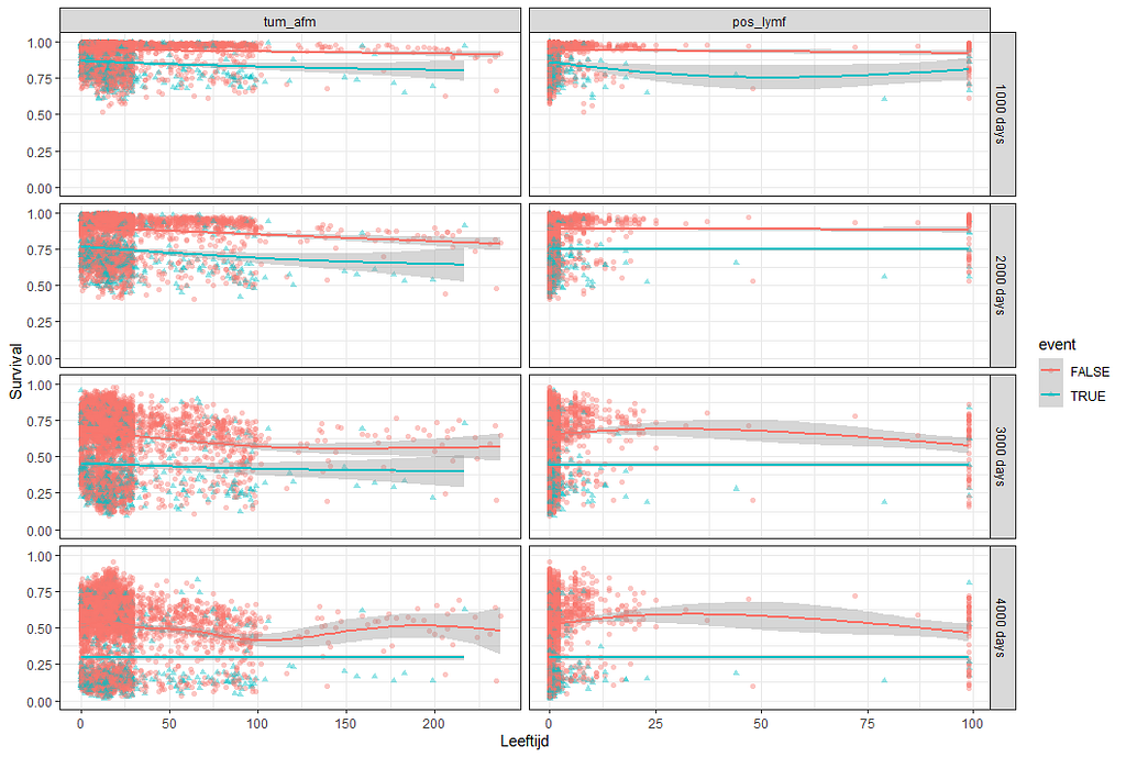
Good, we have something for age. Let's see if we can also find something for the number of positive lymph nodes. This one is not so easy, since there are mostly quite some lymph nodes examined, but the majority is not positive.
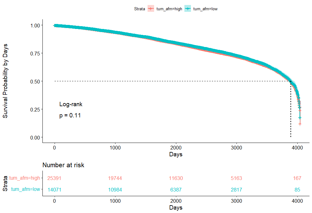
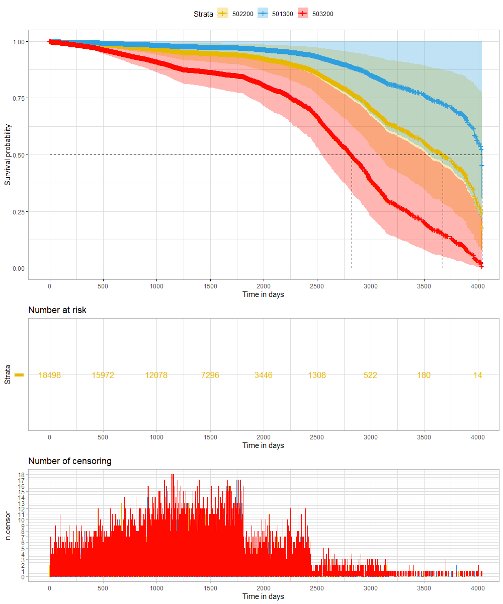
And, last but not least, tumor size.
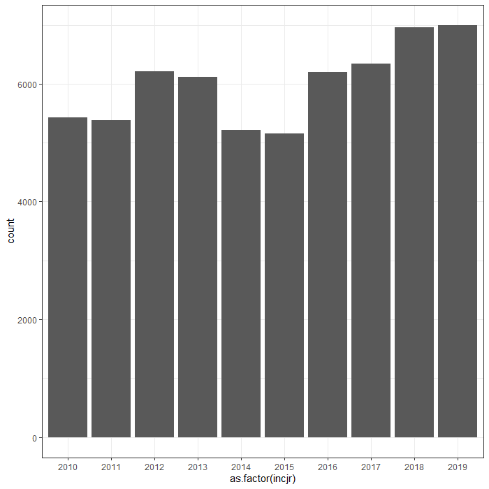
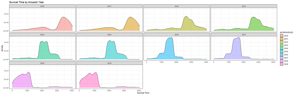
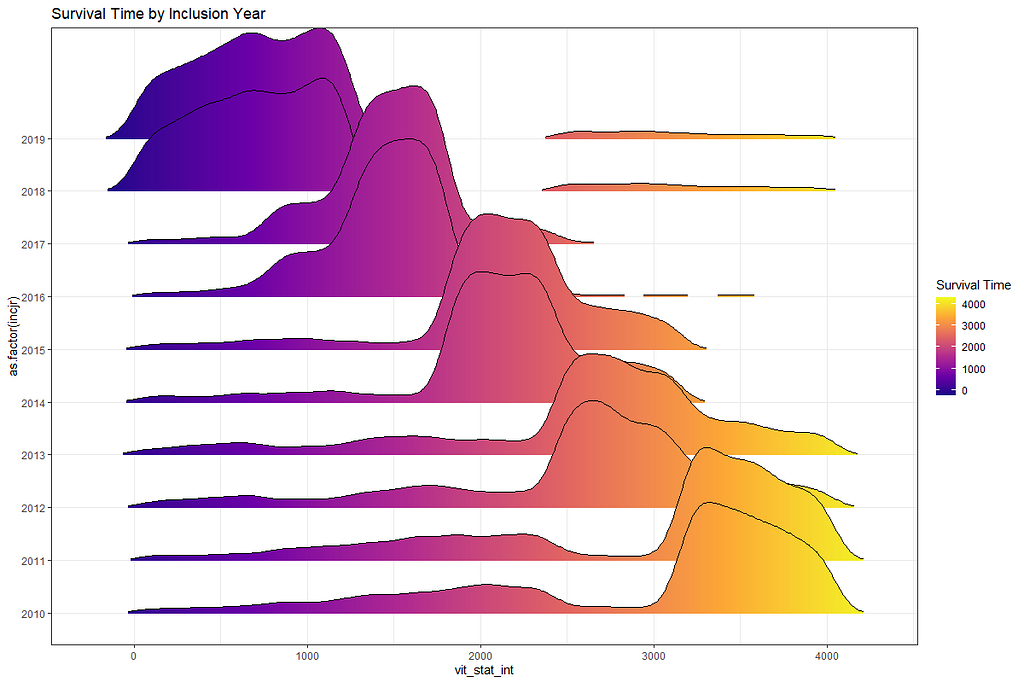
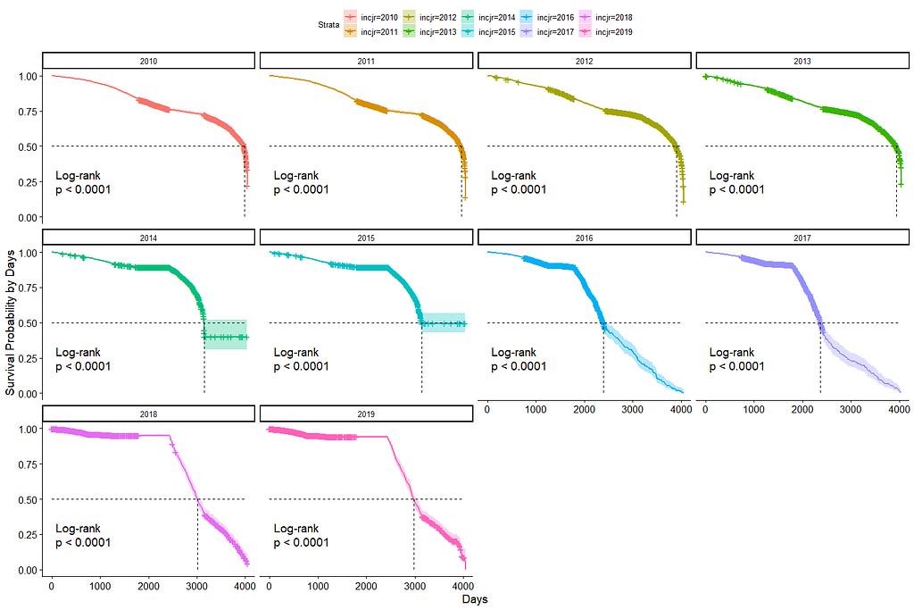
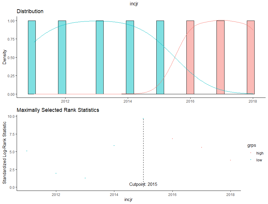
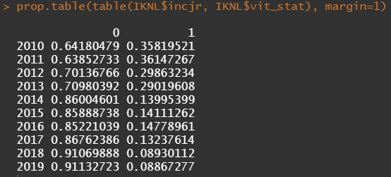
Then I could not resist looking at inclusion year. It makes no sense actually since it is a categorical factor, but let's take a look anyhow.
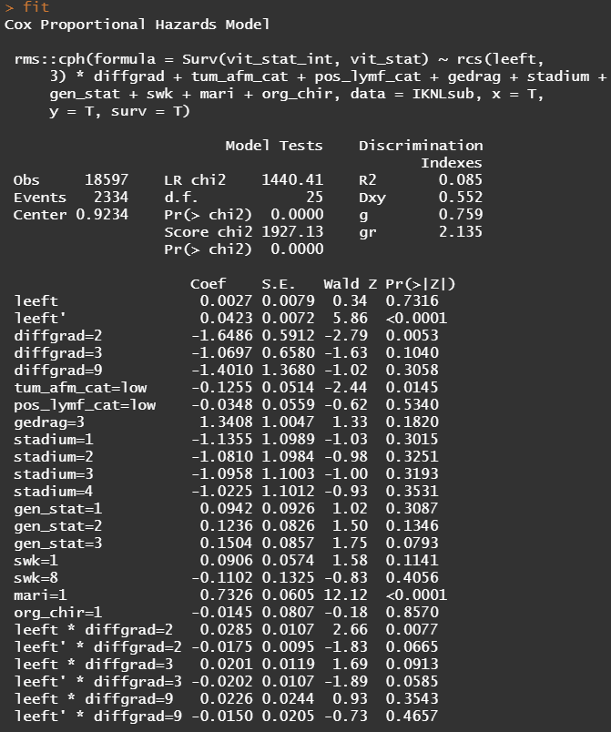
Okay, so I did some exploratory univariate survival curves. Let's advance and conduct a Cox Regression combining multiple variables.
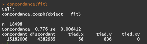
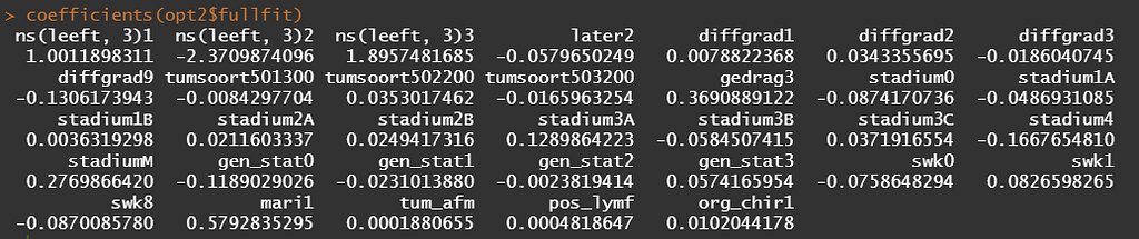
Below is the code for the cos-regression containing splines, looking for the predictive power (concordance), and showing the influence of each of the variables included.
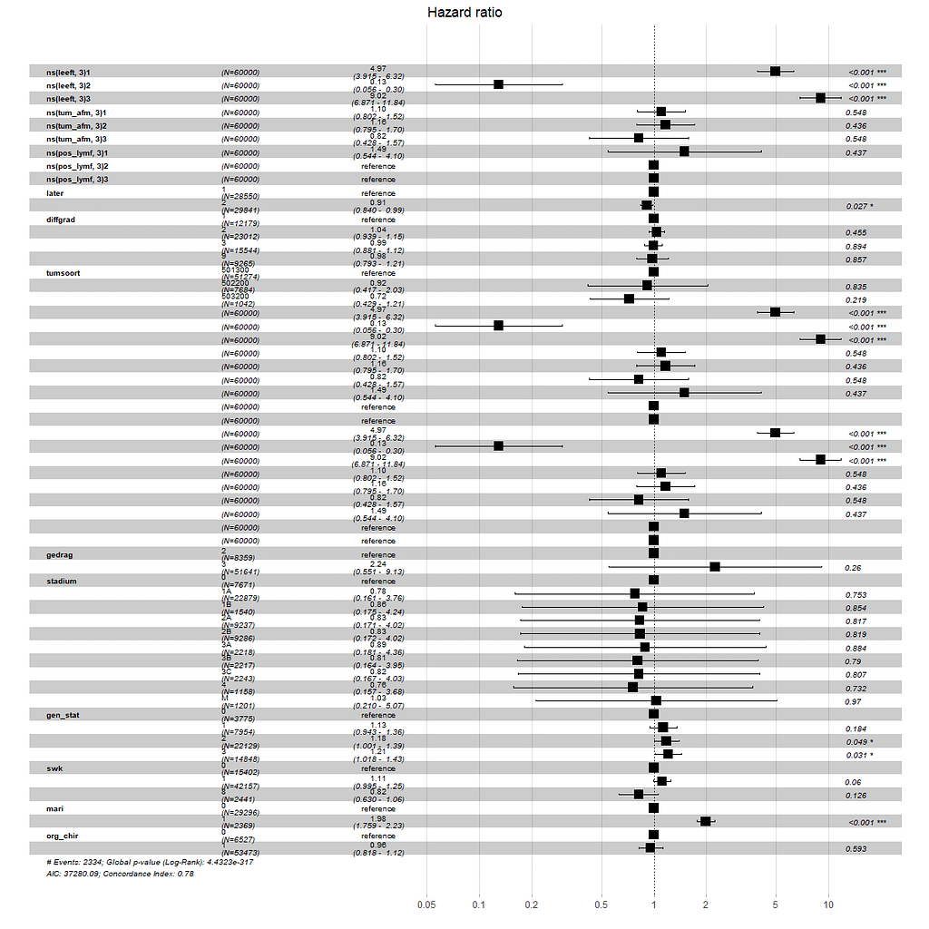
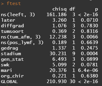
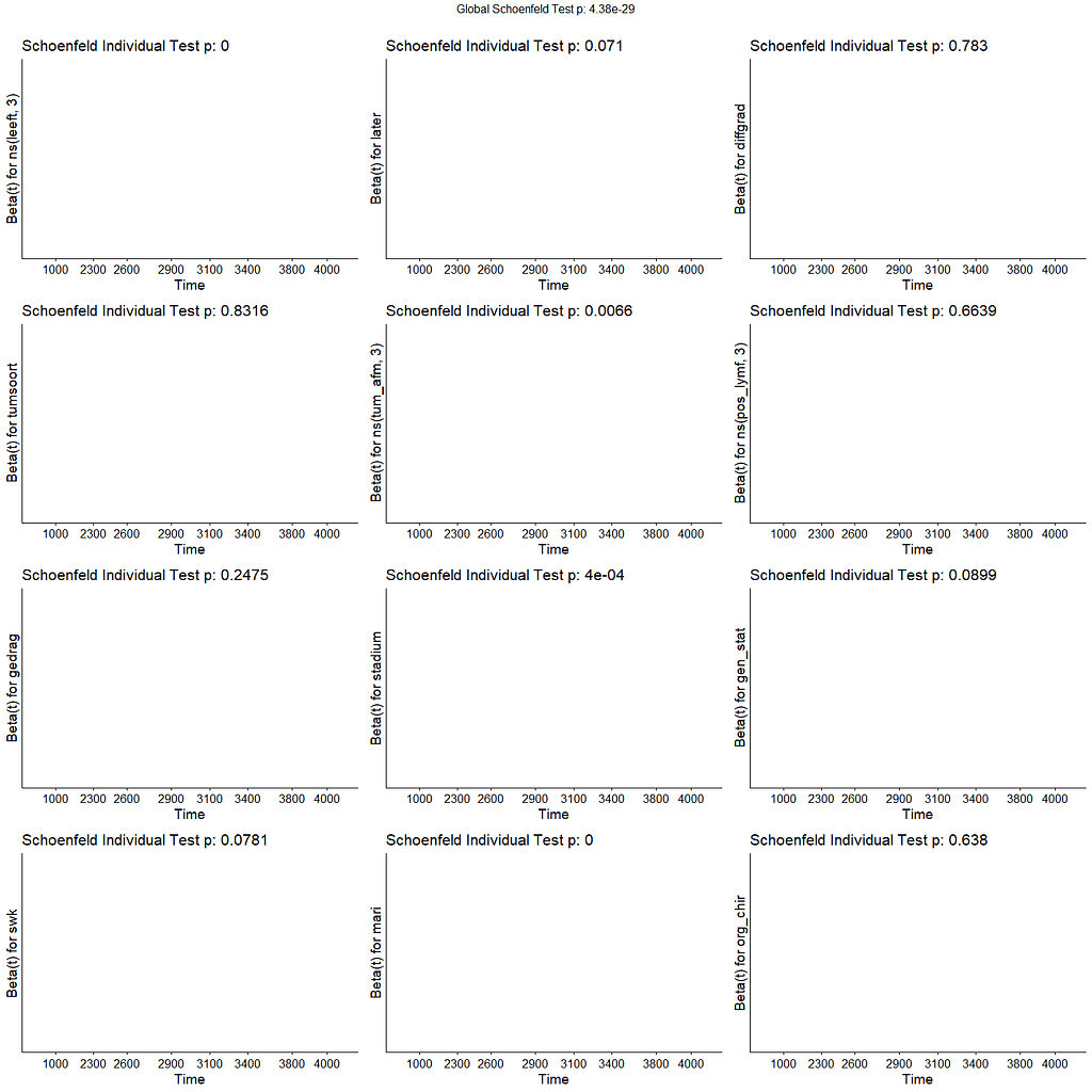
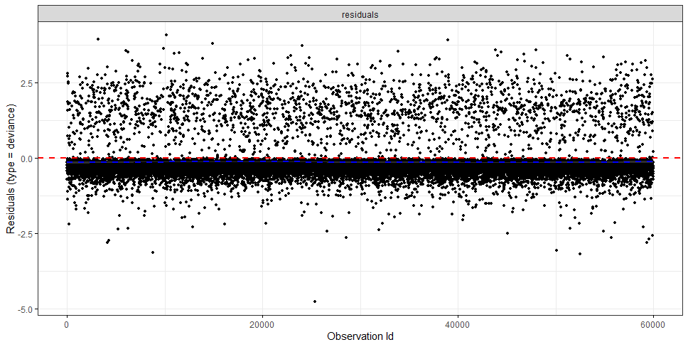
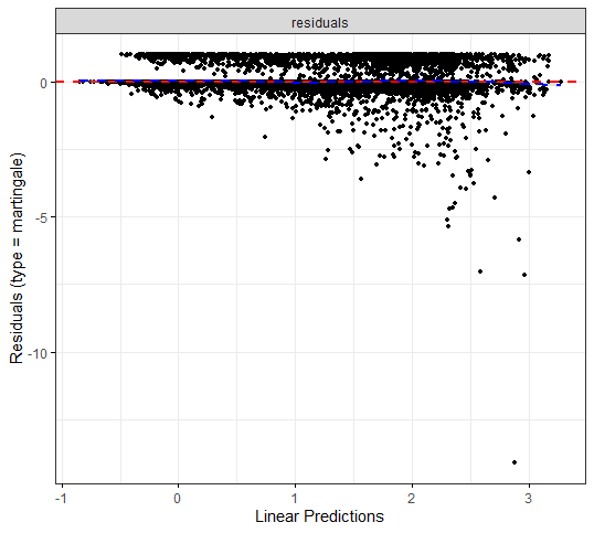
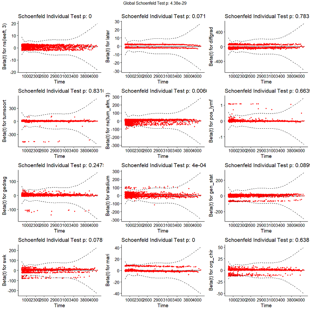
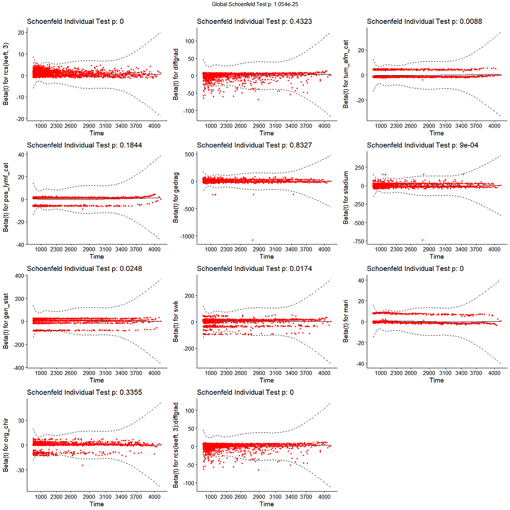
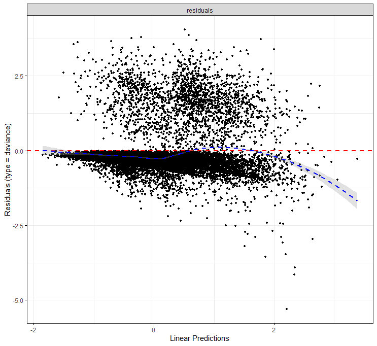
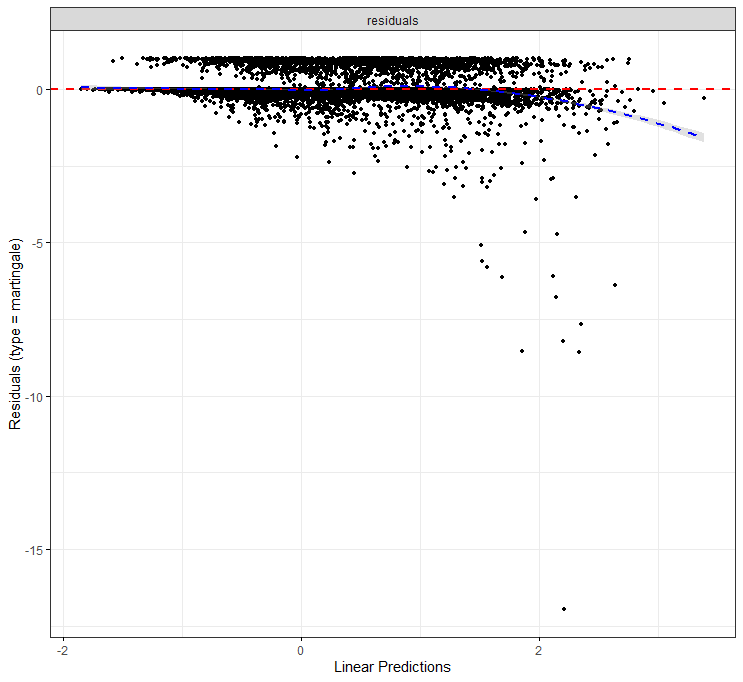
All of the above is useless if we do not first check the assumptions of the semi-parametric Cox regression. This means that the Hazard Ratios should be proportional and stable over time. I will also check if the splines fit the data well.
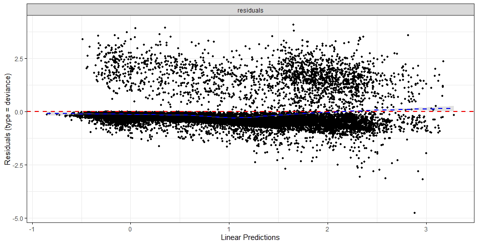
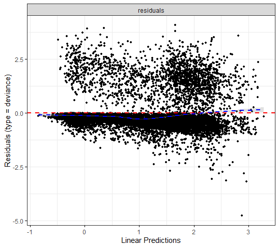
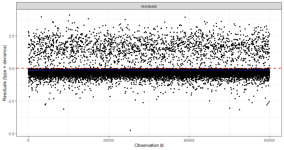
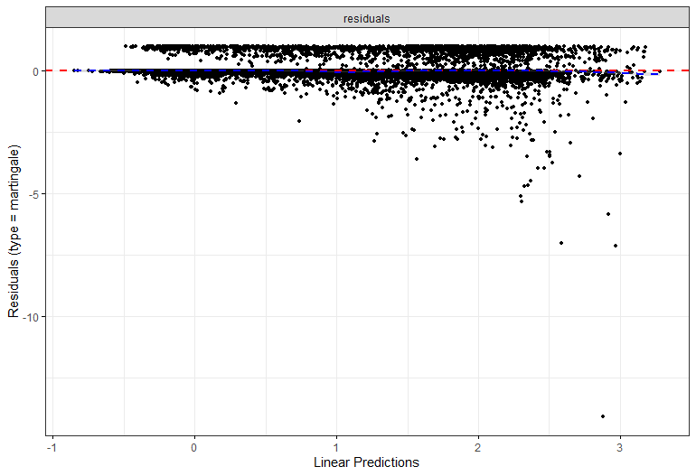
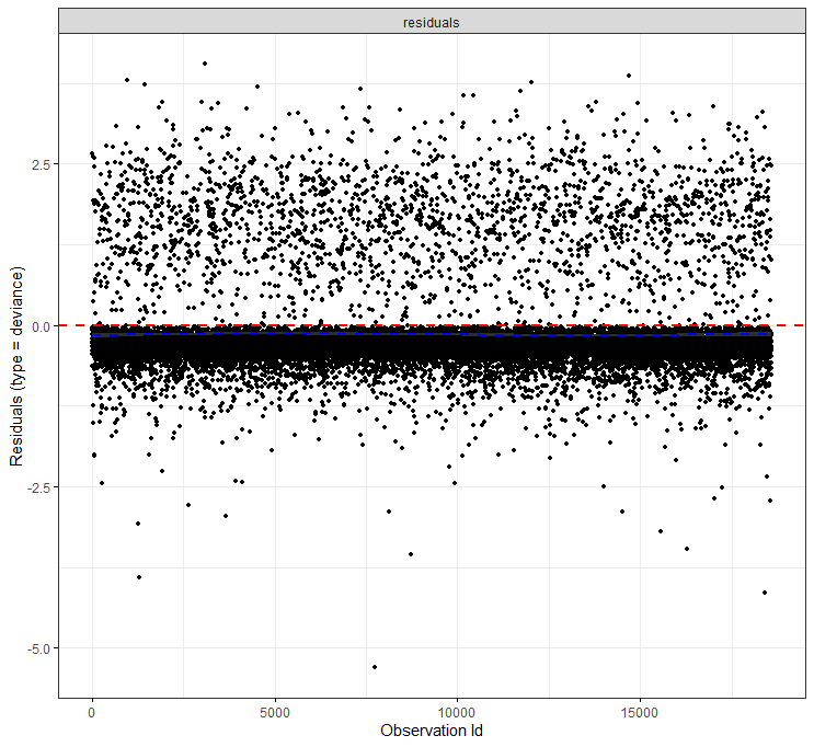
The deviance residuals are the standardized residuals in a Cox regression. You want them to be homogenous.
I wanted to dig a bit deeper into the suitability of the splines. There is a function for that, but it does not accept splines. So, just have a glimpse, let's take a look by using cubic polynomials.
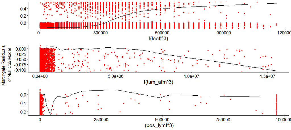
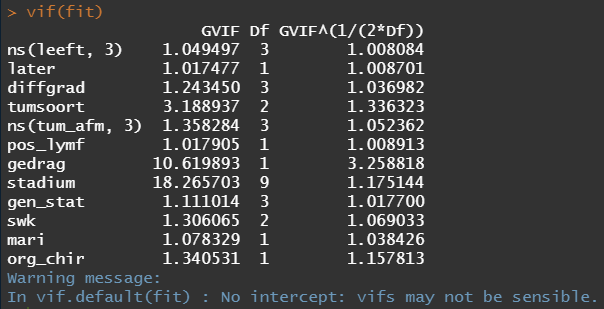
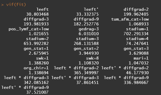
So, in the next model, I deleted the spline for the number of positive lymph nodes. The variables probably need a transformation, but let's see how the model performs now, by looking at the Variance Inflation Factor (VIF). The VIF provides an indicator of the cross-correlations of the variables.
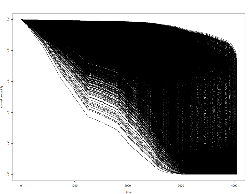
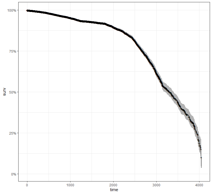
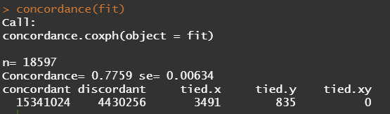
A sensible next step would be to assess the predictive power of the model. Well, actually, I want to see if the model can discriminate between groups, so I made three risk profiles (I am not even sure if they make biological sense) and see what the models predict.
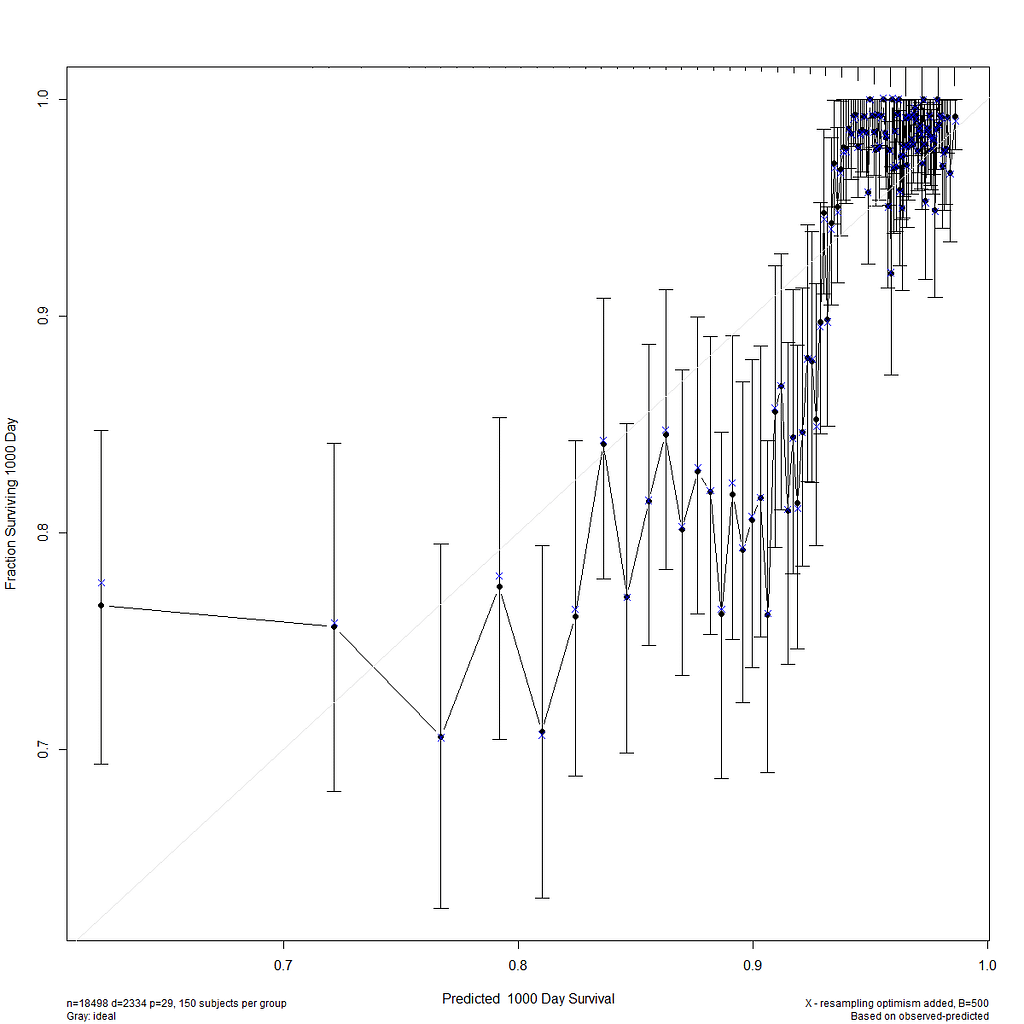
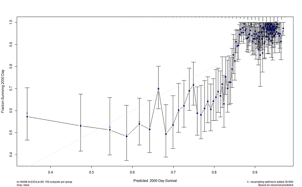
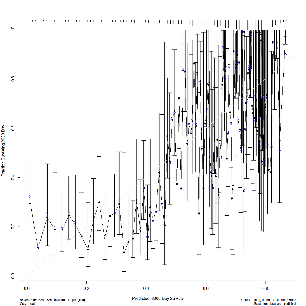
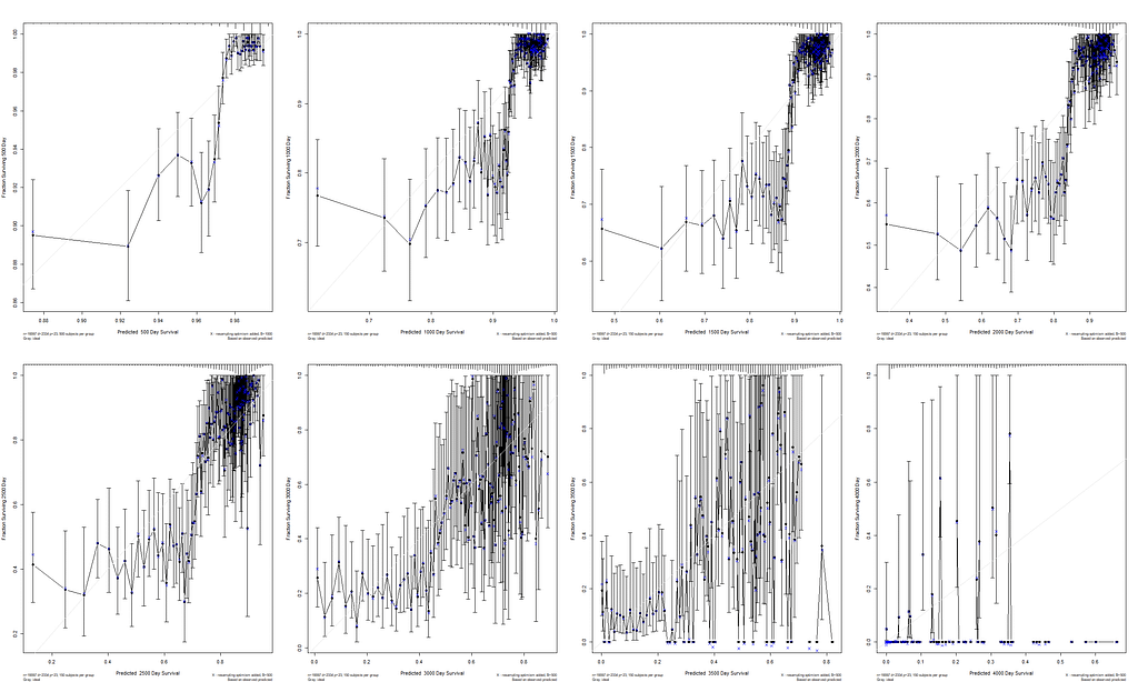
I already showed that to assess a model, you can look at the residuals and the concordance statistic. In the rms package, there are also some great tools to validate your model via bootstrapping. At particular time points. Let's see how this turns out.
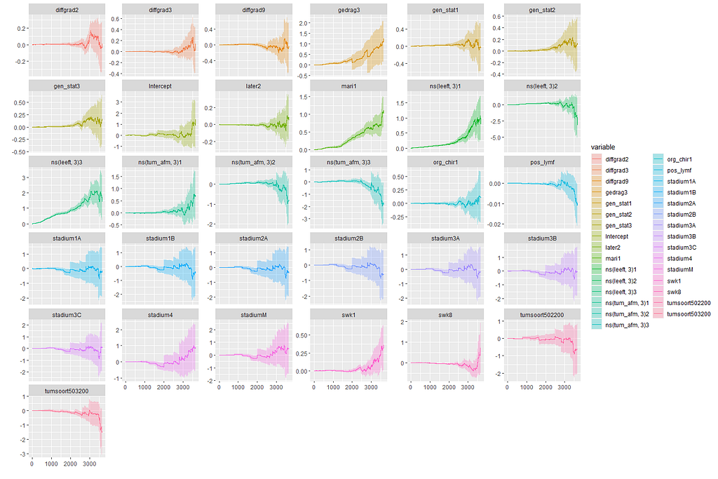
In this day and age of machine learning, we can go and try for some additional models. The first is actually an old, the Nelson-Aalen estimation which is the non-parametric brother of the Cox regression which is semi-parametric. The Nelson-Aalen focuses exclusively on the hazard function and will provide us with plots to show the influence of each predictor on the hazard function. Quite important information.
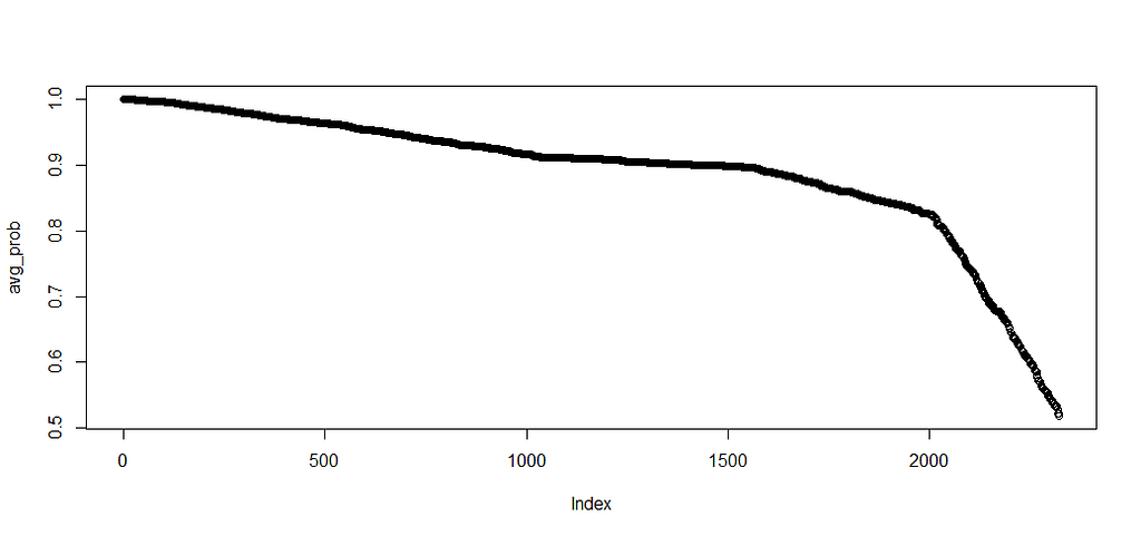
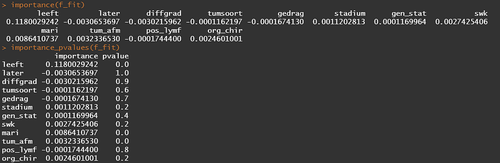
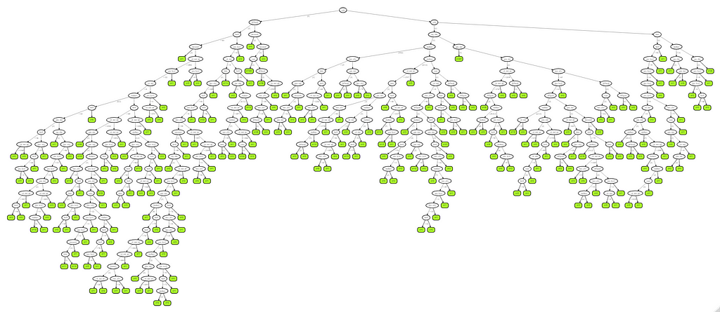
Next up, is true machine learning. The Random Forest. To me, this is just a tool to look at which variables were deemed important, not to use it to predict. The reason is that the Random Forest becomes very easily unexplainable.
On the first try, I used the ranger package.
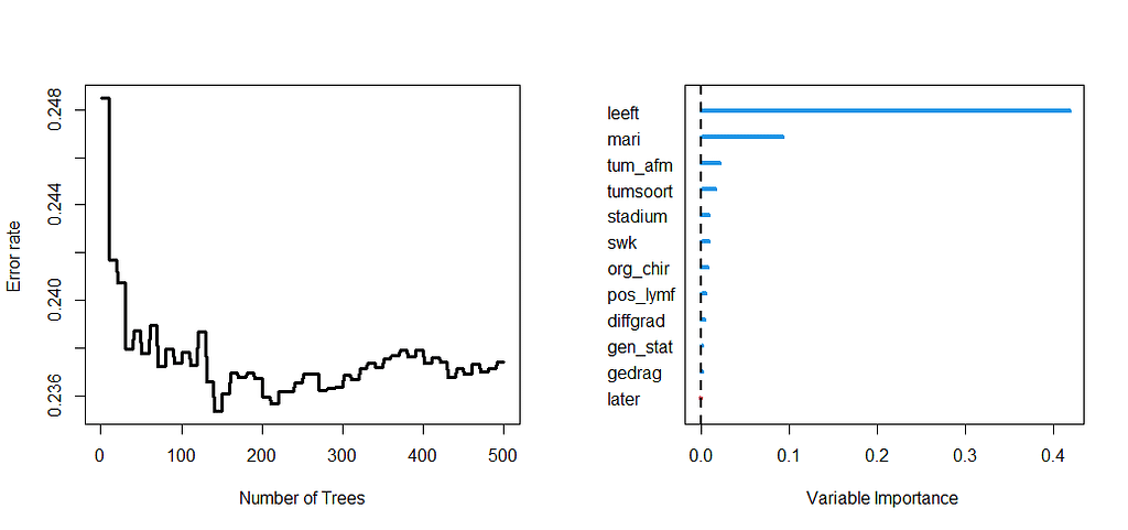
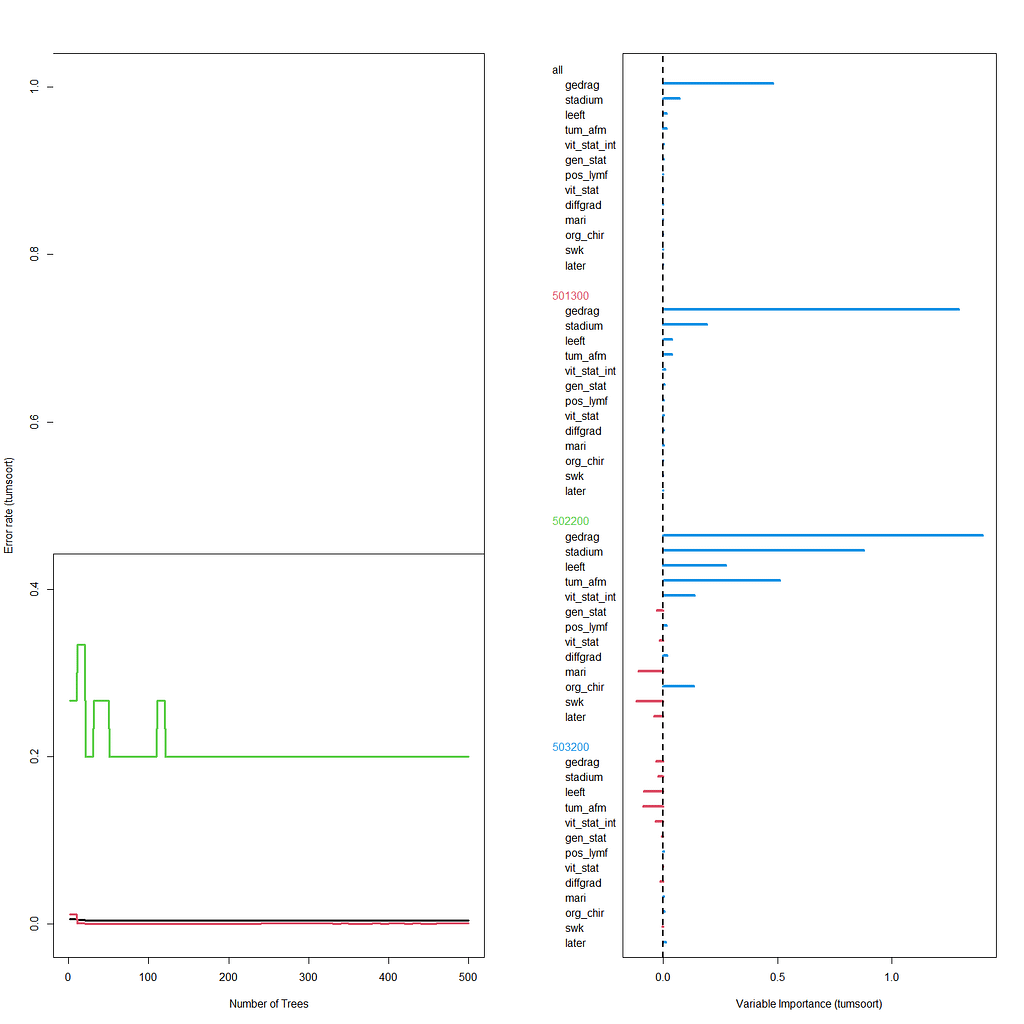
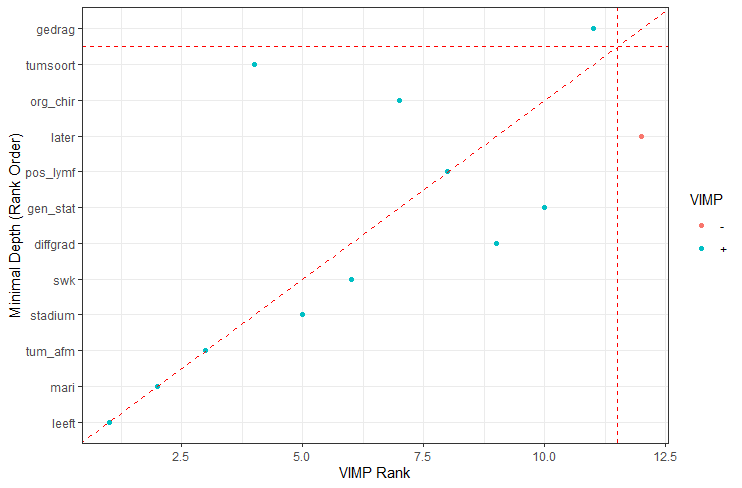
Let's try another package — randomforestSRC. In addition to running a Random Forest for time-to-event data it also provides nice ways to plot the data. The standard option will build 500 trees.
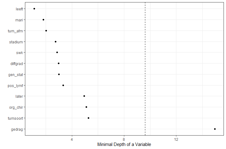
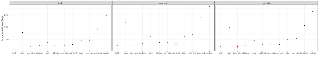
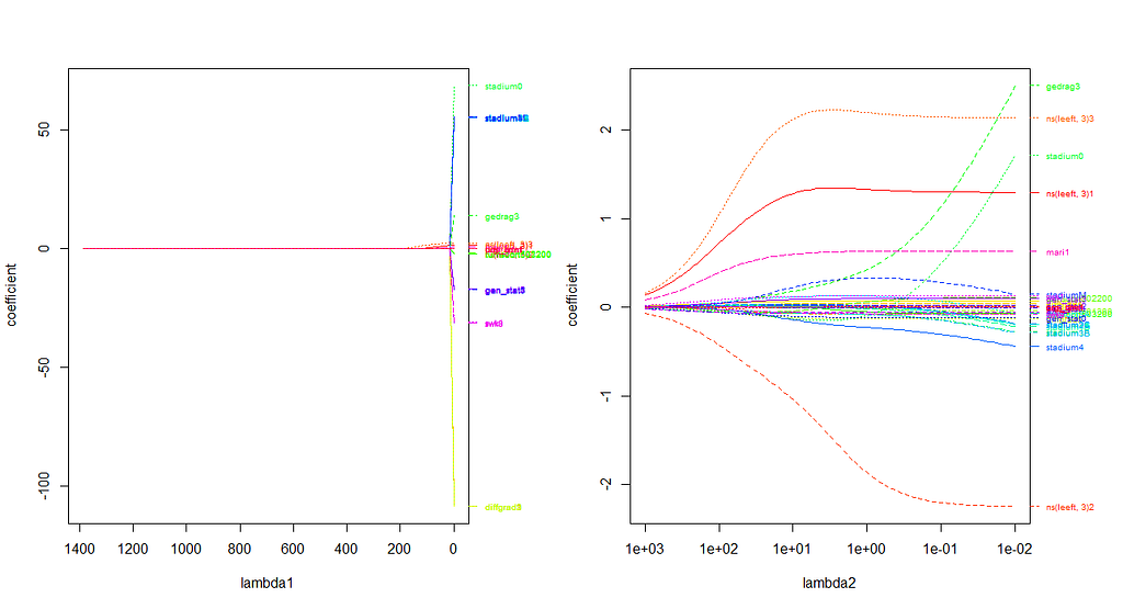
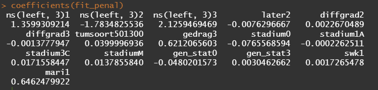
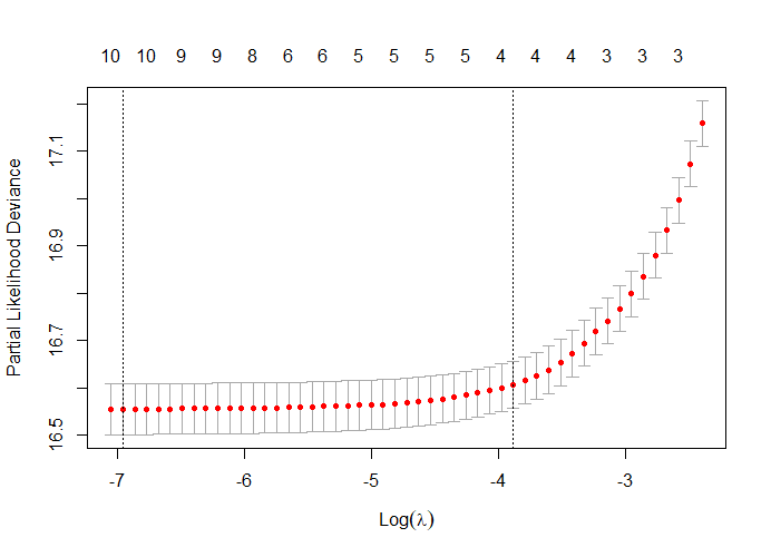
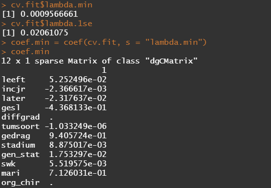
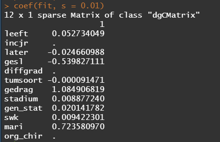
The random forest models above already clearly showed that some variables are not that interesting whereas others are. Now, one of the best methods to look at variables and their importance is to include the L1 and L2 penalization methods — LASSO and Ridge Regression. I posted about these and other variable selection methods before.
These methods were applied to a subset of the data since the entire dataset gave problems with memory size that I could not solve. As you can see I only subsampled once, but a better way would be to loop this dataset and do it many many times so you get bootstrapped estimates of their importance. For now, we keep it easy and make a subset of 10k.
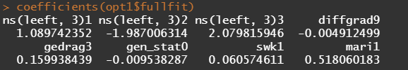
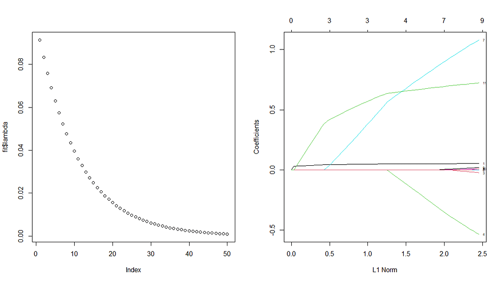
First, we will ask the penalized package to profile the L1 and L2 parameters and then search for their optimum. Once we have that, we apply them both. By applying them both, we deploy what is called an elastic net.

Besides the penalized package there is also the GLMNET package. Lets give this one a try as well.
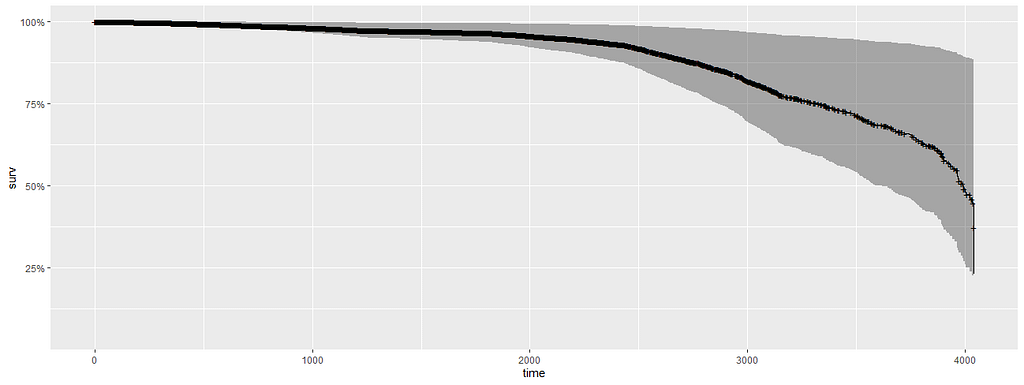
The following part is a bit experimental for this particular dataset since I do not really need it. Below you will see me fit parametric survival models, which try to bring survival curves to the end by modeling beyond the data. Now, modeling beyond the data via a (statistical) model is always tricky, but this kind of model ARE accepted and often used in Health Technology Assessment procedures.
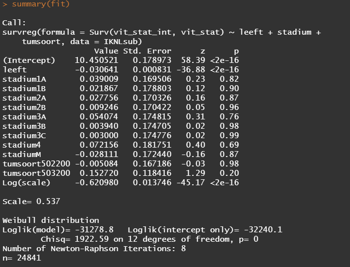
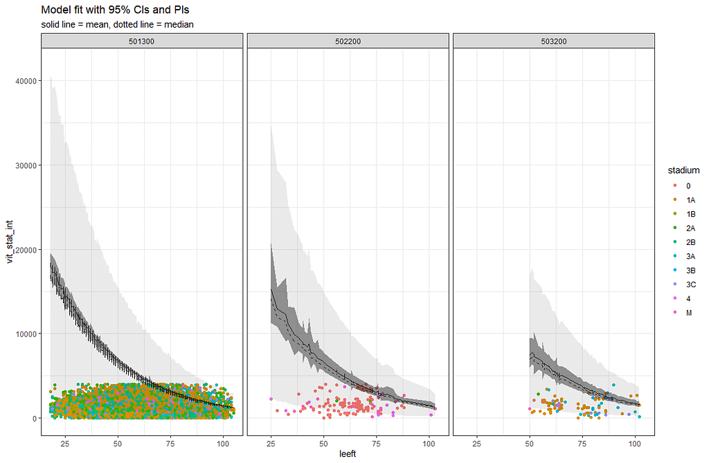
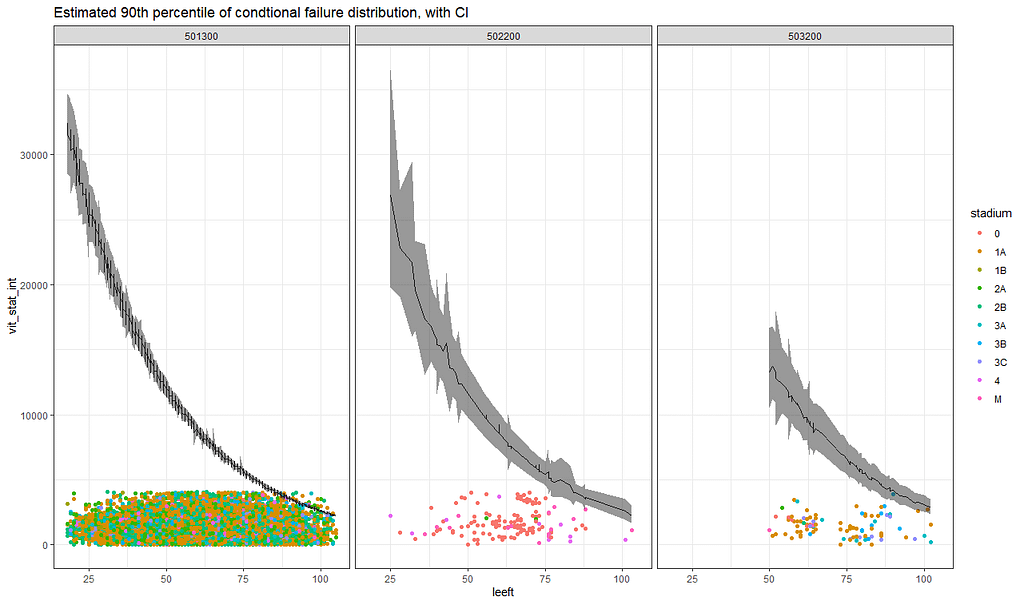
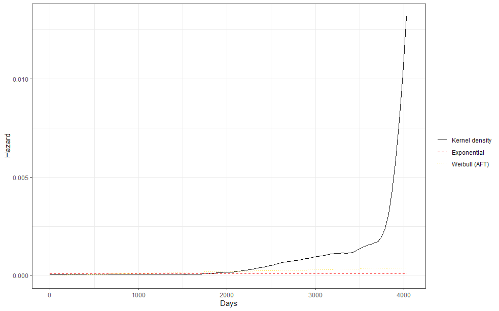
So, the parametric survival model did not really bring me something and perhaps the data are not so good for this kind of modeling anyway. Survival in Breast Cancer is quite high and a parametric survival model would by far extend beyond the data at hand. Most likely too far. So, let's stick to what we have, and seal the deal a bit.
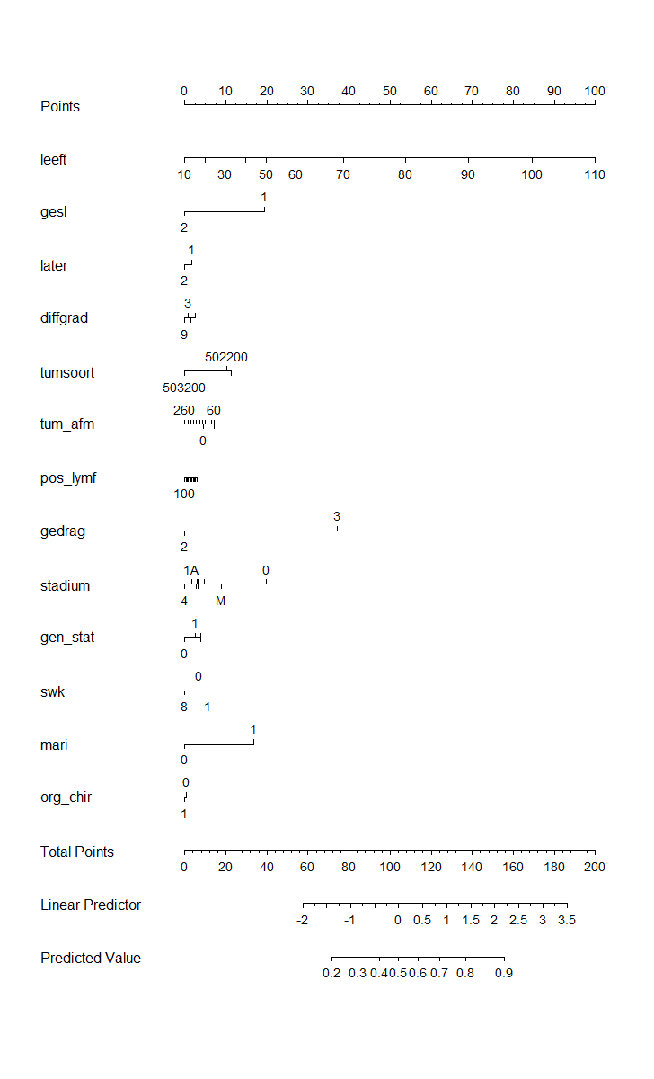
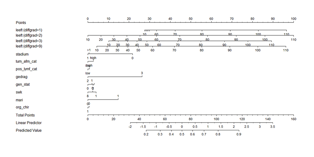
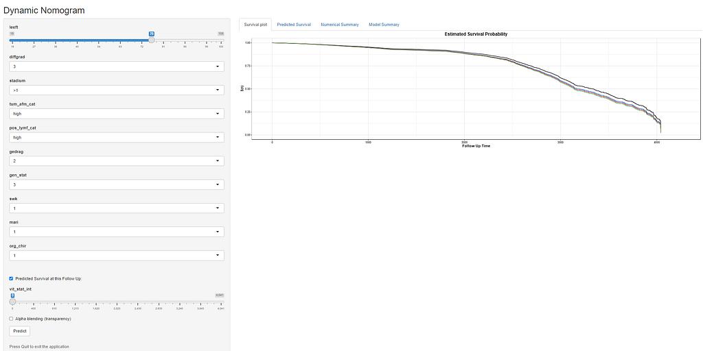
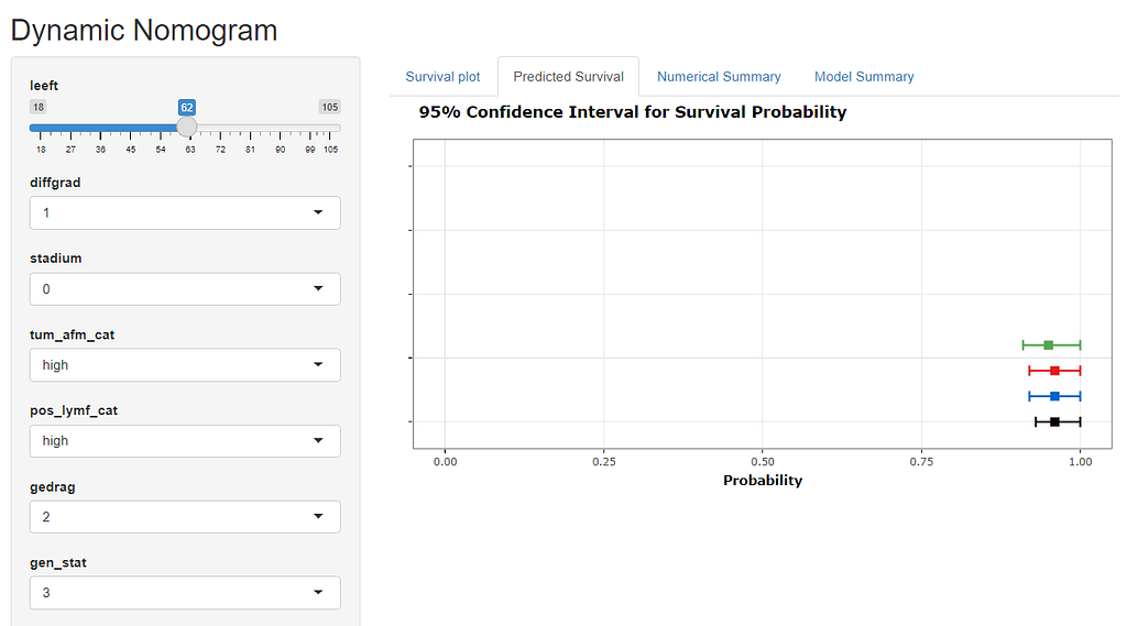
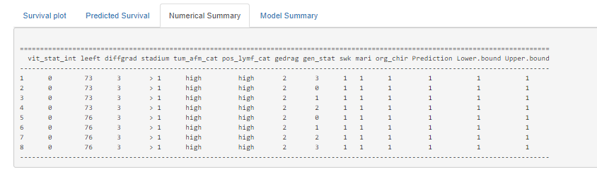
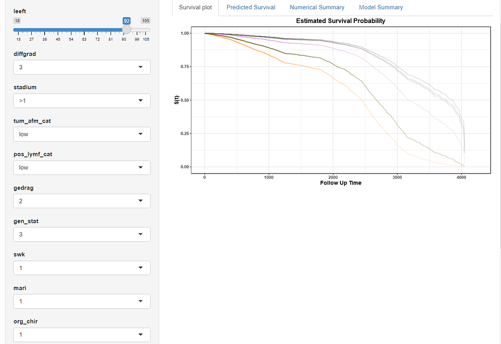
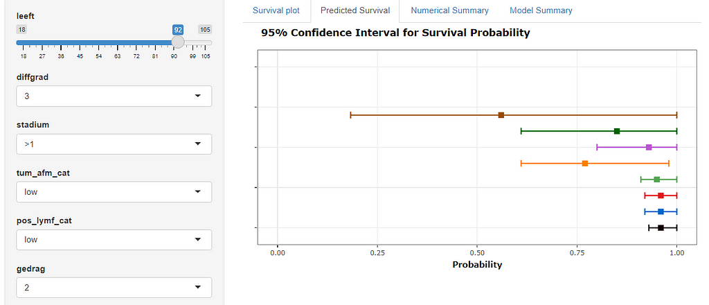
Here, you see me building a nomogram — stable and dynamic using the RMS package and the DynNom package.
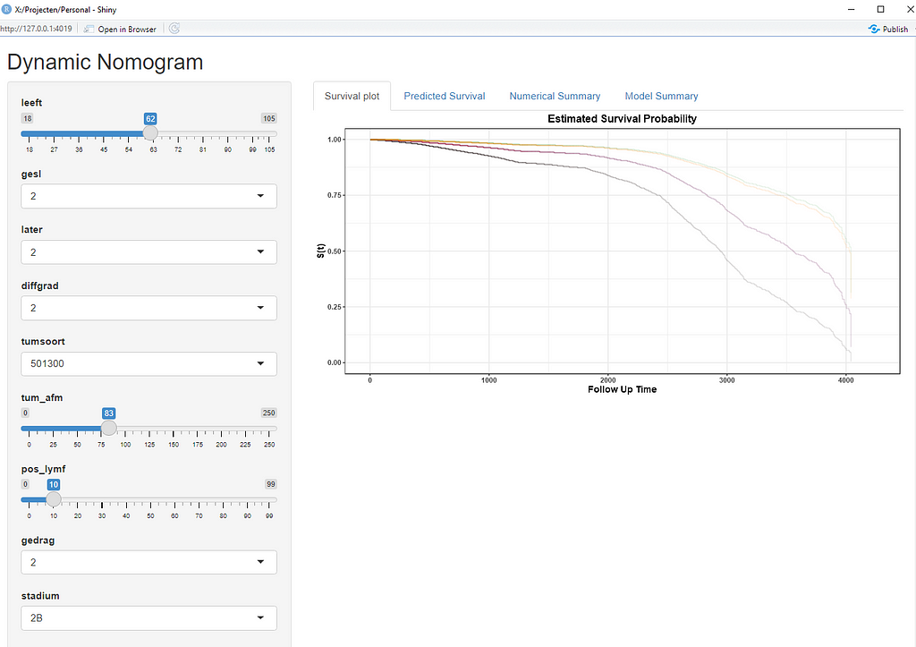
Good, so we now moved through the most important aspects of modeling this dataset, which are visual exploration, univariate survival models, multivariable cox regression models, model assessment and validation, penalization and variable importance, and parametric survival. Now I have shown what a potential sensible pathway could be towards a dynamic nomogram, which can be used in a clinical setting, lets rehash what we have learned and build a second tier of models.
It’s decision time. Let's make the model we want to have and focus a bit more. Based on the above, I will make the following choices:
- Females only → although breast cancer is a possibility in men, we have more data on females.
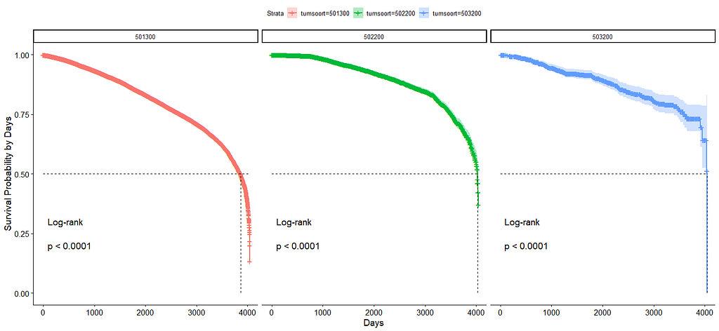
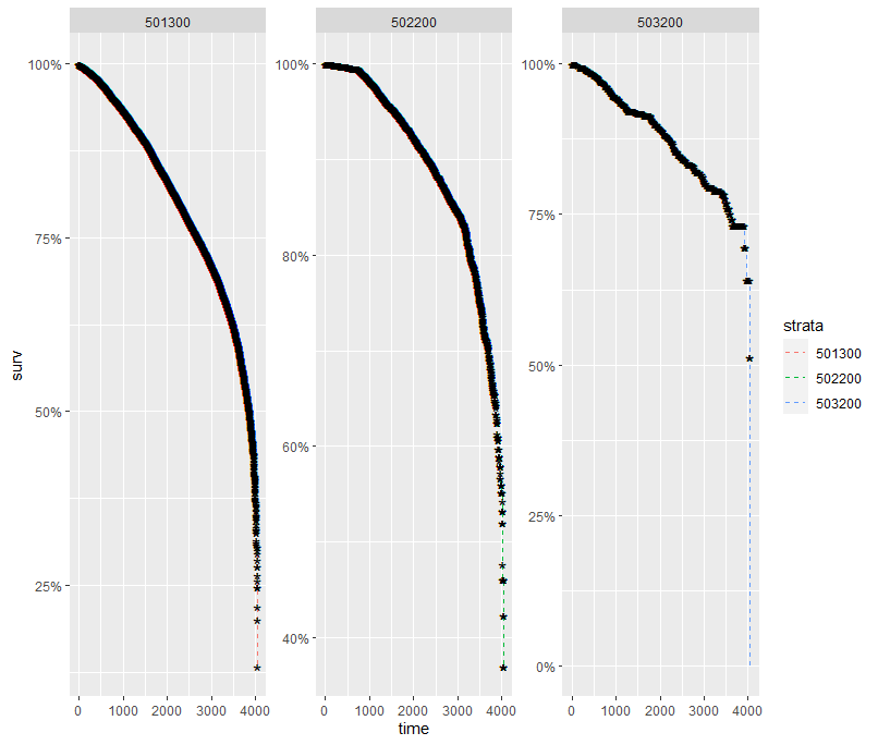
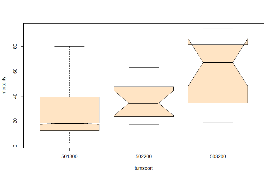
- Tumor kind 501300 only → the majority of the data is situated here.
- Will not include the inclusion year — a proxy for survival
- From the penalized models, only the following variables were deemed important: age, differential grade, tumor position, hormonal indicators, Mari-procedure, and tumor stage.
- From the Random Forest Models, only the following variables were deemed important: age, Mari-procedure, tumor size, tumor stage, sentinel node procedure performed, surgery performed, number of positive lymph nodes found, differential grade, and hormonal receptors.
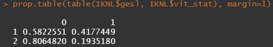
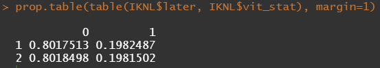
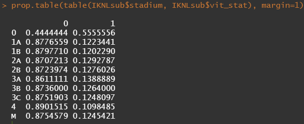
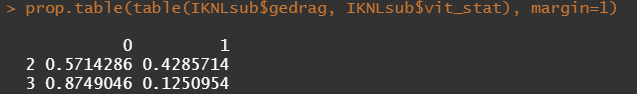
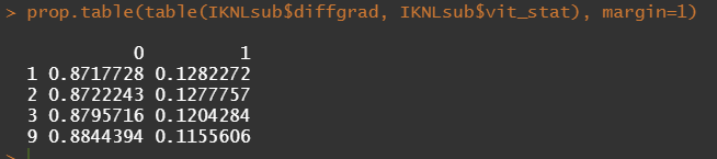
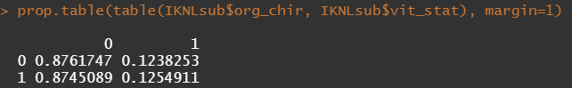
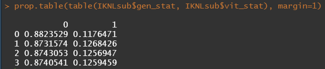
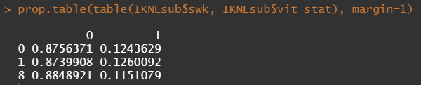
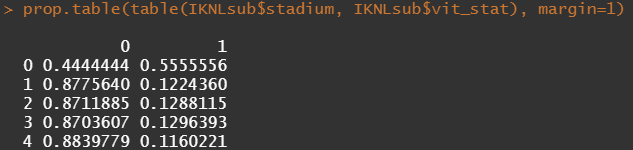
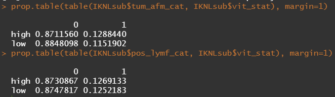
Let's try and re-verify the above by plotting some basic proportional tables. What I want to see is that the variables included show the same proportion of events and non-events across their levels. If this is the case then that variable has limited appeal.
First, check the proportions, within each row of the matrix for tumor kind, sex, lateralization, and inclusion year.
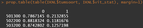
Then, let's look at the variables deemed important.
To ease the model a bit, I will refactor some of the variables included to downplay the number of factors. I will also cut two continuous variables. Normally, this is really not a smart thing to do as you will lose predictive power, but for the sake of the prediction model, I might make sense.
Now, let's rerun the models and see where we will land. I will not be perfect, for sure, since this model is made without an oncologist or anybody else with a lot of content knowledge on how to treat breast cancer.
All right, folks, this is it for now. I am surely not done, but I need some time to contemplate. I will also dedicate a post on showing you how to host the Shiny app.
If something is amiss with this post, or there is a mistake or you have a question, you know where to find me!
Enjoy!
Analysis of a Synthetic Breast Cancer Dataset in R was originally published in Towards AI on Medium, where people are continuing the conversation by highlighting and responding to this story.
Join thousands of data leaders on the AI newsletter. It’s free, we don’t spam, and we never share your email address. Keep up to date with the latest work in AI. From research to projects and ideas. If you are building an AI startup, an AI-related product, or a service, we invite you to consider becoming a sponsor.
Published via Towards AI
Towards AI Academy
We Build Enterprise-Grade AI. We'll Teach You to Master It Too.
15 engineers. 100,000+ students. Towards AI Academy teaches what actually survives production.
Start free — no commitment:
→ 6-Day Agentic AI Engineering Email Guide — one practical lesson per day
→ Agents Architecture Cheatsheet — 3 years of architecture decisions in 6 pages
Our courses:
→ AI Engineering Certification — 90+ lessons from project selection to deployed product. The most comprehensive practical LLM course out there.
→ Agent Engineering Course — Hands on with production agent architectures, memory, routing, and eval frameworks — built from real enterprise engagements.
→ AI for Work — Understand, evaluate, and apply AI for complex work tasks.
Note: Article content contains the views of the contributing authors and not Towards AI.
Related posts
Recent Posts


")