
Mastering Matplotlib: A Comprehensive Guide to Data Visualization
Last Updated on November 5, 2023 by Editorial Team
Author(s): RaviTeja G
Originally published on Towards AI.

Hello, Data EnthusiastU+1F44B We know that data is better understood through visualizations. It doesn’t just help us get insights, Visualizations also make things easy to explain our insights to clients or others. So, We can say that learning to make better visualizations is essential for any data enthusiast!
Enter Matplotlib, short for “Mathematical Plotting Library,” is a fundamental data visualization library of Python. Just as a painter brushes to craft masterpieces on canvas, Matplotlib empowers data scientists and analysts to create different insightful charts with data. Here’s a glimpse of what lies ahead.
Table of Contents
- Basic Plotting
∘ 1.1 Creating Simple Line Plots
∘ 1.2 Customization options for labels, colors, and styles.
∘ 1.3 Saving Matplotlib plots as image files - Plot Types
∘ 2.1 Bar Chart
∘ 2.2 Histograms
∘ 2.3 Scatter plots
∘ 2.4 Pie Charts
∘ 2.5 Box Plot (Box and Whisker Plot)
∘ 2.6 Heatmap, and Displaying Images
∘ 2.7 Stack Plot
· Conclusion
∘ Announcement #100daysMLDL
— Let’s get into the visualization world! —
1. Basic Plotting
First things first, we need to import matplotlib.pyplot to access the plotting functions.
1.1 Creating Simple Line Plots
As the name suggests, data points are connected by straight lines which are useful for displaying data that varies continuously over a range, making it easy to identify patterns and trends. Use plt.plot(x,y) for a simple line plot, and plt.show() to show the plot.
import matplotlib.pyplot as plt

# Let's take a data representing monthly website traffic (in thousands)
months = ['Jan', 'Feb', 'Mar', 'Apr', 'May', 'Jun']
traffic = [150, 200, 180, 220, 250, 210]

# To Create a line plot
plt.plot(months, traffic)
plt.show()

- But as we can see, it doesn’t have any labels or titles as such.
1.2 Customization options for labels, colors, and styles.
We can convey the information with much clarity by customizing the plots. Matplotlib offers numerous customization options, allowing you to control color, line style, markers, and more.
- Add Labels and Title: Use
plt.xlabel(),plt.ylabel()andplt.title()
import matplotlib.pyplot as plt

# Sample data representing monthly website traffic (in thousands)
months = ['Jan', 'Feb', 'Mar', 'Apr', 'May', 'Jun']
traffic = [150, 200, 180, 220, 250, 210]

# Create a line plot
plt.plot(months, traffic)

# Add labels and a title
plt.xlabel('Month')
plt.ylabel('Monthly Traffic (in Thousands)')
plt.title('Monthly Website Traffic')

plt.show()
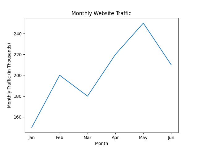
Note: Remember that plt.show() should always be at the end of your plot settings. If you give label commands after the plt.show()then they won’t be displayed!
- Changing color and linestyle: Use the parameter
markerto mark the points,linetsyleto change the styling of line, and add grid to the plots by usingplt.grid(True)
# Create a line plot with custom appearance
plt.plot(months, traffic, marker='o', linestyle='--', color='g')

# Add labels and a title
plt.xlabel('Month')
plt.ylabel('Monthly Traffic (in Thousands)')
plt.title('Monthly Website Traffic')

# Add grid to the plot
plt.grid(True)
# Display the plot
plt.show()
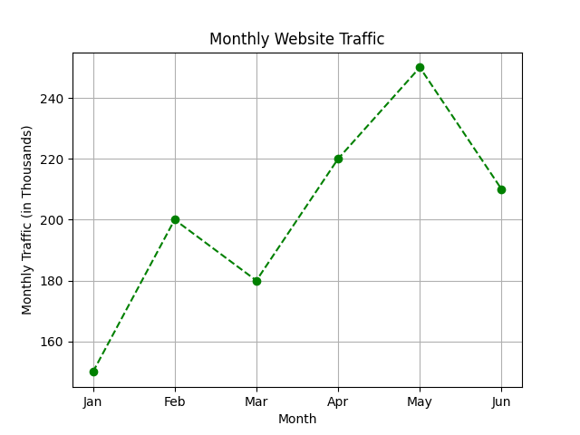
- Changing the plot style: There are various styles available in Matplotlib, to check the available styles, use the command
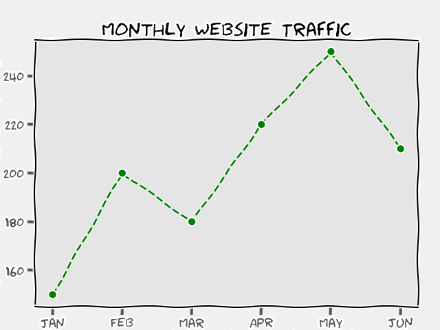
plt.style.available. Useplt.style.use('desired_style')to change the style of the entire plot. To use a comic-style plot, you can useplt.xkcd(), this will give a cool plot like below.These will change the plot styles for the entire notebook, if you wish to change to default, use
plt.style.use('default')
Note: Make sure to use these style commands before the plt.show()
- To change the figure size: We often have to adjust the plot size, right? And to do that, we need to use
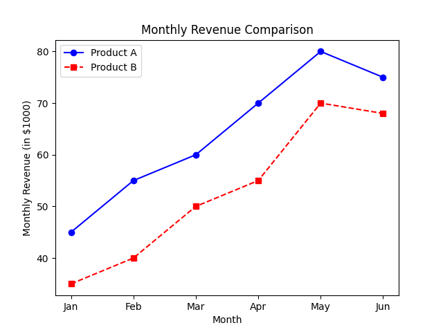
plt.figure(figsize=(x_size,y_size)), Make sure to use this before the .plot command. - Using Label: In the case of plotting multiple lines in the same graph, You can do so by using the plot command two times for the variables you want. But the issue is to differentiate them properly, for this, we have a parameter called a
label, along with that you also need to useplt.legend()
# Sample data for two products' monthly revenue (in thousands of dollars)
months = ['Jan', 'Feb', 'Mar', 'Apr', 'May', 'Jun']
product_a_revenue = [45, 55, 60, 70, 80, 75]
product_b_revenue = [35, 40, 50, 55, 70, 68]

# Create a line plot for Product A with a blue line and circular markers
plt.plot(months, product_a_revenue, marker='o', linestyle='-', color='blue', label='Product A')

# Create a line plot for Product B with a red dashed line and square markers
plt.plot(months, product_b_revenue, marker='s', linestyle='--', color='red', label='Product B')

# Add labels and a title
plt.xlabel('Month')
plt.ylabel('Monthly Revenue (in $1000)')
plt.title('Monthly Revenue Comparison')

# Display a legend to differentiate between Product A and Product B
plt.legend()

# Display the plot
plt.show()
1.3 Saving Matplotlib plots as image files
Matplotlib enables you to save the plot as an image file.
- In Jupyter Notebook: When working in Jupyter Notebook if you wish to save the plot as an image file, you have to use
plt.savefig('path/to/directory/plot_name.png'). You can specify the complete file path, and you can specify the desired file name and format( Eg: .jpg, .png, .pdf ) - In Google Colab: When working in Google Colab, if you wish to save the plot as an image file, you have to first mount the drive and use
plt.savefig().
from google.colab import drive

# Mount Google Drive
drive.mount('/content/drive')

# Save the plot as an image file in Colab
# After my drive, you can change the location to your desired folder.
plt.savefig('/content/drive/My Drive/'+'my_plot.png')
2. Plot Types
We have seen the basic line plot in the previous section, but Matplotlib has a lot more kinds of plots to offer such as Bar Charts, Histograms, Scatter Plots, Pie Charts, Box Plot (Box and whisker Plot), Heatmaps, Displaying images, etc. Now, Let’s understand when to use them along with a few use cases.
2.1 Bar Chart
Bar charts represent categorical data with rectangular bars, where the length or height of each bar represents a value. You can use the command plt.bar(x,y) to generate vertical bar charts and plt.barh(x,y) for horizontal bar charts.
Few Use Cases:
1. Comparing sales performance of different products.
2. Showing population distribution by country.
Eg: Multi Bar plot in a single Graph
# Expense categories
categories = ['Housing', 'Transportation', 'Food', 'Entertainment', 'Utilities']

# Monthly expenses for Alice, Bob, and Carol
alice_expenses = [1200, 300, 400, 200, 150]
bob_expenses = [1100, 320, 380, 180, 140]
carol_expenses = [1300, 280, 420, 220, 160]

# Create an array for the x-axis positions
x = np.arange(len(categories))

# Width of the bars, we need it as we intend to plot multiple bars.
bar_width = 0.2

# Create bars for Alice's expenses, Subract bar width from x array,
# such that it will be placed to the left.
plt.bar(x - bar_width, alice_expenses, width=bar_width, label='Alice', color='skyblue')

# Create bars for Bob's expenses
plt.bar(x, bob_expenses, width=bar_width, label='Bob', color='lightcoral')

# Create bars for Carol's expenses, Add bar width to x array,
# such that it will be placed to the right.
plt.bar(x + bar_width, carol_expenses, width=bar_width, label='Carol', color='lightgreen')

# Add labels, a title, and a legend
plt.xlabel('Expense Categories')
plt.ylabel('Monthly Expenses (USD)')
plt.title('Monthly Expenses Comparison')

# To show the category names at x-axis positions.
plt.xticks(x, categories)
plt.legend()

# Display the plot
plt.show()
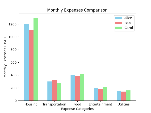
- so, to get these bars, for the first bar we subtracted the x-labels with the bar width, and for the last bar, we added the label with the bar width. We set the width parameter to be equal to the bar width for all.
2.2 Histograms
Histograms are used to visualize the distribution of continuous or numerical data and they help us identify patterns in data. In a histogram plot the data is grouped into “bins,” and the height of each bar represents the frequency or count of data points in that bin. It takes the lower and upper limits of the given data and divides it into the no of bins given.
You can use the command plt.hist(x) to generate histograms. Unlike the bar plot, here you don’t need the ‘y’, as it only represents the frequency of one continuous data. The default bins are 10, and they can be changed. You can override the bins range as well with your desired bins range. You can also add the edgecolor for bars.
Along with the histogram plot, in the same graph if you want to add any line, say the mean or median, you can do so by calculating the value and passing to to plt.axvline(calculated_mean,label=desired_label) . This can be used with any other plot.
Few Use Cases:
1. Analyzing age distribution in a population.
2. Examining exam score distribution in a classroom.
# Sample exam scores data
exam_scores = [68, 72, 75, 80, 82, 84, 86, 90, 92, 95, 98, 100]

# Custom bin ranges
bin_ranges = [60, 70, 80, 90, 100]

# Create a histogram with custom bin ranges by assigning it to bins.
plt.hist(exam_scores, bins=bin_ranges, color='lightblue', edgecolor='black', alpha=0.7)

# Add labels and a title
plt.xlabel('Exam Scores')
plt.ylabel('Frequency')
plt.title('Exam Scores Histogram with Custom Bins')

# Calculate and add a median line
median_score = np.median(exam_scores)
plt.axvline(median_score, color='red', linestyle='dashed', linewidth=2, label=f'Median Score: {median_score}')

# Add a legend
plt.legend()

# Display the plot
plt.show()

2.3 Scatter plots
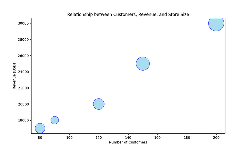
Scatter plots display individual data points as dots on a two-dimensional plane. And they are used to explore relationships or correlations between two numerical variables. In this, each axis represents one variable, and the dots represent data points.
You can use plt.scatter(x,y) to generate scatter plots. To change the size of the points use the parameter s , c for the color, and marker to change the marker instead of a dot. And alpha parameter controls the intensity of the color. For the size, you can even send a different list of sizes for each point.
Few Use Cases:
1. Investigating the relationship between study hours and exam scores.
2. Analyzing the correlation between temperature and ice cream sales.
# Let's take a sample data for stores
# Store Size Represents the size of each store in 100sq.ft
stores = ['Store A', 'Store B', 'Store C', 'Store D', 'Store E']
customers = [120, 90, 150, 80, 200]
revenue = [20000, 18000, 25000, 17000, 30000]
store_size = [10, 5, 15, 8, 20]

# Here we are scaling the store sizes for point sizes in the scatter plot
point_sizes = [size * 100 for size in store_size]

# To Create a scatter plot with different point sizes,
# Here alpha controls the intensity of the color.
plt.scatter(customers, revenue, s=point_sizes, c='skyblue', alpha=0.7, edgecolors='b')

# Add labels, a title, and a legend
plt.xlabel('Number of Customers')
plt.ylabel('Revenue (USD)')
plt.title('Relationship between Customers, Revenue, and Store Size')

# To Display the plot
plt.show()
2.4 Pie Charts
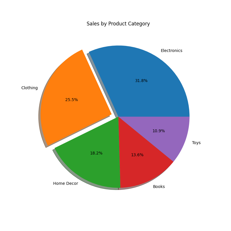
Pie charts represent parts of a whole as slices of a circular pie. They are suitable for showing the composition of a single categorical variable in terms of percentages. But this won’t look good when there are more than six categories as they get clumsy, in such cases horizontal bar might be preferred.
Use the command plt.pie(x,labels=your_category_names, colors=desired_colors_list) , if you have a desired colors list, you can provide that and you can also change the edge color of the pie chart with the parameter wedgeprops={'edgecolor':your_color} .
We can also highlight particular segments using explode parameter by passing a tuple where each element is the amount by which it has to explode. And autopct parameter enables you to choose how many values after the decimal are to be shown in the plot.
Few Use Cases:
1. Displaying the distribution of a budget by expense categories.
2. Showing the market share of various smartphone brands.
Eg: Exploding a particular segment for better storytelling during presentations.
# Product categories
categories = ['Electronics', 'Clothing', 'Home Decor', 'Books', 'Toys']

# Sales data for each category
sales = [3500, 2800, 2000, 1500, 1200]

# Explode a specific segment (e.g., 'Clothing'),
# second value (0.1) is the amount by which the segment 'Clothing'.
explode = (0, 0.1, 0, 0, 0)

# Create a pie chart with explode and shadow
plt.pie(sales, labels=categories, explode=explode, shadow=True, autopct='%1.1f%%')
plt.title('Sales by Product Category')

# Display the plot
plt.show()
2.5 Box Plot (Box and Whisker Plot)
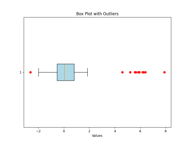
Box plots are the ones that look complicated, right? Simply put they summarize the distribution of numerical data by displaying quartiles, outliers, and potential skewness. They provide insights into data spread, central tendency, and variability. Box plots are especially useful for identifying outliers and comparing distributions.
You can use plt.boxplot(data) to plot the box plot. You can customize the appearance of the box and outliers using boxprops and flierprops , use vert=False to make the box plot horizontal and patch_artist=True to fill the box with color.
Few Use Cases:
1. Analyzing the distribution of salaries in a company.
2. Assessing the variability of housing prices in different neighborhoods.
# Generate random data with outliers
np.random.seed(42)
data = np.concatenate([np.random.normal(0, 1, 100), np.random.normal(6, 1, 10)])

# Create a box plot with outliers
plt.figure(figsize=(8, 6)) # Set the figure size
plt.boxplot(data, vert=False, patch_artist=True,
 boxprops={'facecolor': 'lightblue'},
 flierprops={'marker': 'o', 'markerfacecolor': 'red',
 'markeredgecolor': 'red'})

# Add labels and a title
plt.xlabel('Values')
plt.title('Box Plot with Outliers')

# Display the plot
plt.grid(True) # Add a grid for better readability
plt.show()
2.6 Heatmap, and Displaying Images
plt.imshow() is a Matplotlib function that is used for displaying 2D image data, visualizing 2D arrays, or showing images in various formats.
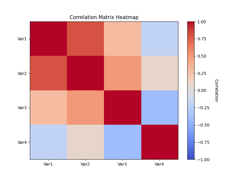
- Using imshow for heatmap: Heatmap is a visualization for correlation matrix, which will give us a sense of how each variable is correlated with the other variable. Here, we’ll create a heatmap to visualize a correlation matrix, and we’ll use a color map to show this relationship visually. Pass the correlation matrix to imshow to visualize the heatmap.
# Create a sample correlation matrix
correlation_matrix = np.array([[1.0, 0.8, 0.3, -0.2],
 [0.8, 1.0, 0.5, 0.1],
 [0.3, 0.5, 1.0, -0.4],
 [-0.2, 0.1, -0.4, 1.0]])

# Create a heatmap for the correlation matrix
plt.imshow(correlation_matrix, cmap='coolwarm', vmin=-1, vmax=1, aspect='auto', origin='upper')

# Add a colorbar with the following commands
cbar = plt.colorbar()
cbar.set_label('Correlation', rotation=270, labelpad=20)

# Add labels and a title
plt.title('Correlation Matrix Heatmap')
plt.xticks(range(len(correlation_matrix)), ['Var1', 'Var2', 'Var3', 'Var4'])
plt.yticks(range(len(correlation_matrix)), ['Var1', 'Var2', 'Var3', 'Var4'])

plt.show()
- Displaying Images with imshow: Matplotlib’s
imreadmethod frommatplotlib.imagemodule is often used to read and load images in various formats, including JPEG, PNG, BMP, TIFF, and more, which can then be displayed usingimshow. If you have image data in an array already, then it can be displayed directly with imshow.
import matplotlib.image as mpimg

# Load and display an image
img = mpimg.imread('sample_image.jpg')
# Display the image
plt.imshow(img)
# Turn off axis labels and ticks
plt.axis('off')
# Add a title
plt.title('Sample Image')
# Show the plot
plt.show()
2.7 Stack Plot
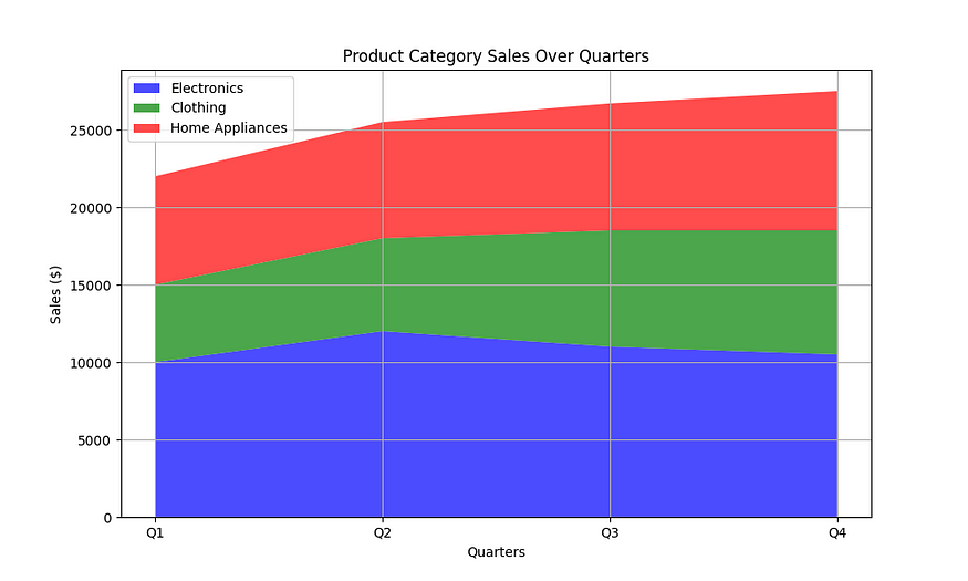
Imagine you want to visualize how three product categories (electronics, clothing, and home appliances) contribute to total sales over four quarters (Q1 to Q4). Then you can represent each category’s sales as layers in the plot, and the plot helps us understand their contributions and trends over time. That’s exactly what the stack plot does.
A stack plot, which is also known as a stacked area plot, is a type of data visualization that displays multiple datasets as layers stacked on top of one another, with each layer representing a different category or component of the data. Stack plots are particularly useful for visualizing how individual components contribute to a whole over a continuous time period or categorical domain. Use it as plt.stackplot(x,y1,y2) , as many stacks as you want!
# Sample data for stack plot
quarters = ['Q1', 'Q2', 'Q3', 'Q4']
electronics = [10000, 12000, 11000, 10500]
clothing = [5000, 6000, 7500, 8000]
home_appliances = [7000, 7500, 8200, 9000]

# Create a stack plot
plt.figure(figsize=(10, 6)) # Set the figure size
plt.stackplot(quarters, electronics, clothing, home_appliances, labels=['Electronics', 'Clothing', 'Home Appliances'],
 colors=['blue', 'green', 'red'], alpha=0.7)

# Add labels, legend, and title
plt.xlabel('Quarters')
plt.ylabel('Sales ($)')
plt.title('Product Category Sales Over Quarters')
plt.legend(loc='upper left')

# Display the plot
plt.grid(True)
plt.show()
References:
1. Matplotlib Tutorial from Codebasics Channel
Conclusion
In this Matplotlib guide, we’ve covered how to make basic plots, customize them, and discussed the characteristics of important plots. Be sure to remember the Note points that I have mentioned.
Mastering Matplotlib is essential for better data visualization, and it doesn’t just stop with the ones we discussed! Advanced techniques of Matplotlib will be discussed in part 2 of this guide.
If you are interested in Pandas, Numpy, Matplolib, Seaborn, and Plotly, then look no further, I also have detailed articles on these essential libraries for Data Science, Here’s a curated List.

Detailed Guides for all the Essential Data Science Libraries
View list8 stories


I will be posting more interesting articles related to Machine learning as well. Follow me for more and Subscribe to not miss any exciting data science articles!
Announcement #100daysMLDL
Day 4/100 — Revisiting Matplotlib.
Here’s a Repo Link to the challenge. I invite you all to join me on this exhilarating journey! Whether you’re a fellow data enthusiast or just curious about the world of machine learning, there’s something here for everyone. Let’s learn, grow, and inspire each other. Thank you for reading, Happy learning, and Have a good day 🙂
Join thousands of data leaders on the AI newsletter. Join over 80,000 subscribers and keep up to date with the latest developments in AI. From research to projects and ideas. If you are building an AI startup, an AI-related product, or a service, we invite you to consider becoming a sponsor.
Published via Towards AI
Towards AI Academy
We Build Enterprise-Grade AI. We'll Teach You to Master It Too.
15 engineers. 100,000+ students. Towards AI Academy teaches what actually survives production.
Start free — no commitment:
→ 6-Day Agentic AI Engineering Email Guide — one practical lesson per day
→ Agents Architecture Cheatsheet — 3 years of architecture decisions in 6 pages
Our courses:
→ AI Engineering Certification — 90+ lessons from project selection to deployed product. The most comprehensive practical LLM course out there.
→ Agent Engineering Course — Hands on with production agent architectures, memory, routing, and eval frameworks — built from real enterprise engagements.
→ AI for Work — Understand, evaluate, and apply AI for complex work tasks.
Note: Article content contains the views of the contributing authors and not Towards AI.


