Chat Analyzer — From Raw Chats To Data Insights
Last Updated on January 29, 2024 by Editorial Team
Author(s): Alon Cohen
Originally published on Towards AI.

Table of Content
· Why Did I Write This Article?
· How does it work?
· Data Normalization
· Section A: Basic Statistic
· Section B: User-Level Analysis
∘ Most Frequent Emoji (Top Freq N)
∘ Most Associated Emoji (Class-based TF-IDF)
· Section C: Text Analysis
∘ Chat Explorer
∘ Conversations Summarizer
· Section D: Geographics
· Conclusion
Why Did I Write This Article?
Have you ever wondered what secrets your chat data holds? (e.g. Whatsapp / Telegram/ etc…)? I did, and it turns out the online options were basic and limited. So, naturally, I decided to DIY my Chat Analyzer app.
After a long struggle with Flask & Dash, I decided to seek a simpler framework and stumbled upon Streamlit.io — a free and open-source framework for shareable data apps. It took some time to learn Streamlit’s nuances, but once I got it, the development process became smooth and easy!
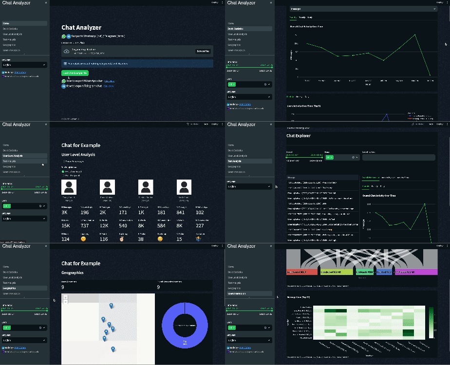
The purpose of this article is to expose others to the development of a Streamlit data app. To show the process holistically, I will go over the app sections in general while focusing on selected widgets to discuss different aspects such as app flow, NLP methodologies, and visualization practices.
A couple of notes before we start:
- The Chat Analyzer is a non-profit app and was built just for fun. code is public and can be viewed here
- Your data is protected! Once uploaded to the app, nothing is saved/sent elsewhere and deleted when the session ends.
- To demonstrate the Chat Analyzer capabilities, I used a public WhatsApp export of Indian Developers’ group in 2020, kindly uploaded to GitHub by Tushar Nankani. you can view it here.
- This article will cover only part of what the Chat Analyzer has to offer. To view all the functionalities, try it out here:
How does it work?
Every person can easily export his own chat data. (see instructions for WhatsApp & Telegram). The Chat Analyzer is a tool that can digest these exports, normalize them to one unified schema, and build insightful widgets on top of the normalized data.
Data Normalization
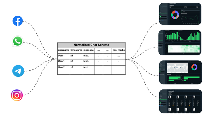
Each chat platform has its data format and schema. Whatsapp for example supports txt, while Telegram supports html/json. The normalization step received the data export via st.file_uploader and passed this data to a normalization function, which outputs a pandas data frame.
The normalization logic for WhatsApp file looks as follows:
from chatminer.chatparsers import WhatsAppParser
import streamlit as st
import tempfile
import os

def normalize_whatsapp_data(chat_export):

 # write data locally
 tempdir = tempfile.mkdtemp(prefix='chat_exports')
 with open(os.path.join(tempdir, 'chat_export.txt'), mode='wb') as f:
 f.write(chat_export.read())

 # parse whatsapp txt file
 parser = WhatsAppParser(os.path.join(tempdir, 'chat_export.txt'))
 parser.parse_file()

 # add metadata
 df = parser.parsed_messages.get_df(as_pandas=True).rename(columns={'author':'username'})
 df['date'] = df['timestamp'].dt.date
 df['hour'] = df['timestamp'].dt.floor('h').dt.strftime("%H:%M")
 df['week'] = df['timestamp'].dt.to_period('W').dt.start_time
 df['month'] = df['timestamp'].to_numpy().astype('datetime64[M]')
 df['day_name'] = df['timestamp'].dt.day_name()
 df['is_media'] = df['message'].str.contains('<Media omitted>')
 df['text_length'] = df['message'].str.split().map(len)
# upload WhatsApp export file
uploaded_file = st.file_uploader("Uplaoad your file")
if uploaded_file:
 df = normalize_whatsapp_data(uploaded_file)
 st.session_state['data'] = df
 df
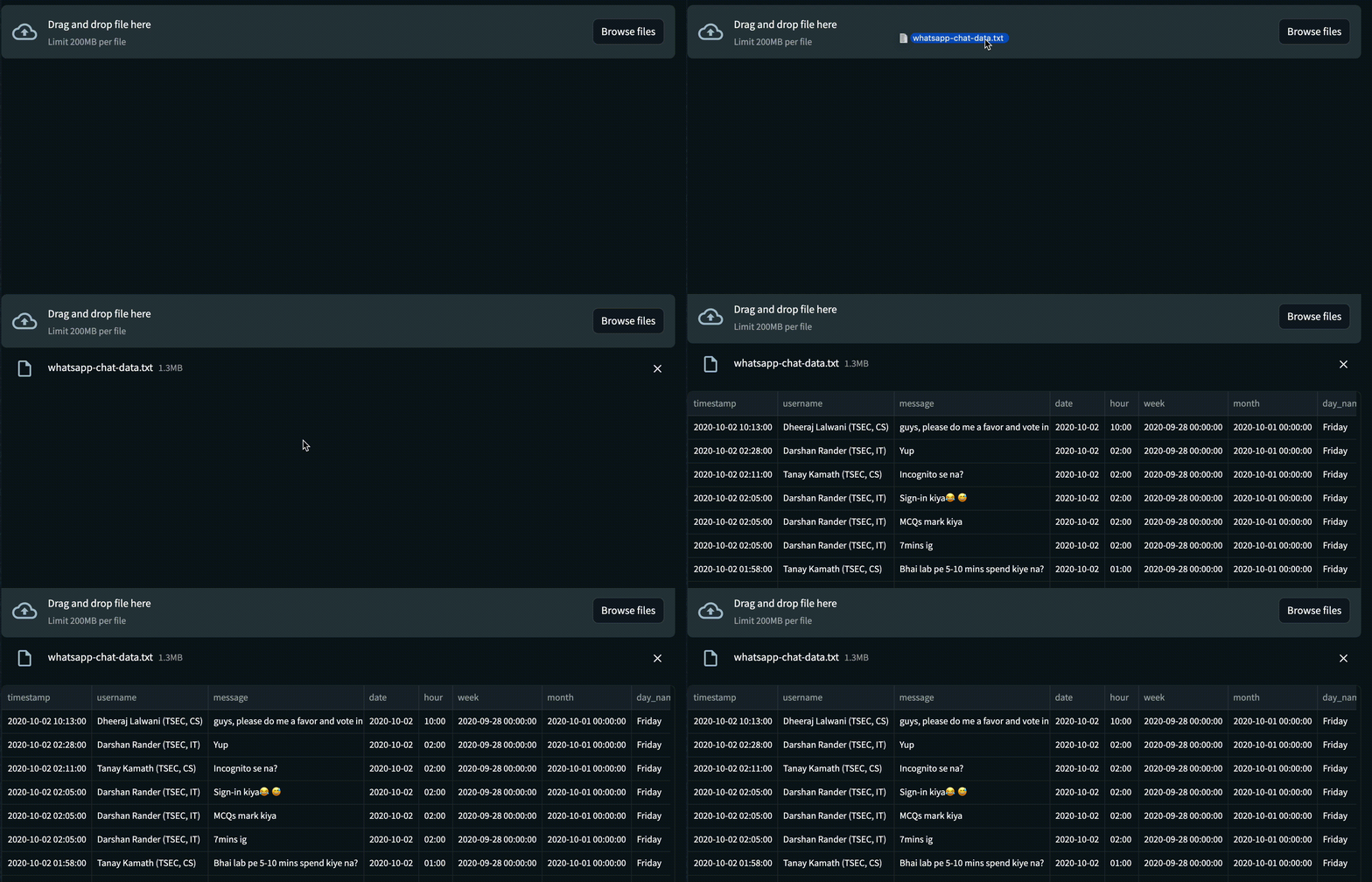
Now that we have the chat data as a pandas data frame stored in st.session_state, we can easily access it, create interactive graphs, and divide them into sections. Each section in the app gives a different glance at the chat group, allowing the user to explore diverse aspects of his data.
Different filters, such as period interval or selected users, can be applied to the data at all sections using st.sidebar
Section A: Basic Statistic
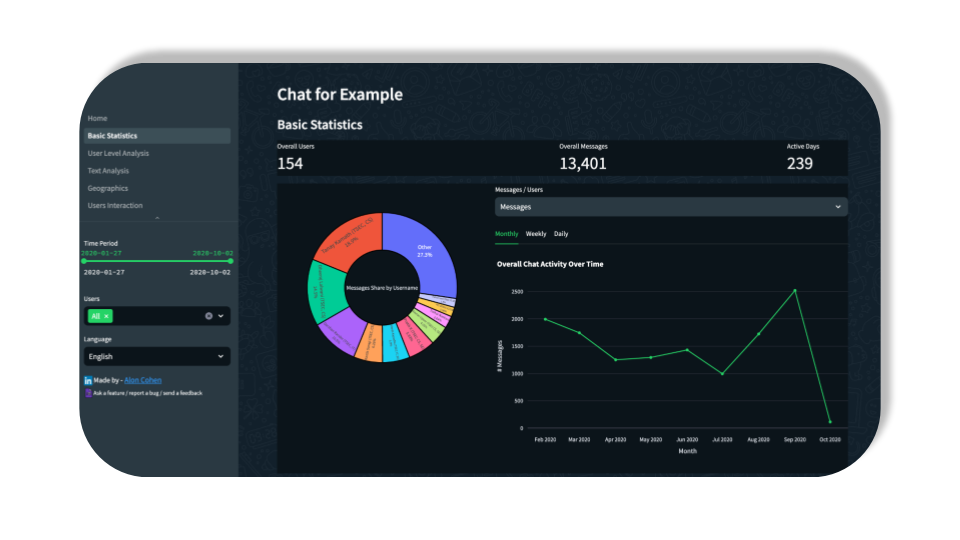

The Basic Statistics section aims to reveal some high-level insights such as overall active days/users, activity by hour, user activity share, etc…
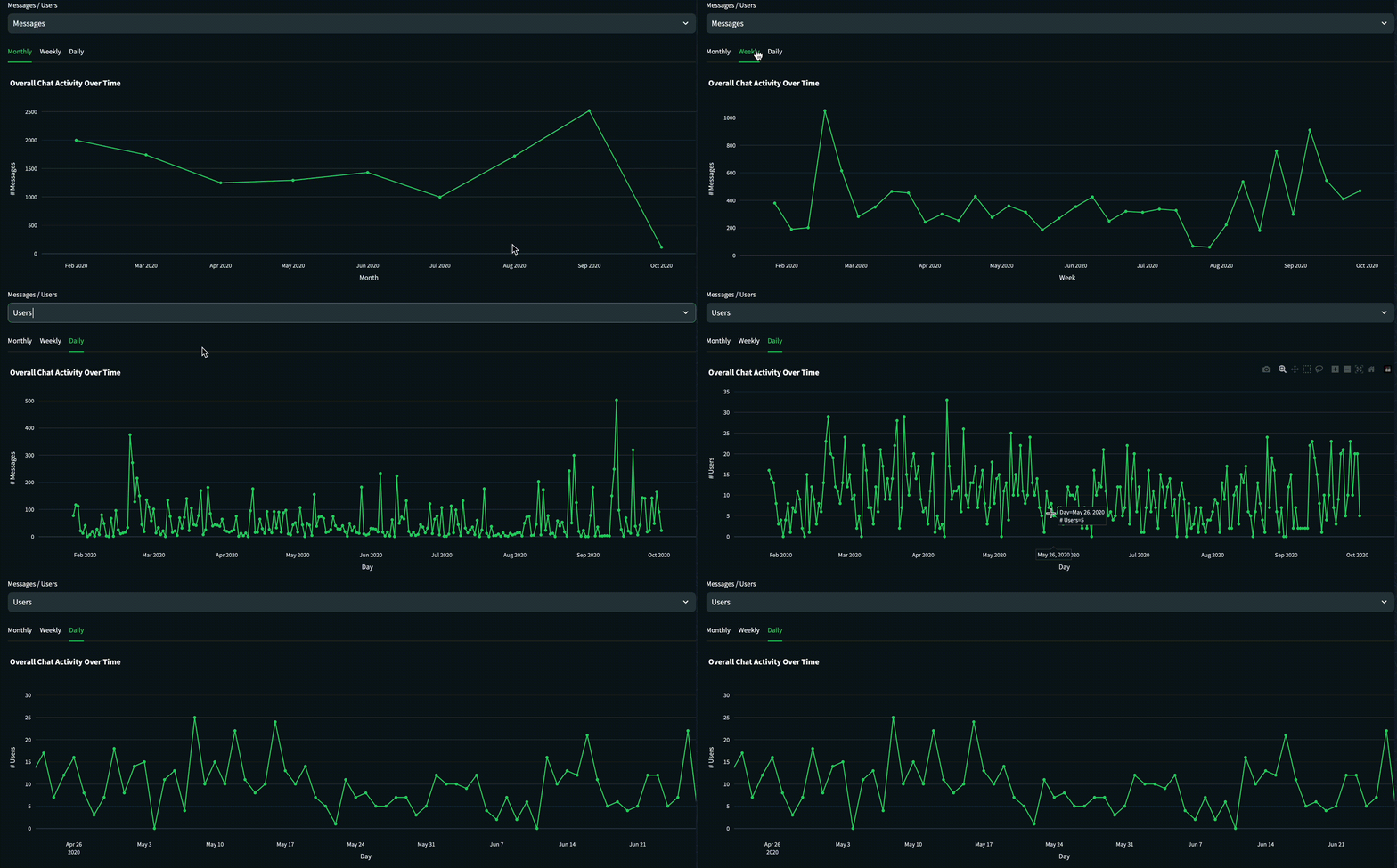
One of the widgets in the section is the “Activity Over Time” graph which shows a trendline of # messages/users.
Streamlit supports Plotly visualizations, which we going to use here and in many other widgets. The following script creates the trendline graph while supporting different units (messages/users) and different time granularities (monthly/ weekly/ daily)
import streamlit as st
import plotly.express as px

def generate_activity_overtime(df, unit, granularity):
 unit_dict = {'Messages': 'count', 'Users': 'nunique'}
 agg_df = df.groupby(granularity,as_index=False).agg({'username': unit_dict[unit]}).reset_index() \
 .rename(columns={'username': f'# {unit}', 'index': granularity.capitalize()})
 fig = px.line(agg_df, x=granularity.capitalize(), y=f'# {unit}')
 fig['data'][0]['line']['color'] = "#24d366"
 fig.update_layout(paper_bgcolor="rgba(18,32,43)", plot_bgcolor="rgba(18,32,43)", hovermode="x",
 title_text='Overall Chat Activity Over Time')
 return fig
df = st.session_state['data']
unit = st.selectbox("Messages / Users", ("Messages", "Users"))
sub0, sub1, sub2 = st.tabs(["Monthly", "Weekly", "Daily"])
sub0.plotly_chart(generate_activity_overtime(df, unit, 'month'))
sub1.plotly_chart(generate_activity_overtime(df, unit, 'week'))
sub2.plotly_chart(generate_activity_overtime(df, unit, 'date'))
Section B: User-Level Analysis

The User-Level section allows us to tell a story about the group participants. It shows some basic chat user-level numbers such as % of total messages, and N words, but contains some more complex ideas such as “Top Emoji”.
Let’s open up the Top Emoji feature — emojis have become a fundamental part of our language, especially when it comes to chat groups. people tend to use emojis in their unique ways, which we can analyze.
In the first step, we will preprocess the data to filter the text to emojis only and aggregate it to the user level.
import streamlit as st
import emoji

df = st.session_state['data']
df['emojis_list'] = df['message'].map(emoji.distinct_emoji_list)
emoji_df = df[df['emojis_list'].apply(len) > 0].groupby('username',as_index=False).agg({'emojis_list': 'sum'})
emoji_df.head()

Next, we need to come up with a methodology to pick the Top Emoji for each chat participant. I’ve come up with two — Most Frequent Emoji and Most Associate Emoji.
Most Frequent Emoji (Top Freq N)
A straightforward approach: count the emojis occurrences at the chat users’ level and pick the one with max occurrences. Obviously, this method is easy to apply, but it has a big downside — some emojis are vastly used by all participants, which can result in the same top emoji for all of them.
Most Associated Emoji (Class-based TF-IDF)
This approach is more complex — In general, it is a TF-IDF formula adopted for multiple classes (users in our case), which takes into account the emojis occurrences of the users relative to the emojis occurrence of all other users. Read more about c-TF-IDF here.
The below code applies the two approaches to emoji_df, and creating a user-level data frame. you can easily see the difference between the methodologies.
import pandas as pd
from sklearn.feature_extraction.text import CountVectorizer
from bertopic.vectorizers._ctfidf import ClassTfidfTransformer

# transform emoji_df to BOW ׂׂׂ(bag of words)
def dummy(doc):
 return doc
vectorizer = CountVectorizer(tokenizer=dummy,preprocessor=dummy)
X = vectorizer.fit_transform(emoji_df['emojis_list'])
emojies = vectorizer.get_feature_names_out()
## Most frequent emoji
bow_df = pd.DataFrame(X.toarray(), columns=emojies, index=emoji_df['username'])
top_freq_emoji = pd.DataFrame(bow_df.idxmax(axis=1)).reset_index() \
 .rename(columns={0: 'Most Frequent Emoji'})
## c-TF-IDF (Most Associate Emoji)
ctfidf = ClassTfidfTransformer(reduce_frequent_words=True).fit_transform(X).toarray()
words_per_class_min = {user_name: [emojies[index] for index in ctfidf[label].argsort()[-1:]]
 for label, user_name in zip(emoji_df.username.index, emoji_df.username)}
top_ctfidf_emoji = pd.DataFrame(words_per_class_min).T.reset_index()\
 .rename(columns={0: 'Most Associated Emoji','index':'username'})
top_ctfidf_emoji.merge(top_fre_emoji, on='username')

Section C: Text Analysis

The Text Analysis section deals with the most important things in the chat — the text messages. It currently contains 2 widgets — The Chat Explorer and Conversations Summarizer.
Chat Explorer
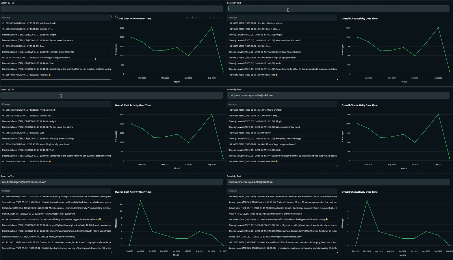
The top widget is an exploration tool that helps the user to find trends and patterns in chat using text filtering. The idea behind it was to show the Basic Statistics graphs, but this time with text filtering capabilities. To show the chat and graphs side by side, I’ve used the st.columns to assign the filtered table on the left and the trenline graph on the right.
Although the discussions in the chat group we analyzed mainly revolved around development issues, publicized events with historical importance will likely be reflected in them. See, for example, the following query, which is composed of terms associated with COVID-19. Applying it to the chat shows a correlation between the COVID-19 outbreak to messages discussing it.
Query: covidU+007CcoronaU+007CvirusU+007CquarantineU+007Clockdown
import streamlit as st

df = st.session_state['data']
text_query = st.text_input('Search by Text')
filtered_df = df[df['message'].str.lower().str.contains(text_query.lower())]
col0, col1 = st.columns((5, 5))
with col0:
 st.dataframe(filtered_df, hide_index=True)
with col1:
 st.plotly_chart(generate_activity_overtime(filtered_df, "Messages", "month"))

Conversations Summarizer
Up until now, we used traditional methodologies to the chat texts and it’s about time to pull the heavy artillery! let’s see how deep learning can help us deal with a tremendous amount of text by summarizing chat conversations into short paragraphs.
Split Chat To Conversations
Coming up with a universal method of splitting logic for chat (into subunits of conversations) is a challenging task as the chatting behavior changes across chat groups. Here I proposed a naive methodology that uses the message’s time diffs as splitting parameters. let’s run a short analysis of the time difference between adjacent messages.
import streamlit as st
import seaborn as sns
import matplotlib.pyplot as plt

# add time_diff_minutes to dataframe
df = st.session_state['data'].sort_values('timestamp')
df = df.join(df[['timestamp']].shift(-1), lsuffix='', rsuffix='_prev')
df['time_diff_minutes'] = ((df['timestamp_prev'] - df['timestamp']).dt.seconds / 60)
# plot time diff cdf
sns.ecdfplot(df['time_diff_minutes'])
offset_factor = 0.95
plt.title('Messages Time Diff'), plt.axhline(0.90, color='r'), plt.ylabel('% of Messages');
plt.text(22*offset_factor, 0.9*offset_factor, f'22 min', ha='center', va='center', color='black')

Looking at the message’s time difference CDF, it looks like most messages have a few minutes difference. The 90th percentile stands at 22 minutes, which I think is a reasonable chat conversation splitter threshold. The following script applies the threshold to the chat and produces a visualization to demonstrate the outcome.
import numpy as np
import matplotlib.pyplot as plt
import matplotlib.dates as mdates
from matplotlib.patches import Rectangle

def viz_conversations(df, start_period, end_period):
 sample_df = df.query(f"timestamp >= '{start_period}' and timestamp < '{end_period}'")
 plt.figure(figsize=(20, 2))
 ax = plt.gca()
 ax.plot(sample_df['timestamp'], np.ones(len(sample_df)), '.b', alpha=0.4, markersize=10)
 for conv_id, conv_df in sample_df.groupby('conversation_id'):
 if len(conv_df)>3: # at least 3 messages
 start = mdates.date2num(conv_df['timestamp'].min())
 end = mdates.date2num(conv_df['timestamp'].max())
 ax.add_patch(Rectangle([start, 0.75], end - start, 0.8, color='b', alpha=0.2))
 ax.text(start + (end - start) / 2, 1.4, f'id: {conv_id}', ha='center', va='center', color='black')
 else:
 ax.plot(conv_df['timestamp'], np.ones(len(conv_df)), '.r',markersize=10)
 ax.text(conv_df['timestamp'].min(), 1.4, f'nosie', ha='center', va='center', color='black')
 ax.xaxis.set_major_formatter(mdates.DateFormatter('%Y-%m-%d %H:%M'))
 plt.xticks(rotation=20), plt.title('Conversations Timeline'), plt.xlabel('Time'), plt.yticks([]), plt.ylim([0, 2]);

threshold=0.9
df['conversation_id'] = (df['time_diff_minutes'] >= df['time_diff_minutes'].quantile(threshold)).astype(int).cumsum()
df.loc[(df['time_diff_minutes'] >= df['time_diff_minutes'].quantile(threshold)), 'conversation_id'] -= 1
start_period = '2020-01-28'
end_period = '2020-01-30'
viz_conversations(df, start_period, end_period)

Summarize Chat Conversations
Now that we have the chat’s text split into conversation IDs, let’s move forward to the summarization. Text summarization in NLP aims to automatically condense a given text, extracting or generating a brief and coherent summary that captures the essential information. Since we dealing with a specific kind of text (chat), we better choose carefully a model that fits our text’s nature.
The quest for the ideal text summarization model in Hugging Face ended up with the choosing of philschmid/bart-large-cnn-samsum — A BART based model(facebook/bart-large-cnn), which was fine-tuned with SAMSum, a data set that contains about 16k messenger-like conversations with summaries. Let’s create a widget that pulls a selected conversation, inputs it to the summarization model, and presents the prediction.
Running the model is computationally heavy, so we will use the st.cache_data decorator which will pickle the input & output and prevent identical runs of the model
import streamlit as st
from transformers import pipeline

@st.cache_data()
def summrize_text(text, model_pipeline):
 pred = model_pipeline(text)
 return result[0].get('summary_text')
summarizer = pipeline("summarization", model="philschmid/bart-large-cnn-samsum")
df = st.session_state['data']
df['Conversation'] = df['username'] + ': ' + df['message'] + '\n'
conv_df = df.groupby('conversation_id', as_index=False)\
.agg({"Conversation": '\n'.join, 'date': 'min'})
col0, col1 = st.columns((4, 1))
with col0:
 min_date, max_date = conv_df['date'].min(), conv_df['date'].max()
 s_time, end_t = st.slider("Select Period", min_date, max_date, (min_date, max_date))
with col1:
 conv_id = st.selectbox('Conversation ID:', conv_df[conv_df['date'].between(s_time, end_t)]['conversation_id'].unique())
text = conv_df.query(f'conversation_id=={conv_id}')['Conversation'].iloc[0]
col2, col3 = st.columns((1, 1))
with col2:
 st.subheader('Original Conversation')
 st.divider()
 st.write(text)
with col3:
 st.subheader('Summarized Conversation')
 st.divider()
 with st.chat_message("assistant"):
 st.write(summrize_text(text,summarizer))

Section D: Geographics

The last section I will discuss is Geographics, which extracts all locations from the chat’s text and presents a nice map with some metadata.
Locations are mostly sent while sharing Google Maps links. Filtering the text correctly will output the chat locations as latitude & longitude. Luckily, Streamlit supports Folium which supplies powerful mapping visualization capabilities.
import streamlit as st
from streamlit_folium import st_folium
import folium

df = st.session_state['data']
LOCATIONS_PATTERN = r"(https:\/\/maps\.google\.com\/\?q=-?\d+\.\d+,-?\d+\.\d+)"
locations_df = locations_df = df[(df['message'].str.contains(r'^(?=.*maps.google.com)(?=.*q=)'))]
if not locations_df.empty:
 locations_df['lat'], locations_df['lon'] = zip(*locations_df['message'].str.extract(LOCATIONS_PATTERN)[0] \
 .apply(lambda x: x.split('=')[1].split(',')))
m = folium.Map(location=locations_df[['lat', 'lon']].mean().values.tolist(),
 zoom_start=15, tiles='cartodbpositron')
for i in locations_df.to_dict('records'):
 folium.Marker(location=[i['lat'], i['lon']],
 tooltip=i['username'] + '<br>' + i['date']).add_to(m)
st.title('Chat Group Locations')
st_folium(m)

Conclusion
The Chat Analyzer was built to allow anyone to analyze his chat group data easily. In this article, we demonstrated the tool’s capabilities along with some code examples. Leveraging Streamlit, the creation of the Chat Analyzer was quick and straightforward, and it holds significant value. having said that, the tool has some limitations:
- Integration & Coverage — Currently, to use the Chat Analyzer one must actively export his chat, download it locally, and upload it to the tool. That’s uncomfortable and might block struggling users. In addition, the tool currently supports WhatsApp and Telegram, while there are many other chat platforms.
- Missing Features — Although the tool is rich with sections and widgets, it’s not yet reached its full potential regarding NLP methodology. More specifically — LLMs can produce much value if rightly implemented in the tool. For example — imagine an LLM-based widget that vectorizes the whole chat and lets the user ask questions in natural language.
Streamlit limitations:
- Scale — The Chat Analyzer was deployed on Streamlit’s Community Cloud platform, which is free and easily connected to Github, but limited by its resources, and not ready for high-volume usage.
- Frontend Flexibility -Using Streamlit indeed makes life easier when it comes to fronted development. On the other hand, Streamlit’s users are bound to what the package has to offer.
Hope you enjoyed this article!
Feel free to leave comments / ask questions
Made by — Alon Cohen
Join thousands of data leaders on the AI newsletter. Join over 80,000 subscribers and keep up to date with the latest developments in AI. From research to projects and ideas. If you are building an AI startup, an AI-related product, or a service, we invite you to consider becoming a sponsor.
Published via Towards AI
Take our 90+ lesson From Beginner to Advanced LLM Developer Certification: From choosing a project to deploying a working product this is the most comprehensive and practical LLM course out there!
Towards AI has published Building LLMs for Production—our 470+ page guide to mastering LLMs with practical projects and expert insights!

Discover Your Dream AI Career at Towards AI Jobs
Towards AI has built a jobs board tailored specifically to Machine Learning and Data Science Jobs and Skills. Our software searches for live AI jobs each hour, labels and categorises them and makes them easily searchable. Explore over 40,000 live jobs today with Towards AI Jobs!
Note: Content contains the views of the contributing authors and not Towards AI.


