


Serum analysis
Last Updated on January 21, 2022 by Editorial Team
Author(s): Dr. Marc Jacobs
Originally published on Towards AI the World’s Leading AI and Technology News and Media Company. If you are building an AI-related product or service, we invite you to consider becoming an AI sponsor. At Towards AI, we help scale AI and technology startups. Let us help you unleash your technology to the masses.
Data Analysis
Hunting for a mixed model in R
In this post, I will show you, using commercial data, how I tried to model serum data coming from cows. The data I cannot share, unfortunately, but analysis of commercial data always shows you what real data looks like. Even when the design of the experiment was done with the biggest scrutiny possible, the modeling itself may still pose quite a challenge.
I will try to show the data as best as I can and write the codes in such a way that they can be used on your own dataset.
First, let's load the libraries I used. You do not need all of them to model the data adequately, but R has a way of allowing analyses to be done via multiple packages and some offer additional functionality on top of the other
## Loading packages
rm(list = ls())
library(plyr)
library(sjPlot)
library(ggplot2)
library(lattice)
library(reshape2)
library(kml)
library(dplyr)
library(effects)
library(lme4)
library(sjmisc)
library(arm)
library(pbkrtest)
library(lmerTest)
library(lmtest)
library(AICcmodavg)
library(lubridate)
library(merTools)
library(piecewiseSEM)
require(parallel)  # parallel computing
library(scales)    # for squish()
library(gridExtra)
library(coefplot)  # coefficient plots (not on CRAN)
library(coda)      # MCMC diagnostics
library(aods3)     # overdispersion diagnostics
library(plotMCMC)  # pretty plots from MCMC fits
library(bbmle)     # AICtab
library(nlme)
library(readxl)
library(readr)
library(lubridate)
library(sjPlot)
library(sjstats)
Then, I will load in the data and start looking into it.
SerumDairy <- read_delim("data.csv", delim = ";",
                   escape_double = FALSE, trim_ws = TRUE)
SerumDairy$Treatment<-as.factor(SerumDairy$Treatment)
SerumDairy$Treatment<-factor(SerumDairy$Treatment,
                             levels=c("1","2", "3","4","5","6"))
print(levels(SerumDairy$Treatment))
SerumDairy$Treatment<-factor(SerumDairy$Treatment, levels(SerumDairy$Treatment)[c(2:6,1)])
SerumDairy$Treatment<-factor(SerumDairy$Treatment, ordered=TRUE)
SerumDairy$Treatment_cont<-as.character(SerumDairy$Treatment)
SerumDairy$sample<-NULL
SerumDairy$collar<-NULL
SerumDairy$Zn.ppm <- gsub(",", "", SerumDairy$Zn.ppm)
SerumDairy$Cu.ppm <- gsub(",", "", SerumDairy$Cu.ppm)
SerumDairy$Zn.ppm<-as.numeric(SerumDairy$Zn.ppm)
SerumDairy$Cu.ppm<-as.numeric(SerumDairy$Cu.ppm)
head(SerumDairy)
class(SerumDairy$date)
SerumDairy$date
SerumDairy$Daydiff<-dmy(SerumDairy$date)
SerumDairy$Daydiff<-SerumDairy$Daydiff-SerumDairy$Daydiff[1]
SerumDairy<-SerumDairy[order(SerumDairy$Cow),]
SerumDairy$Daydiff<-as.numeric(SerumDairy$Daydiff)
SerumDairyCompl<-SerumDairy[complete.cases(SerumDairy),]
SerumMelt<-melt(SerumDairy, id.vars=c("Day", "Daydiff", "Cow","Block", "Treatment"),
                measure.vars=c("Zn.ppm", "Cu.ppm"))
SerumMelt$value <- gsub(",", "", SerumMelt$value)
SerumMelt$value<-as.numeric(SerumMelt$value)
#Summarising data tabular
table(SerumDairy$Day)
table(SerumDairy$Treatment)
table(SerumDairy$Block)
table(SerumDairy$Cow)
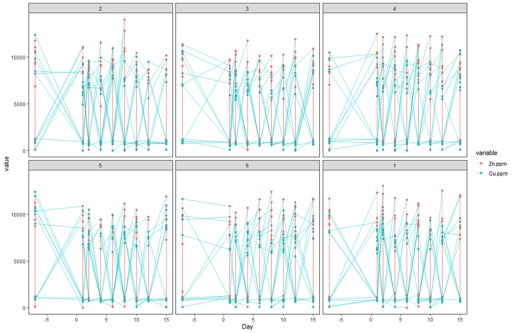
Off to the plots.
ggplot(SerumMelt, aes(x=Day, y=value, color=variable,group=Cow)) +
  geom_point() +
  geom_line(alpha=0.5)+
  theme_bw() +
  facet_wrap(~Treatment) +
  theme(panel.grid.major = element_blank(), panel.grid.minor = element_blank()) +
  guides(linetype=F, size=F)
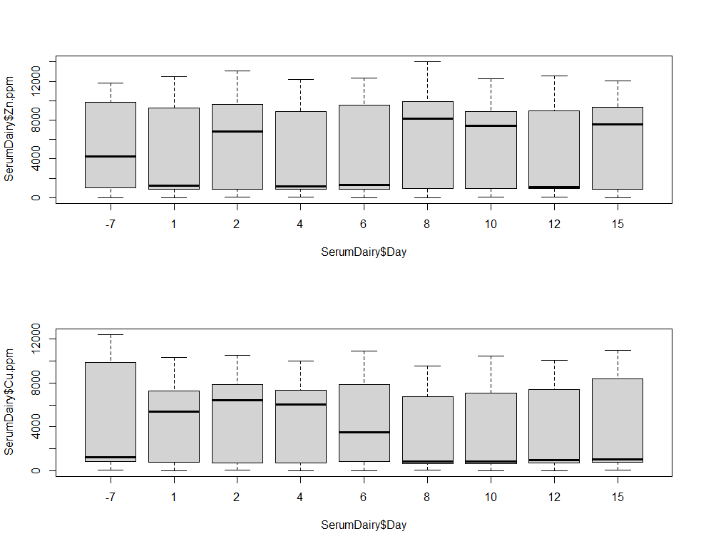
# Plotting data
dev.off()
par(mfrow=c(2,1))
boxplot(SerumDairy$Zn.ppm~SerumDairy$Day)
boxplot(SerumDairy$Cu.ppm~SerumDairy$Day)
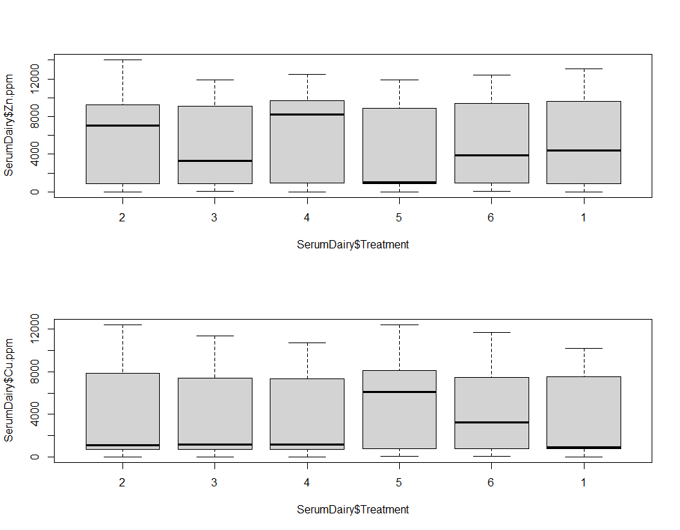
boxplot(SerumDairy$Zn.ppm~SerumDairy$Treatment)
boxplot(SerumDairy$Cu.ppm~SerumDairy$Treatment)
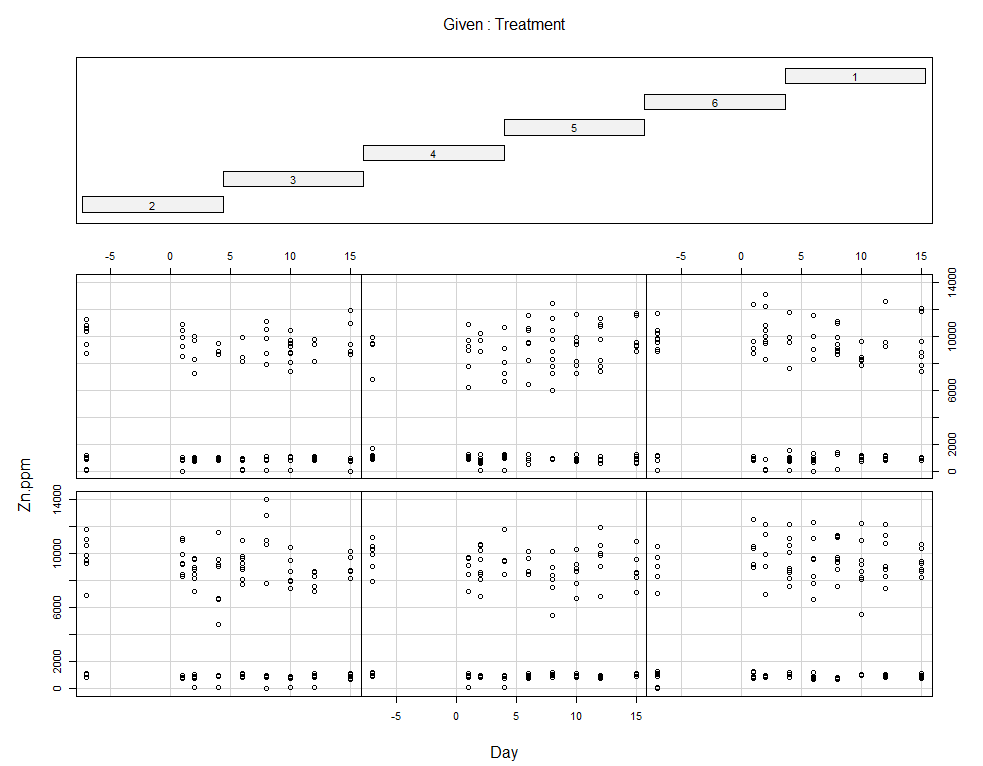
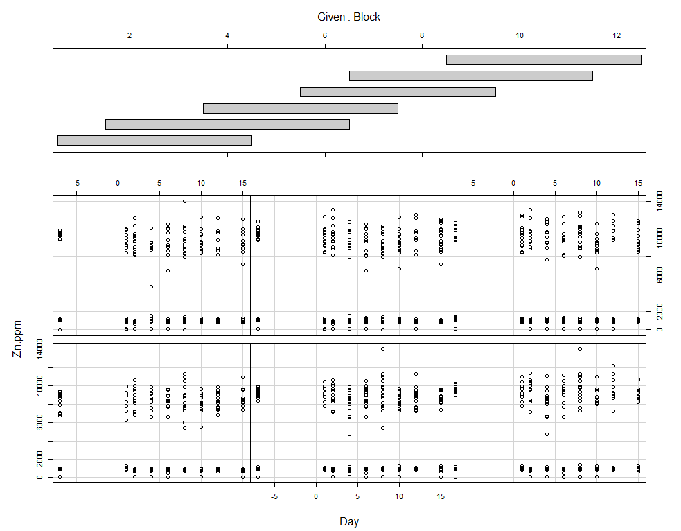
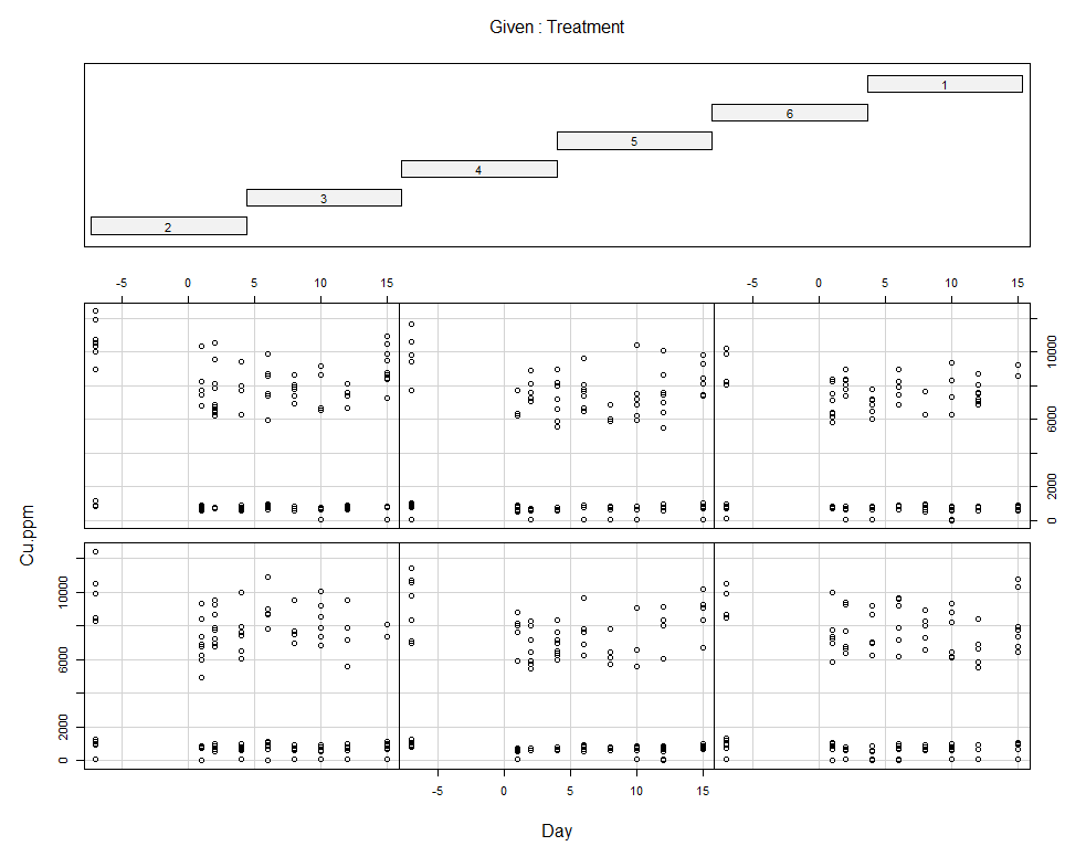
coplot(Zn.ppm~Day|Treatment, data=SerumDairy)
coplot(Zn.ppm~Day|Block, data=SerumDairy)
coplot(Cu.ppm~Day|Treatment, data=SerumDairy)
coplot(Cu.ppm~Day|Block, data=SerumDairy)

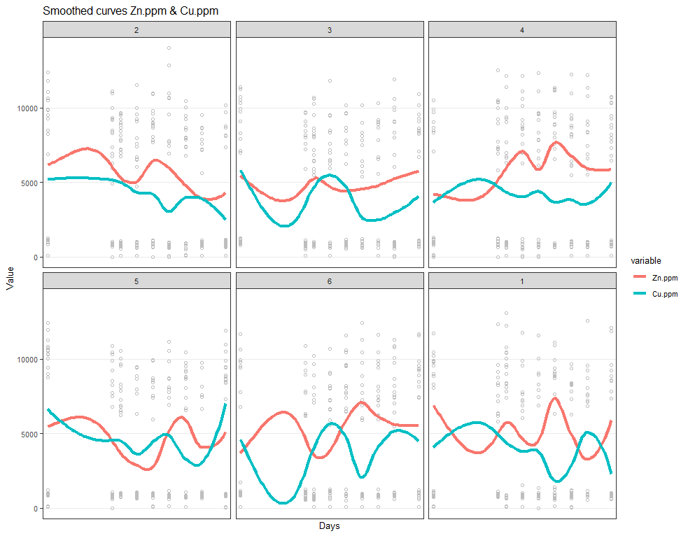
Now, I want to plot some more to get a better even better idea. Remember, that first plot I made did not help at all.
# plotting Zn.ppm & Cu.ppm
ggplot(SerumMelt, aes(x=Day, y=value, group=Cow, color=variable)) +
        geom_point(color="gray", shape=1)+
        geom_smooth(aes(group=variable, colour=variable), method="loess", size=1.5, se=F, span=0.5)+
        scale_y_continuous("Value") +
        scale_x_discrete("Days")+
        ggtitle(paste("Smoothed curves Zn.ppm & Cu.ppm"))+
        theme_bw()+
        facet_wrap(~Treatment)+
        theme(text=element_text(size=10),
              axis.title.x = element_text(),
              panel.grid.minor = element_blank())
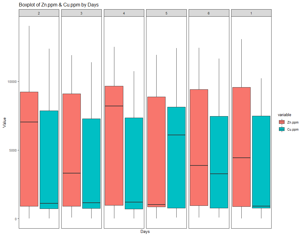
ggplot(SerumMelt, aes(x=Day, y=value, fill=variable)) +
        geom_boxplot() +
        theme_bw()+
        theme(panel.grid.major = element_blank(), panel.grid.minor = element_blank())+
        ggtitle(paste("Boxplot of Zn.ppm & Cu.ppm by Days")) +
        scale_y_continuous("Value") +
        scale_x_discrete("Days") +
        facet_grid(~Treatment)+
theme(text=element_text(size=10),
      axis.title.x = element_text(),
      panel.grid.minor = element_blank())
Now, I want to look more closely at treatments.
# boxplot showing per treatment BW over time
ggplot(SerumDairy, aes(x=as.factor(Day), y=Zn.ppm, colour=as.factor(Treatment))) +
        geom_boxplot() +
        theme_bw() +
        ggtitle(paste("Boxplot of Zn.ppm by Days")) +
        scale_y_continuous("Zn.ppm") +
        scale_x_discrete("Days") +
        theme(text=element_text(size=10),
              axis.title.x = element_text(),
              panel.grid.minor = element_blank())
# line plot
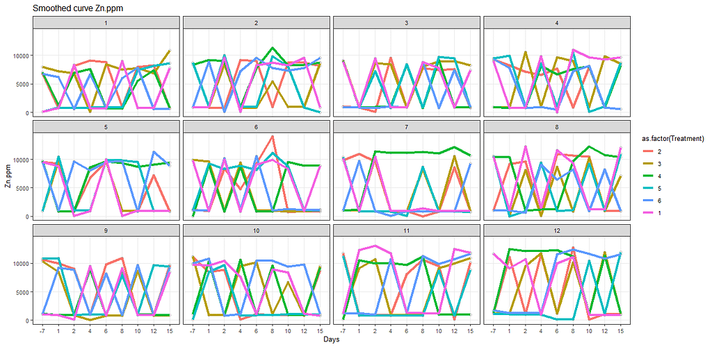
ggplot(SerumDairy, aes(x=as.factor(Day), y=Zn.ppm, group=Cow)) +
geom_point(color="gray", shape=1) +
geom_smooth(aes(group=Treatment, colour=as.factor(Treatment)), method="loess", size=1.5, se=F, span=0.5) +
scale_y_continuous("Zn.ppm") +
scale_x_discrete("Days")+
ggtitle(paste("Smoothed curve Zn.ppm"))+
theme_bw()+
facet_wrap(~Block)+
theme(text=element_text(size=10),
axis.title.x = element_text(),
panel.grid.minor = element_blank())
ggplot(SerumDairy, aes(x=Daydiff, y=Zn.ppm, group=Cow, colour=Treatment)) +
        geom_point(color="gray", shape=1) +
        geom_smooth(aes(group=1), size=1.5, se=F, alpha=0.8, span=0.5) +
        facet_wrap(~Treatment)+
        theme_bw()

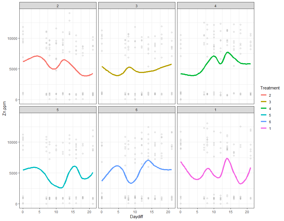
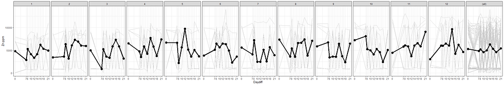
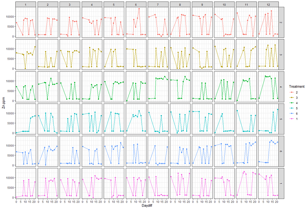
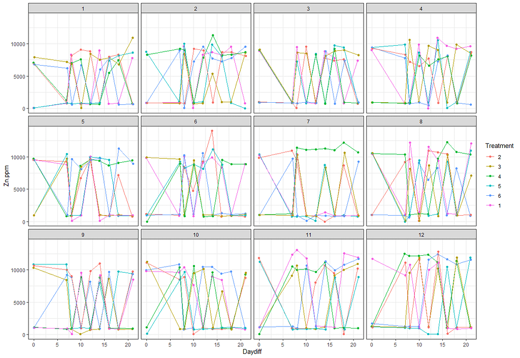
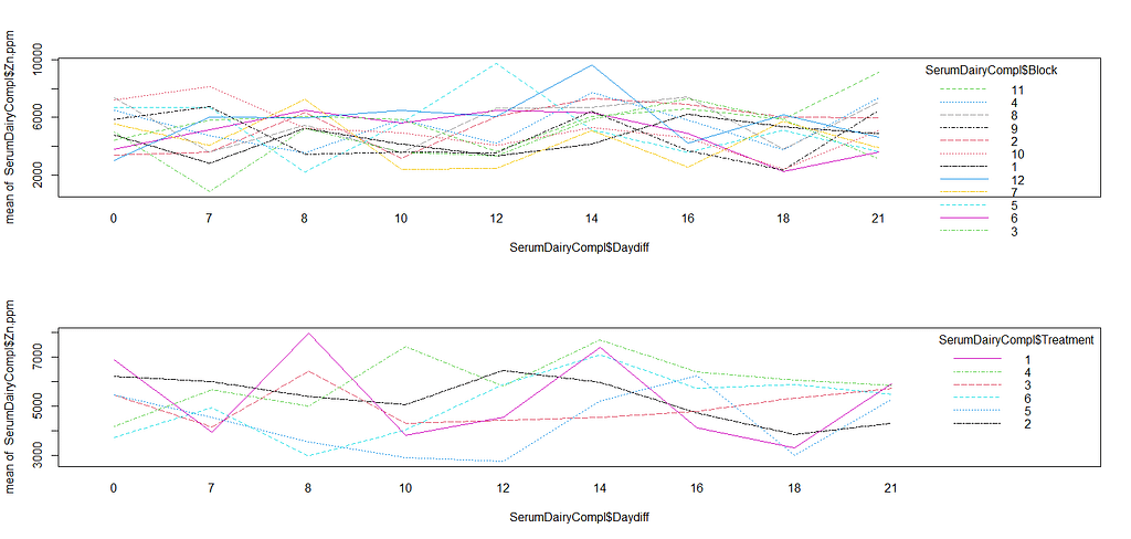
The next plots are perhaps the handiest for looking at the treatment data. Not because they try to picture the mean impact each treatment has, but also because they show the sheer level of variance already hinted at in the boxplots. Boxplots, for that matter, is perhaps the most inclusive plots to make.
# nicest line plot for Treatment
theme_set(theme_bw())
myx<-scale_x_continuous(breaks=c(0,7,8,10,12,14,16,18,21))
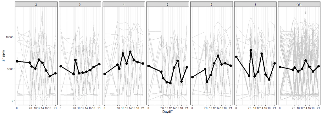
ggplot(SerumDairyCompl, aes(x=Daydiff, y=Zn.ppm, group=Cow))+
myx+
geom_line(colour="grey80") +
facet_grid(~Treatment, margins=T)+
stat_summary(aes(group=1), fun.y=mean, geom="point", size=3.5)+
stat_summary(aes(group=1), fun.y=mean, geom="line", lwd=1.5)
theme_set(theme_bw())
myx<-scale_x_continuous(breaks=c(0,7,8,10,12,14,16,18,21))
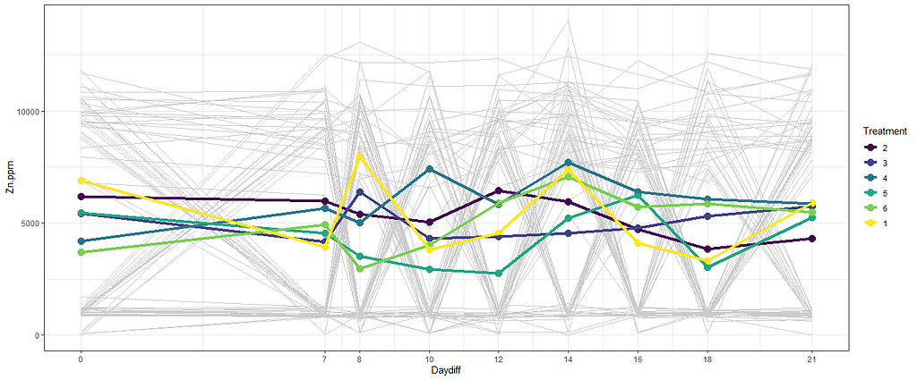
ggplot(SerumDairyCompl, aes(x=Daydiff, y=Zn.ppm, group=Cow))+
myx+
geom_line(colour="grey80") +
stat_summary(aes(group=Treatment, colour=Treatment), fun.y=mean, geom="point", size=3.5)+
stat_summary(aes(group=Treatment, colour=Treatment), fun.y=mean, geom="line", lwd=1.5)
# nicest line plot for Block
theme_set(theme_bw())
myx<-scale_x_continuous(breaks=c(0,7,8,10,12,14,16,18,21))
ggplot(SerumDairyCompl, aes(x=Daydiff, y=Zn.ppm, group=Cow))+
        myx+
        geom_line(colour="grey80") +
        facet_grid(~Block, margins=T)+
        stat_summary(aes(group=1), fun.y=mean, geom="point", size=3.5)+
        stat_summary(aes(group=1), fun.y=mean, geom="line", lwd=1.5)
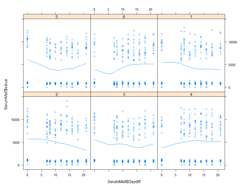
xyplot(SerumMelt$value~SerumMelt$Daydiff|SerumMelt$Treatment, type=c("p", "smooth"))
histogram(~SerumDairy$Zn.ppm|SerumDairy$Day+SerumDairy$Treatment)
The time for graphs has come and I want to start modeling now, using Linear Mixed Models to take into account the correlated nature of the data via repeated measures.
First, some simple regression to get a better idea of how the models will deal with the different components of the design.
### Linear Mixed Models
## Zinc
# Linear model for exploring data
SerumDairy$Daydiff<-as.numeric(as.character(SerumDairy$Daydiff))
class(SerumDairy$Daydiff)
SerumDairy$Treatment<-factor(SerumDairy$Treatment, ordered=FALSE)
summary(regr1<-lm(Zn.ppm~Daydiff, data=SerumDairy))
summary(regr2<-lm(Zn.ppm~Daydiff*Treatment, data=SerumDairy))
summary(regr3<-lm(Zn.ppm~Daydiff*Block, data=SerumDairy))
summary(regr4<-lm(Zn.ppm~Daydiff*Treatment*Block, data=SerumDairy))
plot(allEffects(regr1))
plot(allEffects(regr2))
plot(allEffects(regr3))
plot(allEffects(regr4))
anova(regr1, regr2, regr3, regr4)


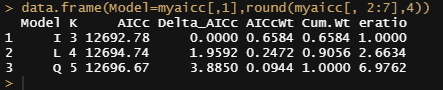
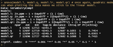
Let's continue and build unconditional growth models.
# Unconditional means model - intercept only model
model.i<-lmer(Zn.ppm~1 + (1|Cow), SerumDairy, REML=FALSE)
# Unconditional growth model - linear effect of time
model.l<-lmer(Zn.ppm~1 + Daydiff + (1|Cow), SerumDairyCompl, REML=FALSE) # random intercept + fixed time
# Unconditional polynomial growth model - quadratic effect of time
model.q<-lmer(Zn.ppm~1 + Daydiff + I(Daydiff^2) + (1|Cow), SerumDairy, REML=FALSE)

# comparing the unconditional mean model, the unconditional growth model, and the unconditional polynomial growth model
mynames<-c("I", "L", "Q")
myaicc<-as.data.frame(aictab(cand.set=list(model.i,model.l,model.q), modnames=mynames))[, -c(5,7)]
myaicc$eratio<-max(myaicc$AICcWt)/myaicc$AICcWt
data.frame(Model=myaicc[,1],round(myaicc[, 2:7],4))
I will then continue adding random slopes to the models.
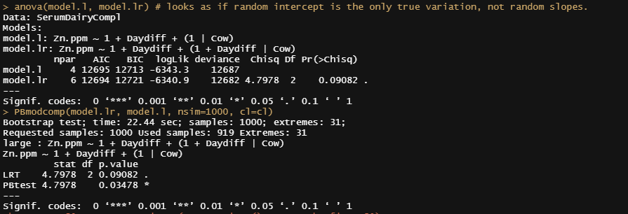
model.l<-lmer(Zn.ppm~1 + Daydiff + (1|Cow), SerumDairyCompl, REML=FALSE)
model.lr<-lmer(Zn.ppm~1 + Daydiff + (1+Daydiff|Cow), SerumDairyCompl, REML=FALSE)
anova(model.l, model.lr)
PBmodcomp(model.lr, model.l, nsim=1000, cl=cl)
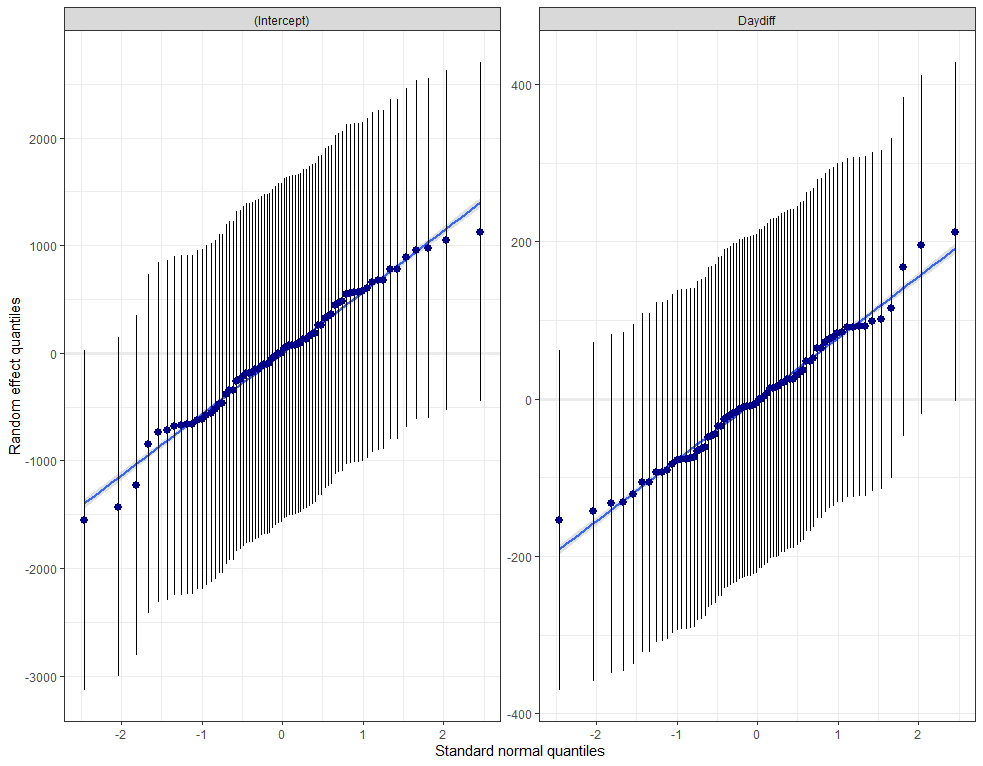
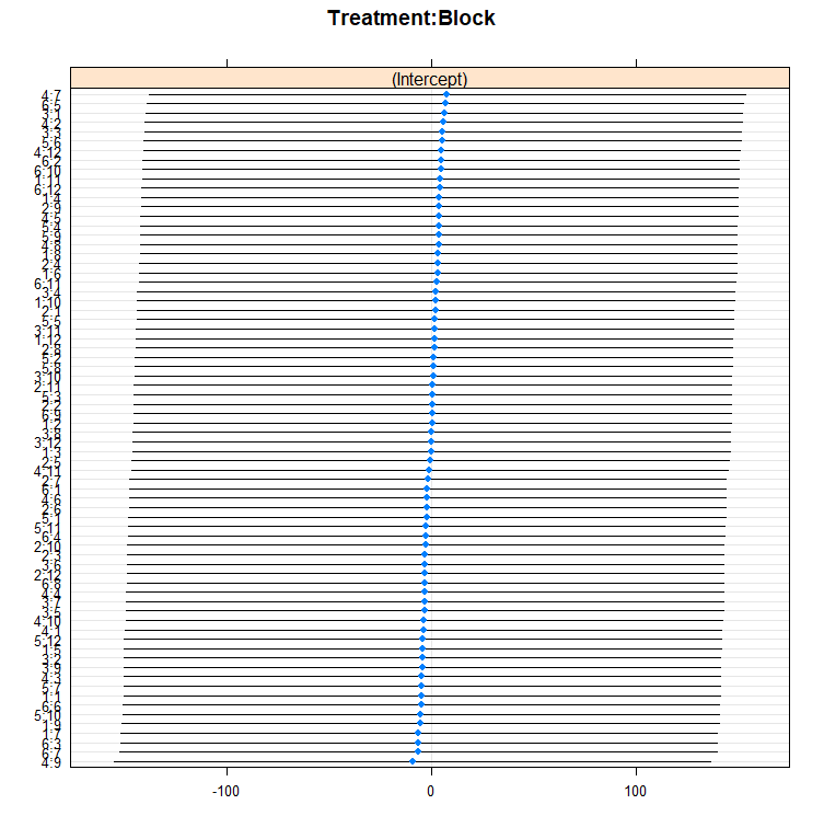
plot_model(model.lr, facet.grid=F, sort.est="sort.all", y.offset=1.0)
plot_model(model.lr, type="est");
plot_modelr(model.4, type="std")
plot_model(model.lr, type="eff")
plot_model(model.lr, type="pred", facet.grid=F, vars=c("Daydiff", "Treatment"))
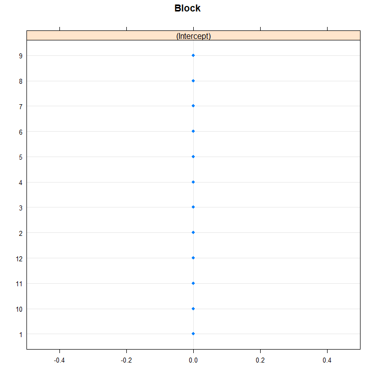
ranef(model.lr)
fixef(model.lr)
sam<-sample(SerumDairy$Cow, 15);sam
plot_model(model.lr, type="slope", facet.grid = F, sample.n=sam) # plotting random intercepts
plot_model(model.lr, type="resid", facet.grid = F, sample.n=sam) # plotting random intercepts but does not work??
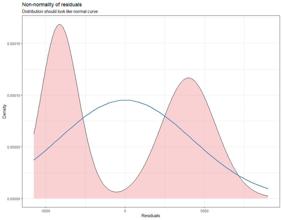
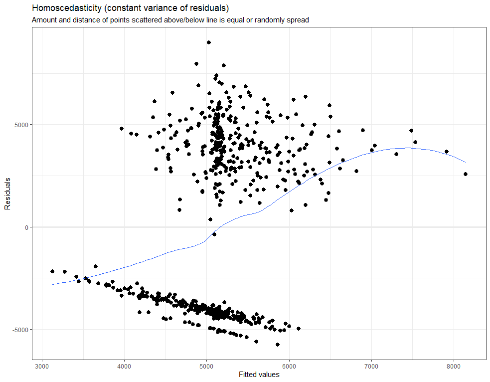
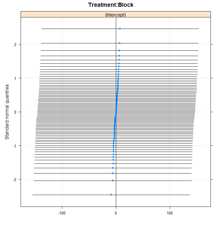
plot_model(model.lr, type="diag")

model.qr<-lmer(Zn.ppm~1 + Daydiff + I(Daydiff^2) + (1+Daydiff|Cow), SerumDairyCompl, REML=FALSE)
summary(model.qr)
anova(model.l, model.q, model.lr, model.qr)
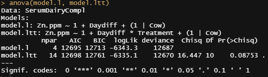
I will now add the treatment effect
## Adding treatment effect
model.ltt<-lmer(Zn.ppm~1 + Daydiff*Treatment + (1|Cow), SerumDairyCompl, REML=FALSE)
summary(model.ltt)
anova(model.l, model.ltt)
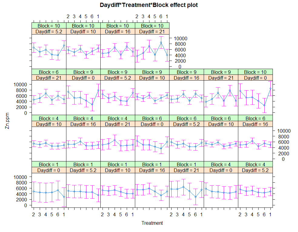
# plotting time over treatments and blocks
pd <- position_dodge(width = 0.2)
ggplot(SerumDairy, aes(x=Daydiff, y=Zn.ppm, group=Cow, color=Treatment))+ geom_point(position=pd) + geom_line(position=pd) + facet_grid(Treatment~Block)
ggplot(SerumDairy, aes(x=Daydiff, y=Zn.ppm, group=Cow, color=Treatment))+ geom_point(position=pd) + geom_line(position=pd) + facet_wrap(~Block)
plot(allEffects(model.5))
eff.model.5<-allEffects(model.5)
regr<-lm(Zn.ppm~Daydiff+Treatment+Block, data=SerumDairyCompl)
plot(allEffects(regr)) # smaller confidence intervals then multilevel model
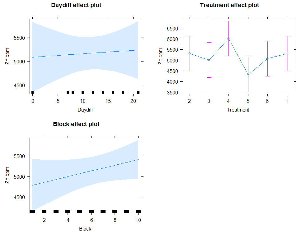
Next up I will extend the model using the block effect.
## Adding block effect
SerumDairy$Block<-as.integer(SerumDairy$Block)
model.l<-lmer(Zn.ppm~1 + Daydiff + (1|Cow), SerumDairyCompl, REML=FALSE) # random intercept + fixed slope
model.lttb<-lmer(Zn.ppm~1 + Daydiff+Treatment++(1|Cow), SerumDairyCompl, REML=FALSE)
summary(model.lttb)
model.lttbr<-lmer(Zn.ppm~1 + Daydiff+Treatment+Block+(1|Cow) + (1|Block), SerumDairyCompl, REML=FALSE)
summary(model.lttbr)
anova(model.lttb, model.lttbr)
model.lttbri<-lmer(Zn.ppm~1 + Daydiff*Treatment*Block + (1|Block/Cow), SerumDairyCompl, REML=FALSE) # (1|Block/Cow) is the same as (1|Cow) & (1|Block)
summary(model.lttbri)
anova(model.l,model.ltt,model.lttbri)

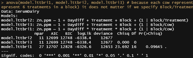
Then I will look for the interaction effect. At this point, I already got a feeling how a direct comparison will end up in the results.
# Interaction effects or just fixed effects?
model.lttbri1<-lmer(Zn.ppm~1 + Daydiff*Treatment*Block + (1|Block/Cow), SerumDairy, REML=FALSE) # (1|Block/Cow) is the same as (1|Cow) & (1|Block)
model.lttbri2<-lmer(Zn.ppm~1 + Daydiff+Treatment+Block + (1|Block/Treatment), SerumDairy, REML=FALSE)
model.lttbri3<-lmer(Zn.ppm~1 + Daydiff+Treatment+Block + (1|Block/Cow), SerumDairy, REML=FALSE)
anova(model.lttbri1, model.lttbri2, model.lttbri3) # because each cow represent the treatment in a block (6 cows to represent 6 treatments in a block) it does not matter if we specify Block/Treatment or Block/CoW
Time to compare the most likely models even deeper.
model.1<-lme4::lmer(Zn.ppm~1 + (1|Block/Treatment), SerumDairyCompl, REML=FALSE)
model.2<-lme4::lmer(Zn.ppm~Daydiff + (1|Block/Treatment), SerumDairyCompl, REML=FALSE)
model.3<-lme4::lmer(Zn.ppm~Daydiff + Treatment + (1|Block/Treatment), SerumDairyCompl, REML=FALSE)
model.4<-lme4::lmer(Zn.ppm~Daydiff + Treatment + Block + (1|Block), SerumDairyCompl, REML=FALSE)
model.5<-lme4::lmer(Zn.ppm~Daydiff + Treatment + Block + (1|Block/Treatment), SerumDairyCompl, REML=FALSE)
model.6<-lme4::lmer(Zn.ppm~Daydiff + Treatment + Block + (Daydiff|Treatment) + (1|Block/Treatment), SerumDairyCompl, REML=FALSE) # is maximal model possible, random slopes + intercept by subjects, and random intercept of treatment, blocks and treatment within blocks. But Corr is NaN which seems like overfitting the model or making it redundant
model.7<-lme4::lmer(Zn.ppm~Daydiff + Treatment + Block + (0+Block|Treatment), SerumDairyCompl, REML=FALSE) # experimental model, leaving the intercept alone, and thus only specifying the random slope. Do not fully understand that model yet.
model.8<-lme4::lmer(Zn.ppm~Daydiff + Treatment + Block + (1|Treatment) + (1|Block), SerumDairyCompl, REML=FALSE) # shows varing intercepts by Block, not by Treatment. Is that even possible?

model.9<-lme4::lmer(Zn.ppm~Daydiff + Treatment + Block + (1|Cow), SerumDairyCompl, REML=FALSE
, SerumDairyCompl, REML=FALSE)
model.10<-lme4::lmer(Zn.ppm~Daydiff + I(Daydiff^2) + Treatment + Block + (1|Block/Treatment), SerumDairyCompl, REML=FALSE)
model.11<-lme4::lmer(Zn.ppm~Daydiff + Treatment + Block + (1|Block:Treatment), SerumDairyCompl, REML=FALSE)
model.11<-lme4::lmer(Zn.ppm~Daydiff + Treatment + (1|Block:Treatment), SerumDairyCompl, REML=FALSE)
model.12<-lme4::lmer(Zn.ppm~1+(1|Block:Treatment:Daydiff), SerumDairyCompl, REML=FALSE) # Error: number of levels of each grouping factor must be < number of observations
model.13<-lme4::lmer(Zn.ppm~Daydiff + Treatment + Block + (1|Block) + (1|Block:Treatment), SerumDairyCompl, REML=FALSE) # exact same as model.5
model.14<-lme4::lmer(Zn.ppm~Daydiff + Block + (1|Block/Treatment), SerumDairyCompl, REML=FALSE)
model.15<-lme4::lmer(Zn.ppm~Daydiff + Block + (1|Block), SerumDairyCompl, REML=FALSE)
model.16<-lme4::lmer(Zn.ppm~poly(Daydiff,3) + Treatment + Block + (1|Block/Treatment), SerumDairyCompl, REML=FALSE)
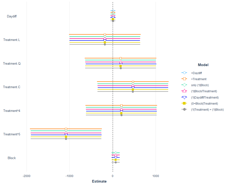
A lot of models that we can easily compare using the jtools package.
jtools::plot_summs(model.2,
                   model.3,
                   model.4,
                   model.5,
                   model.6,
                   model.7,
                   model.8,robust = "HC3",
                   model.names = c("+Daydiff",
                                   "+Treatment",
                                   "only (1|Block)",
                                   "(1|Block/Treatment)",
                                   "(1|Daydiff/Treatment)",
                                   "(0+Block|Treatment)",
                                   "(1|Treatment) + (1|Block)"))
Let's see how the other models perform.
jtools::plot_summs(model.10,
                   model.11,
                   model.13,
                   model.14,
                   model.15,
                   model.16,
                   robust = "HC3",
                   model.names = c("+I(Daydiff^2)",
                                   "+(1|Block:Treatment)",
                                   "(1|Block) + (1|Block:Treatment)",
                                   "(1|Block/Treatment)",
                                   "(1|Block)",
                                   "poly(Daydiff,3)"))
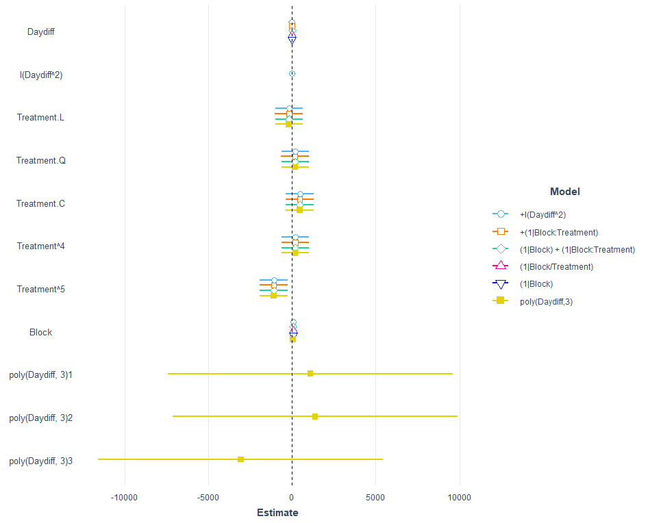
I am going to pick a model now, model.5, because it makes the most sense given the design set-up. Given the data, though, it would very well be a good idea to jus pick the simplest model showing just an effect of time.
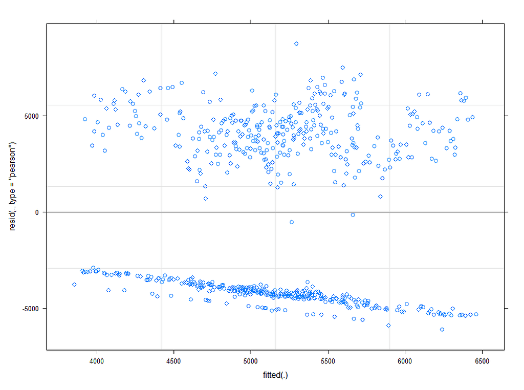
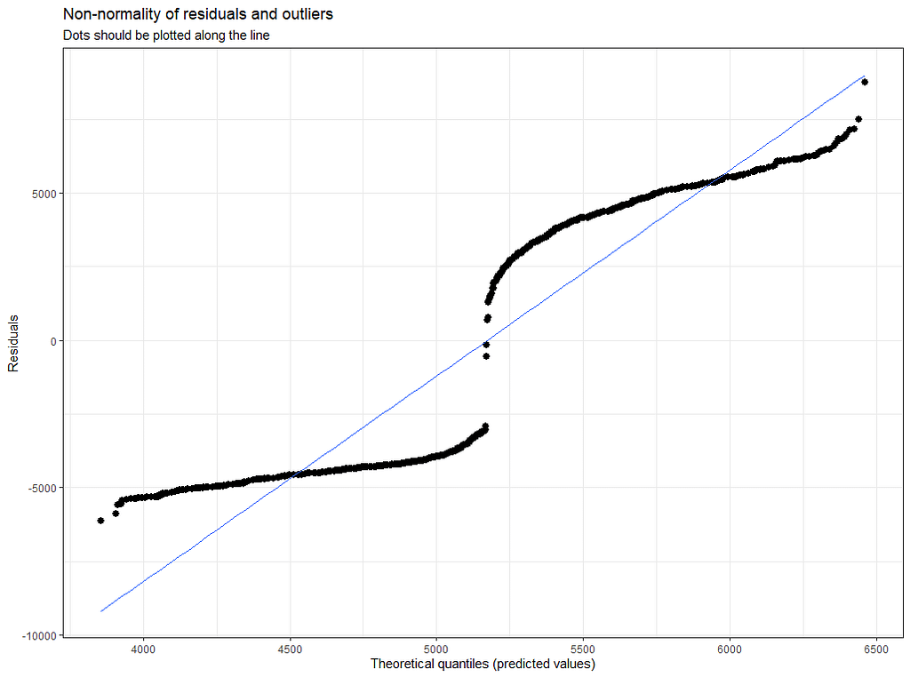
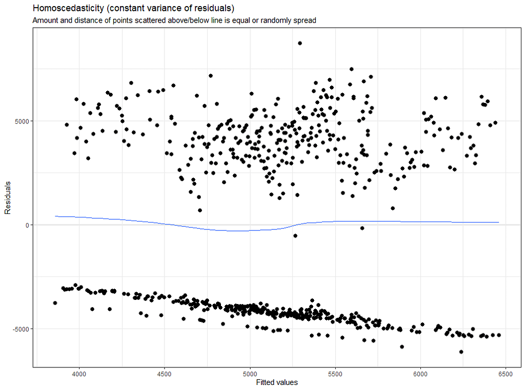
# diagnostic plots model.5
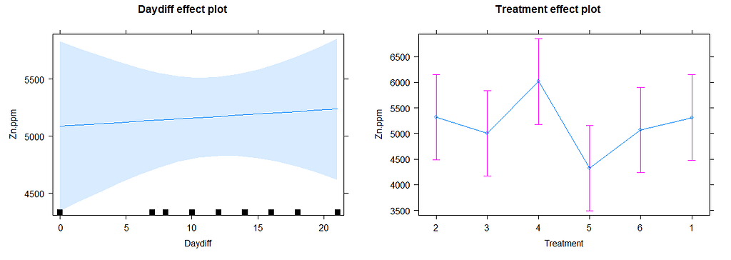
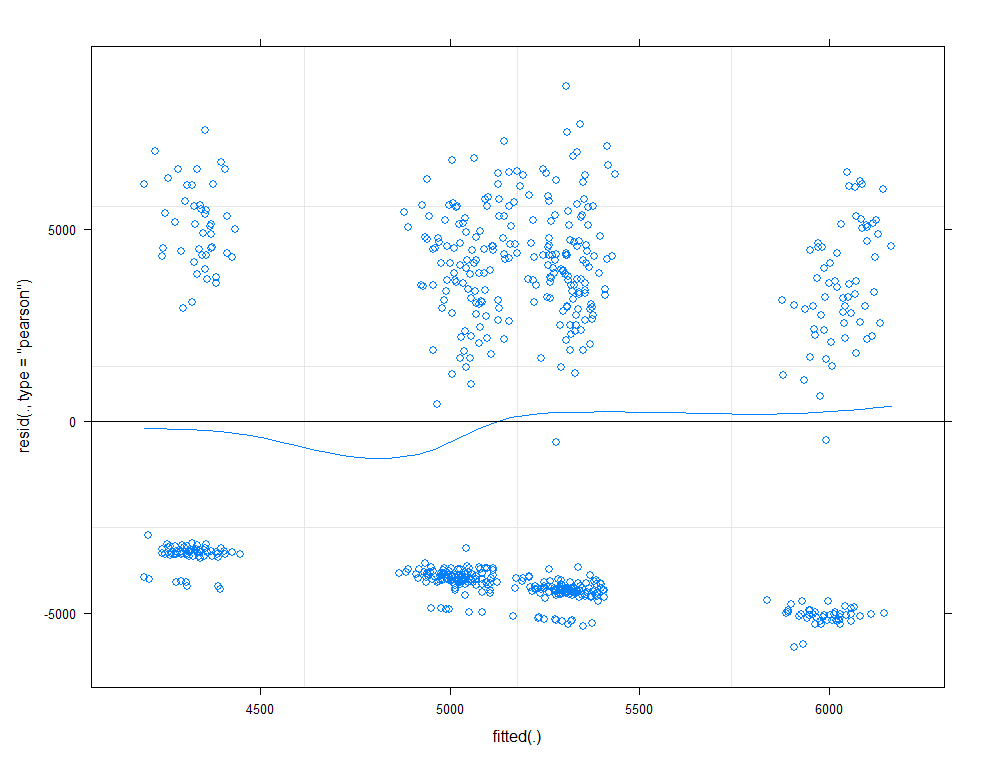
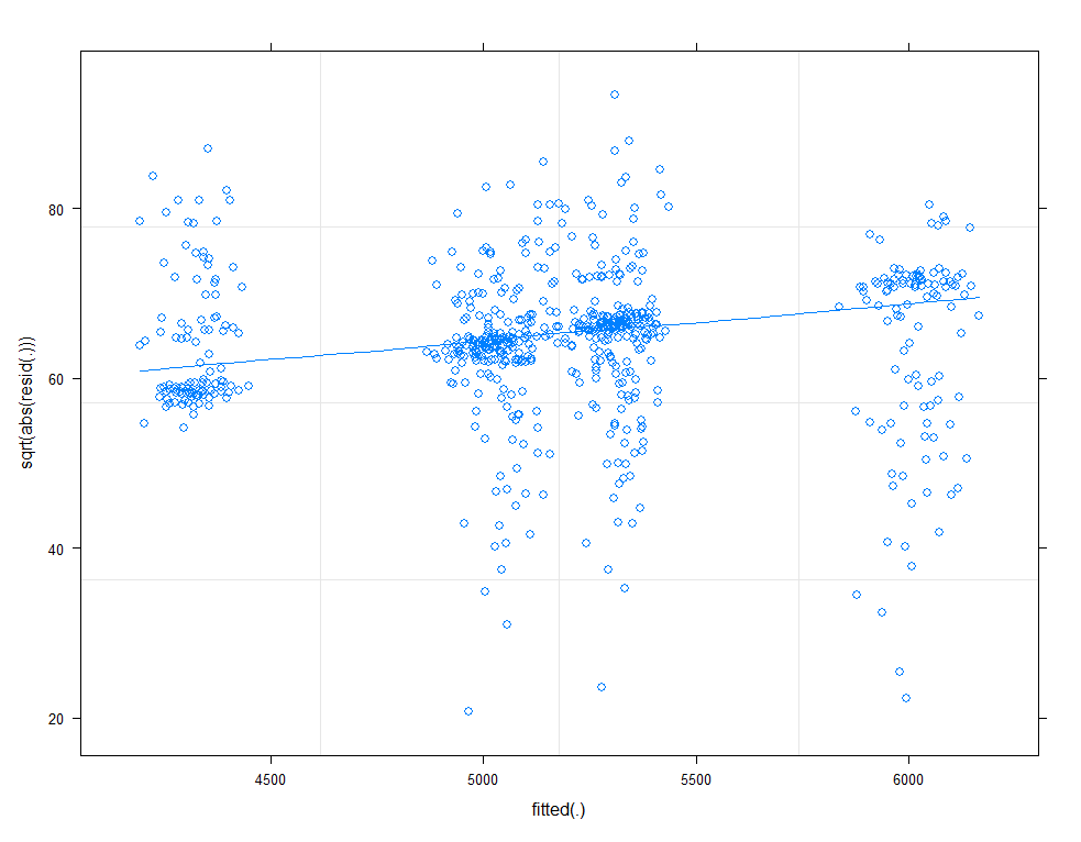
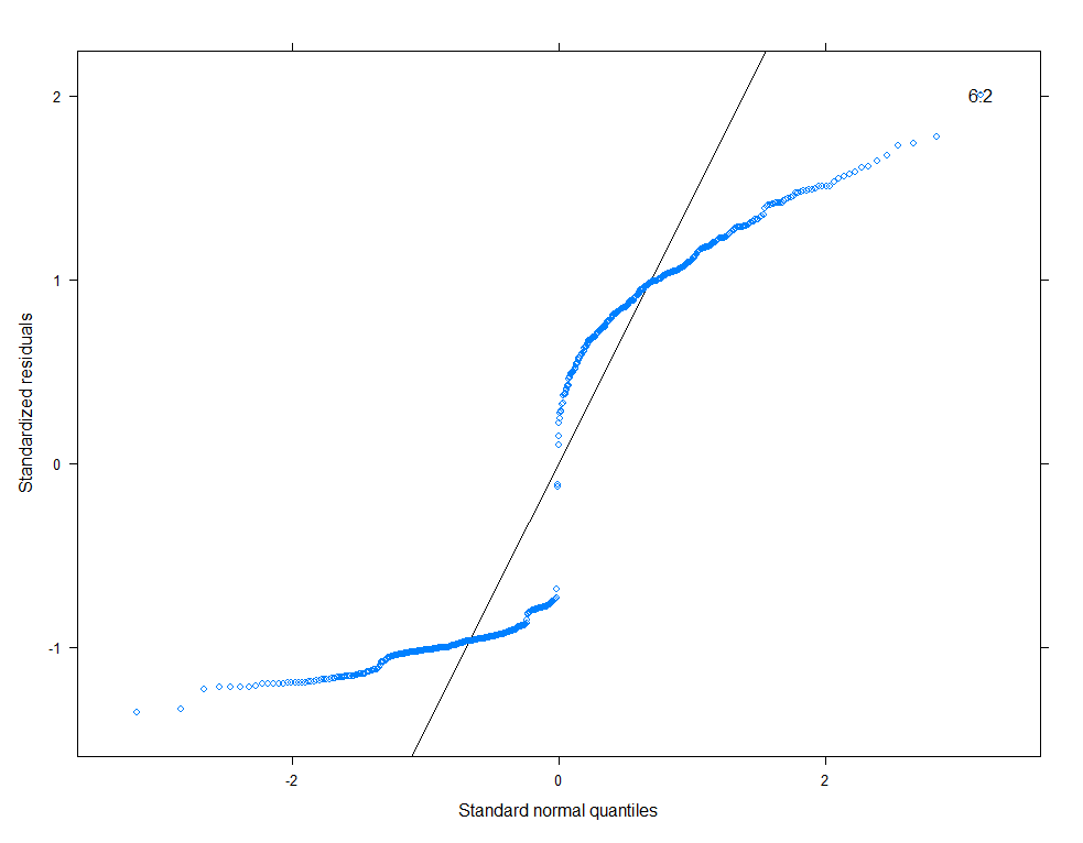
plot(allEffects(model.11))
plot(model.11, type=c("p", "smooth"))
plot(model.11, sqrt(abs(resid(.)))~fitted(.), type=c("p", "smooth"))
qqmath(model.11, id=0.05)
There is a nice package, called HLMdiag, that will let you venture deeper into the residuals of the models do diagnostics on various levels.
model.l<-lmer(Zn.ppm~1 + Daydiff + (1|Cow), SerumDairyCompl, REML=FALSE)
model.q<-lmer(Zn.ppm~1 + Daydiff + I(Daydiff^2) + (1|Cow), SerumDairy, REML=FALSE)
model.q3<-lmer(Zn.ppm~1 + Daydiff + I(Daydiff^2) + I(Daydiff^3) + (1|Cow), SerumDairy, REML=FALSE) # cubic model
model.qr<-lmer(Zn.ppm~1 + Daydiff + I(Daydiff^2) + (Daydiff|Cow), SerumDairy, REML=FALSE)
model.l.resid <- hlm_resid(model.l, standardize = TRUE, include.ls = TRUE, level=1)
ggplot(data = model.l.resid, aes(x = Daydiff, y = .std.ls.resid)) +
  geom_point(alpha = 0.2) +
  geom_smooth(method = "loess", se = FALSE) +
  labs(y = "LS level-1 residuals", title = "LS residuals against Day Difference")
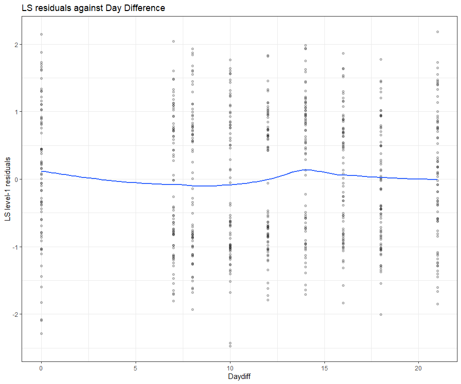
Then, I want to look at influencers and will do so by looking at the first level of the data, which is the observation. Below you can see that there are for sure some influential observations, but that does not mean that they require deletion. When you find influencers or outliers, they show you a hint for real-life mechanisms. You should cherish them if you find them. If the model cannot handle them, the model shows its limitations.
All of the above is applicable when the observations labeled outliers are not BAD data. They should not be mistakes.
model.l.infl <- hlm_influence(model.l, level = 1)
dotplot_diag(model.l.infl$cooksd, name = "cooks.distance", cutoff = "internal")
dotplot_diag(model.l.infl$cooksd, name = "mdffits", cutoff = "internal")
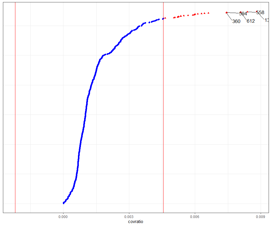
dotplot_diag(model.l.infl$cooksd, name = "covratio", cutoff = "internal")
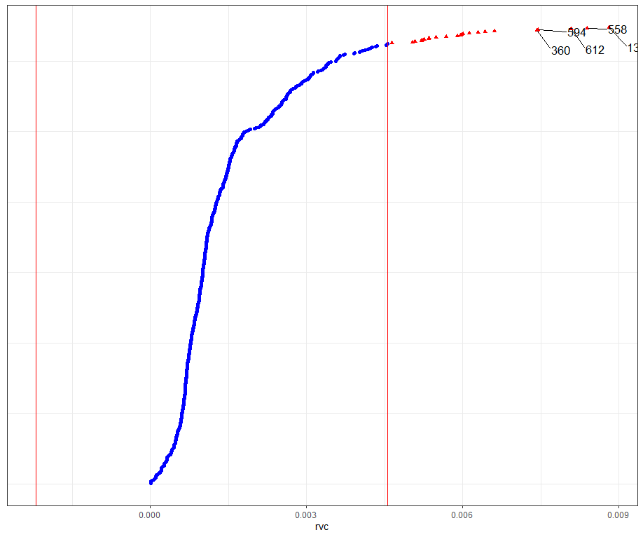
dotplot_diag(model.l.infl$cooksd, name = "rvc", cutoff = "internal")

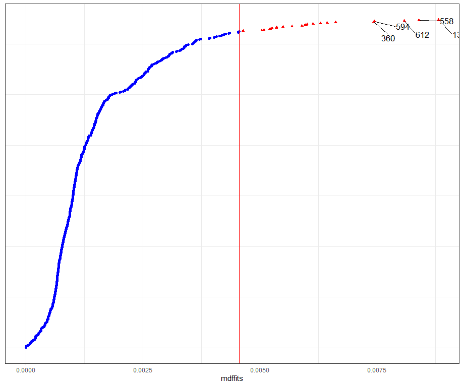
What if I start deleting cows entirely?
model.l.del<-case_delete(model.l, level="Cow", type="both")
model.l.del$fitted.delete<-as.data.frame( model.l.del$fitted.delete)
ggplot(data = model.l.del$fitted.delete,
       aes(y = as.factor(deleted),
           x= as.factor(Daydiff),
           fill=fitted.x.)) +
  geom_tile() +
  scale_fill_viridis_c(option="C")+
  theme_bw()+
  labs(y = "Deleted cow",
       x = "Day difference",
       title = "Changes in Zn (ppm) by deletion of cows")

Next up I want to take a look at the posterior predictive simulations coming from model 5. First, let's fit model 5.
model.5<-lme4::lmer(Zn.ppm~Daydiff + Treatment + Block + (1|Block/Treatment), SerumDairyCompl, REML=FALSE)
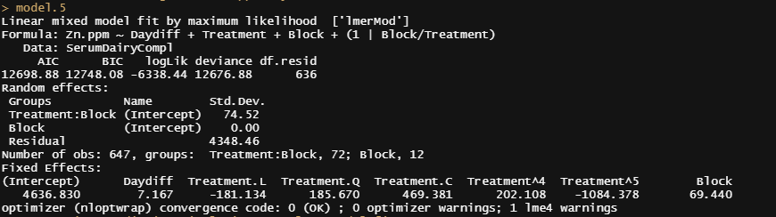
Then the simulation work begins.
mySumm <- function(.) { s <- sigma(.)
c(beta =getME(., "beta"), sigma = s, sig01 = unname(s * getME(., "theta"))) }
boo01<-bootMer(model.5, mySumm, nsim = 1000)
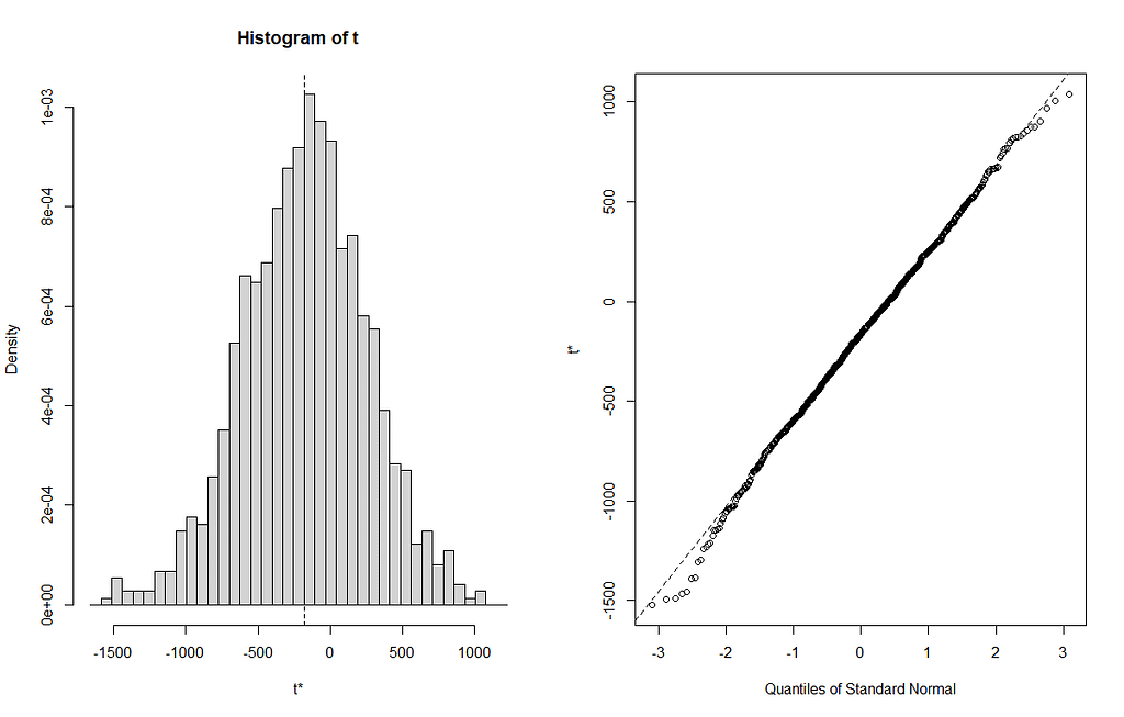
plot(boo01,index=3)
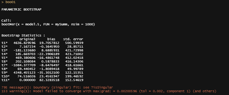
From the bootstrapped results I can extract particular kinds of confidence intervals at various levels, and plot them. Here, you see the distribution via a histogram and the qq-plot of the 3rd variable, t3. It coincides with Treatment.L. Hence, it shows the effect of Treatment.L compared to the reference treatment via resampling. The resampling shows what you want it to show — normal distribution like spread. For Treatment.L however, the no-effect now becomes blatantly clear.
From all of this, we can choose which kind of confidence to choose. They are not all the same. From the function, you can choose:
- Normal. A matrix of intervals is calculated using the normal approximation. It will have 3 columns, the first being the level and the other two being the upper and lower endpoints of the intervals.
- Basic. The intervals were calculated using the basic bootstrap method.
- Student. The intervals were calculated using the studentized bootstrap method.
- Percent. The intervals were calculated using the bootstrap percentile method.
- BCA. The intervals were calculated using the adjusted bootstrap percentile (BCa) method.
## ------ Bootstrap-based confidence intervals ------------
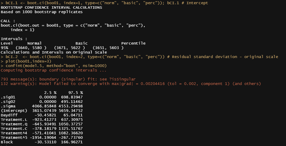
bCI.1 <- boot.ci(boo01, index=1, type=c("norm", "basic", "perc")); bCI.1 # Intercept
bCI.2 <- boot.ci(boo01, index=2, type=c("norm", "basic", "perc")) # Residual standard deviation - original scale
plot(boo01,index=3)
confint(model.5, method="boot", nsim=1000)
Like I said before, R has a way of doing the same thing in many different ways via different packages. Below I show the prediction intervals coming from the merTools package and the lme4 bootMer function.
PI<-predictInterval(model.5, newdata=SerumDairyCompl, level=0.95, n.sims=1000, stat="median", type="linear.prediction", include.resid.var=T)
head(PI)
ggplot(aes(x=1:30, y=fit, ymin=lwr, ymax=upr), data=PI[1:30,])+geom_point()+geom_linerange()+labs(x="Index", y="Prediction w/95% PI") + theme_bw()

mySumm <- function(.) {
        predict(., newdata=SerumDairyCompl, re.form=NULL)
}
####Collapse bootstrap into median, 95% PI
sumBoot <- function(merBoot) {
        return(
                data.frame(fit = apply(merBoot$t, 2, function(x) as.numeric(quantile(x, probs=.5, na.rm=TRUE))),
                           lwr = apply(merBoot$t, 2, function(x) as.numeric(quantile(x, probs=.025, na.rm=TRUE))),
                           upr = apply(merBoot$t, 2, function(x) as.numeric(quantile(x, probs=.975, na.rm=TRUE)))))}
boot1 <- lme4::bootMer(model.5, mySumm, nsim=1000, use.u=FALSE, type="parametric")
PI.boot1 <- sumBoot(boot1)
ggplot(PI.boot1)+
  geom_density(aes(x=fit))+
  geom_density(aes(x=lwr, fill="red"),alpha=0.5)+
  geom_density(aes(x=upr, fill="red"),alpha=0.5)+
  theme_bw()+
  theme(legend.position = "none")

What I will be doing is now is going back a little bit, looking at the interactions. I want to figure out what happened, and I will use the ANOVA models to take a closer look. Since the data is balanced, ANOVA will work just fine. Otherwise, I would have to use mixed models.
model.5.aov<-aov(Zn.ppm~Daydiff+Treatment*Block, data=SerumDairyCompl)
coef(model.5.aov)
summary(model.5.aov)
par(mfrow=c(2,1))
interaction.plot(SerumDairyCompl$Daydiff, SerumDairyCompl$Block, SerumDairyCompl$Zn.ppm, col=seq(1,12,1))
interaction.plot(SerumDairyCompl$Daydiff, SerumDairyCompl$Treatment, SerumDairyCompl$Zn.ppm, col=seq(1,6,1))
rr<-ranef(model.5)
dotplot(ranef(model.5, condVar=T))
qqmath(ranef(model.5)); abline(0,1)
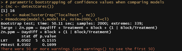
You can also use bootstrapping to compare models. Labour intensive for the pc so makes sure you run in parallel.
# parametric bootstrapping of confidence values when comparing models
(nc <- detectCores())
cl <- makeCluster(rep("localhost", nc))
PBmodcomp(model.5,model.14, nsim=2000, cl=cl)
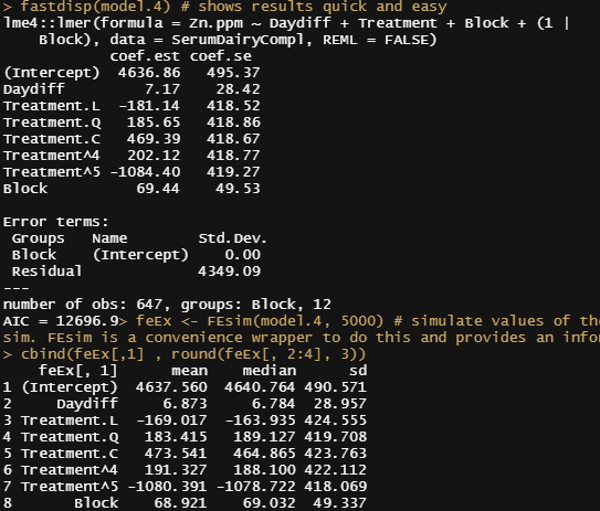
Let's look further at the models, using the MerTools package again. Via MerTools you simulate values of the fixed effects from the posterior using te function arm::sim. FEsim is a convenience wrapper to do this and provides an informative dataframe.
fastdisp(model.4)
feEx <- FEsim(model.4, 5000) # simulate values of the fixed effects from the posterior using te function arm::sim. FEsim is a convenience wrapper to do this and provides an informative dataframe
cbind(feEx[,1] , round(feEx[, 2:4], 3))
library(ggplot2)
plotFEsim(feEx) +
theme_bw() +
labs(title = "Coefficient Plot of InstEval Model", x = "Median Effect Estimate", y = "Evaluation Rating") # The lighter bars represent grouping levels that are not distinguishable from 0 in the data.
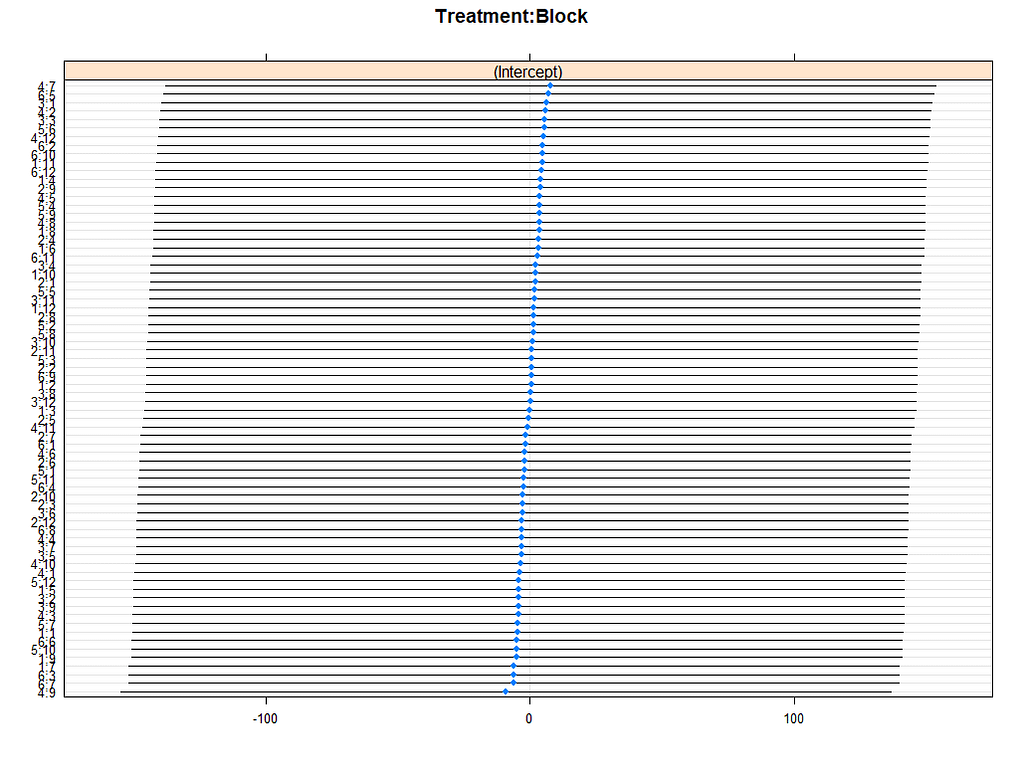
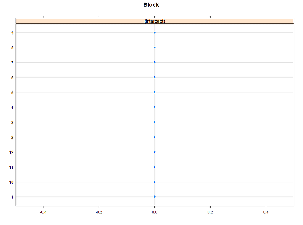
reEx <- REsim(model.5, 5000); reEx
table(reEx$groupFctr)
table(reEx$term)
lattice::dotplot(ranef(model.5, condVar=TRUE))
p1 <- plotREsim(reEx); p1


plot(model.4)
plot_model(model.4, type="diag")

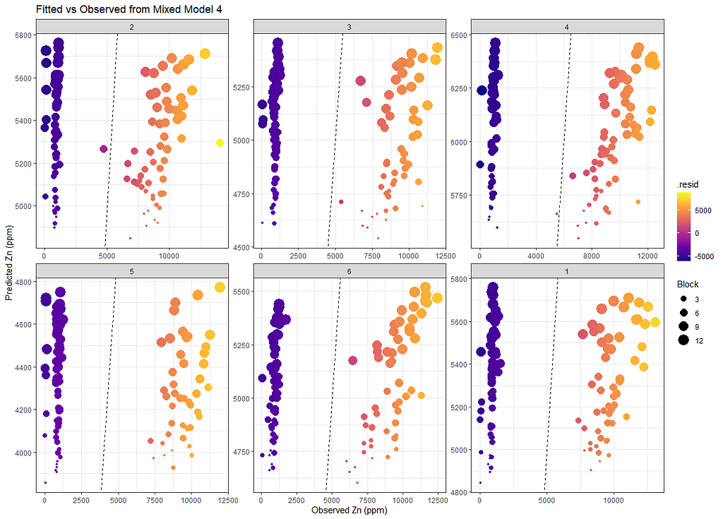
Last but not least, predicted vs observed to see model fit.
SerumDairyFitted<-broom.mixed::augment(model.4)
ggplot(SerumDairyFitted, aes(x=Zn.ppm, y=.fitted, colour=.resid, size=Block))+
  geom_point()+
  geom_abline(slope=1, lty=2)+
  scale_color_viridis_c(option="C")+
  facet_wrap(~Treatment, scales="free")+
  labs(title="Fitted vs Observed from Mixed Model 4",
       x="Observed Zn (ppm)",
       y="Predicted Zn (ppm)")+
  theme_bw()
Sometimes, it is best to leave the data for what it is and do not model it. We already saw this from the graphs alone, but back then I could nog give it a rest. It is commercial data anyhow.
Don't make my mistakes!
Serum analysis was originally published in Towards AI on Medium, where people are continuing the conversation by highlighting and responding to this story.
Join thousands of data leaders on the AI newsletter. It’s free, we don’t spam, and we never share your email address. Keep up to date with the latest work in AI. From research to projects and ideas. If you are building an AI startup, an AI-related product, or a service, we invite you to consider becoming a sponsor.
Published via Towards AI
Towards AI Academy
We Build Enterprise-Grade AI. We'll Teach You to Master It Too.
15 engineers. 100,000+ students. Towards AI Academy teaches what actually survives production.
Start free — no commitment:
→ 6-Day Agentic AI Engineering Email Guide — one practical lesson per day
→ Agents Architecture Cheatsheet — 3 years of architecture decisions in 6 pages
Our courses:
→ AI Engineering Certification — 90+ lessons from project selection to deployed product. The most comprehensive practical LLM course out there.
→ Agent Engineering Course — Hands on with production agent architectures, memory, routing, and eval frameworks — built from real enterprise engagements.
→ AI for Work — Understand, evaluate, and apply AI for complex work tasks.
Note: Article content contains the views of the contributing authors and not Towards AI.
Related posts
Recent Posts


")

