I Built an Interactive Decision Tree Plotter — This Is What I Learned
Last Updated on June 23, 2024 by Editorial Team
Author(s): Frederik Holtel
Originally published on Towards AI.

When I learned about decision trees for the first time, I thought that it would be very useful to have a simple plotting tool to play around with and develop an intuitive understanding of what is going on. I searched on the web, but came up empty-handed. Therefore, I decided to build my own plotter. Voilà! 👇🏽
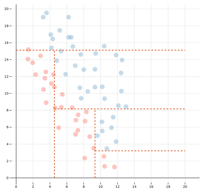
So what can you see here? Each of the circles represents a data point with an x and a y value, as well as a type, indicated by the colour, red or blue. An algorithm is making choices about where to split the space. The result is a decision tree.
Doesn’t look like a tree to you? Maybe this one is more familiar:

This is the same decision tree as the one in the plot (if you didn’t make any changes), just in its extensive form. Basically, the x-y-space is split up into five parts. Three areas are categorised as blue, two as red. If you read the tree from the right to the left, you see easily how the areas are delimited. One of the red ones for example is where x>15.5 and y>15.75, in other words the upper right corner on the plot. The other red area is where x<12.25 and y<2.5, in the bottom left corner. The middle blue area is the one where y>4.5 and y<15.75 (no matter the x). Once such a decision tree has been trained on some data, if a new data point comes in we can classify it according to these decision rules.
The algorithm here is based on the most simple and straightforward approach — there is no boosting, bagging or random forestry involved. In the first step, the algorithm iterates through all data points and calculates how much entropy would be reduced if the split were to be performed at this point. Once the data point is found where the entropy reduction is maximal, the set is split into two subsets. With each of the subsets, the process is repeated. This process continues until the maximum number of splits is reached as specified by the user.
For a more thorough insight into what is going on, have a look at one of the many tutorials online or at the explanation in the great book “An Introduction to Statistical Learning” by James, Witten, Hastie and Tibshirani (https://www.statlearning.com/).
Now it’s up to you! Decision trees are an essential machine-learning technique. Deepen your intuition of how they work and try out the plot by adding, deleting, and moving data points. And then keep reading and find out which lessons I learnt while creating this plotter.
What I learned
The algorithm is good at capturing some patterns
Decision trees are able to capture some patterns exceptionally well. Methods like linear discriminant analysis would have difficulties with the following pattern:

The data can be regarded to be distributed as “blocks”, which is why the splits along the x and y axes work very well.
But even a data distribution for which we would probably prefer a diagonal split, as with linear discriminant analysis, may yield good results:

The algorithm is really bad with other patterns
When you look at the following data distribution, it is immediately clear how the split should be made. After all, the four clusters are well separated and can be distinguished perfectly.

Why is the algorithm not able to find this solution? The reason is that each split is performed by maximizing the immediate gain (the entropy reduction). It would be best to split the space first at x = 10, for example, and afterward at y = 10. But the first split does practically bring no gain. As the algorithm does not look ahead, it discards this option and splits at x=15.5 first.
The tree is sometimes very sensitive to small changes
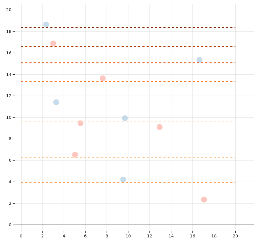
When playing around with the plot, you will notice that dragging a single data point often moves the splits considerably. Take a look at this simple example:


Even though I only moved the blue data point at x = 9.5 bit, the splits are totally different. Note that in both situations, the decision tree is perfect: Each data point ended up in a zone with data of the same color.
In the next example, such a sudden change also occurs given many more data points:


Here, only one blue data point at (x=8, y=4) was removed, which considerably changed the decision tree. However, note that even though the splits are made differently, the classification remains overly the same. The top and left sides are categorized as majority red areas, while the bottom and right are split in a way that there are mostly blue data points in the same zone. This shows that there are often many nearly equivalent ways to split up a space.
Usually, the decision tree will become less sensitive to small changes when you add more data to the plot.
If you enjoyed this plotter, make sure you also check out my linear discriminant analysis plotter! And don’t forget to follow me to stay in the loop for further articles!
Join thousands of data leaders on the AI newsletter. Join over 80,000 subscribers and keep up to date with the latest developments in AI. From research to projects and ideas. If you are building an AI startup, an AI-related product, or a service, we invite you to consider becoming a sponsor.
Published via Towards AI
Towards AI Academy
We Build Enterprise-Grade AI. We'll Teach You to Master It Too.
15 engineers. 100,000+ students. Towards AI Academy teaches what actually survives production.
Start free — no commitment:
→ 6-Day Agentic AI Engineering Email Guide — one practical lesson per day
→ Agents Architecture Cheatsheet — 3 years of architecture decisions in 6 pages
Our courses:
→ AI Engineering Certification — 90+ lessons from project selection to deployed product. The most comprehensive practical LLM course out there.
→ Agent Engineering Course — Hands on with production agent architectures, memory, routing, and eval frameworks — built from real enterprise engagements.
→ AI for Work — Understand, evaluate, and apply AI for complex work tasks.
Note: Article content contains the views of the contributing authors and not Towards AI.


