


Non-Linear Models
Last Updated on August 2, 2022 by Editorial Team
Author(s): Dr. Marc Jacobs
Originally published on Towards AI the World’s Leading AI and Technology News and Media Company. If you are building an AI-related product or service, we invite you to consider becoming an AI sponsor. At Towards AI, we help scale AI and technology startups. Let us help you unleash your technology to the masses.
When the formula looks nice but is hurting the analysis
This is not my first blog concerning non-linear models. In fact, if you sift through my lists of blogs, you can see I applied quite a couple of them. Personally, I like non-linear models since they have a biological basis, and if you have data that does not connect to that basis, it can become quite a challenge to move further. As always, the first steps are the hardest, and nothing suits that premise better than a non-linear model.
I will not dive into a talk about non-linear models, but what I will do is show you briefly my struggle with a dataset handed to me by another researcher. This is nutritional commercial data, so I cannot share the data itself, but you can see what I did. Also, the formula given to me is beyond my comprehension, but what I will show is that a perfect-looking formula can be quite difficult to work with if it fits the data too perfectly.
Let's start by loading the libraries and the data. It is data coming from piglets, measured across time.
rm(list = ls())
library(readr)
library(nlstools)
library(nlme)
library(ggplot2)
library(nls2)
## new file from Theo
Oral_data_for_Marc <- read_delim("Oral data for Marc.csv",
";", escape_double = FALSE, trim_ws = TRUE)
data<-Oral_data_for_Marc
rm(Oral_data_for_Marc)
data<-data[, 1:3]
data<-data[complete.cases(data),]
head(data);str(data)
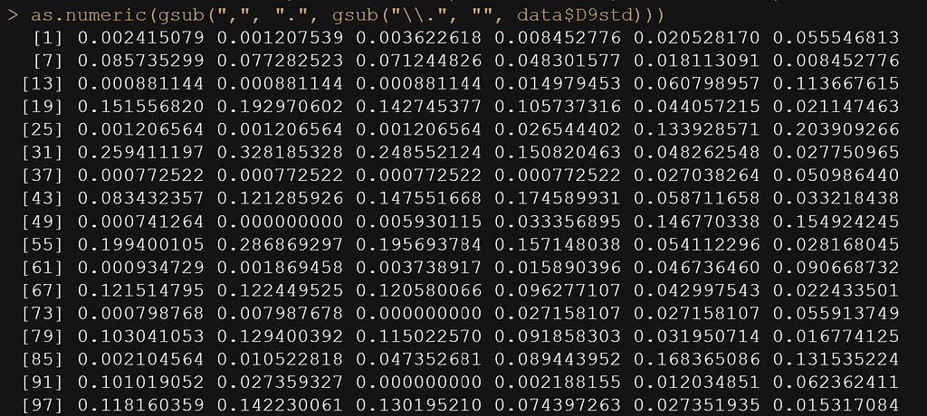
as.numeric(gsub(",", ".", gsub("\\.", "", data$D9std)))
data$D9std <- gsub(",", "", data$D9std)
data$D9std <- as.numeric(data$D9std)
data$D9std<-data$D9std/1000000000
data$Big<-as.factor(data$Big)
Now, the data was not easy to work with from the start, especially the outcome. It was loaded as a character, but I could not make a numeric on the spot, forcing me to do some transformations first.
ggplot(data,
       aes(x=time,
           y=D9std,
           group=Big,
           col=Big))+
  geom_point()+
  geom_line()+
  theme_bw()+
  labs(x="Time",
       y="Value",
       col="Pig" )
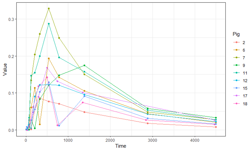
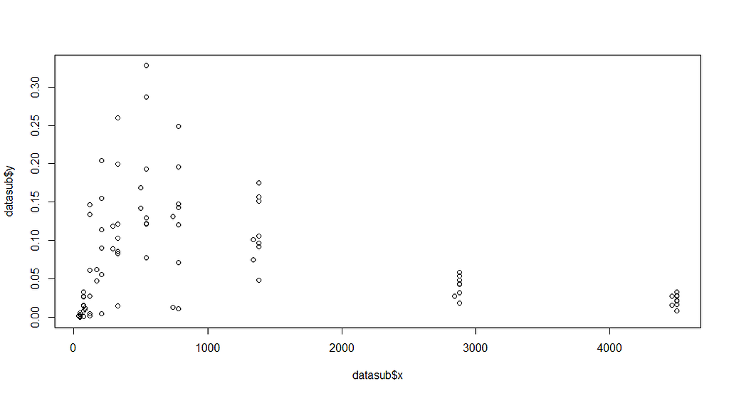
Not only will the pathway cause issues, but also the beginning, which is why I cut a couple of seconds from the data. Let's see how the data will look then.
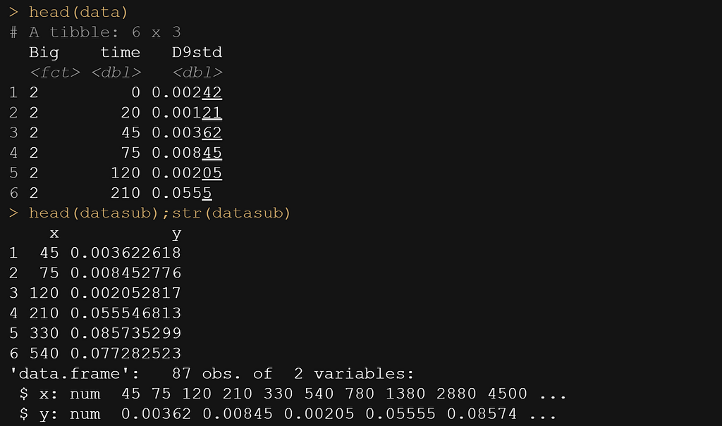
datasub<-data[data$time>=30,];head(datasub)
colnames(datasub)[2]<-"x" # time called x
colnames(datasub)[3]<-"y" # D9std called y
datasub$Big<-NULL # not informative vector
datasub<-as.data.frame(datasub)
datasub$y <- gsub(",", "", datasub$y)
datasub$y<-as.numeric(datasub$y)
head(data)
head(datasub);str(datasub)
plot(datasub$x, datasub$y)
Now, it is time to look at the formula. As I said, this was handed to me, and I have no idea how somebody ever came up with such an elaborate formula. It truly is massive, with several compartments included. Below you see ways to connect the formula and how I test it to make sure I translated it correctly in R.
formulaExp<-as.formula(y~P*(I(1-(exp(-(Ks*x))))^B)*(Ka*((exp(-(Ke*x)))-(exp(-(Ka*x))))/(Ka-Ke)))
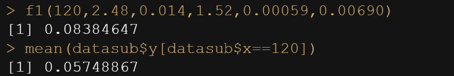
f1<-function(x, P, Ks,B, Ka, Ke){
  P*(I(1-(exp(-(Ks*x))))^B)*(Ka*((exp(-(Ke*x)))-(exp(-(Ka*x))))/(Ka-Ke))}
f1(20, P=2.48, Ks=0.014, B=1.52, Ka=0.00059, Ke=0.00690)

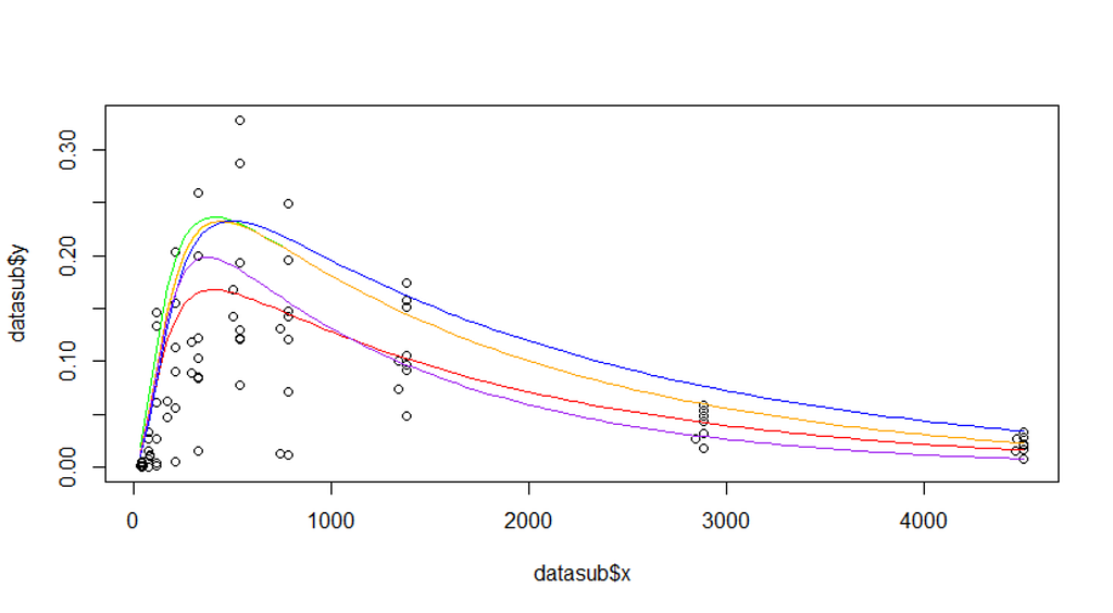
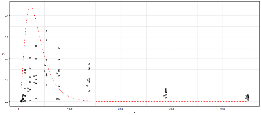
The biggest hurdle in non-linear regression modeling is finding the exact values. Since non-linear models are not closed, the search goes iterative. One way of taking a peak is by plotting the data and overlaying several gradations of the curve.
plot(datasub$x, datasub$y)
curve(f1(x, P=2.48, Ks=0.014, B=1.52, Ka=0.00059, Ke=0.00690), add=T, col="red")
curve(f1(x, P=3.5, Ks=0.014, B=1.52, Ka=0.00059, Ke=0.00690), add=T, col="green")
curve(f1(x, P=3.5, Ks=0.010, B=1.52, Ka=0.00059, Ke=0.00690), add=T, col="yellow")
curve(f1(x, P=3.5, Ks=0.010, B=1.52, Ka=0.00050, Ke=0.00590), add=T, col="blue")
curve(f1(x, P=3.5, Ks=0.010, B=1.42, Ka=0.00059, Ke=0.00690), add=T, col="orange")
curve(f1(x, P=3.0, Ks=0.010, B=1.62, Ka=0.00080, Ke=0.0090), add=T, col="purple")
In R, there is a very nice package called NLStools, which will help you look at the data and offer functions to preview the coefficients you deem to be a good fit. Like I said before, that process is quite difficult, and unlike simple linear regression or mixed modeling, decent starting values are key in finding the solution. If there is one.
Up until now, I have fed the formula a single or just a couple of scenarios. That is good if you know where to look but often you do not, so it is better to conduct a grid search. What this simply means is that you create a matrix of combinations and then let the model sift to that.
Below is the command for the grid and how it looks.
grid.theo<-expand.grid(list(P=seq(2, 4, by=0.1),
                            Ks=seq(0.010, 0.020, by=0.01),
                            B=seq(1.4, 1.6, by=0.01),
                            Ka=seq(0.005,0.007,by=0.01),
                            Ke=seq(0.006,0.008, by=0.01)))
grid.theo
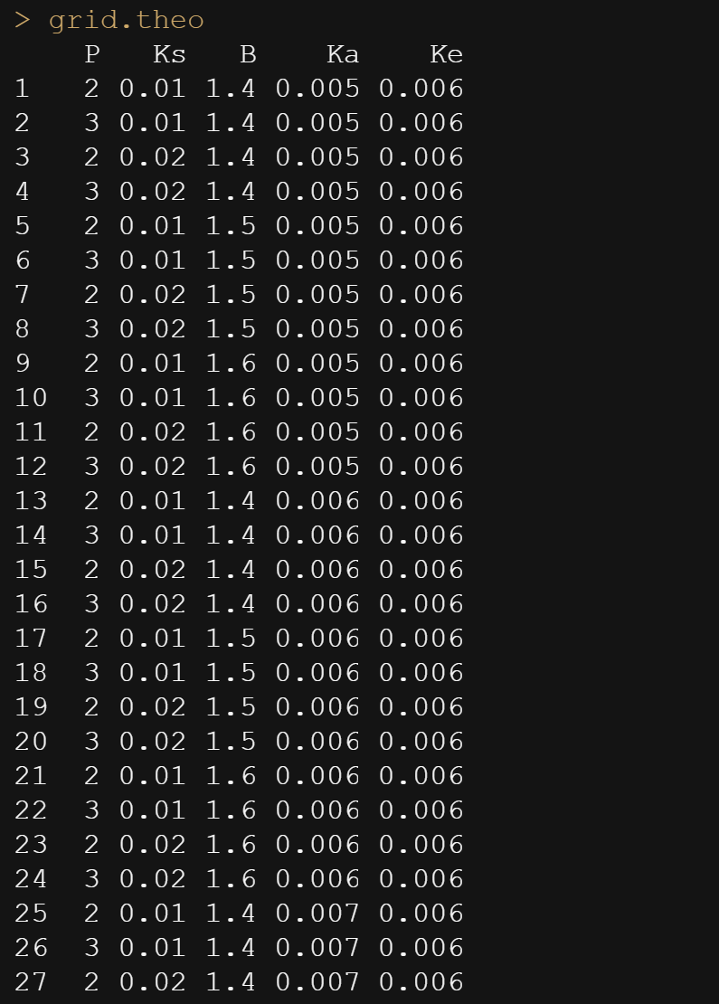
Then, it is time to feed the model the grid.
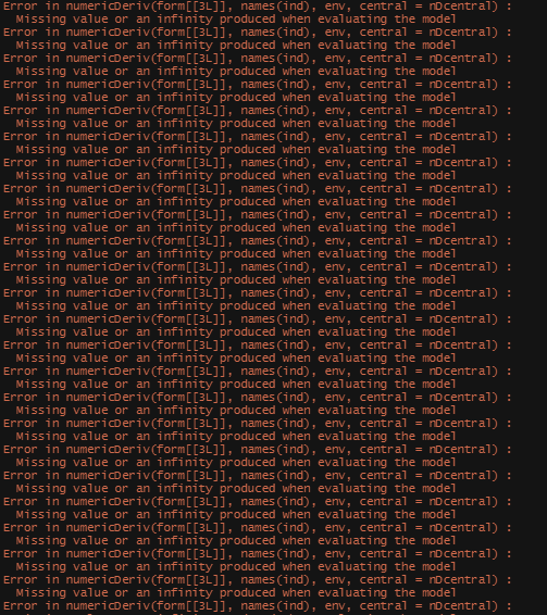
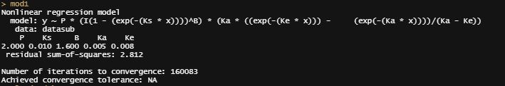
mod1 <- nls2(formulaExp,
             data=datasub,
             start = grid.theo,
             algorithm = "brute-force")
plot(mod1)
nls2(formulaExp, data=datasub, start = mod1)
However, the model does produce. You can see the formula, the coefficients, and the residual sum of squares of the model chosen. It looks a lot higher than the value I obtained from the last preview.
Now, there ARE other ways of using grid searches by connecting them directly to the model. Here, you see me going at it again.
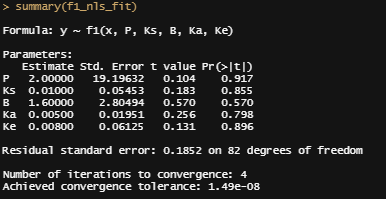
f1_nls_fit <- nls.multstart::nls_multstart(y ~ f1(x, P, Ks,B, Ka, Ke),data = datasub,
lower=c(P=2, Ks=0.01, B=1.4, Ka=0.005, Ke=0.006),
upper=c(P=4, Ks=0.02, B=1.6, Ka=0.007, Ke=0.008),
start_lower = c(P=2, Ks=0.01, B=1.4, Ka=0.005, Ke=0.006),
start_upper = c(P=4, Ks=0.02, B=1.6, Ka=0.007, Ke=0.008),
iter = 500,supp_errors = "Y")
summary(f1_nls_fit)
plot(f1_nls_fit)
plot_nls <- function(nls_object, data) {
  predframe <- tibble(x=seq(from=min(datasub$x), to=max(datasub$x),
                               length.out = 1024)) %>%
    mutate(ypred = predict(nls_object, newdata = list(x=.$x)))
  ggplot(data, aes(x=x, y=y)) +
    geom_point(size=3, alpha=0.5) +
    geom_line(data = predframe,
              aes(x=x, y=ypred),
              col="red", lty=2)+
    theme_bw()}
plot_nls(f1_nls_fit, datasub)
Let's try again, changing the control measures and from a single list of starting coefficients.
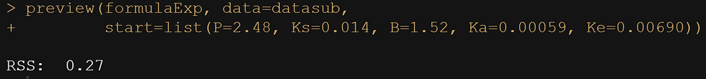
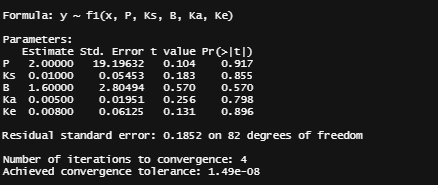
control1<-nls.control(maxiter=100, tol=1e-10, minFactor=1/100000000, warnOnly=T)
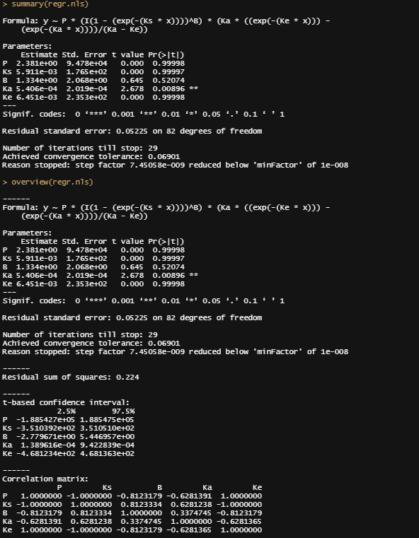
regr.nls<-nls(formulaExp,start=list(P=2.48, Ks=0.014, B=1.52, Ka=0.00059, Ke=0.00690),control=control1, data=datasub, trace=T)
summary(regr.nls)
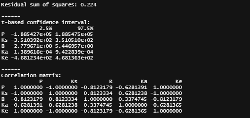
overview(regr.nls)
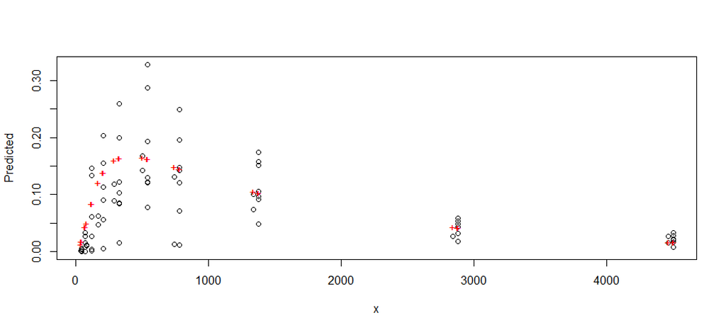
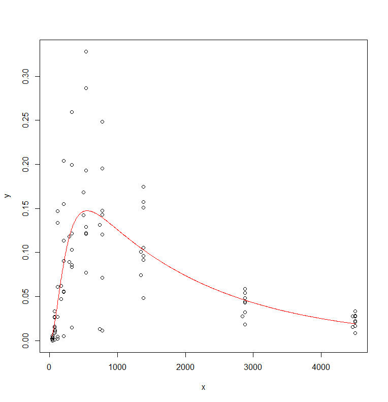
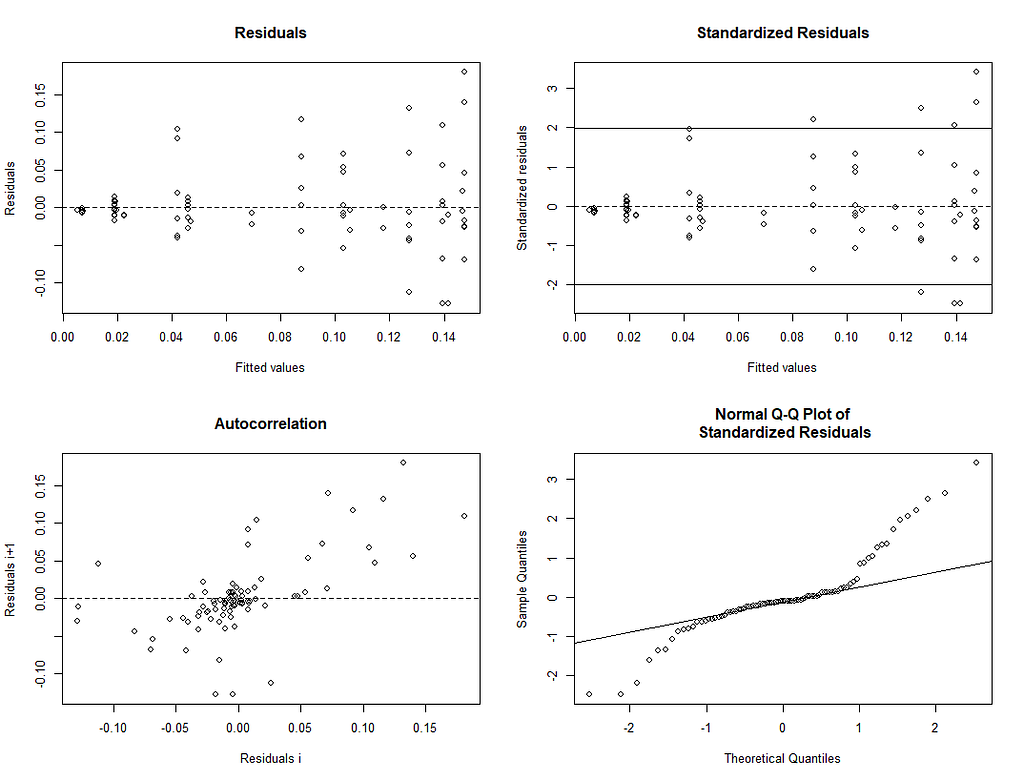
plotfit(regr.nls, smooth=T)
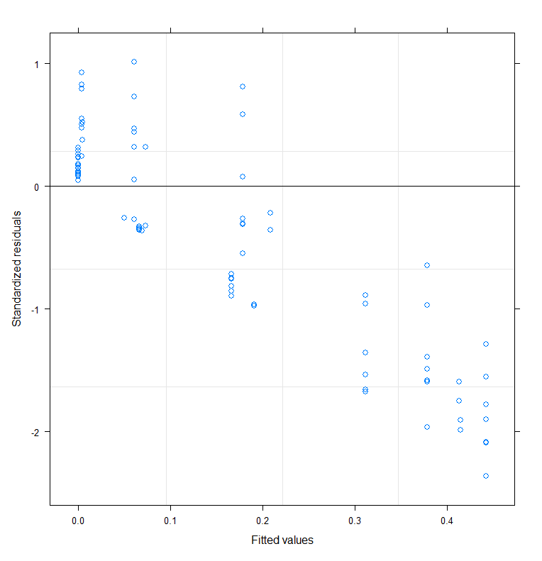
Let's take a closer look at the residuals.
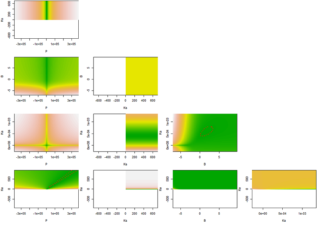
A more decent way of showing the interconnectedness of the coefficients is to plot contours.
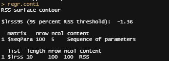
regr.cont1<-nlsContourRSS(regr.nls)
plot(regr.cont1)
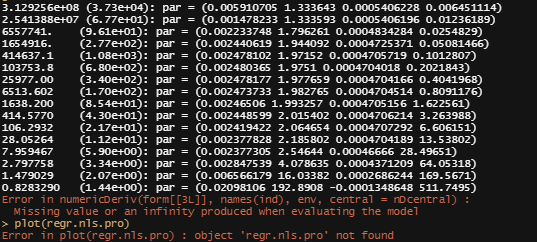
regr.conf1<-nlsConfRegions(regr.nls,exp=4, length=20)
plot(regr.conf1, bound=T)
regr.nls.pro<-profile(regr.nls)
plot(regr.nls.pro)

Perhaps, it is time to look at the mixed modeling side of non-linear regression. We have multiple pigs, so it should be possible and those of you who remember the first plots also remember that not every pig had the same curve.
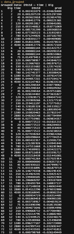
I will turn to the nlme package, which I have relied heavily on one before, and start grouping the data in a dataset that nlme likes.
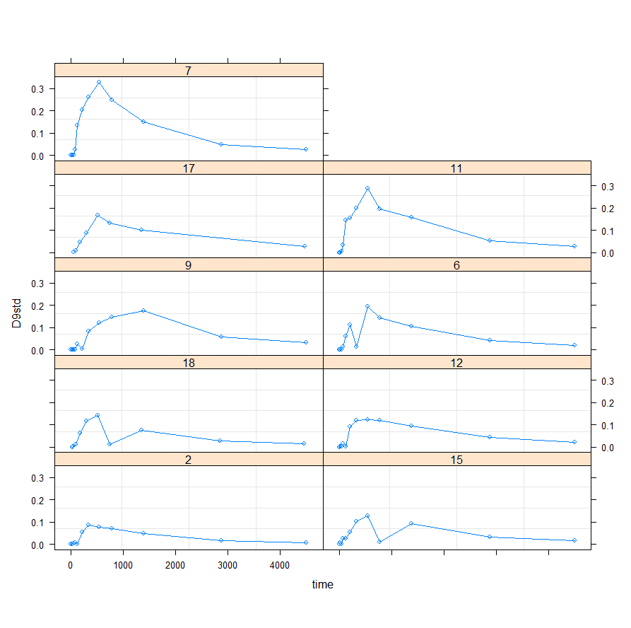
Lets go for it!
f1_nlme_fit <- nlme(D9std ~ f1(time, P, Ks, B, Ka, Ke),
                    data = data_grouped,
                    fixed = P + Ks + B + Ka + Ke ~ 1,
                    random = P ~ 1,
                    groups = ~ Big,
                    start = c(P=2.48, Ks=0.014, B=1.52, Ka=0.00059,
                    Ke=0.00690),verbose = F)

This brings me back to the original overview some time back, showing me the heavy correlations. This will just never work, the formula is too stringent! And since I have no idea how it was made up, I decided to go for a different model altogether. One that would offer me more freedom at the expense of biological explainability.
General Additive Mixed Models — using time as a spline and still keeping the grouped dataset. However, without specifying the hierarchy specified in the model, nothing will happen.
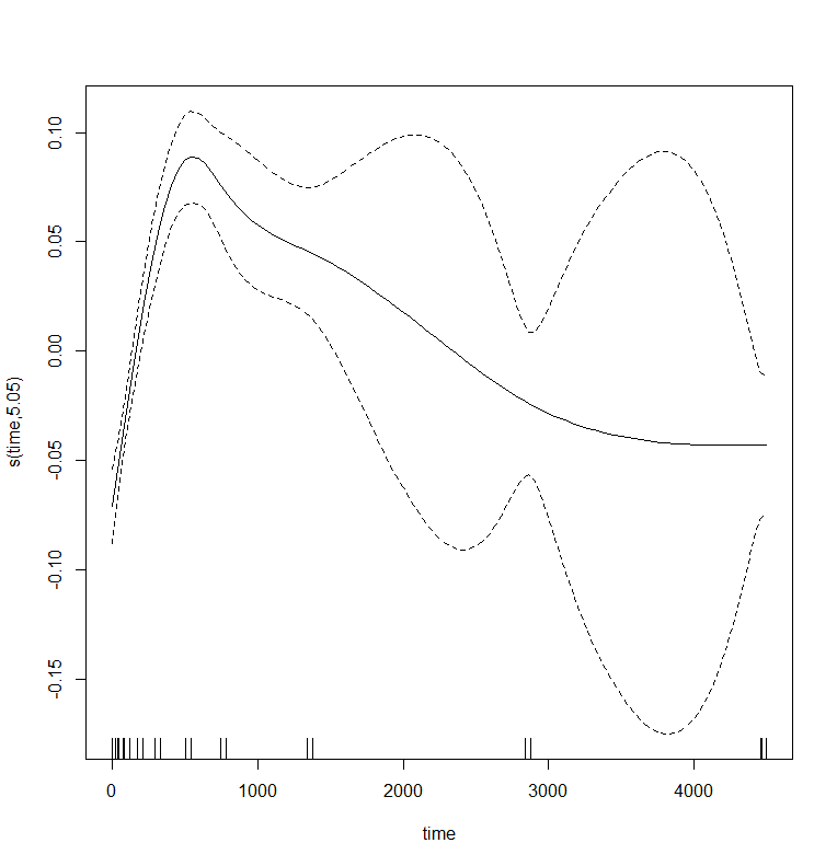
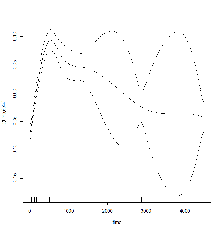
gamm_fit<-mgcv::gamm(D9std~s(time), data=data_grouped)
plot(gamm_fit$gam,pages=1)
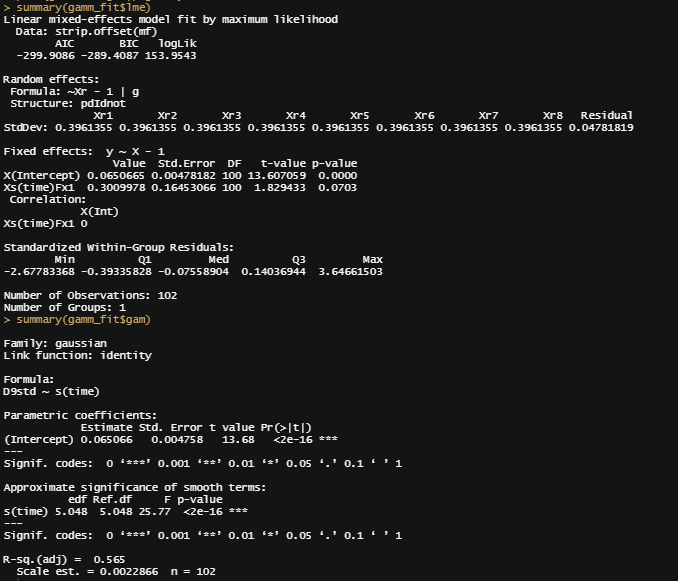
summary(gamm_fit$lme)
summary(gamm_fit$gam)
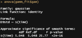
anova(gamm_fit$gam)
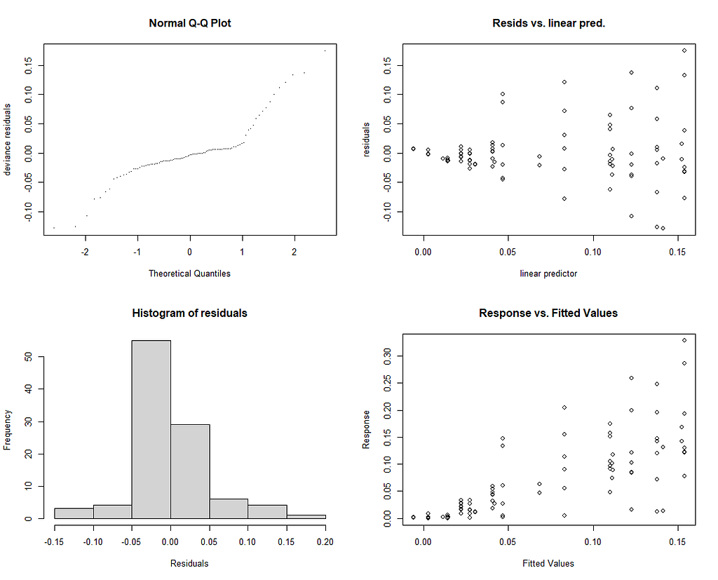
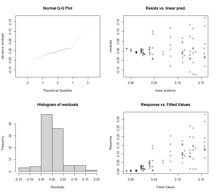
par(mfrow = c(2, 2))
mgcv::gam.check(gamm_fit$gam)
And the lme (mixed model) part of the gamm function.
Let's incorporate the hierarchy in the model by adding a random intercept.
gamm_fit2<-mgcv::gamm(D9std~s(time),
                      data=data_grouped,
                      random=list(Big=~1))
plot(gamm_fit2$gam,pages=1)
big <- data_grouped$Big
rm(big)
par(mfrow = c(2, 2))
mgcv::gam.check(gamm_fit2$gam)
Let's add a random slope as well.
gamm_fit2.1<-mgcv::gamm(D9std~s(time),
data=data_grouped,
random=list(Big=~time))
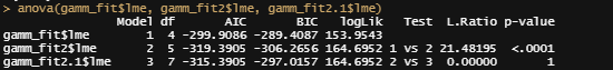
anova(gamm_fit$lme, gamm_fit2$lme, gamm_fit2.1$lme)
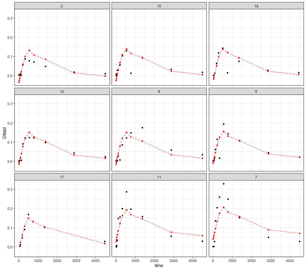
Last but not least, I want to check if the model I made makes any sense. Overfitting is always a problem, and since I have lost the biological relevance of the non-linear function, I want to make at least sure that this data-driven model is looking at the right things.
pred<-fitted(gamm_fit2$lme);pred
pred<-fitted(gamm_fit2$gam);pred
data_grouped$pred<-pred
ggplot(data_grouped,
       aes(x=time))+
  geom_point(aes(y=D9std))+
  geom_point(aes(y=pred), col="red")+
  geom_line(aes(y=pred), col="red", lty=2)+
  theme_bw()+
  facet_wrap(~Big)
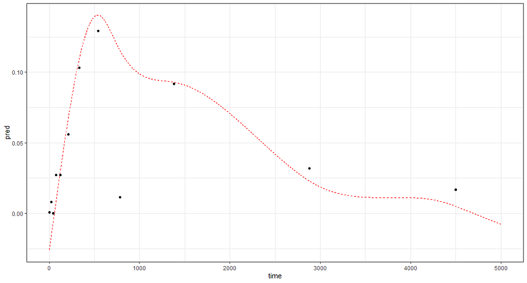
And the last check by creating a full time-path for a particular pig.
df<-data.frame(time = seq(0,5000, 1),Big  = "15")
rand_big<-ranef(gamm_fit2$lme, level=2)
df$pred<-rand_big$`(Intercept)`[2] + mgcv::predict.gam(gamm_fit2$gam,df)
ggplot(df,
       aes(x=time))+
  geom_line(aes(y=pred), col="red", lty=2)+
  geom_point(data=data_grouped[data_grouped$Big=="15", ],
             aes(x=time, y=D9std), col="black")+
    theme_bw()
So, I hope you liked this small post. Do not forget, modeling is not easy. That is why it is fun!
Non-Linear Models was originally published in Towards AI on Medium, where people are continuing the conversation by highlighting and responding to this story.
Join thousands of data leaders on the AI newsletter. It’s free, we don’t spam, and we never share your email address. Keep up to date with the latest work in AI. From research to projects and ideas. If you are building an AI startup, an AI-related product, or a service, we invite you to consider becoming a sponsor.
Published via Towards AI
Towards AI Academy
We Build Enterprise-Grade AI. We'll Teach You to Master It Too.
15 engineers. 100,000+ students. Towards AI Academy teaches what actually survives production.
Start free — no commitment:
→ 6-Day Agentic AI Engineering Email Guide — one practical lesson per day
→ Agents Architecture Cheatsheet — 3 years of architecture decisions in 6 pages
Our courses:
→ AI Engineering Certification — 90+ lessons from project selection to deployed product. The most comprehensive practical LLM course out there.
→ Agent Engineering Course — Hands on with production agent architectures, memory, routing, and eval frameworks — built from real enterprise engagements.
→ AI for Work — Understand, evaluate, and apply AI for complex work tasks.
Note: Article content contains the views of the contributing authors and not Towards AI.
Related posts
Recent Posts


")

