Data Visualization — An Underrated Art
Last Updated on July 24, 2023 by Editorial Team
Author(s): Saiteja Kura
Originally published on Towards AI.
1. Data-Ink Ratio

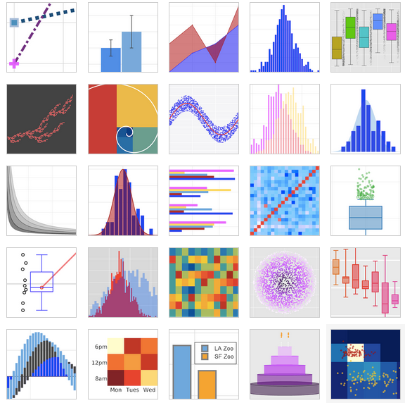
It is essential to choose the right one! (Source — Data Science Central)
Raise your hands if you ever came across the terms data visualization and data visualization tools like Tableau and Python modules like matplotlib, plotlyand seaborn. I am not going to talk about any of these tools, but I am going to explain the heuristics of Data visualization and how a good/adverse visual impacts the user experience.
According to Google, If information is presented orally, we remember about 10% three days later. Incase, A graphic is used to represent things the number go up to 65%.
Data visualisation is representing information… Read the full blog for free on Medium.
Join thousands of data leaders on the AI newsletter. Join over 80,000 subscribers and keep up to date with the latest developments in AI. From research to projects and ideas. If you are building an AI startup, an AI-related product, or a service, we invite you to consider becoming a sponsor.
Published via Towards AI
Towards AI Academy
We Build Enterprise-Grade AI. We'll Teach You to Master It Too.
15 engineers. 100,000+ students. Towards AI Academy teaches what actually survives production.
Start free — no commitment:
→ 6-Day Agentic AI Engineering Email Guide — one practical lesson per day
→ Agents Architecture Cheatsheet — 3 years of architecture decisions in 6 pages
Our courses:
→ AI Engineering Certification — 90+ lessons from project selection to deployed product. The most comprehensive practical LLM course out there.
→ Agent Engineering Course — Hands on with production agent architectures, memory, routing, and eval frameworks — built from real enterprise engagements.
→ AI for Work — Understand, evaluate, and apply AI for complex work tasks.
Note: Article content contains the views of the contributing authors and not Towards AI.


