


Author(s): Kashish Rastogi
Data Visualization
Step-by-step guide for Bar Chart and making mind-blowing visualization. Tips and tricks to make your work easy.
You never knew you needed Plotly! Plotly is like chocolate for visualization you can’t get enough of it. The best library has the best user interaction charts.
Here I am going to talk about different types of Bar charts in Plotly. Data is taken from Kaggle and the whole notebook is available here.
The idea behind making a chart.
How you display data has more power than any charts you use, but the right chart also matters a lot.
Let’s get started!
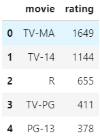
Data
The idea to make a chart was to display which program; TV Shows or Movies has the highest rating on Netflix.

First Plot
Plotted a stacked bar chart for comparison between TV Shows and Movies. This chart tells us that Netflix’s audience prefers to watch movies rather than TV Shows. The Highest rating is given to Movies and TV Show having TV-MA tag which tell us that most of the content on Netflix is for the mature audience and not for age 17 years and under.
Code:
fig = px.histogram(df, y='rating', color='type')

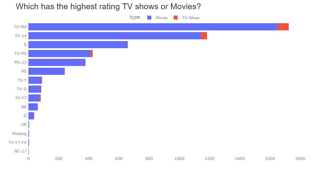
I am quite satisfied with the Stacked bar chart but it is not easy to look for TV shows in the chart. Sometimes the amount of TV Shows is so little that even if the TV Show value is present in the chart at my first glance of the chart I am not being able to see it.
Don’t worry we have another option too.
Group Bar chart
code:
fig = px.histogram(df, y='rating', color='type', barmode='group')

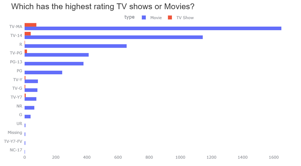
Now I can clearly see and compare the TV Shows and Movies for Ratings. It looks quite elegant now but in TV Show ‘R’ rating have a very small value and, ‘PG-13’, ‘PG’, etc do not have any value. The audience might don’t see this information as its value is very less. Do you think any other chart is more suitable than this? Let’s find out.
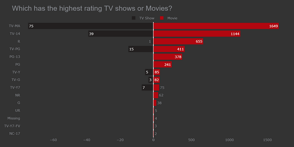
Bidirectional Bar chart

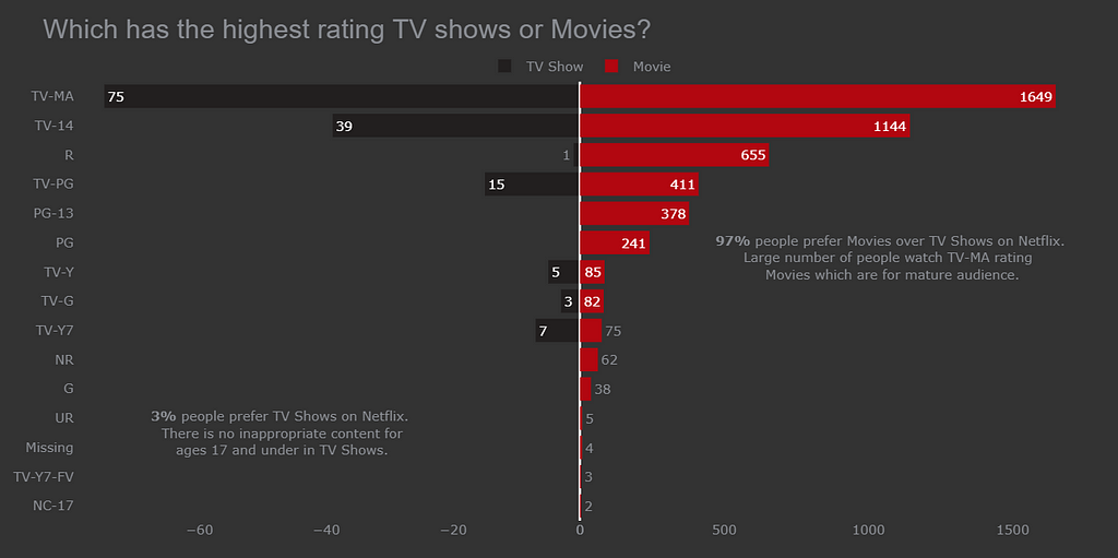
This is the best chart till now it is easy to compare both TV Show and Movies vs Rating.
Code:
# making a copy of df
dff = df.copy()
#1. making a df one for tv show with rating
df_tv_show = dff[dff['type']=='TV Show'][['rating', 'type']].rename(columns={'type':'tv_show'})
# making a df for movie with rating
df_movie = dff[dff['type']=='Movie'][['rating', 'type']].rename(columns={'type':'movie'})
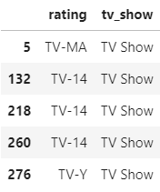
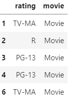
Making a data frame for each TV Show and Movie with Ratings.
Selecting the data which has Type= TV Show with a rating and renaming the column to ‘tv_show’. The df_tv_show look like this

Selecting the data which has Type= Movie with a rating and renaming the column to ‘movie’. The df_movie look like this

Now let’s find out the value counts of rating in df_tv_show and df_movie.
# 2.
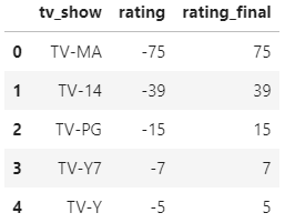
df_tv_show = df_tv_show.rating.value_counts()
df_tv_show = pd.DataFrame(df_tv_show).reset_index().rename(columns={'index':'tv_show'})
df_tv_show['rating_final'] = df_tv_show['rating']
# making rating column value negative
df_tv_show['rating'] *= -1
df_movie = df_movie.rating.value_counts()
df_movie = pd.DataFrame(df_movie).reset_index().rename(columns={'index':'movie'})
After finding out the value count of the rating rename the columns to tv_show. We want to build a Bidirectional Bar chart so one of the ‘type’ has to set the values of rating on the negative x-axis. Let’s make a new column rating_final where multiply (-1) with the original values of rating.
The data look like this for df_tv_show.

After finding out the value count of the rating rename the columns to the movie. The data look like this for df_movie.

All the preprocessing is done.
Let’s make the Bidirectional Bar Chart
Code:
fig = make_subplots(rows=1, cols=2, specs=[[{}, {}]], shared_yaxes=True, horizontal_spacing=0)
# bar plot for tv shows
fig.append_trace(go.Bar(x=df_tv_show.rating, y=df_tv_show.tv_show,
                        orientation='h', showlegend=True,
                        text=df_tv_show.rating_final,
                        name='TV Show',
                        marker_color='#221f1f'), 1, 1)
# bar plot for movies
fig.append_trace(go.Bar(x=df_movie.rating, y=df_movie.movie,
                        orientation='h', showlegend=True,
                        text=df_movie.rating,
                        name='Movie', marker_color='#b20710'), 1, 2)
Making 2 subplots of bar chart one bar chart having df_tv_show and another one with df_movie.
Parameters:
- shared_yaxis= True: To make a bidirectional bar chart; the bar chart needs to share the y-axis
- horizontal_spacing=0: Space between both the bar charts should be 0. If you want space between the 2 bar charts then specify the value in this parameter.
- orientation: We can see the bar chart in two forms one is horizontal and another one is the vertical
- text: The value which we are seeing on the bar is being displayed with ‘text’ parameter.
- name: It will specify the name of the legends (Movie, TV Show)
- marker_color: You can specify any color you want for the bars.
For further details in the parameters give a look at this blog.
These are the additional parameters to look the bar chart more attractive.
fig.update_xaxes(showgrid=False)
fig.update_yaxes(showgrid=False, categoryorder='total ascending',
                 ticksuffix=' ', showline=False)
fig.update_traces(hovertemplate=None)
fig.update_layout(title='Which has the highest rating TV shows or Movies?',
                  margin=dict(t=80, b=0, l=70, r=40),
                  hovermode="y unified",
                  xaxis_title=' ', yaxis_title=" ",
                  plot_bgcolor='#333', paper_bgcolor='#333',
                  title_font=dict(size=25, color='#8a8d93',
                                  family="Lato, sans-serif"),
                  font=dict(color='#8a8d93'),
                  legend=dict(orientation="h", yanchor="bottom",
                              y=1, xanchor="center", x=0.5),
                  hoverlabel=dict(bgcolor="black", font_size=13,
                                  font_family="Lato, sans-serif"))
fig.add_annotation(dict(x=0.81, y=0.6, ax=0, ay=0,
                    xref = "paper", yref = "paper",
                    text= "<b>97%</b> people prefer Movies over TV Shows on Netflix.<br> Large number of people watch TV-MA rating  <br> Movies which are for mature audience."
                  ))
fig.add_annotation(dict(x=0.2, y=0.2, ax=0, ay=0,
                    xref = "paper", yref = "paper",
                    text= "<b>3%</b> people prefer TV Shows on Netflix.<br> There is no inappropriate content for<br> ages 17 and under in TV Shows."
                  ))
# bar plot for movies
fig.append_trace(go.Bar(x=df_movie.rating, y=df_movie.movie, orientation='h', showlegend=True, text=df_movie.rating,
                        name='Movie', marker_color='#b20710'), 1, 2)
fig.update_xaxes(showgrid=False)
fig.update_yaxes(showgrid=False, categoryorder='total ascending', ticksuffix=' ', showline=False)
fig.update_traces(hovertemplate=None)
fig.update_layout(title='Which has the highest rating TV shows or Movies?',
                  margin=dict(t=80, b=0, l=70, r=40),
                  hovermode="y unified",
                  xaxis_title=' ', yaxis_title=" ",
                  plot_bgcolor='#333', paper_bgcolor='#333',
                  title_font=dict(size=25, color='#8a8d93', family="Lato, sans-serif"),
                  font=dict(color='#8a8d93'),
                  legend=dict(orientation="h", yanchor="bottom", y=1, xanchor="center", x=0.5),
                  hoverlabel=dict(bgcolor="black", font_size=13, font_family="Lato, sans-serif"))
fig.add_annotation(dict(x=0.81, y=0.6, ax=0, ay=0,
                    xref = "paper", yref = "paper",
                    text= "<b>97%</b> people prefer Movies over TV Shows on Netflix.<br> Large number of people watch TV-MA rating  <br> Movies which are for mature audience."
                  ))
fig.add_annotation(dict(x=0.2, y=0.2, ax=0, ay=0,
                    xref = "paper", yref = "paper",
                    text= "<b>3%</b> people prefer TV Shows on Netflix.<br> There is no inappropriate content for<br> ages 17 and under in TV Shows."
                  ))
Steps to make this chart:
Changing the color of bars in the chart.
- Choosing appropriate colors like red and black which are in the Netflix logo. You can choose any color you want but choose contrast color when you have charts that need a comparison like the above chart.
Setting the background color of the chart.
- Setting the background and bar color should be always different like in this case the bar color for a TV Show is a darker shade of black and the background is a lighter shade of black. We can easily differentiate both the bar and background.
Giving appropriate Title to the chart.
- Most of the time people use a title that is very basic like ‘Type vs Rating’ this title is not wrong but having a Title that automatically tells you about the chart is a very crucial step.
- The title which we use here is ‘Which has the highest Rating TV Shows or Movies on Netflix?’ This title automatically tells us that the below chart will be a comparison between TV Show and Movie for Ratings and additionally it also states that the data which we are looking for is from Netflix.
Adding text to the bar
- When should you add text to the bar it depends on the use case.
- Let’s take an example like here in the above chart when we compare the TV shows and Movies with Ratings. In TV Show ‘R’ rating does have value and, ‘PG-13’, ‘PG’, etc do not have any value. The audience might don’t see this information as its value is very less that’s why it is important to set the text on the bars.
- Additionally, it is easy to compare side-by-side bars for TV shows and Movies Vs Ratings.
Adding an annotation to charts
- Here I have given information like 97% of the audience prefer Movies over TV Show. Laying out more information related to charts is the best way you can present the chart.
Setting different colors for text on the bar, Title, and annotation.
- You should always follow this Rule:
- Title: Font for the title should be always bigger
- Text on Bar: Text on the bar should be always smaller than the main title of the chart.
- By using this rule the charts you make will look good, So always follow this rule of title, annotation, and text on the bar.
If you find this article useful do like it.
Other Resources:
Bar racing charts with Plotly

Tips and tricks for Plotly Bar Chart was originally published in Towards AI on Medium, where people are continuing the conversation by highlighting and responding to this story.
Published via Towards AI